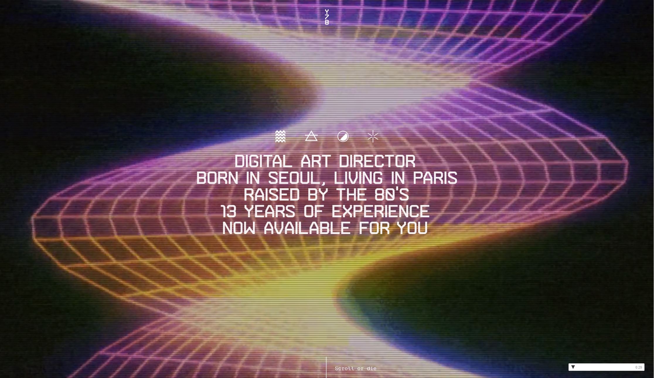
Yul Moreau is a digital art director based in Paris. His primary target audience are potential clients and businesses looking to explore his work. The initial page is attention-grabbing with vibrant colors and a never-ending loop of vintage clips, reflecting his statement of being "born in the 80's." Moreau's portfolio is designed for the viewer to scroll down through his work with individual sections dedicated to his projects.
Intent
The intent of Yul Moreau's website is to showcase his work through a distinct, easy-to-navigate online portfolio.
Voice
The voice of the website is bold and engaging with the capitalized text and striking colors. The digital text is reminiscent of a vintage video game, keeping in consistency with his 80's theme. Overall, the artist conveys his projects in a professional manner, highlighting his role and providing brief descriptions of what the work consisted of.
Tone
The tone is quite direct and informative. From the opening introduction to the end contact information, the text is all straightforward, emphasizing his work and contribution to each project.
Brand
Moreau establishes his brand through the constant use of moving images and embedded videos showcasing his work. Moreover, the contrasting colors and vibrant text fill up the page consistently, reflecting the voice of the website.
Personas
Student
A student would be attracted to this site as possible inspiration for their own portfolio or to gather information on a digital art director’s career. They can compare and contrast his unique site to other competitors and analyze what works well for him. There’s plenty of information regarding the work he’s done, complete with pictures and videos as well. It’s definitely an aesthetically nice site that would prompt a student to bookmark it for the future.
For instance, a design student, Jasmin, might look to this website as an example of how to construct her own digital presence. She can take note of the bright, vivid colors and moving images that keep the audience engaged. It’s clear that there’s a consistent, vintage theme, an observation that will be helpful to her creating her personal message.
Client/Business
Potential clients would be interested in Moreau’s site as they’d be able to assess his skills and explore his previous experience. The information is straightforwardly laid out and at the bottom he provides contact information if they need to get in touch. His website is both heavily design-based and individuals might certainly become repeat customers if they’re attracted to his work and aesthetic.
For instance, if a company like Nike was looking for a designer with UX/UI experience for an upcoming athletic campaign, Moreau’s website would provide a solid work portfolio. In this scenario, Nike wants to create buzz around a new show collaboration they're dropping soon. The website highlights his work and capabilities that might fit well with what Nike wants. Since he possesses UX/UI abilities, both the projects and his website overall serve as good examples of his experience. Even if his skills aren’t suited for one campaign, they can easily save his website for future reference.
Competing Designer
A competing designer would be attracted to this site as it becomes a reference for that individual as well as motivation to improve their work. This designer may draw inspiration from a certain aspect they enjoy from his website and incorporate it into their own portfolio; if they consistently wish to keep up with his work and track his progress they could definitely become a repeat viewer.
For instance, an upcoming designer, Fred, may be interested in how Moreau works and how he’s built his personal resume until now. He's newer to the field and wishes to expand his work portfolio with more experience. Fred, an individual who’s unsure what direction to take his website in, might use Moreau’s work to help design his own brand.
Wireframe
Here is a basic wireframe of the homepage as well as the first project.
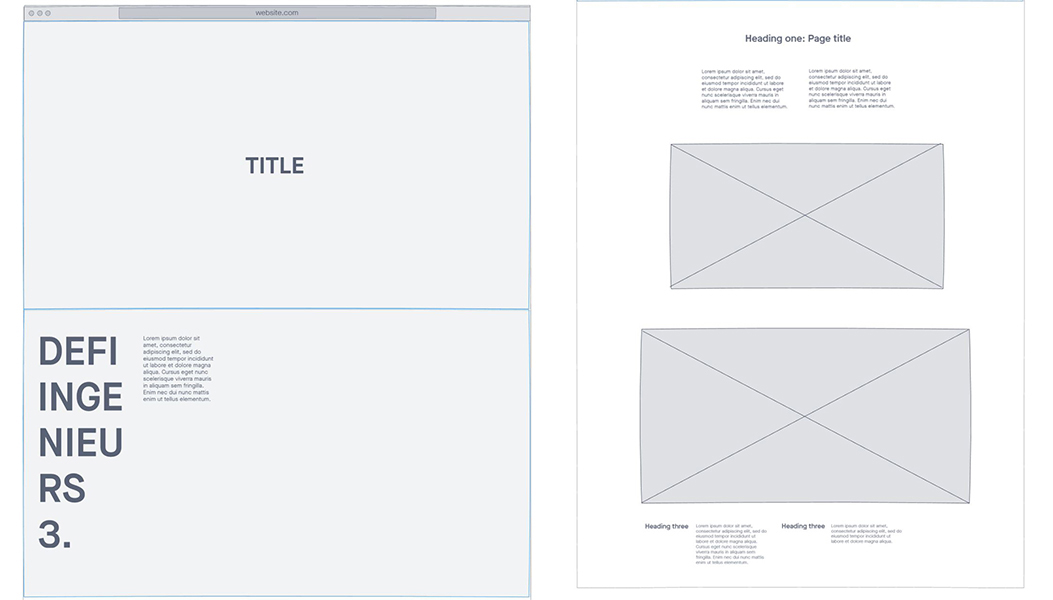
Copydeck
Here is a copydeck of the homepage as well as the first project.
Title
Yul Moreau
Heading
Digital Art Director // Born in Seoul, Living in Paris // Raised by the 80’s // 13 Years of Experience // Now Available for You
Subheading 1
Selected Work .01 // Defi Ingenieurs
Body Copy 1
Serious Game // Client Sncf // Agency Dan Paris // Role // Co-creative Direction // Lead Art Direction // Co-UX Design // UI motion // Client Presentation // Cinematic Storyboarding // Production Follow Up
Subheading 2
The Impossible Game
Body Copy 2
The French railway company SNCF was looking to recruit engineers able to imagine the future of mobility. The idea was to build a recruiting platform around ultra-realistic futuristic scenarios that will test young engineers by asking them to find solutions to the upcoming challenges facing SNCF and thus identify the precious few who have what it takes to engineer the future of the transportation. Developed in HTML 5 Canvas, the SNCF Engineering Challenge boasts a stunning illustrative style and a library of design elements that create a visually exciting futuristic world through which players navigate with their desktop keyboards or using their smartphones as mobile controllers for a more immersive gaming experience.
Subheading 3
The Team // Recognitions
Competition
Looking at portfolio websites from other creative directors, this website seems to be bolder in design with more variation in font and personal branding. A few of the other websites feel brighter and more simplistic while Moreau’s has constant movement and darker, vibrant colors. His personal branding feels more stylistic and unique in this manner. Most of the competition’s websites have a navigation bar that allows the audience to move between pages and projects; this might be a helpful addition for better organization.
Resources