Intent
Toma Vagner is an Illustrator based in New York. The primary intention of this website is to present Vagner’s illustration works as well as their artistic talent and capabilities.
Voice
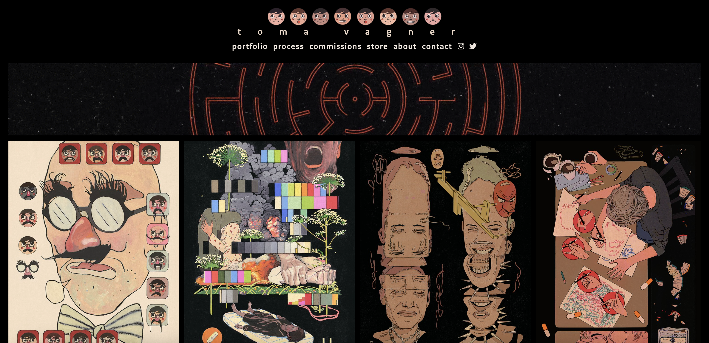
As mentioned, the goal of Vagner's website is to showcase their work and to grab clients' attention. While presenting their work in a visually appealing way, they could highlight their skill in advertisement at the same time. On the website, there is a menu that includes links to portfolio, process, commissions, store, about, contact, and social media. Vagner’s website serves mainly for the presentation of their work for potential clients as an artist. Vagner effectively organized and laid out their works in a simple way. When the viewer hovers on each work, the title is shown. It leads the viewers to view each work with the title without putting any efforts.
Toma Vagner's Website is:
- dark
- simple
- bold
- illustrated
- organized
Tone
The tone of Vagner’s website is dependent on Vagner’s illustration works, which have dark and evocative themes. The use of deep yet warm, vivid colors and fine line often on black background evokes the feeling of eeriness in their works. The vivid colors on a dark background easily grabs the viewer’s attention onto each work. The works are visually organized and thoughtfully displayed in rows of four, and the uniformity in size and arrangements creates a sense of order and symmetry, which goes well with the artist’s use of fine line.
Brand
Vagner’s brand is fine, simple, dark, and detailed. Her website uses black background with a GIF image in the heading. The GIF, which portrays a red circular maze-like pattern turning in circle, gives an emphasis on Vagner’s simple website. Also, in the heading, along with the name “Toma Vagner”, there is an illustration of 8 faces of different expressions. There are not as many details or decoration on Vagner’s website other than the GIF or faces. In the body, their illustration is organized in rows, meaning all the works have the same height, making the website seem very ordered.
Persona
There are multiple users that this website could be addressing. The three examples of personas include:
- An illustration student in NYC, just like myself, visits The Museum of Comic and Cartoon Arts (MoCCA) festival in the city. As soon as they get into the pavilion, she see a massive poster on the wall. It’s a poster that portrays 20 different illustrations with the writing of MoCCA FEST 2023. The illustration drawn with fine line and vibrant colors catches their eyes, leading them to search “main artist for MoCCA Fest 2023” on Google. The results show “Toma Vagner” and she immediately go take a look at Vagner’s website. She carefully look through Vagner’s works and gets fascinated by the quality of work, as the work are put in a very organized way. After viewing the work, she goes onto menu and clicks “process”. She gains idea on how an illustrator should be developing their work. The student saves the website on the bookmark to see later for inspiration.
- An artistic organization is looking for trendy artists to feature their work in their monthly magazine. After looking through Instagram and email application from different artists. the editor finds Vagner’s instagram. They looked through Vagner’s instagram and website linked in her profile. They go onto the menu and sees “about” page. In the about page, they see basic information, including awards, education, and origin, about Vagner, and different clients that hired or featured their works before. After seeing the clients, the editor clicks “commissions” in the menu and looks through the works to see if Vagner’s work would be a good fit for the magazine. Thinking that Vagner’s work would be a perfect choice for the cover, they click “contact” and sends an email to Vagner.
- A student who attends The School of Visual Arts in NYC was given a lecture that introduces alumni of the school. For homework, he needs to interview one of the alumni that were introduced, and present on what they interviewed and the kind of illustration they make after graduation. On the list of alumni he noted during the lecture, he finds Toma Vagner. He decides go onto Vagner’s website and sees what kinds of illustration Vagner makes. Sometimes it gave him headache as the works are too close to each other, but the simple presentation made him feel at ease. After taking notes on what he feels of Vagner’s illustration, he clicks about page to write about the basic information, and he clicks contact page to send Vagner an email asking if they are available for a short interview.