Digital Obesity Detox Clean Feed™ — Final Website Worksheet
A playful, wellness-style “store” that sells awareness about digital junk consumption instead of physical products.
- How do I make the site feel playful and satirical while still communicating a real problem (digital overload)? I want it playful (nutrition labels, “low-fat feed,” detox cleanses) without becoming a joke. It should still point to a real problem: algorithmic overload + persuasive design.
- What’s the simplest navigation (Home, "What is Digital Obesity?", Symptoms, Products, “Detox Plans,” About)?
- How can I use the “nutrition label” idea in a way that feels clever and clean instead of heavy or crowded?
- What color palette feels both “health/wellness” and “digital culture” (maybe neutrals + one neon accent)?
- How do I structure the homepage so the concept is instantly clear? (“You’re consuming too much digital junk.”)
- How can the site feel like a ‘store’ while not selling real objects?
Problem Definition
People today, especially Gen Z, live inside a constant flow of digital “junk food”: trends, ads, viral sounds, notifications, flash sales, and endless algorithmic triggers. This creates digital obesity: an overstimulated mind that is constantly snacking on quick content without ever feeling satisfied.
The problem isn’t just the volume of content - it’s how persuasive it all is. Everything is designed to keep you moving fast, not thinking.
In my capstone I studied how persuasive systems rely on urgency, rewards, scarcity, and automation to keep people scrolling or buying. Digital wellness tools usually fail because they feel preachy (“put your phone down”) or hyper-technical. Young people need something visual, simple, and recognizable - something that explains digital overload the same way nutrition explains food.
Idea
Build a playful website that “sells” a Clean Feed™ - a fake wellness service that treats digital content like food. Users can browse satirical “products” like:
- Low-Fat TikTok Feed™
- Ad-Free Fiber™
- Trend Detox Cleanse™
- Dopamine Lite Content™
- Calm Scroll Formula™
Everything looks like a modern wellness brand — clean neutrals, soft edges, nutrition labels — but the message actually is: Your digital diet is engineered like fast food: addictive, fast, and everywhere.
Why This Works
- Uses humor + clean design to make a complex issue relatable and understandable.
- Fits my capstone’s core idea: persuasion works because it’s invisible and fast.
- Makes digital overwhelm feel tangible, like something you can “see” and measure.
- Non-judgmental, relatable, and visually clean - perfect for students.
- Turns critique into an interactive, playful experience instead of another warning.
- Strong conceptual metaphor. Food = content. Clean feed = clarity.
- Visually appealing. Neutrals, wellness aesthetics, smooth UI.
Discovery & Research
I reviewed other digital wellness platforms (Opal, ScreenZen), minimalist/anti-distraction brands, and nutritional labeling systems. Besides, a considerable part of mt capstone was dedicated to research on TikTok and Instagram, which overload users with constant micro-stimuli (trends, hooks, “for you” triggers).
Patterns:
- Wellness tools feel clinical.
- Social platforms encourage endless consumption.
- There’s space for a playful, design-driven critique that is neither preachy nor overwhelming.
This project fills that gap.
Audience
Young adults (18–25), especially students, who spend hours online and feel digitally overstimulated, are the ones I’m designing for. They know algorithms shape their behavior, but they hate anything preachy or “put your phone down” energy. They respond way better to visual, humorous, clean design - the kind of thing that feels clean and easy to engage with. They already understand detox culture from skincare, supplements, and wellness trends, so this idea feels familiar without being serious or judgmental. They want something that helps them see their habits, not something that scolds them.
MoodBoard
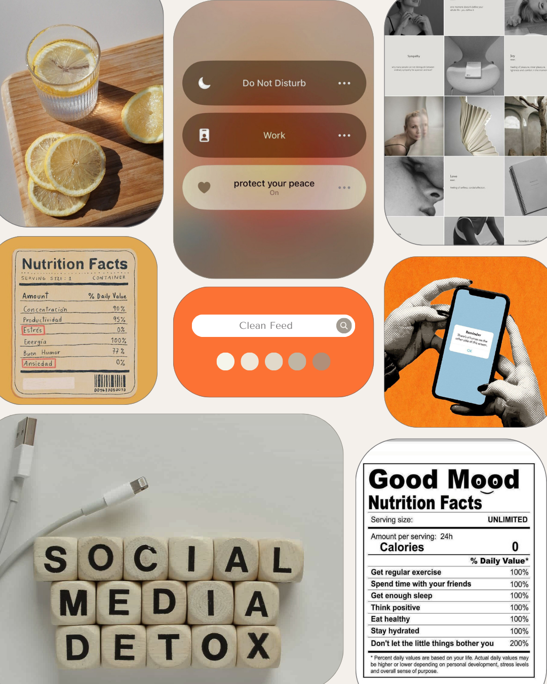
This moodboard shows the aesthetic: soft neutrals, clean wellness visuals, citrus accents, and digital UI elements. This helps establish the playful-but-calming visual identity of the Clean Feed™ concept.

Thumbnails and Wireframes
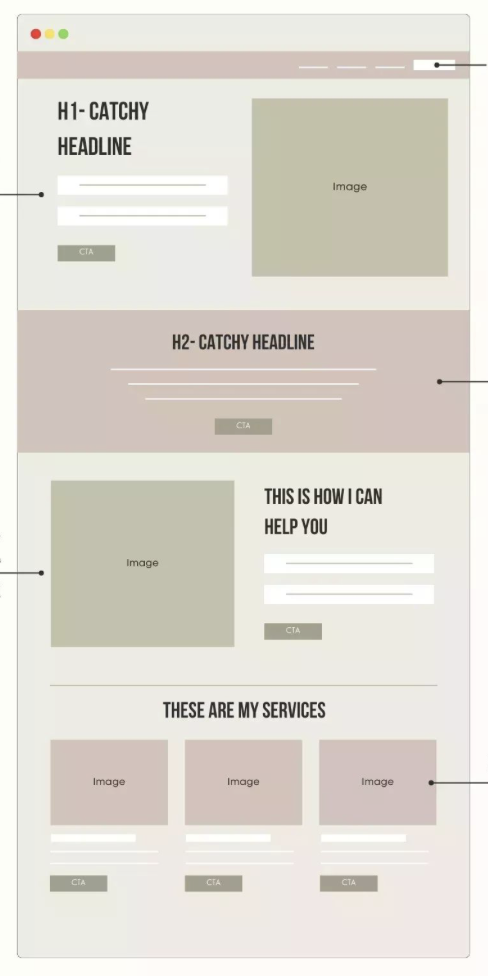
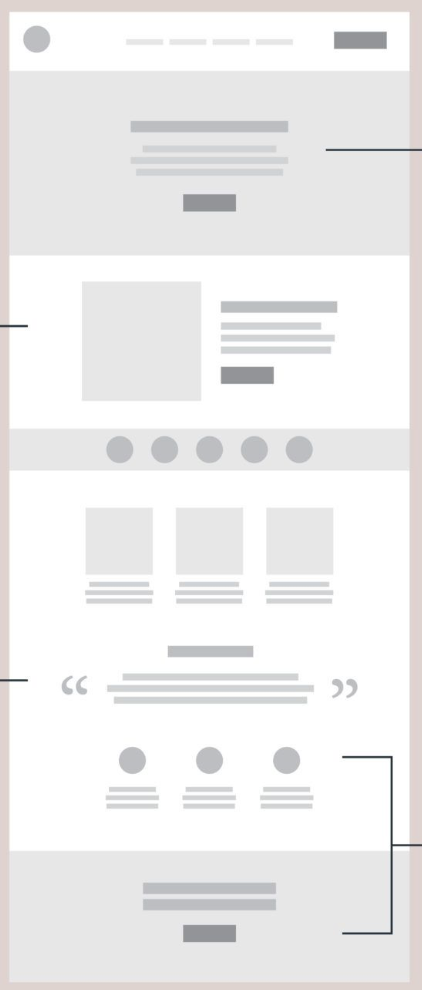
These wireframes are my layout inspirations. They help me plan how the Clean Feed™ homepage will guide users through the idea, the problem, and the “products.” They are not final—they’re references used to shape structure, hierarchy, and flow.


Overall...
This website will not sell a real physical product; instead it will sell an idea, and lifestyle grounded on awareness through design. The “Clean Feed™” is a metaphor that makes digital consumption visible and measurable (almost physical.) By turning content into calories, feeds into diets, and algorithms into ingredients, this site mirrors the language of this generation's obsession with wellness culture - but instead of focusing on the body, it centers the mind, showing how it’s actively shaped and overstimulated by the digital environment. The tone is light, playful, and satirical, but the message is clear: We’re consuming too much digital junk - and it’s time to detox.