Questions, Comments, Observations
- How can I balance clarity and personality so that the site feels curated but not sparse?
- What’s the minimal navigation that keeps students oriented (Home, Trips, Tips, About)?
- Color system: do earthy neutrals + one bold accent color keep accessibility contrast high?
- Can I progressively enhance the layout so it works on mobile-first, then scales to desktop?
Problem Definition
Most travel websites are either overwhelming with too much generic information or focused on luxury experiences that feel unattainable for young travelers—especially international students. Students need clear, affordable, relatable guidance that fits their time and budget constraints.
Idea
Build a curated travel guide for young international students: budget-friendly trips, cultural experiences, and personal stories that make travel feel accessible and exciting (even with limited time and money).
Why This Works
- Reduces information overload with curated, student-centric content.
- Balances budget and memorable experiences.
- Focuses on an often-overlooked perspective: international students studying abroad.
- Creates value through personal insight and relatable voice.
Discovery & Research
I reviewed budget/student travel sites and blogs (e.g., Nomadic Matt, StudentUniverse, GoAbroad). Patterns: either too broad, too commercial, or overwhelming. There’s a gap for concise, personal, student-specific curation.
Audience
International students (18–25) living abroad: tight budgets, limited time, and uncertainty around planning meaningful short trips. They want simple, clear, affordable ideas with practical tips that fit student life (group travel, student discounts, budget airlines).
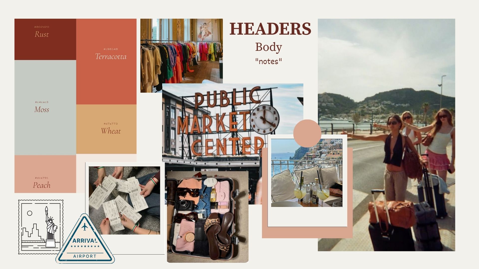
Inspiration & Mood Board
Thumbnails / Sketches
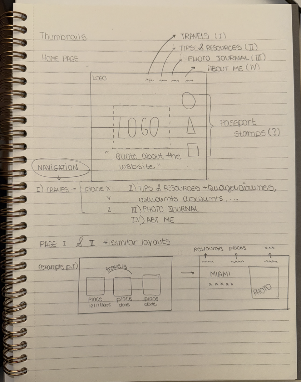
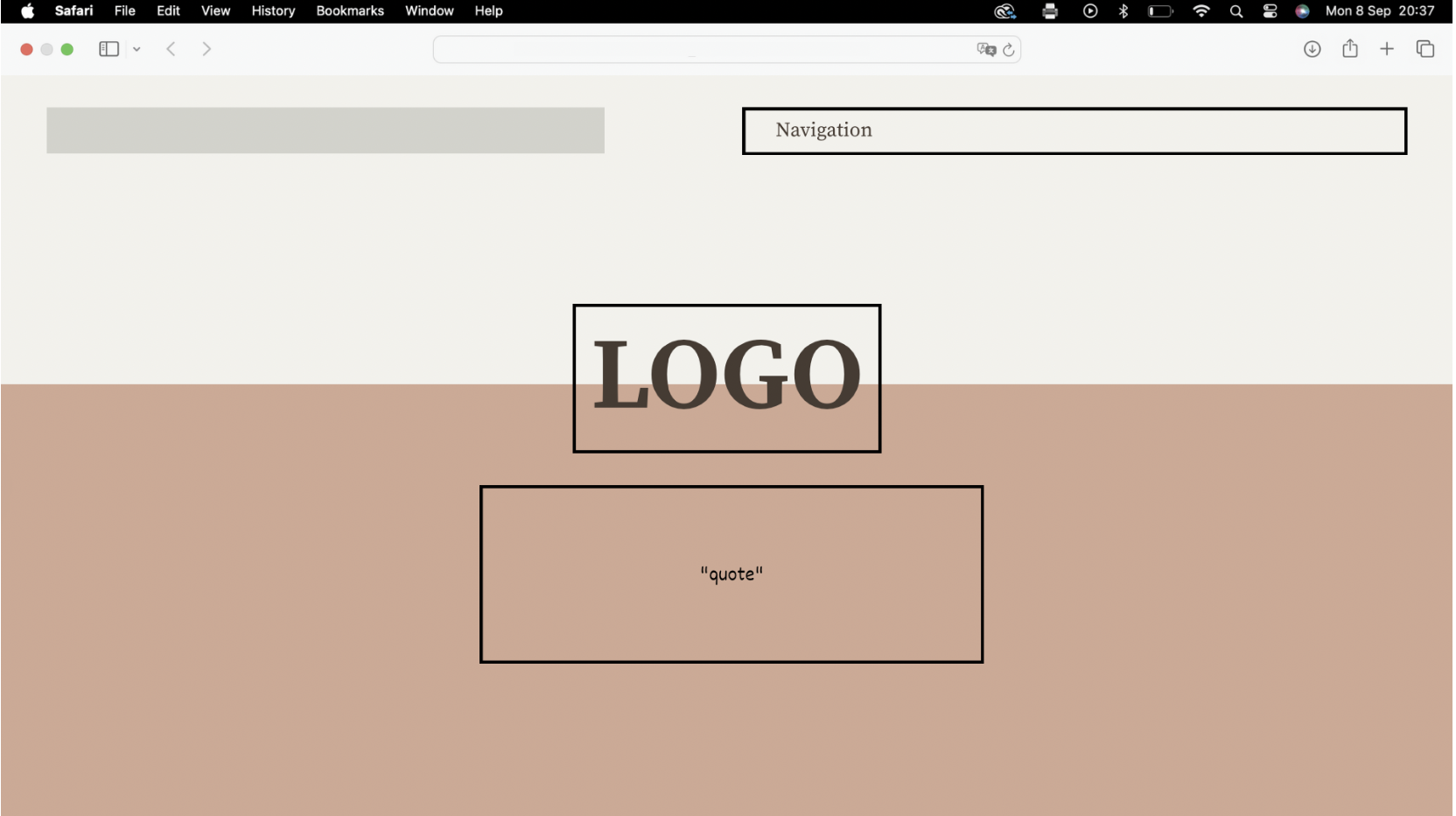
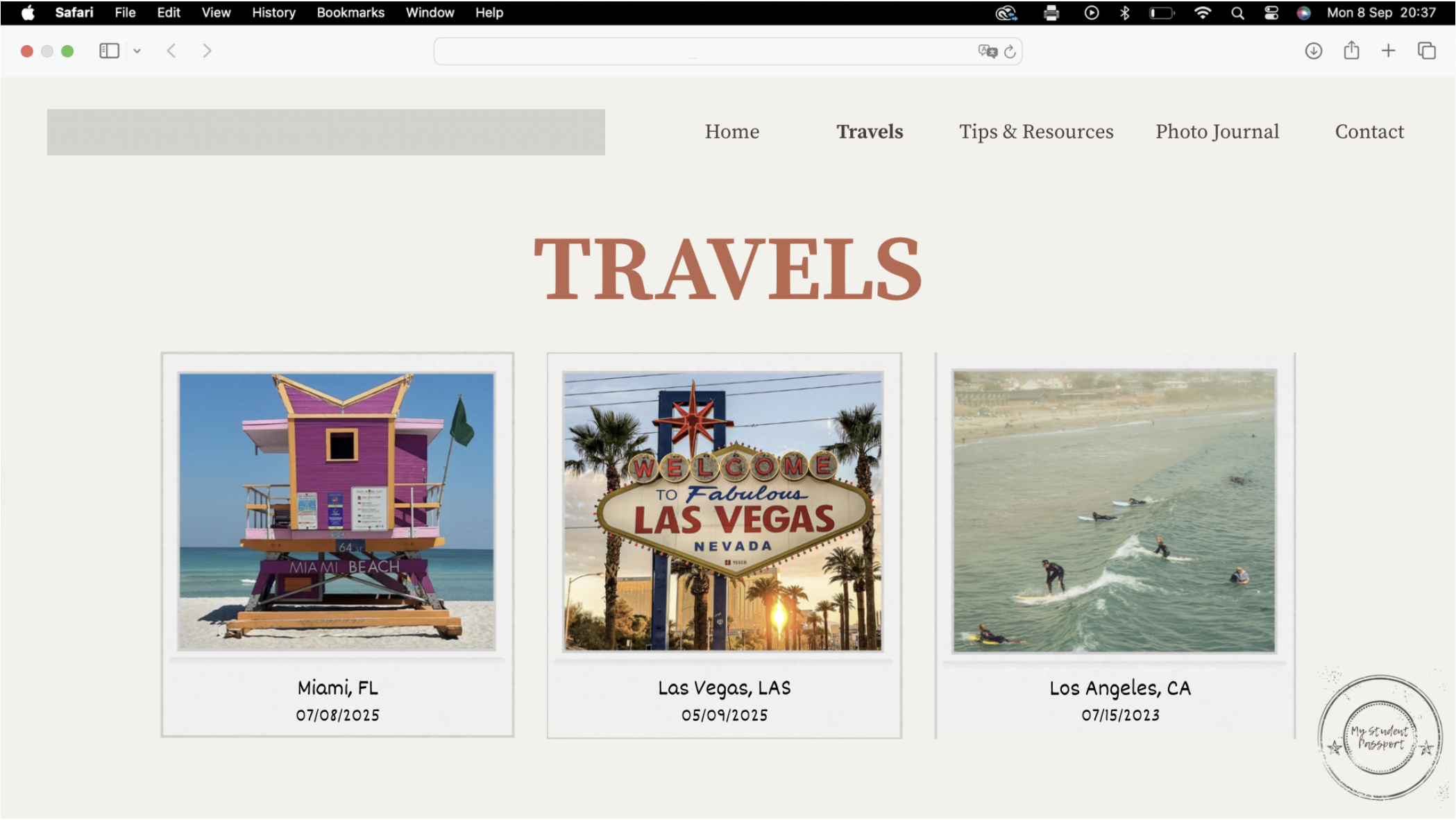
Wireframe
The home page prioritizes quick scanning: hero intro, featured trips, tips modules, and a short “about” block. Navigation remains minimal to reduce choice overload.
Problems & Solutions
- Info overload: limit home to 6 featured cards, with filters for “Weekend,” “Under $200,” “Cultural.”
- Performance (images): export JPGs/WebPs at display size; lazy-load below-the-fold images.
- Wayfinding: persistent breadcrumb on inner pages; clear “back to trips” link.
- Accessibility: maintain color contrast; semantic headings; alt text on all images.
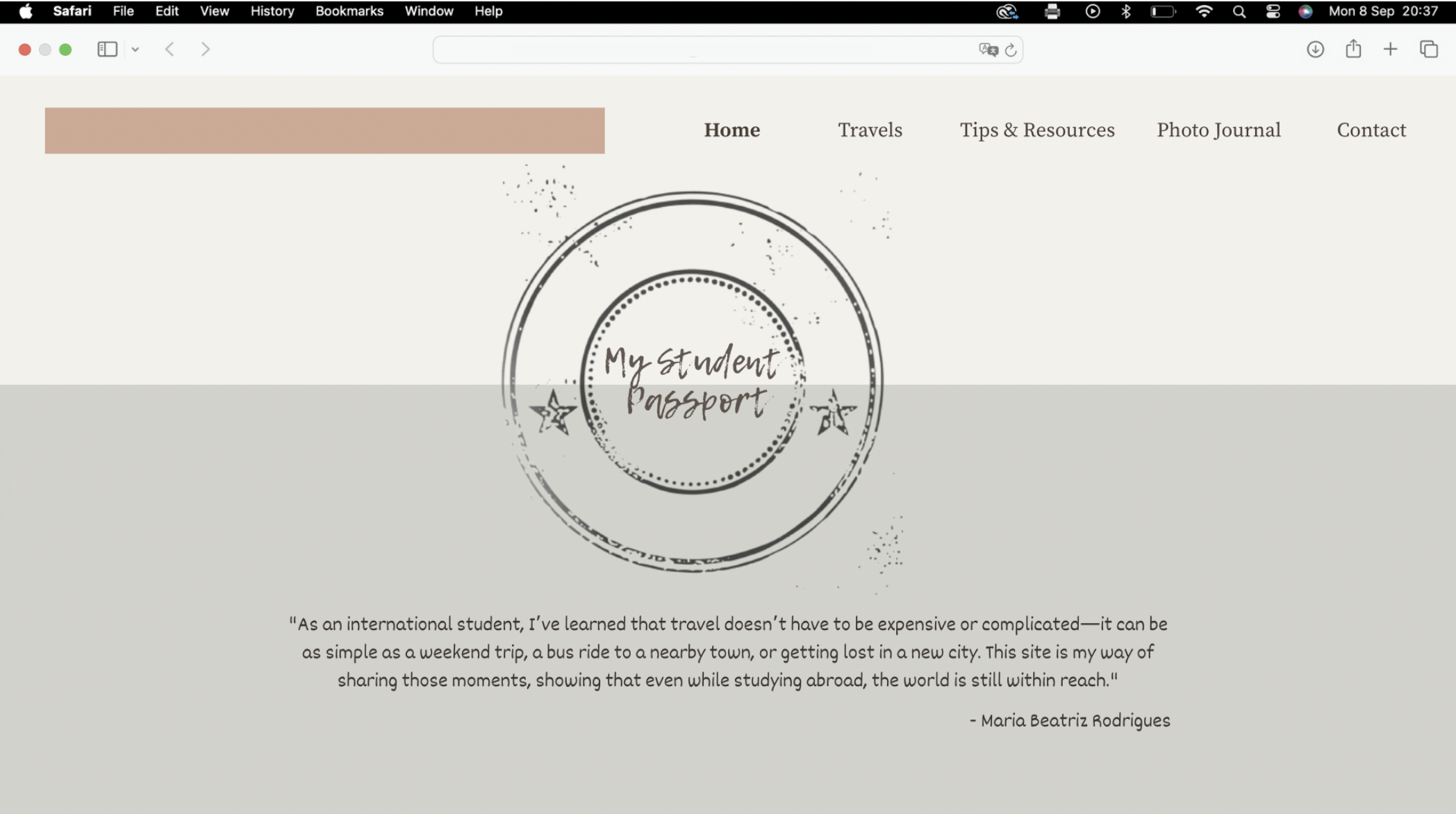
Photoshop Comp / Visual Direction
Applying the mood board system: neutral background, ample white space, large card imagery, and an accent color for active states and CTAs. Typography keeps scannability first.
Next Steps
- Translate the selected wireframe into responsive HTML/CSS.
- Optimize and replace placeholder images with final exports.
- Build out the stylesheet to finalize design choices (spacing, colors, type hierarchy) and make sure they align with my mood board.
- Test with 2–3 international students; iterate on navigation labels and card copy.