Miguel Romero's Portfolio
1) IDEA
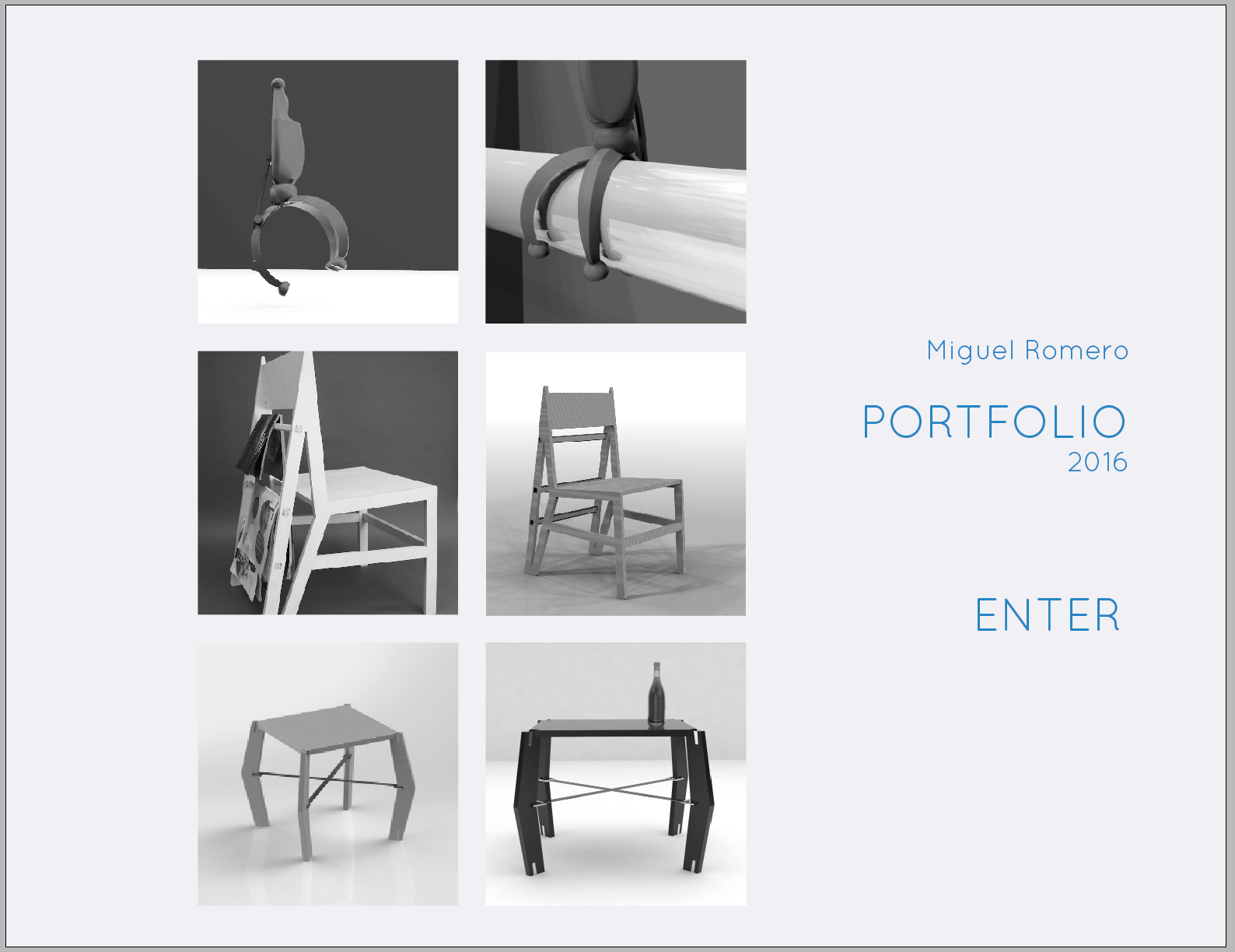
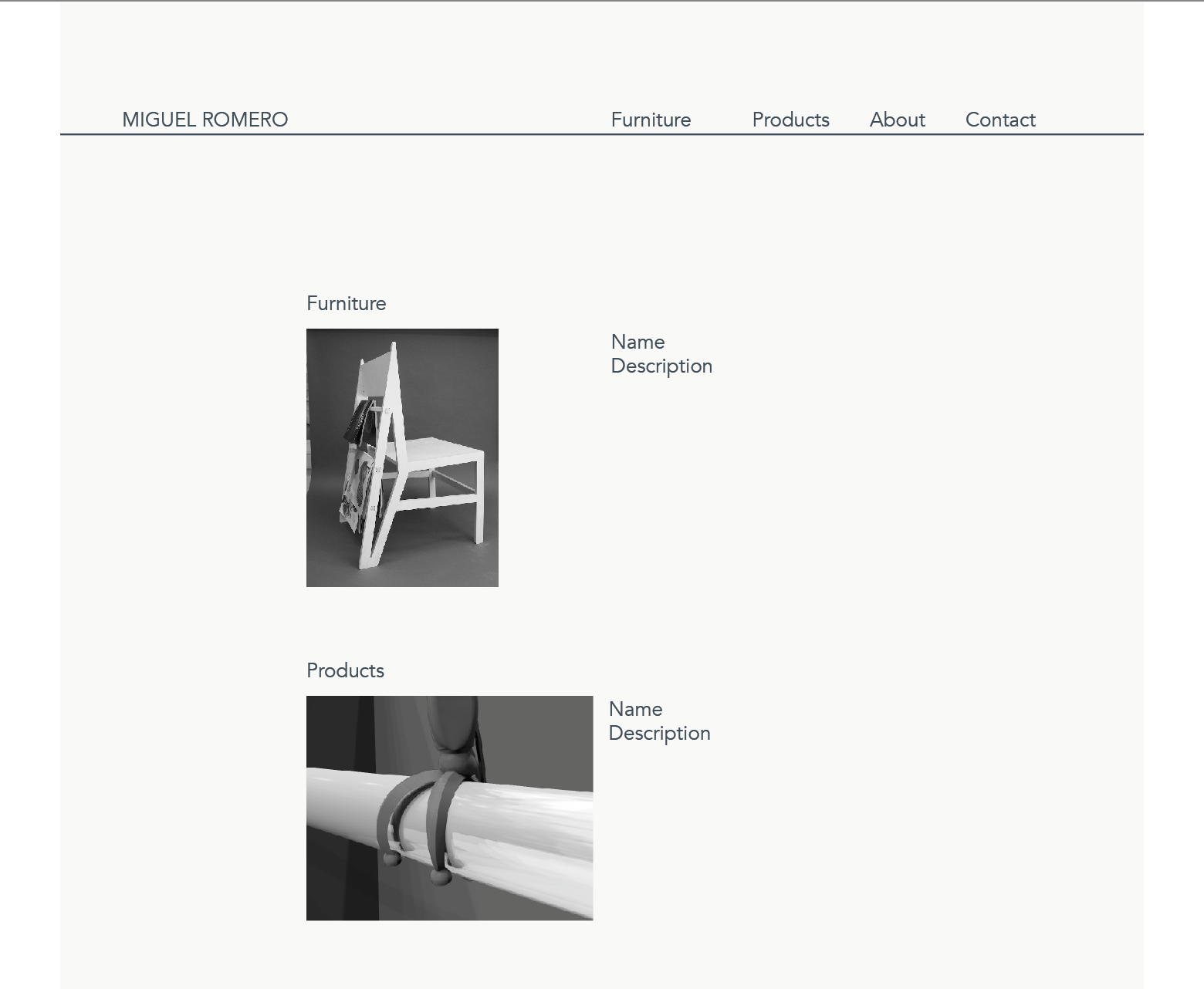
This portfolio website will be minimal in ornamentation and its main focus will be to display the images of the creations of the designer and his contact info. I picture the background to be of a light color, with images of my products in a centered grid, the user will be able to click on the image of each project and be directed to the product description. At the top right of the page my name will be displayed and when clicking on the user will be directed to my contact information.
2) DISCOVERY AND RESEARCH
Karim Rashid
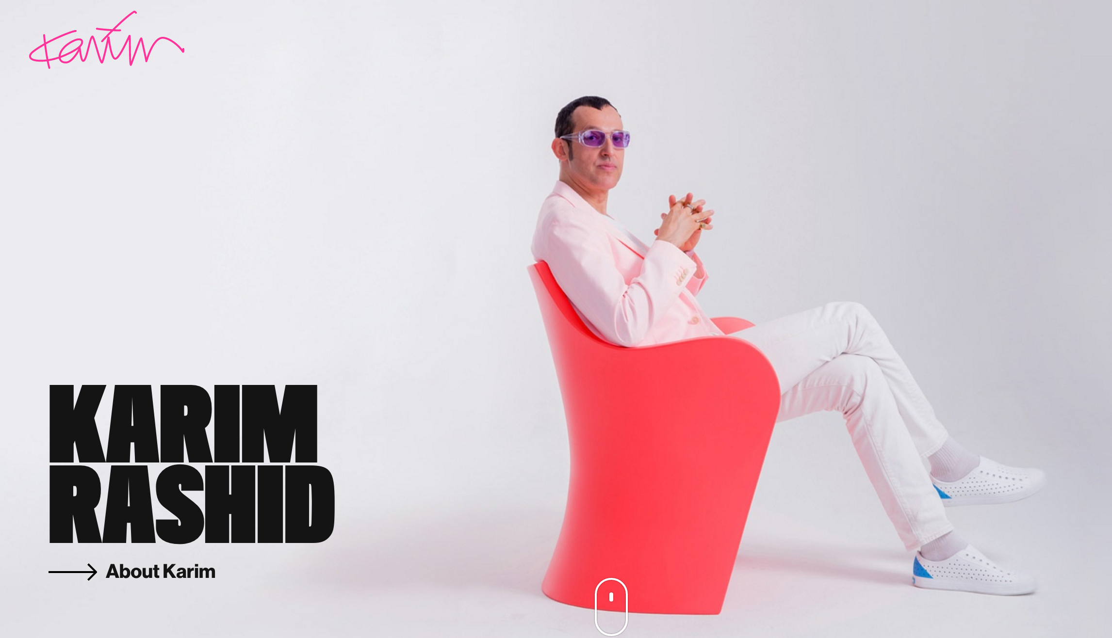
The website shows a big image of the designer and a two interactive buttons. The first button takes you to the information about the designer, showing his bio along with his awards. The second button takes you to the rest of the website, were his products can be found along with descriptions. This website seems more focused on showing the information about the designer rather than his creations. Even though the website is full with color and images, going through it is an easy and light experience.
Marcel Wanders
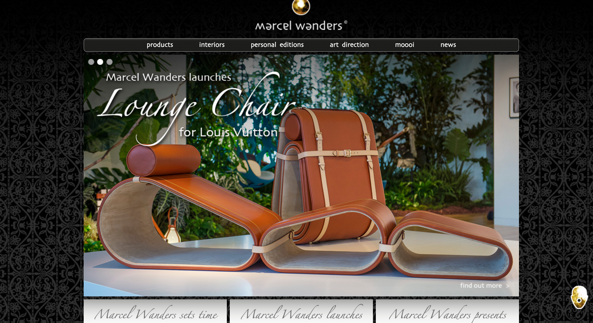
The website is dark colored and uses a very organic old style typeface. It is hard to go through it, you can find many of the creations of the designer without any specific order on them. When clicking a little icon in the bottom right corner, the info of the designer can be found, that was a nice element in this heavily decorated website.
Colony Designers
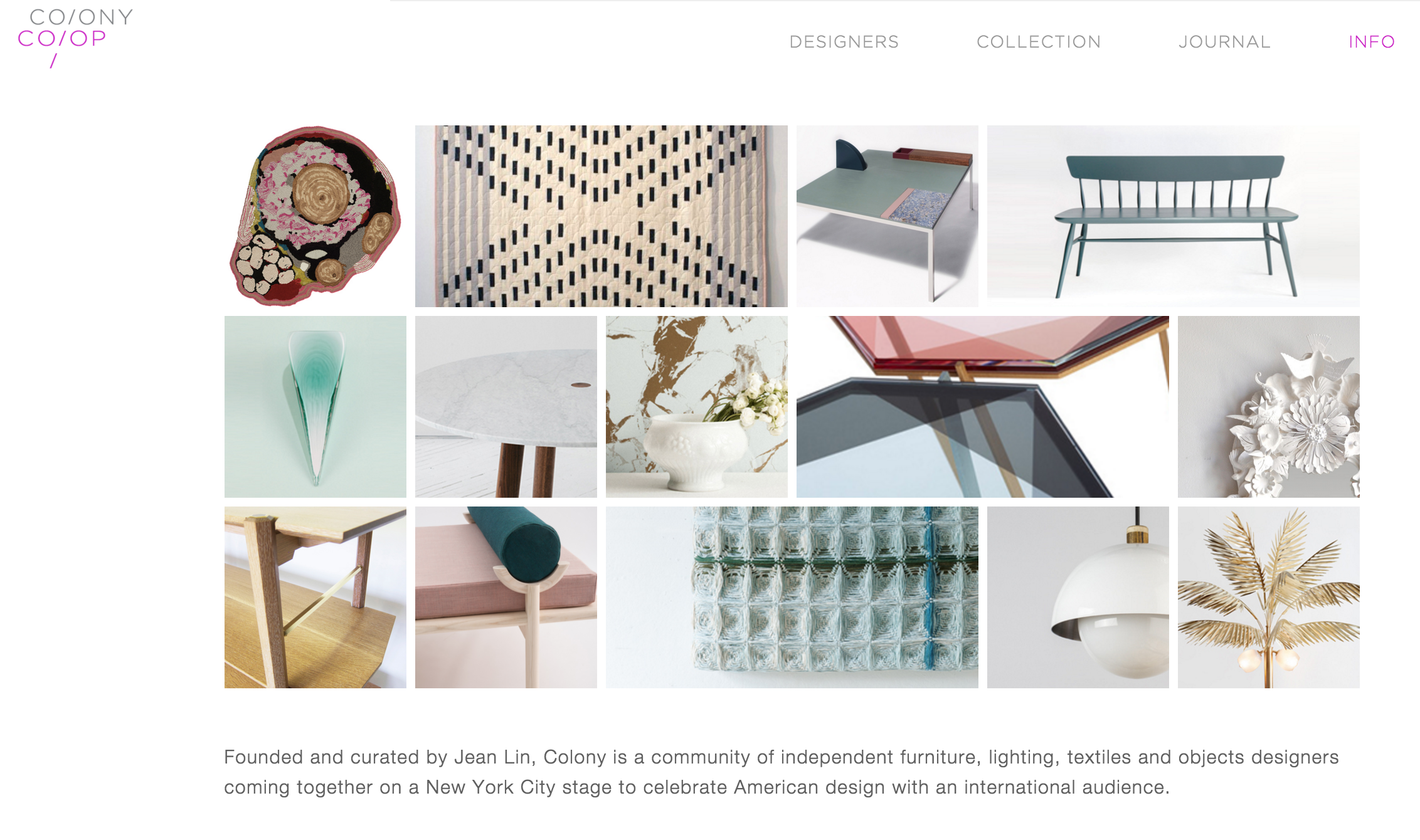
This website is effective on displaying the work of the designers along with simple interactive buttons to find out more about them. This is a layout that is close to the one I intend to use on my own website.
3) AUDIENCE
This portfolio website will be minimal in ornamentation and its main focus will be to display the images of the creations of the designer and his contact info. I picture the background to be of a light color, with images of my products in a centered grid, the user will be able to click on the image of each project and be directed to the product description. At the top right of the page my name will be displayed and when clicking on the user will be directed to my contact information.
4) INSPIRATION
The brand shows itself as interactive, contemporary, with great emphasis on the aesthetics of each one of its products.
5)THUMBNAILS

6)WIREFRAMES

7)LOOK
How my products will be presented
