1) Develop Your Idea
I am creating a website for my brand "Greatures", which is a combination of the words "great" and "creatures". It is a series including many magical non-human creatures. The style is quirky, cute, dreamlike, and also not too delicate. On the website, I will market its related products, like figurines, environment models, T-shirts, etc.
The purpose of the website is to sell products and gain more fans of the IP. It would have products on sale as well as information about the series and its story and characters. Therefore, it is crucial to have a clear vision of its style and its characteristics.
2) Discovery and Research
I looked through a lot of websites that have interesting web design and also websites of successful IPs:
https://www.sanrio.com/
https://lisengmin.com/
http://www.motions.cat/
https://www.pokemon.com/us/
https://global.popmart.com/
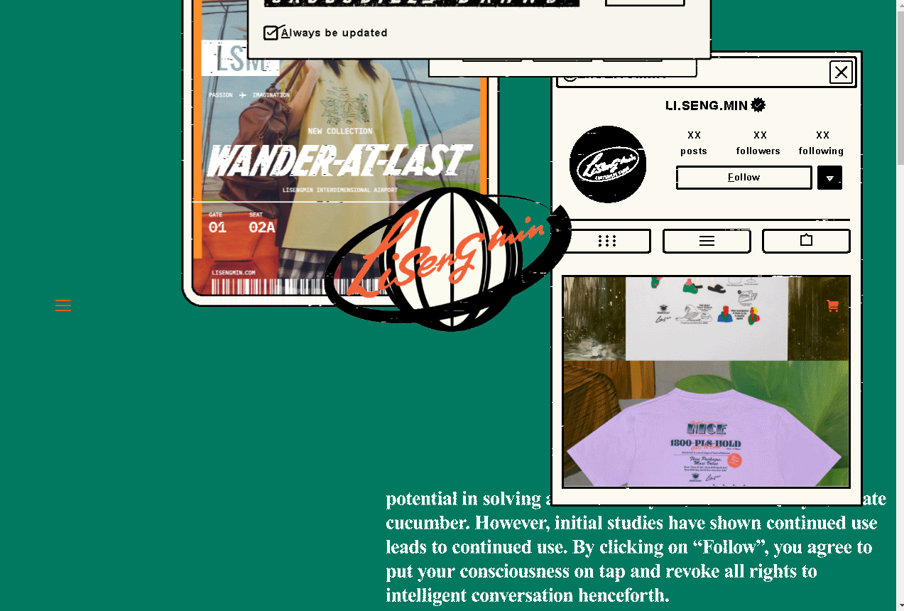
The website of Li Seng Min has a distinct visual style and color palette that is consistent with the design of the products. The stylized interactive (draggable but fake) windows that keep popping out brings out the fashionable and modern style of the brand. It also help sets a fast-paced atmosphere and a stylish tone of the brand quickly and effectively. Also, it would not be distracting for audience just aiming for a fast shopping experience, because they can just simply scroll down to avoid extra interactive elements.
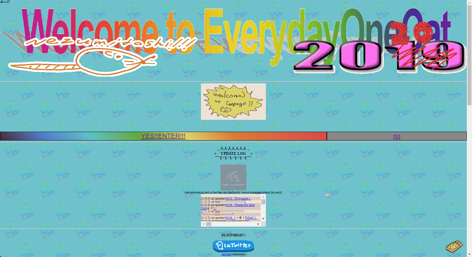
In terms of voice, I am the most impressed by the website of EverydayOneCat. It sets a funny and humorous vibe very effectively with a funky style that is conventionally considered "bad design". There is also a joke in the "YES" an "NO" navigation, and the "NO" leads to a google page searching "How to be a cat". The "buttons" also shake drastically when the mouse is hovering above it, which matches the animation boil in the works. The artist is so successful in making the humor and fun a part of their works. However, all the funny features might lead to a drawback of being unclear and inefficient, and might not work well for all possible occasions. For audience that would like to quickly know the idea, the amusing parts that add much to the style might be instead distracting and hindering.
Other helpful examples include the websites of Pokemon, Sanrio, and Pop Mart. These websites of large brands all have conventional designs. This makes it easy to navagate through them. They have clear interfaces showing news and information about the IP/its products. They have well-designed product pictures that show their style well. They are very simple and true to their functions of information and retail. The web designs themselves do not have much intriguing characteristics. This also might be due to they are already well-established and extremely successful brands that their traits are already well-known for their audience. (They don't need to prove themselves to the audience.) Therefore, they can just have a simple and clear information/shop site for simple purposes. However, these designs probably won't work for my brand because they are only functional and lack unique traits. Unlike them, I don't have an established audience and I need to show the brand's uniqueness and specialty to leave a good first impression on my audience. Still, it would be helpful to look at how these conventional and successful websites arrange information because it would help me create something that is clear and easy to navagate for the common audience.
In conclusion, I think I need to have narrative or interactive elements that match with the concept and character design of "Greatures". This means that the design would be quirky and colorful. It also have to be simple for clarity and because the design of the brand itself is not very delicate. The design must be unique to leave a good first impression on the audience. In terms of information arrangement, I can reference conventional websites to make sure my audience can find information easily.
3) Target Your Audience
The main audience I am targeting with is website are potential customers of "Greature" products. They would be mostly young adults. In addition, there might be clients that hope to collaborate with the "Greature" brand, for example, use the "Greature" characters to advertise for their products. Therefore, my website would have to fulfill the different needs of these people as well as being clear and intriguing for them.
Potential customers and followersFor people who might buy the "Greature" products or become a fan of the IP, which are the main audience of the website, it would be the best to make my website amusing and interesting for them. In order to attract them, I need to make my website special and different to leave a better impression. A possible way is to add narrative and/or interactive elements to make the website intriguing. In addition, I need to make the products on sale to look disirable enough for them. I also need to make clear where and how to shop for the products to make sure shopping experience is good for them. Since the customers would probably be mostly young adults, it is best that my design is modern enough.
Potential ClientFor potential clients that are interested in collaborating with the "Greature" brand, it is the most important to show them its unique concept and distinct design at first sight. Therefore, I need to make the design of the webpage consistent with the style of the brand, so they can get a strong impression of the brand's atmosphere and characteristics. I also need to have my contact information and social media written clearly, so they know how they can contact me to discuss about work. Some "flavor" or fun features on the website might leave a good or bad impression on the potential commisioner. On one hand, some of them might think the extra features enhance the image of me and my style and help them get to know me better, while the other might think they decreased their working efficiency.
4) Inspiration and concepts
My Mood Board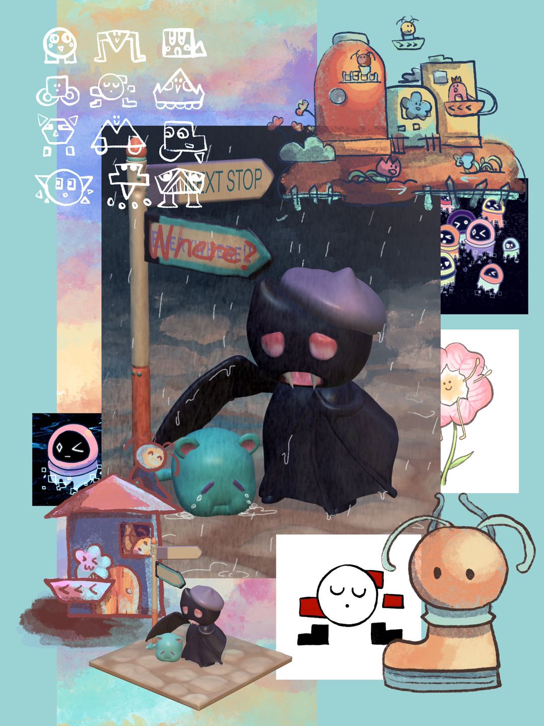
Concept 1: Simplistic & Narrative
Narrative elements can show the theme of "Greatures" well, because each design behind the characters have their own story. However, the series is not limited to a single concept/character, so it is very important to make sure it is not showing too much information at once. An idea would be having simple comic with some words on the front page, and there would be different ones that the audience can browse through. Or, there can be a story that the audience can follow through.
Concept 2: Humorous & EngagingA humorous and engaging style would add more fun to the experience of using the website. It would also compliment the cute and amusing design of this brand. An idea would be to have many interactive elements and character animations. It would make the viewer feel like they are engaging and connecting with the characters. However, technically this might be hard for me to code.
Concept 3: Funky & WildMaking the site highly animated and colorful can make it even more engaging and intriguing for the audience. It would also make people feel like this is unique and brand new. Some reference and examples of this would be EverydayOneCat and Electric Zine Maker. This would also match the very vivid style and bright colors of "Greatures". However, it can hinder clarity, cause confusion and distraction, or make it look less professional.
5) Thumbnails and Sketches
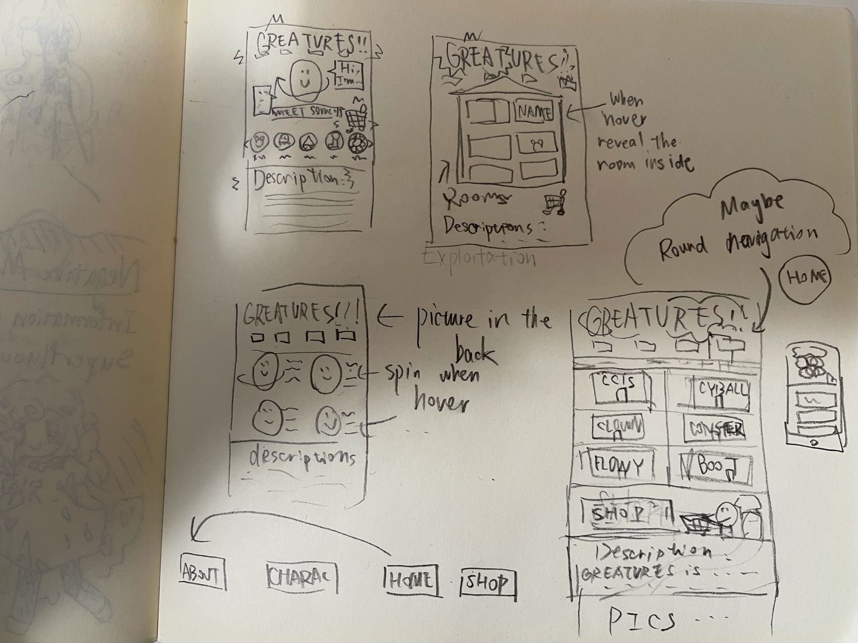
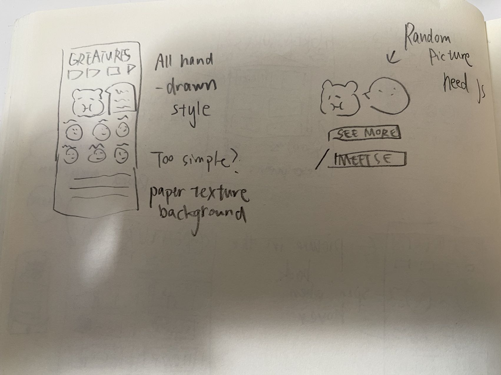
6) Wireframes and Prototypes
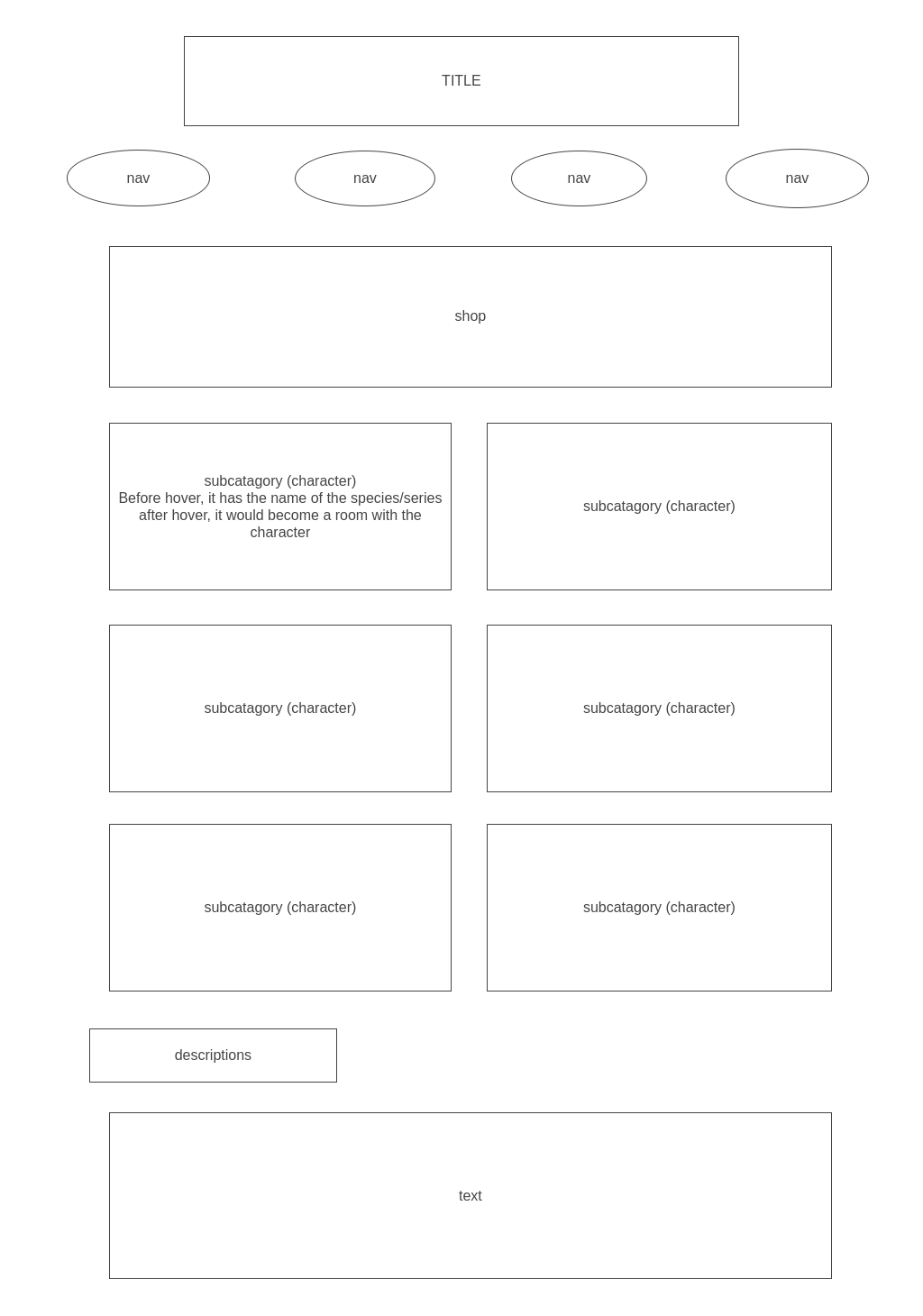
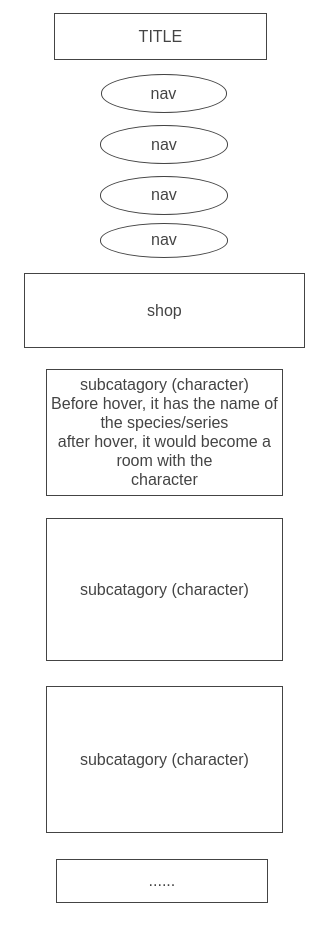
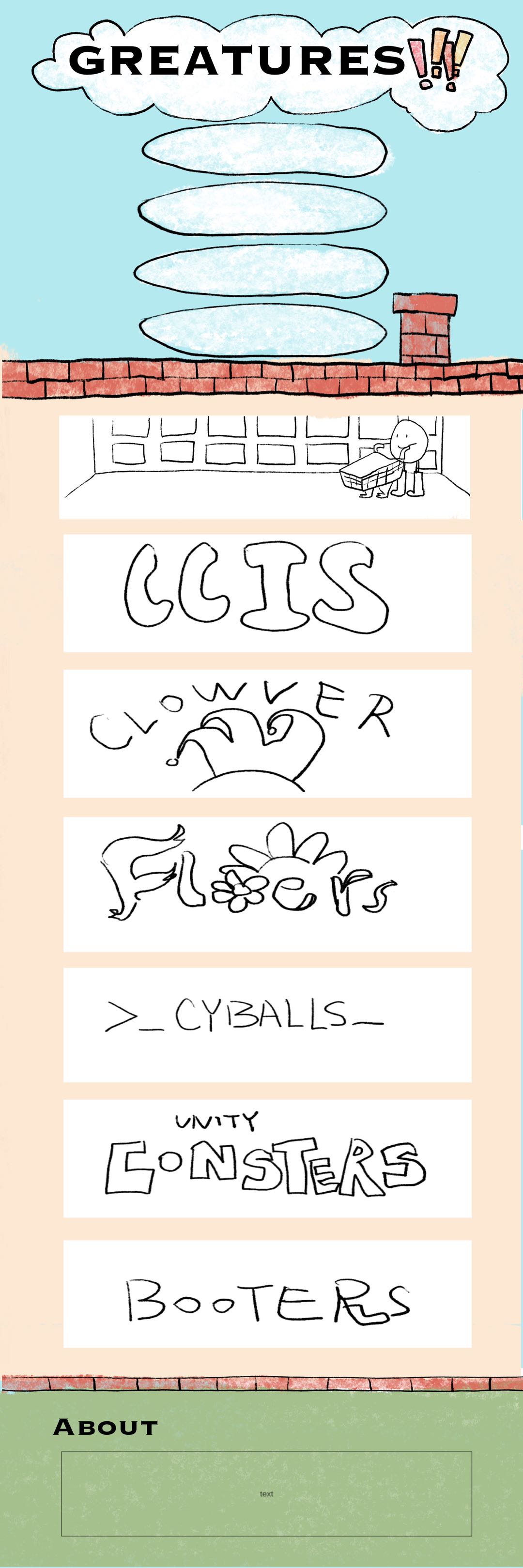
7) PhotoShop Comp
Comp for Desktop and Tablet: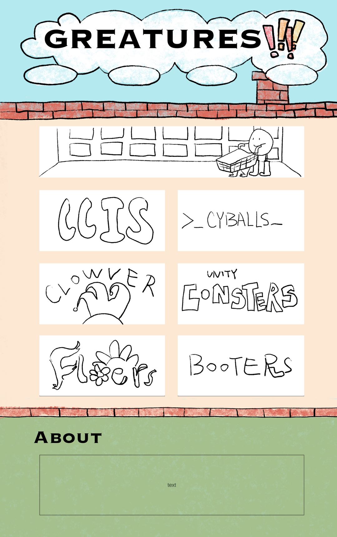
Comp for phone:
 Back
Back