Midterm Worksheet (8 Steps)
1 - Develop Your Idea
The problem that I want to solve through my portfolio website is to have a platform that can represent my professional capabilities to a potential employer, or client. I intend for my portfolio website to act as a product itself, embodying an enjoyable and purposeful user experience. I want to communicate my personal brand through an organized gallery of my projects and/or case studies for UX/UI Design. My goal is to make my site visually aesthetic through a clean layout with pleasant a pleasant color scheme, photos, and typography, that can help establish trust between my clients in my design abilities.
2 - Discovery and Research
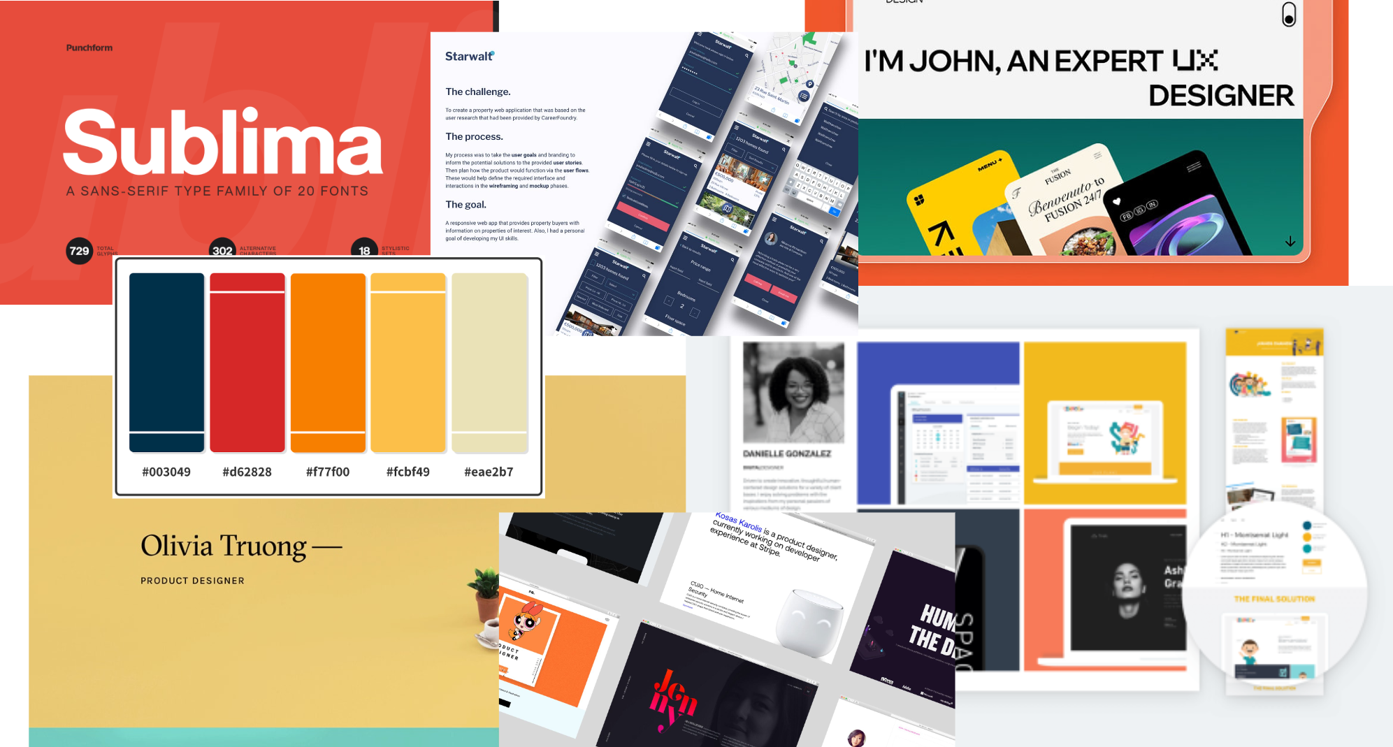
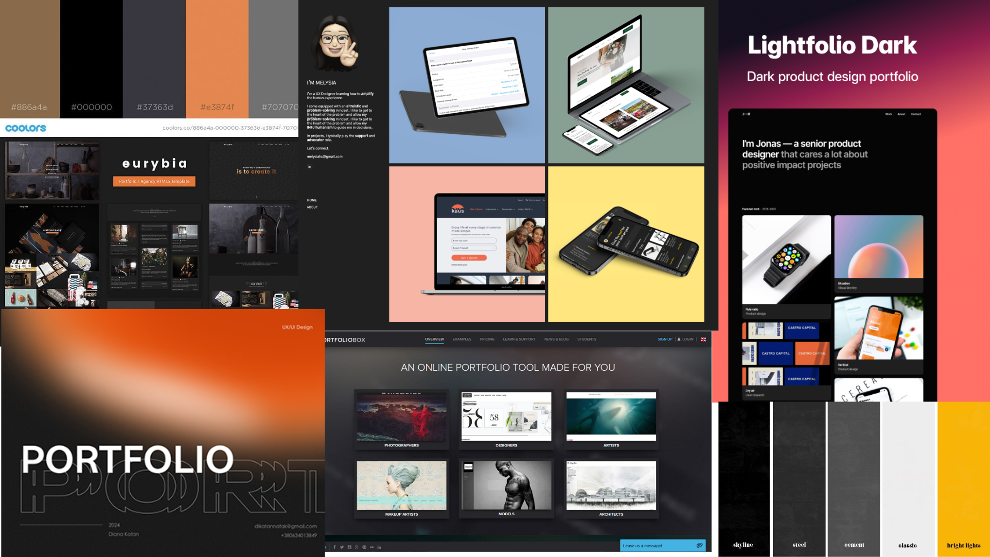
As I have stated previously, I desire to be a UX Designer - whether that is at a design agency, large corporation, or as a freelancer, I have conducted research on what makes a good portfolio for this position. With this is mind, I came across the website cofolios which is a site that has the portfolios of UX Design interns at major tech corporations. While browsing, I was able to interact with an observe professionally approved portfolios, and now I aim to be able to create one someday to that caliber. However, among the website, two in particular stuck out to me and are what I would like to model my own portfolio after.
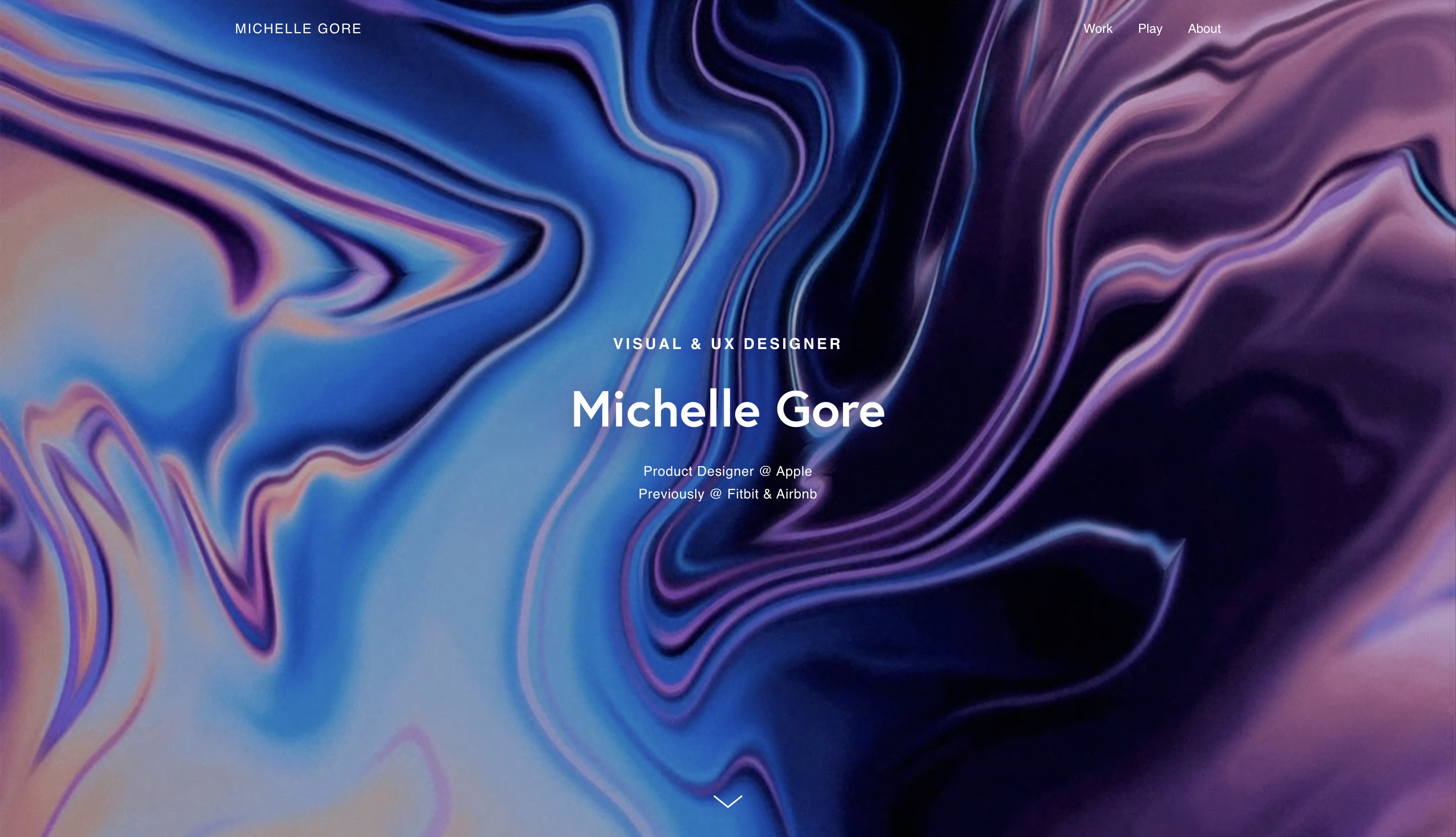
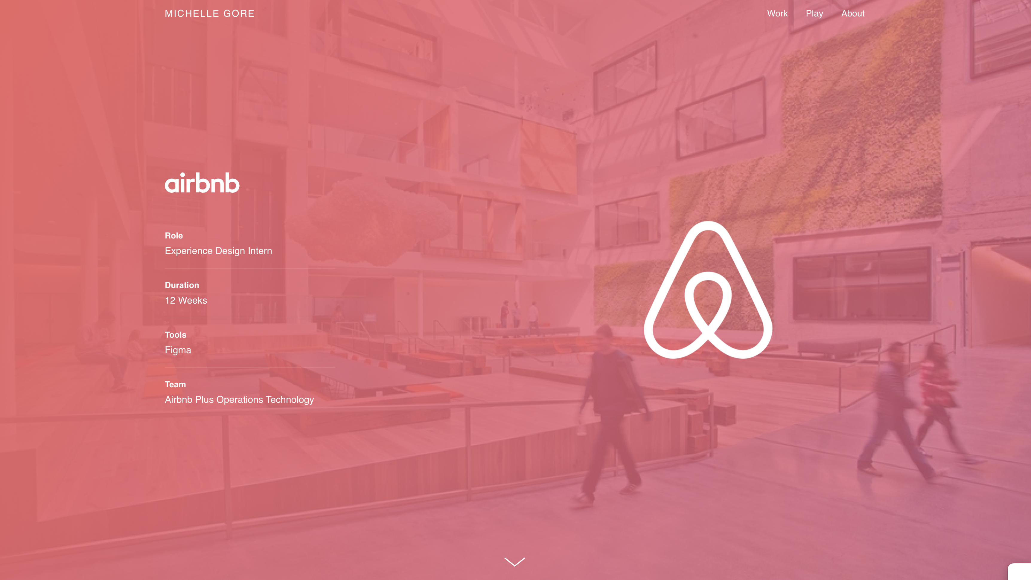
Michelle Gore - Product Designer @ Apple
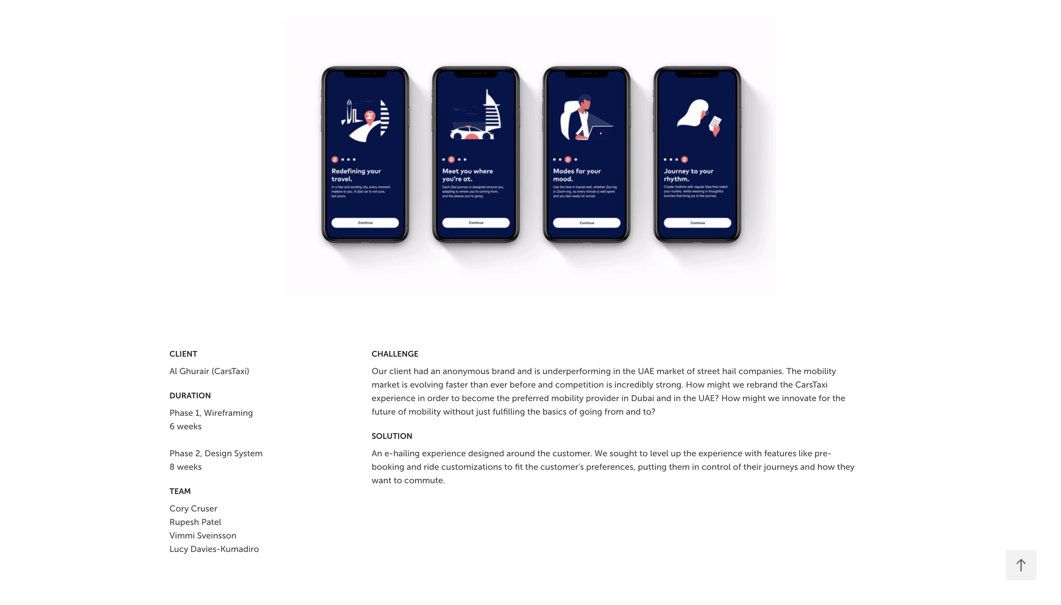
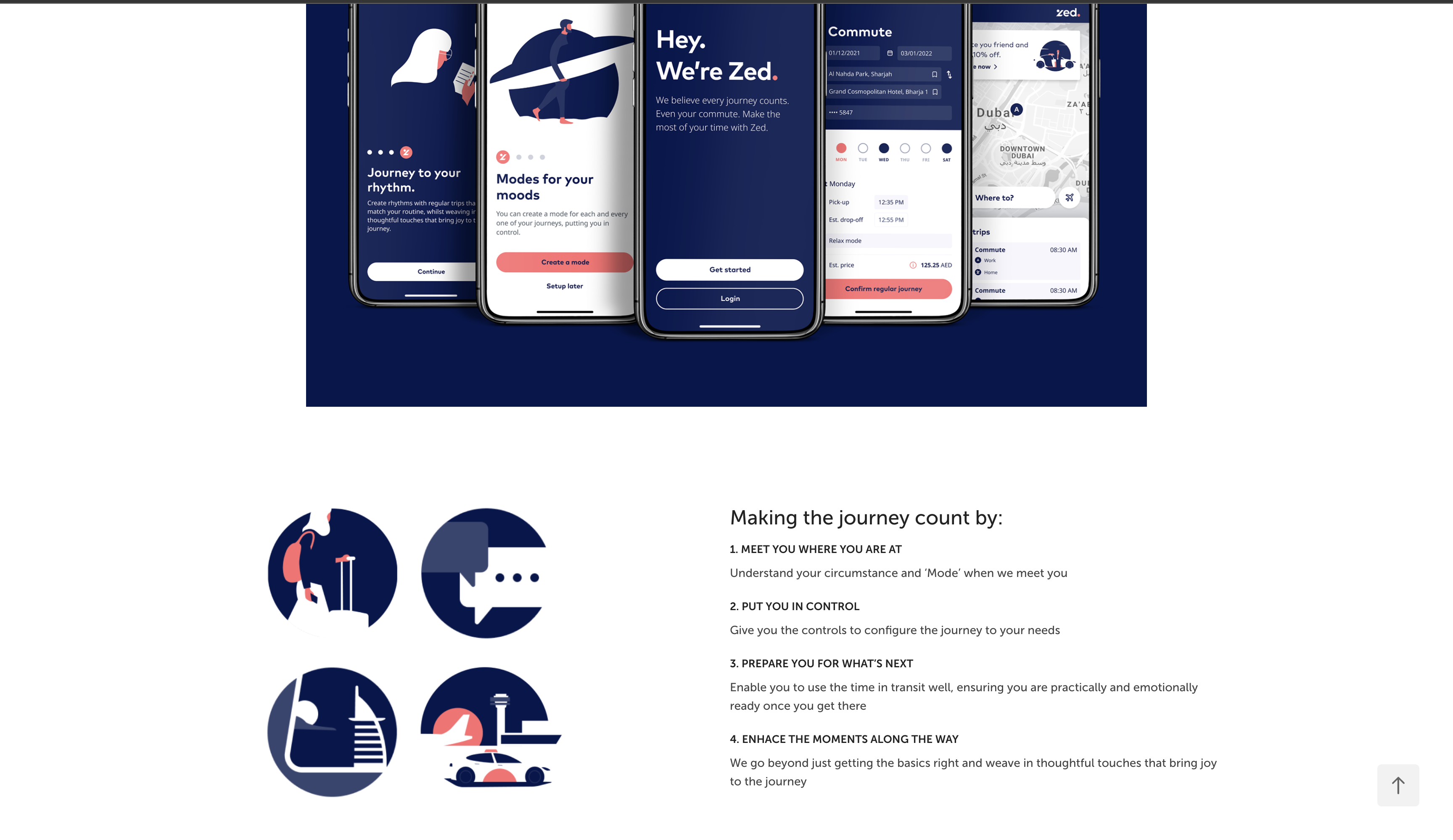
This portfolio is the one I used for the first assignment inspiration. I consider this portfolio more advanced and unique in terms of its immersiveness and dynamicism in comparison to the latter portfolio. My goal is to one day be able to code a website like this one, that possesses such a pleasing visual aesthetic and embodies the Apple user experience. In particular, I love the landing page because of how it sucks you right in with a clean and visually immersive graphic. However, the navigation of her work/project page is also very smooth, but with a hint of sophistication that sets it apart. It is not like the typical grid design that you see in a lot of UX portfolios. This is the portfolio of a more experienced designer, and potentially more of a risk that is reserved for if you have more professional experience, or want to stand out.
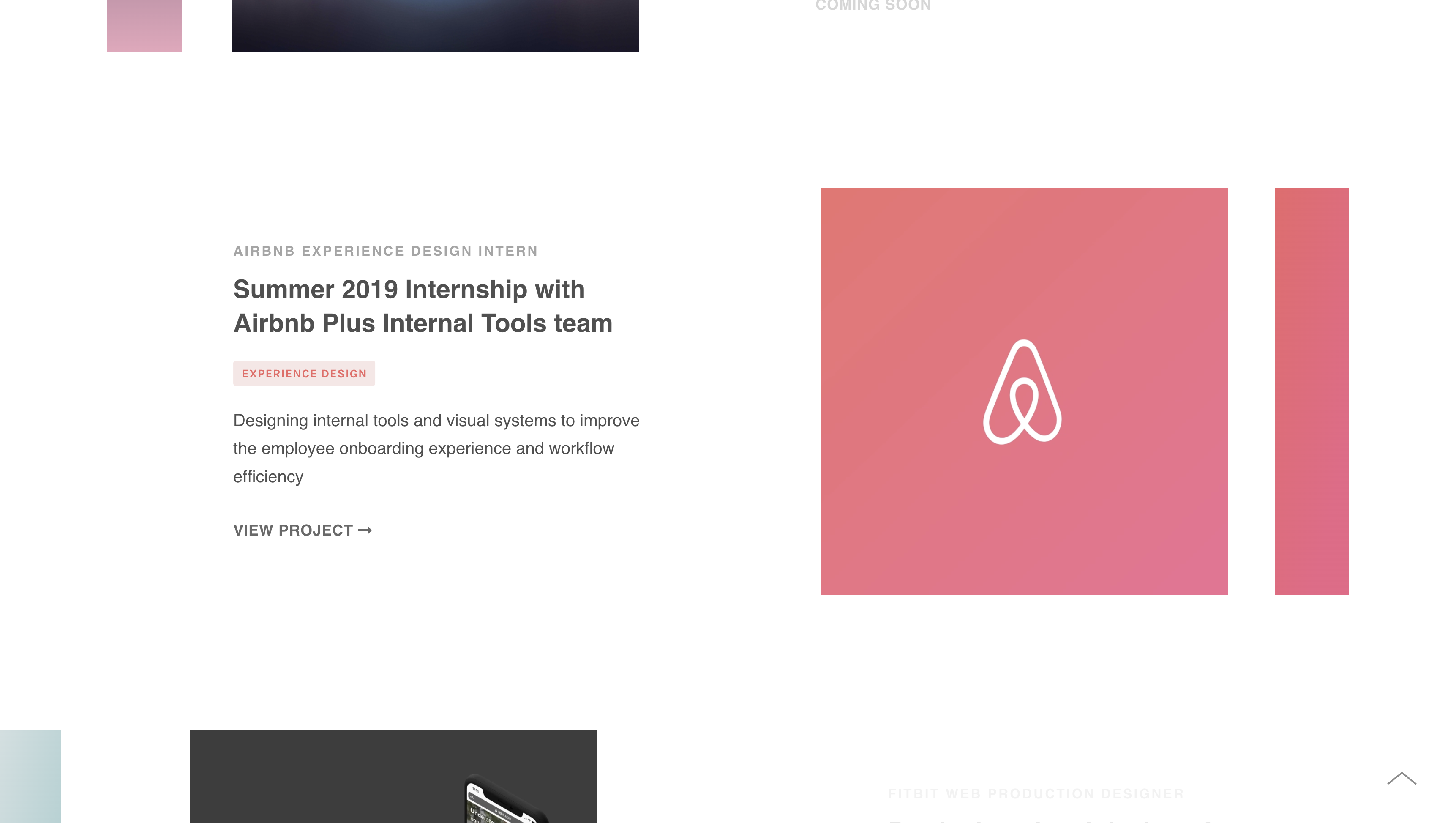
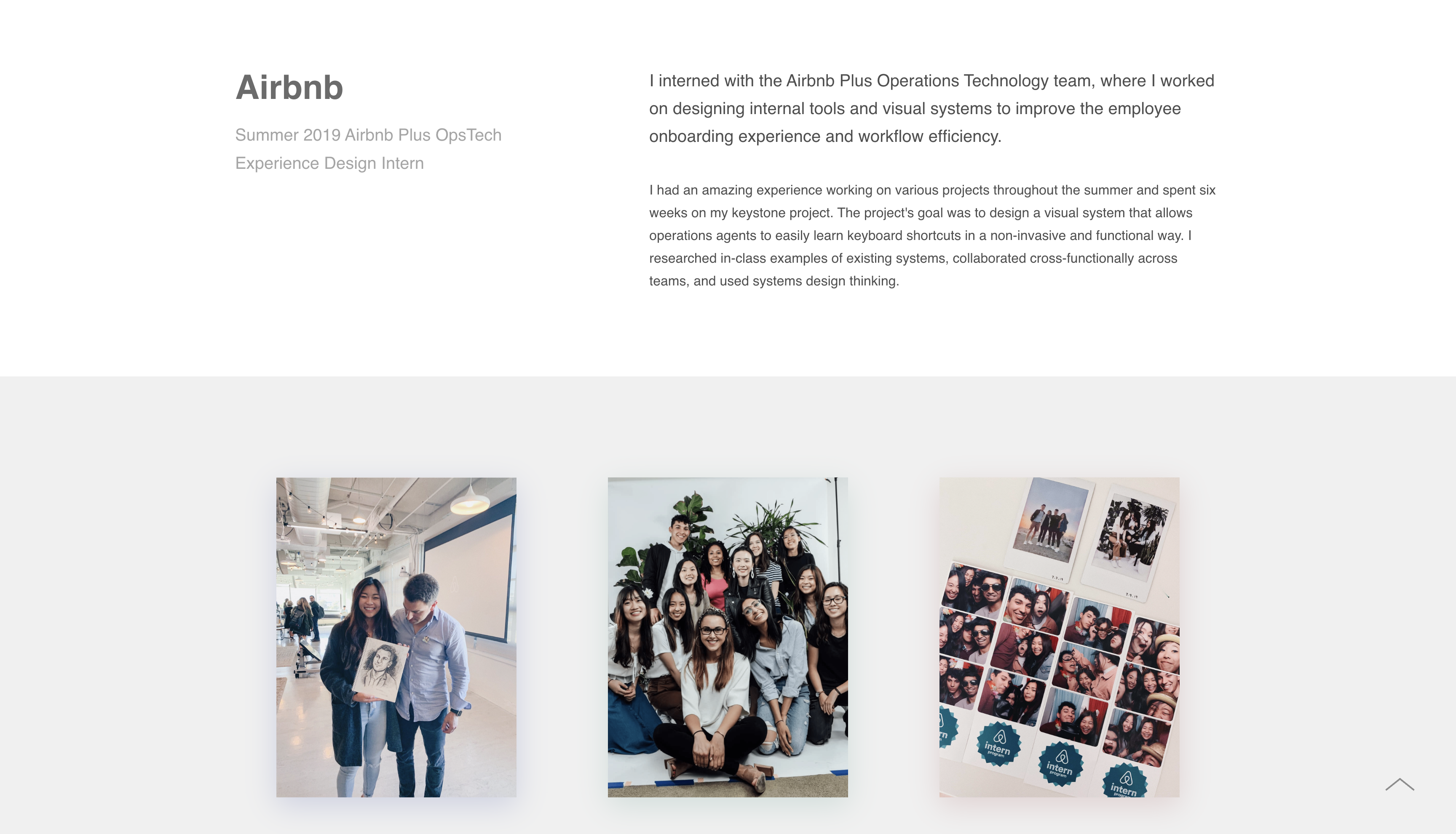
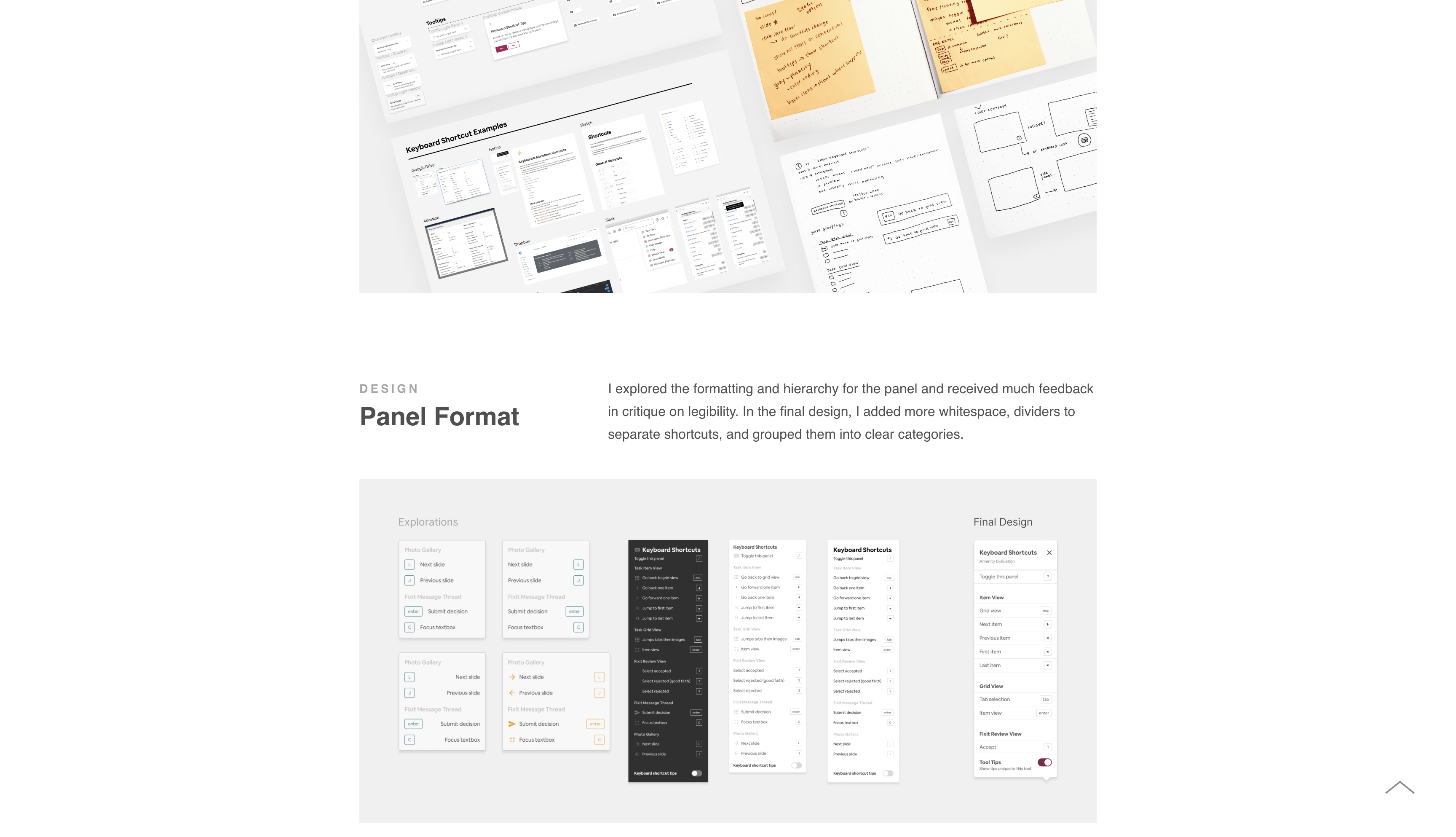
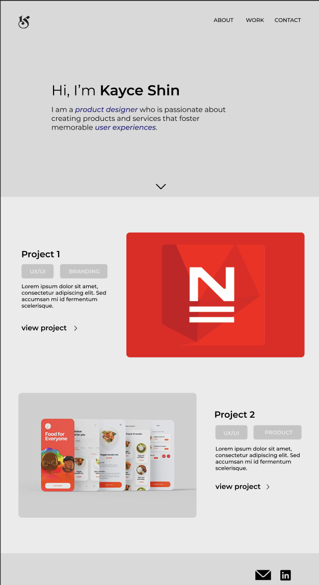
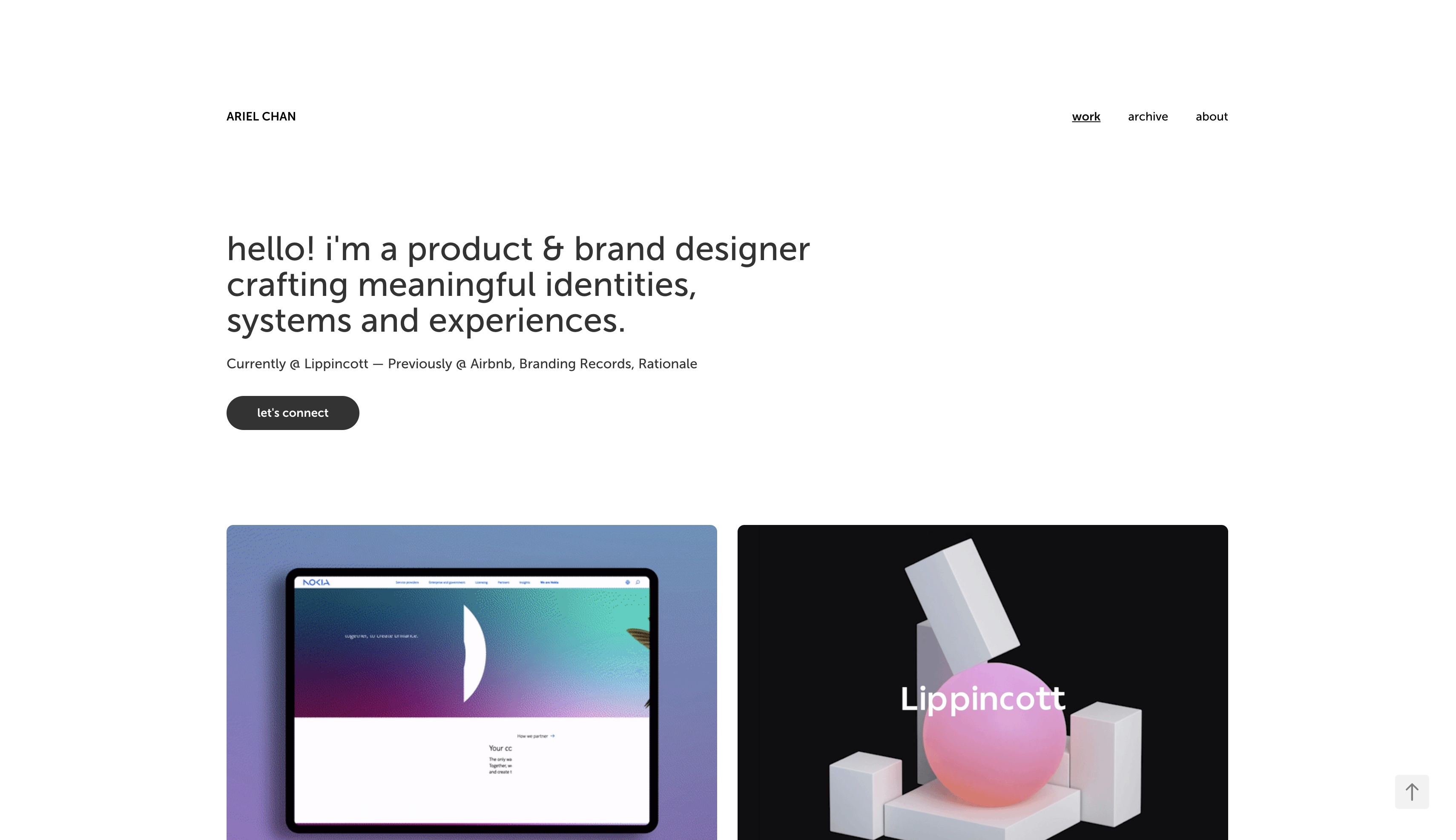
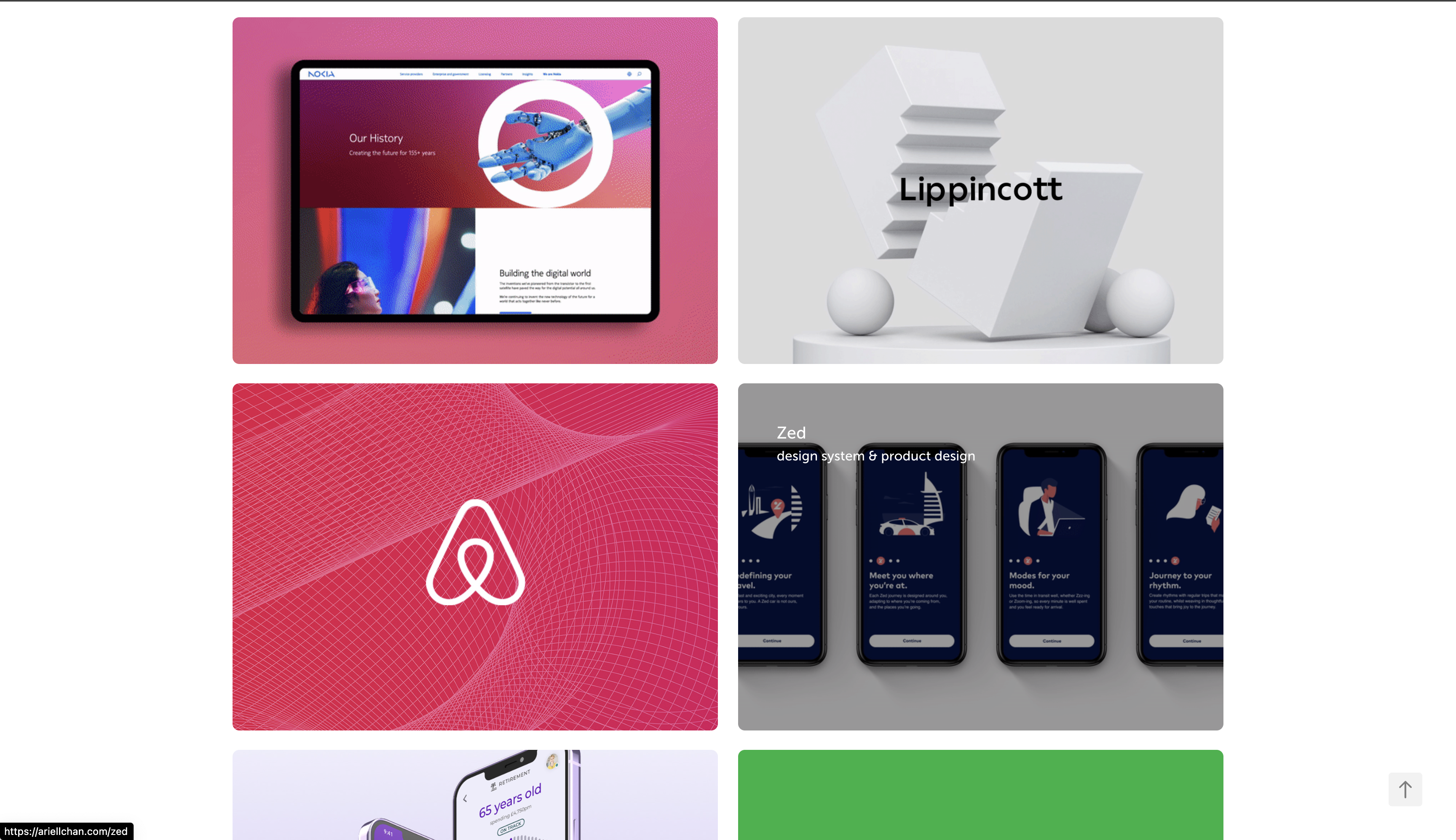
Ariel Chan - Product Designer @ Lippincott
This portfolio differs slightly because it does have the more standard grid layout of UX portfolios. In my research, I discovered that in many cases, recruiters like this layout because it is easiest to navigate through the case studies. Designers are supposed to put their two favorite or best projects at the top, and it is quick to evaluate. So ideally, this would be a good layout if I were looking for an internship and wanted to keep a safe, reliable layout for potential employers reviewing tons of portfolios. What I like about this portfolio in particular is her clean and minimalistic layout, but her choice of images/gifs makes it clear that she is skilled in visual design. I like how it is simple, yet still sophisticated, and her case studies are thorough and organized, while not boring. She plays with typography but does not make it not match the overall aesthetic. I think that modelling my own portfolio after this one is a better idea, as I am a less experienced coder and product designer. And considering that my target audience is recruiters who are probably reviewing tons of other ones, this format allows me to fit the quick and easy experience they are looking for.
3 - Target Your Audience
My target audience are recruiters who are hiring for a UX Design or Product Design Intern. Considering they will likely be reviewing a lot of portfolios, I want mine to be professional and visually appealing enough, however, more importantly, I want all the important things that they are reviewing to be quickly accessible for if they only skim my website. So the tone of my portfolio should cut straight to the point, but still consider user interface.
4 - Inspiration and Concepts
- Color Palette - Concept 1 inspired by Ariel Chan - white background with brighter accent colors. Still clean and sophisticated aesthetic Concept 2 inspired by Michelle Gore - darker aesthetic and more immersive
- Typography - clean, modern typeface that is legible and timeless
- Layout - grid layout or swiping layout for work gallery
- Content - images of mockups/prototypes and thorough case studies
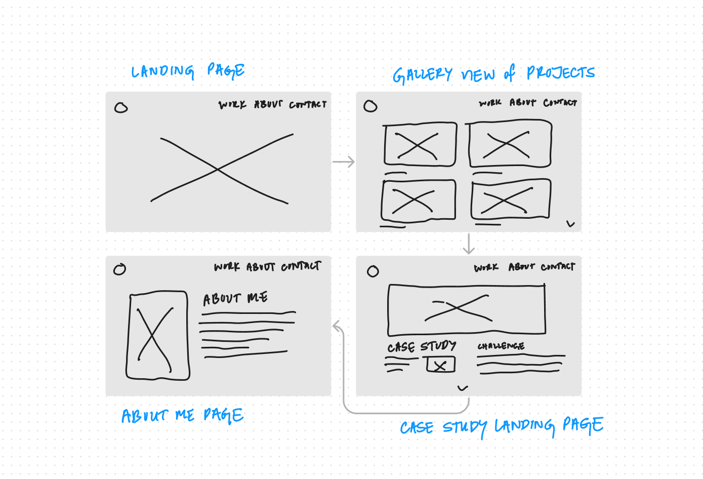
5 - Thumbnails and Sketches
6 - Wireframes and Prototypes
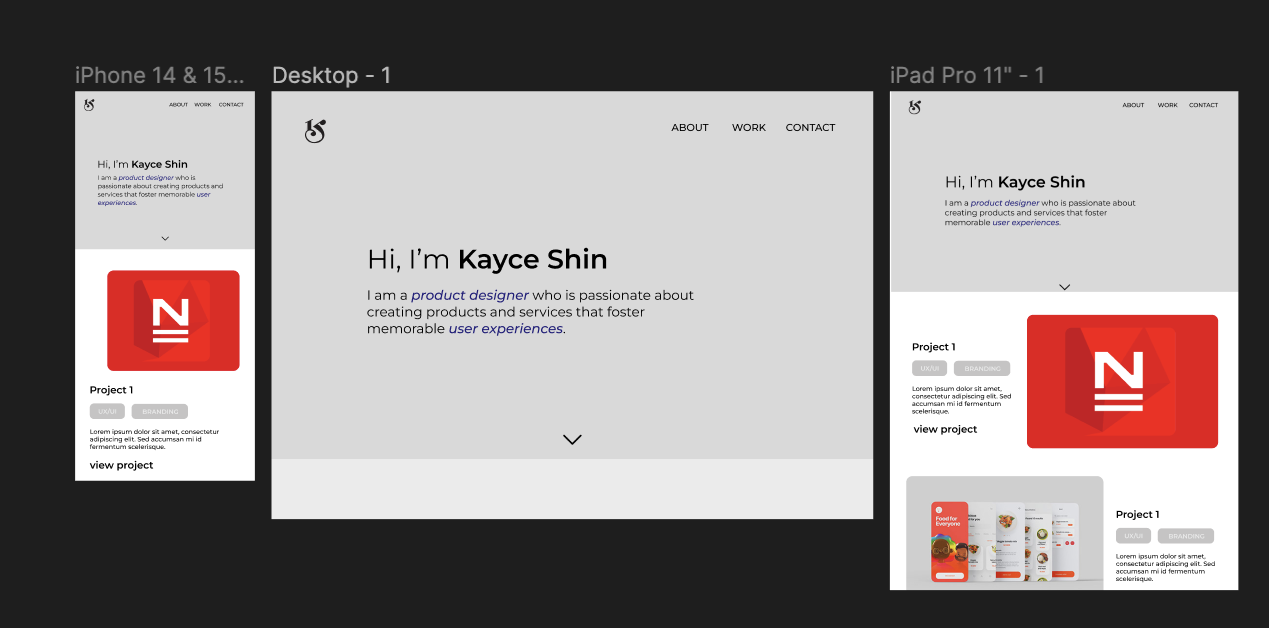
7 - Responsive Mockup
Link to Responsive Mockup8 - Photoshop Comp