Step 1 - Develop Your Idea
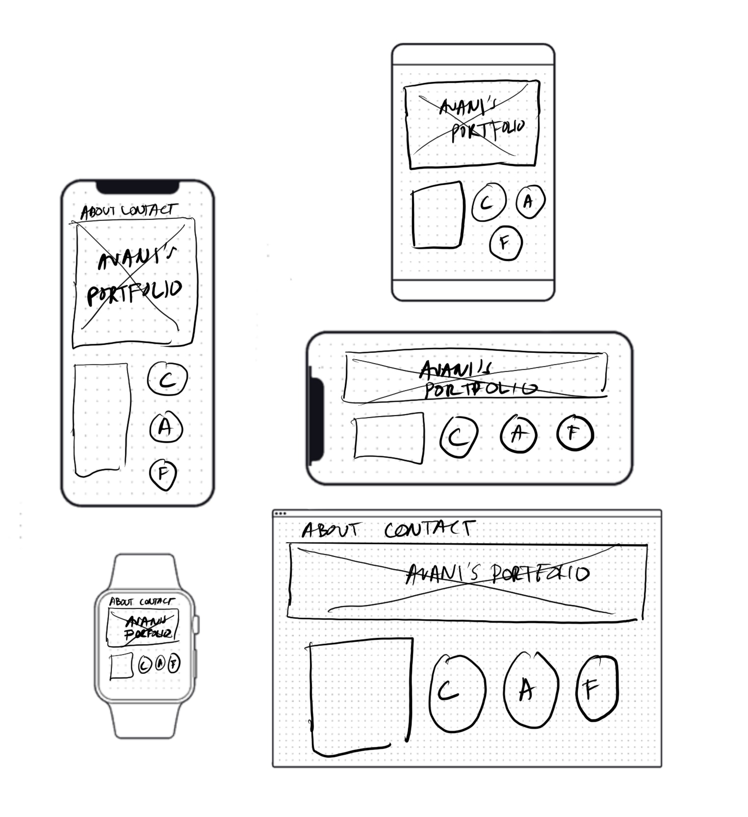
The goal of my portfolio website is to create a space that beautifully showcases all my creative work, highlighting my skills and interests in an organized and visually appealing way. I want the site to serve as a gallery where potential employers, fellow designers and artists who can get to know me and my work on a deeper level, and also buy my garments and artwork. My aim is to design a site that is clean and easy to navigate, while also standing out from other portfolios through distinctive use of color, typography, and visual presentation. The solution in my website is that its not just a portfolio but also a platform where the customers can purchase pieces from the website.
Step 2 - Discovery and Research
Since I wanted my site to include a purchasing feature while remaining easy for customers to navigate, I explored popular websites known for their seamless shopping experience. Given that my work is fashion-focused, I specifically looked at different fashion brands to understand how they design their e-commerce platforms for simplicity and ease of use.
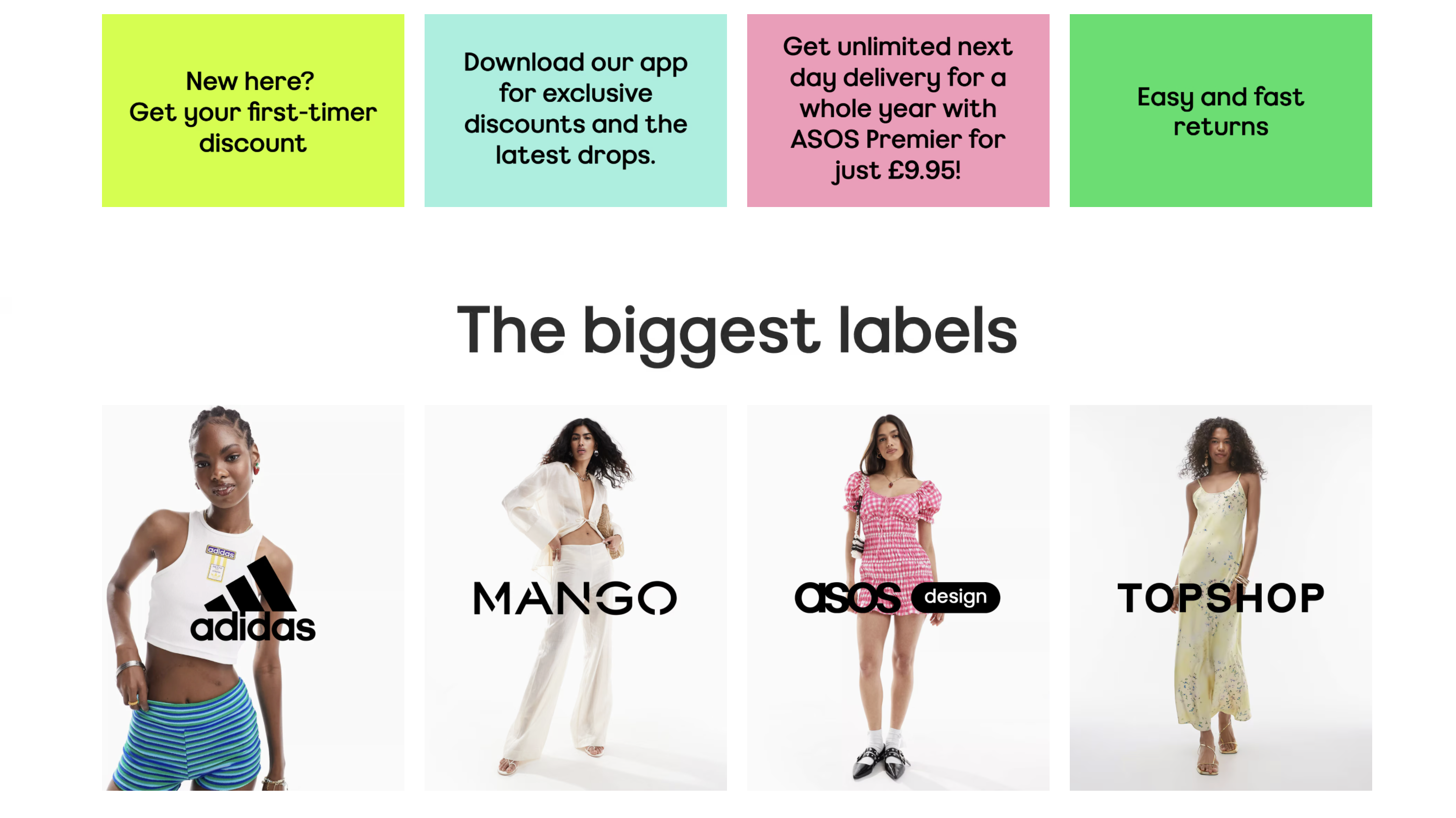
ASOS
Aesthetics and design- The ASOS website has a simple, minimalist structure and crisp, modern design that emphasizes high-quality pictures. The design remains visually appealing and unifying due to the continuous use of fonts, colors, and white space, which makes the products stand out without overpowering the user.
User Interface (UI)- With its easy-to-use menus, filters, and powerful search feature, ASOS excels at user navigation. The website is geared for mobile devices, displaying fluidly on various screens and providing a quick, seamless experience that keeps visitors interested.
Branding- With an open approach to sizing and style, ASOS caters to a fashion-forward, varied audience, primarily between the ages of 16 and 34. The brand's emphasis on sustainability is in line with contemporary consumer values, and its lighthearted, informal tone makes it relatable to its target.
DIOR
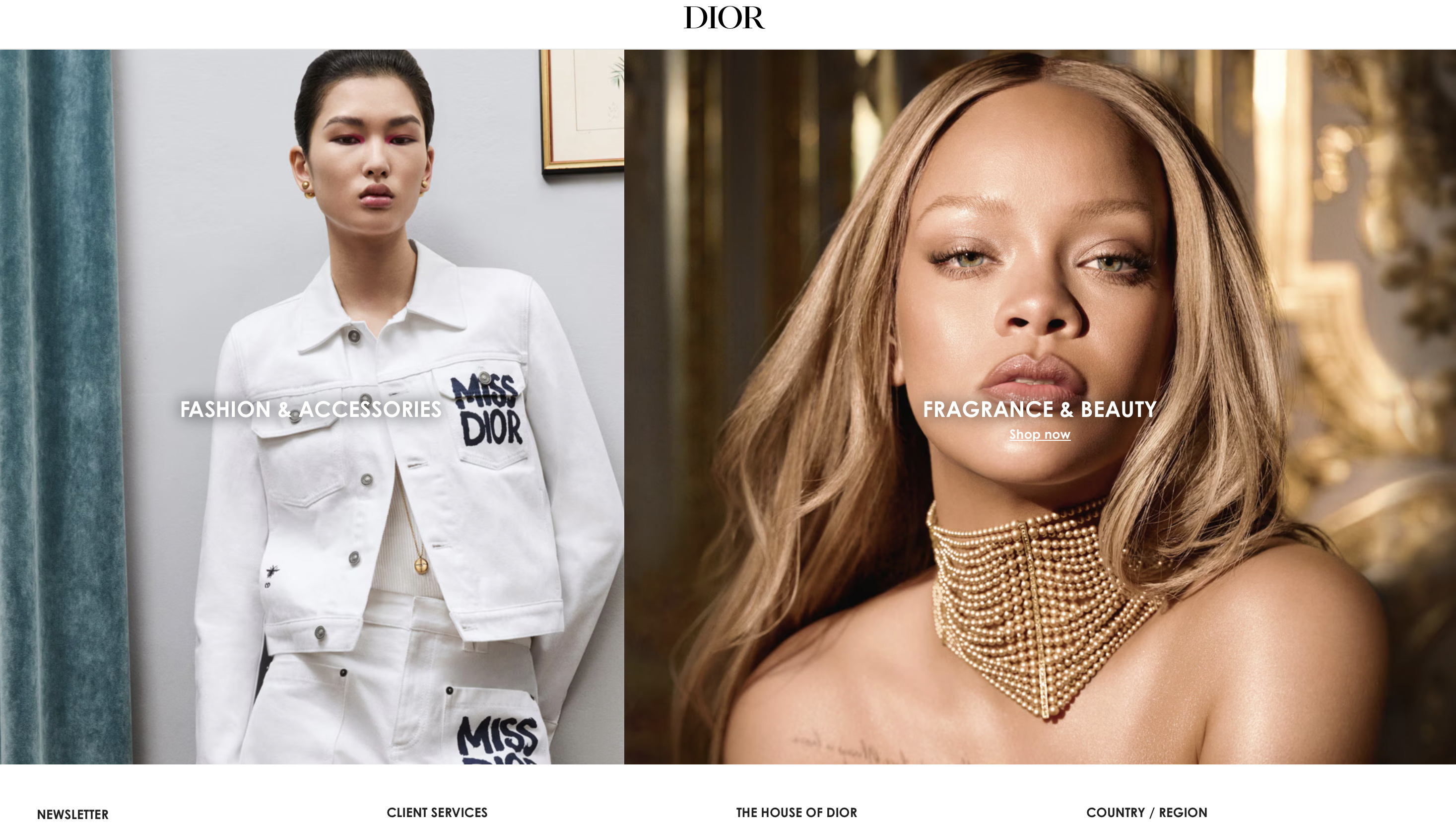
Design and Appeal- Luxurious and Elegant: The website radiates luxury with its clean, minimalist layout, superb photos, and tasteful color scheme, which mostly consists of white, black, and gold accents. The refined and uncluttered visual style is a reflection of Dior's upscale standing.
Immersive Imagery: Dior creates an immersive experience by exhibiting its newest collections and campaigns through the use of huge, full-screen photographs and films. The creative imagery, which frequently has a fashion editorial feel to it, aids in conveying the essence of the brand.
UX, or user experience- Simple Menu Structure: Products are arranged into categories such as Women, Men, Fragrance, and Skincare, making the website intuitive to use. When it comes to shopping or learning more about the brand's past, users can easily locate what they're looking for. Mobile-Friendly: Dior's website works flawlessly on mobile devices thanks to its full responsive design. This is essential for a brand that caters to a worldwide, mobile audience
Content and Storytelling Brand Heritage: Christian Dior's heritage and the brand's rich history are highlighted on Dior's website through the skillful use of narrative. Behind-the-scenes material, designer interviews, and insights into the creative process may be found in the "Dior Stories" section. Collection Showcases: With thorough explanations, look books, and runway films, the website is designed to prominently display new collections. This enables customers to thoroughly examine the brand's most recent products.
Step 3 - Target Your Audience
My target audience includes people who are passionate about creativity and interested in my art, ceramics, and fashion work. They are individuals who appreciate the visual and conceptual aspects of my creations and may also be looking for collaborations. I want my portfolio website to resonate with them by offering a visually engaging, organized space that showcases my work and tells the story behind it. The site will serve as a platform for connection, allowing visitors to get to know me better and encouraging collaborations. My goal is to create a clean, aesthetically pleasing site that stands out while fostering a community of like-minded creatives.
Persona No.1 - Olivia Martinez
Contemporary Art & Fashion Enthusiast
Age: 34
Occupation: Creative Director at a Fashion House
Location: Los Angeles
Interests: Avant-garde fashion, modern art, and experimental design
Motivation: Olivia seeks bold, boundary-pushing works that blend fashion with art to inspire her creative direction for new collections.
Why She Visits: She's fascinated by the unique intersection of ceramics, fine art, and fashion showcased on the site. The installations and wearable art pieces serve as fresh inspiration for her own creative projects.
Will She Return? Yes. Olivia finds the evolving, multidisciplinary approach intriguing and loves exploring new projects and collaborations.
Persona No.2 - Olivia Martinez
Art Collector & Installation Aficionado
Age: 46
Occupation: Private Art Collector
Location: Hong Kong
Interests: Collecting fine art, large-scale installations, and ceramics with a modern twist
Motivation: Michael is always on the lookout for unique, collectible art pieces that combine various forms of craftsmanship. He values works that challenge traditional boundaries and seek new forms of artistic expression.
Why He Visits: The site offers Michael a blend of fine art and craftsmanship, particularly the installations and ceramic works. He sees potential investment pieces and looks for opportunities to commission exclusive work for his collection.
Will He Return? Absolutely. The constant innovation and combination of artistic mediums keep him engaged and interested in future collections.
Persona No.3 - Chloe Patel
Emerging Artist & Multidisciplinary Creator
Age: 25
Occupation: Graduate Student in Fine Arts
Location: London
Interests: Mixed media art, ceramics, and fashion as artistic expression
Motivation: Chloe wants to expand her skills by learning from established artists who work across multiple mediums. She’s particularly interested in how ceramics and fashion can combine in avant-garde ways.
Why She Visits: She’s drawn to the website for its combination of ceramics, fine art, and fashion, using it as a learning tool to study techniques and get inspiration for her own projects.
Will She Return? Definitely. The behind-the-scenes insights into creative processes and updates on new projects provide continuous education and inspiration for Chloe’s evolving style.
Step 4 - Inspiration
Step 5 - Thumbnails
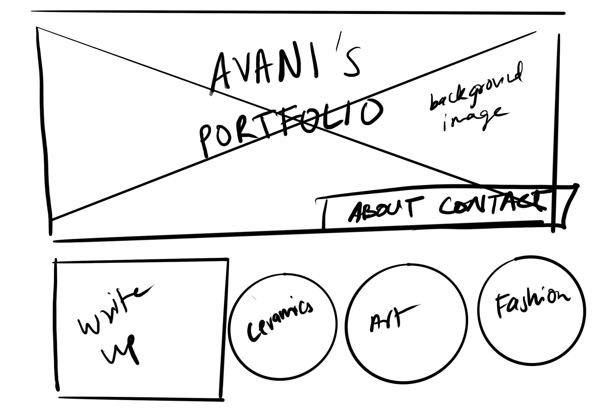
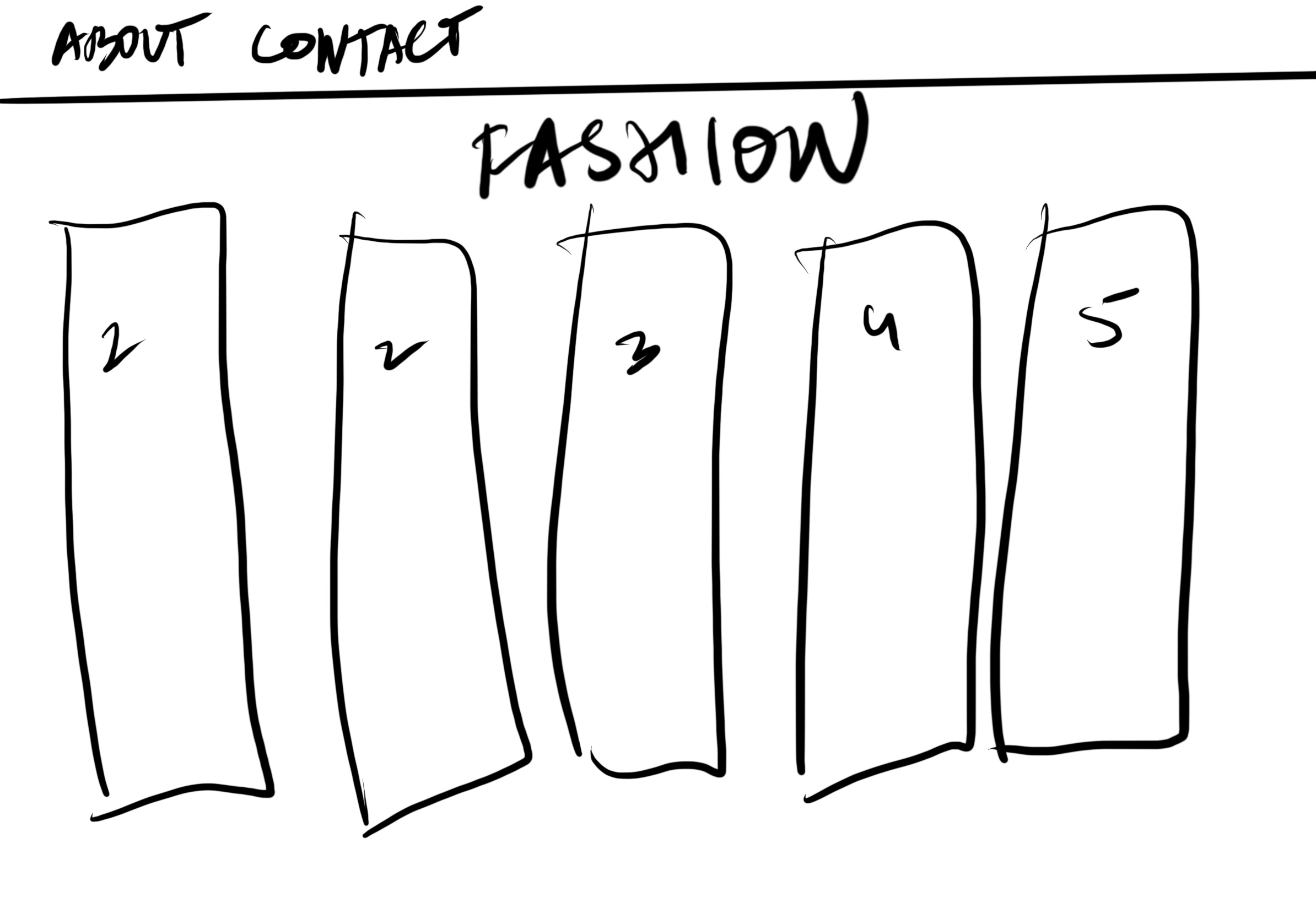
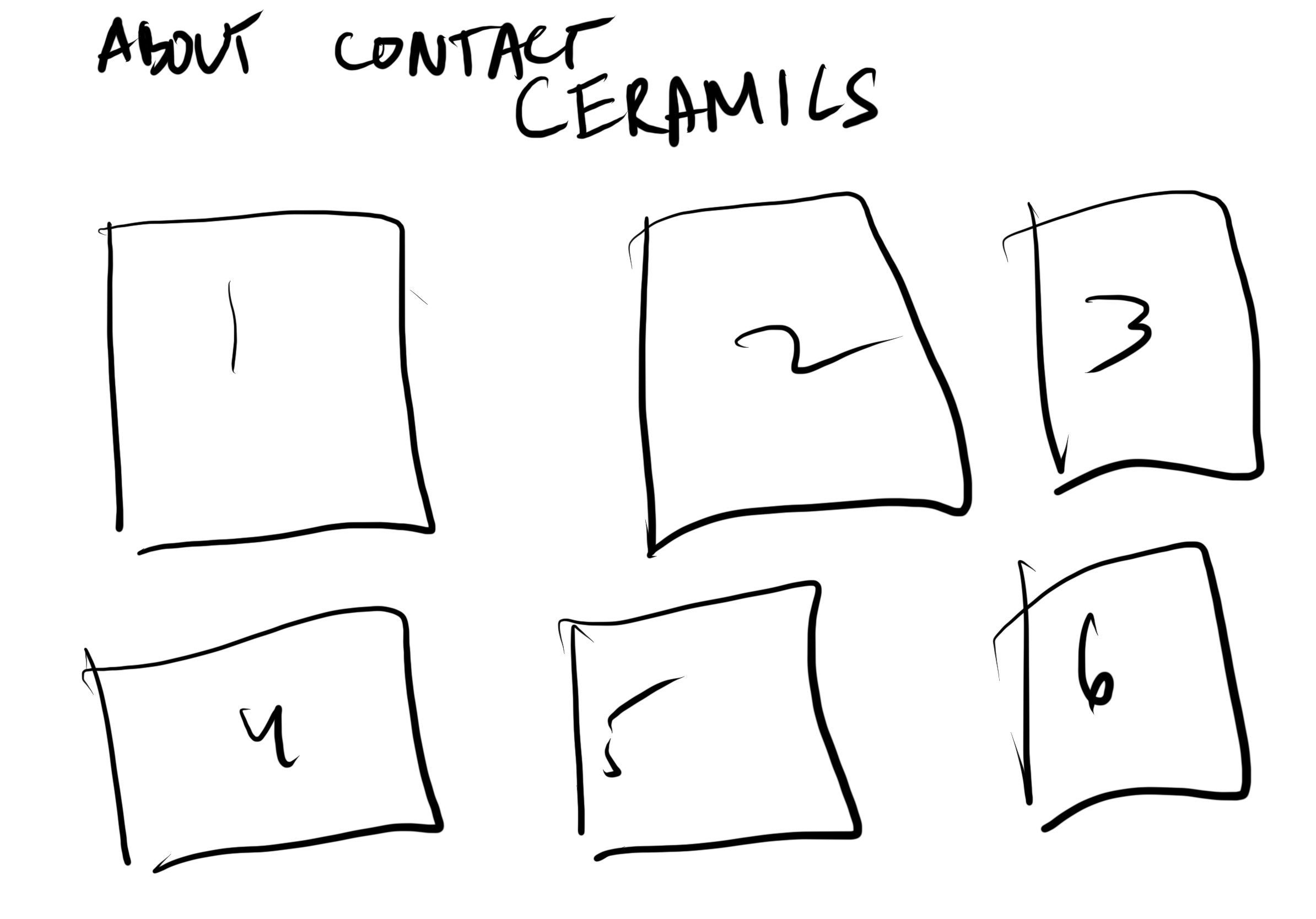
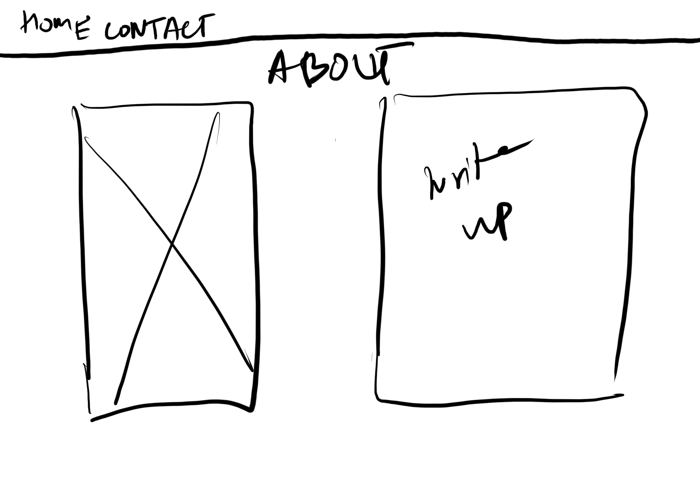
Step 6 - Wireframes
