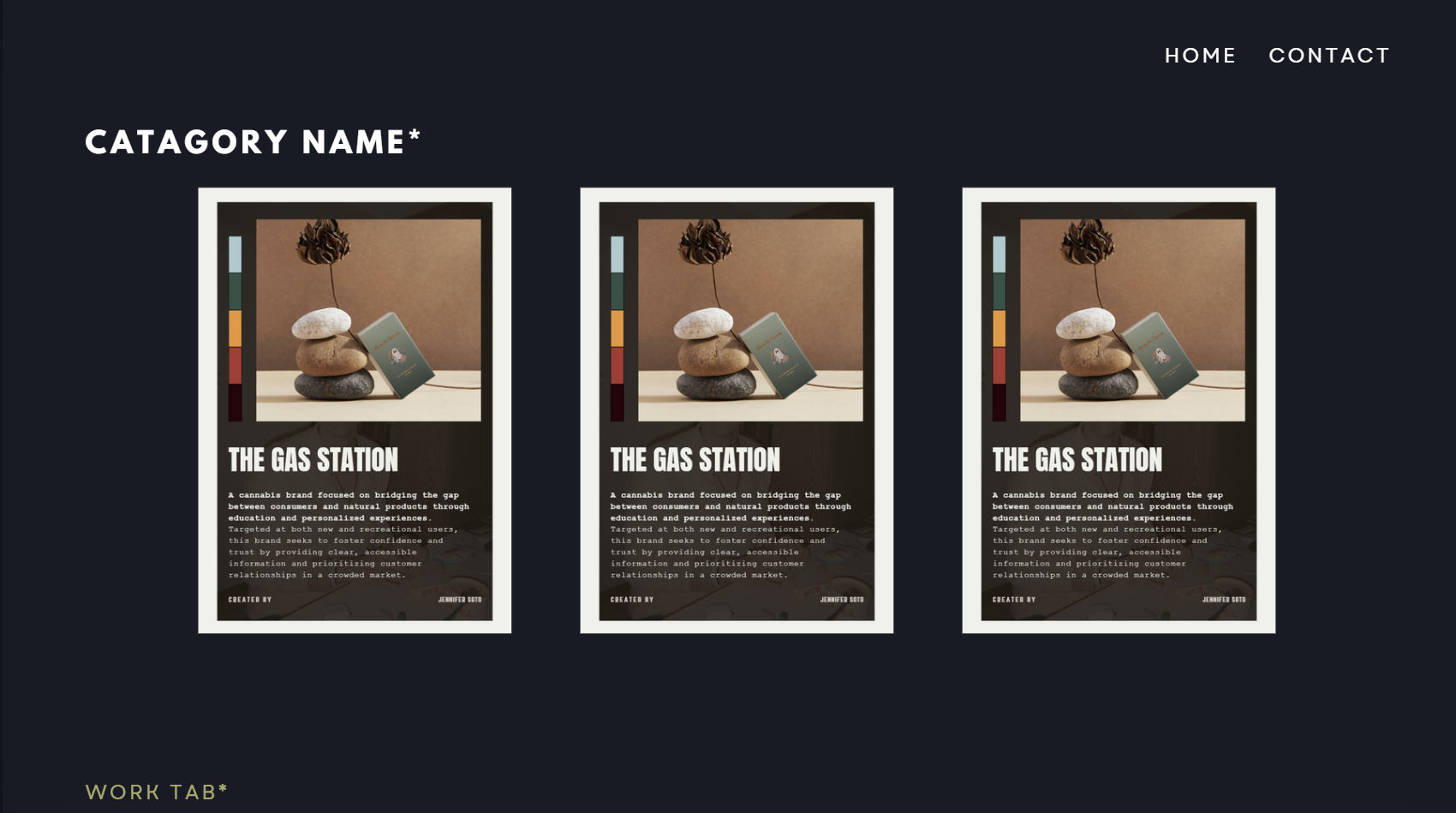
Developing The Idea:
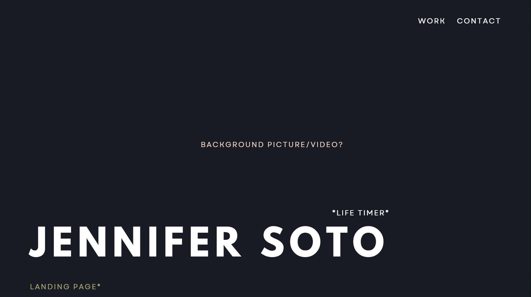
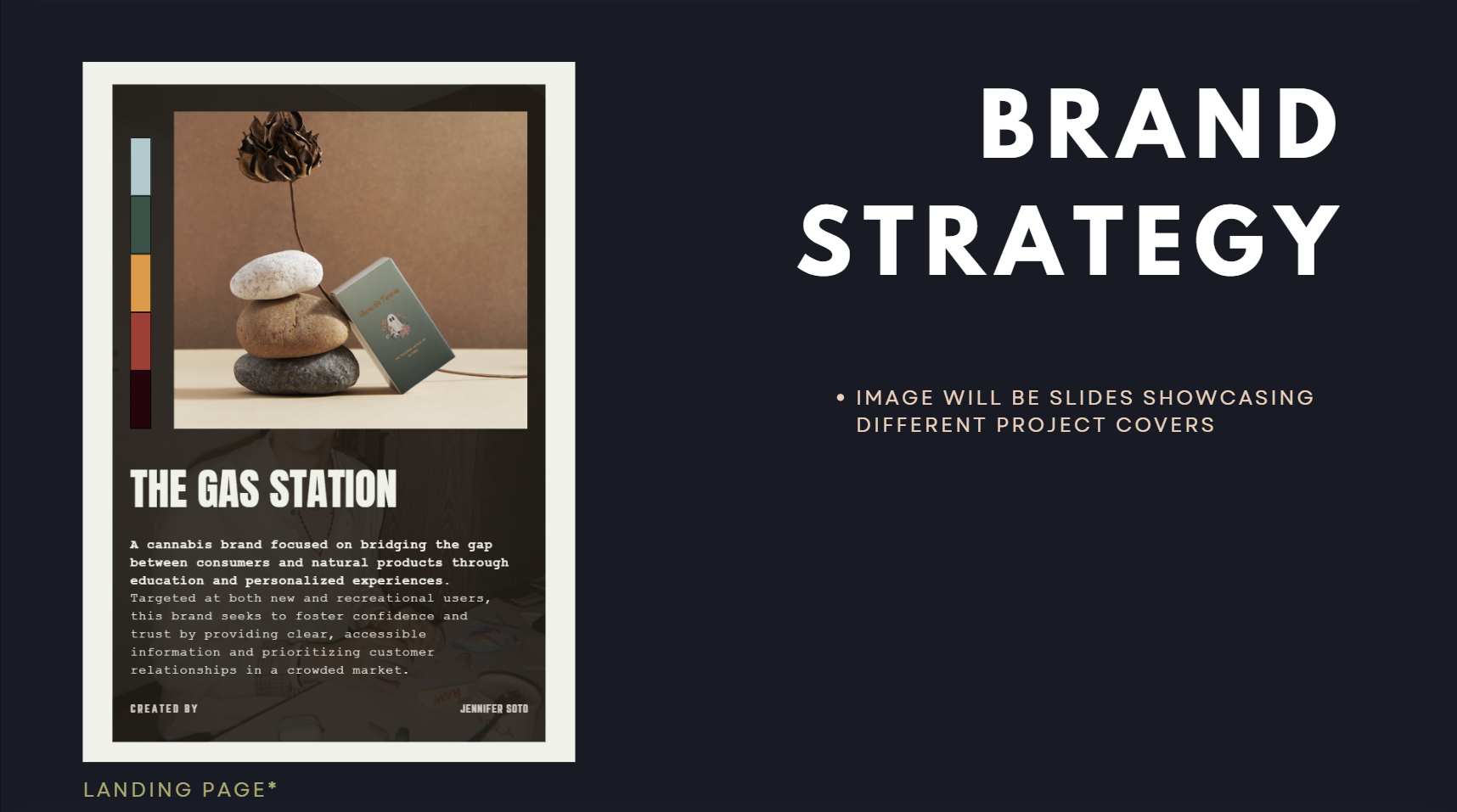
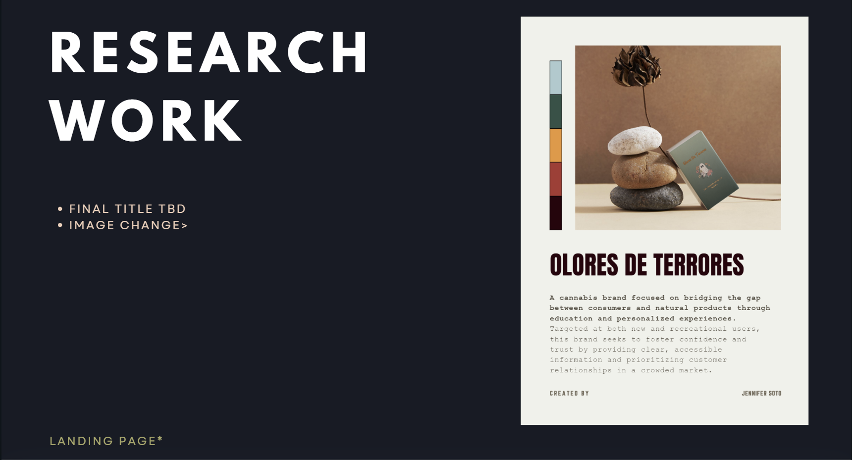
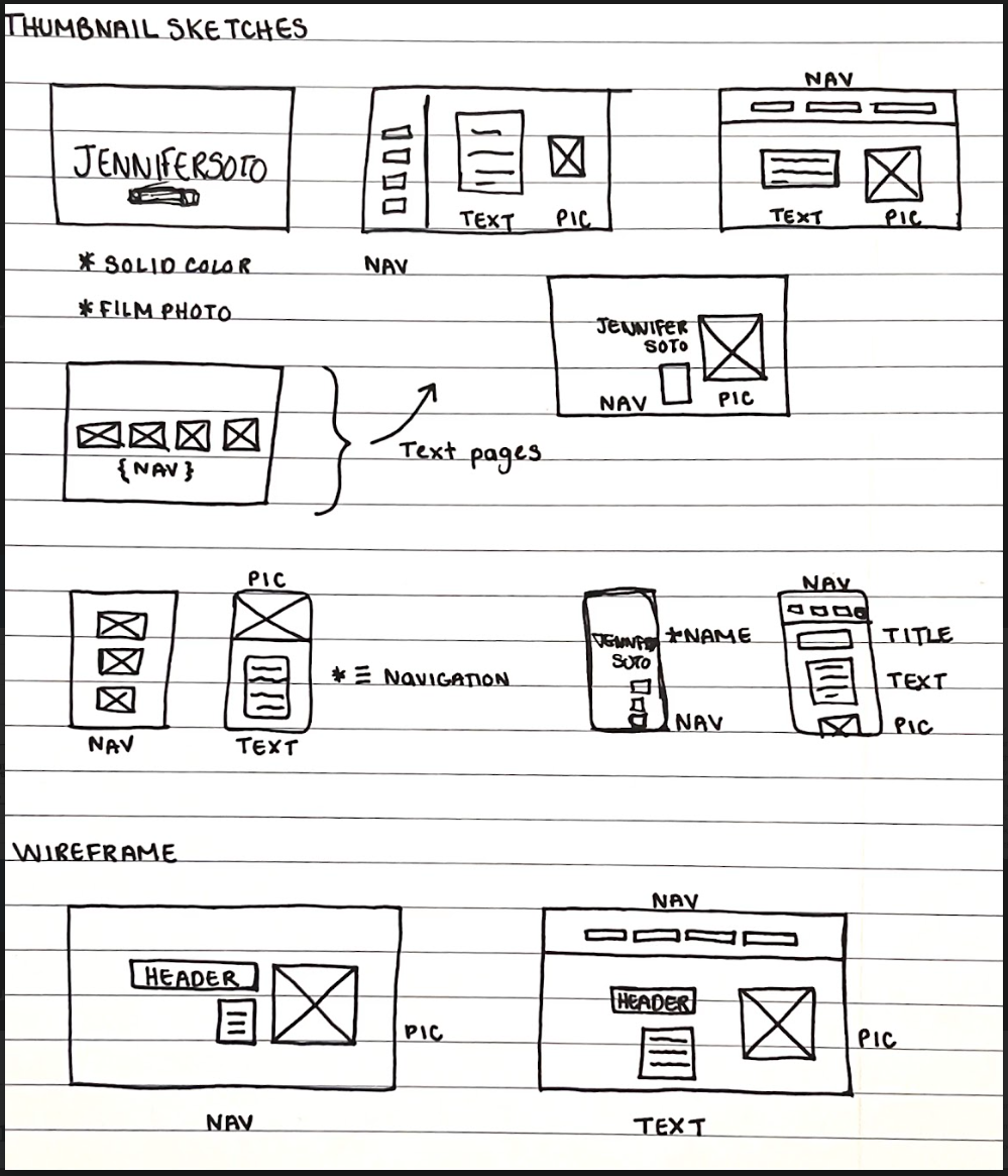
For my final I decided to continue work on my previous website. I used my midterm as a launching pad to see what I can do and how it can come together. Now that I have a decent understanding, I essentially wanted to start from scratch and build something that I can use and call mine through a website builder. Before I began development, I had to consider the new problems I needed to solve in order to give my website purpose. I needed to be able to showcase my work effectively by utilizing stronger storytelling elements and view myself as the product I want to sell. However, my three original problems still remain: I need a place where all my work could live together, I need to have something that is readily available and can be shown to clients, and I need to make myself accessible.
Discovery and Research:
I continued my research by looking at different websites but specifically focusing on content layout. I still used the same websites that I mentioned in my midterm worksheet as a starting point to what I like and don’t like but had trouble figuring out how I want to showcase my work. Due to this, I looked at larger companies and tried to see which elements could be translated into my own website.
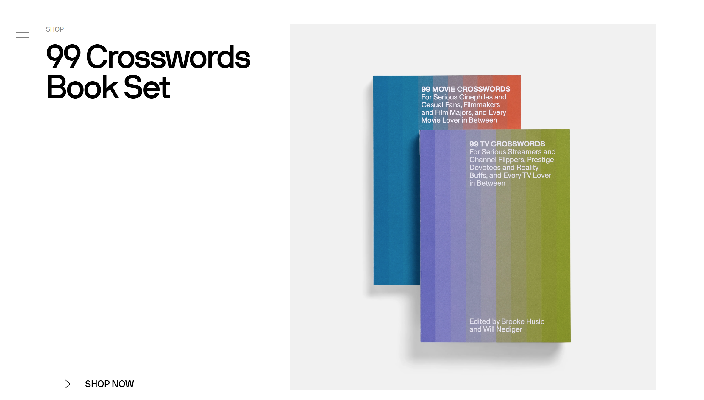
The first example is looking at the A24 landing page. A24 is a movie distribution and production company that specializes in independent films. I’m a big fan of these movies and was looking through their website when I discovered some key elements that were similar to what I had in mind. In particular I liked that their landing page is one large page and is divided into sections. It’s large and simple which matches the aesthetic I was going for. I planned on doing movie posters as my project covers and looking at this website really helped me gain more inspiration.
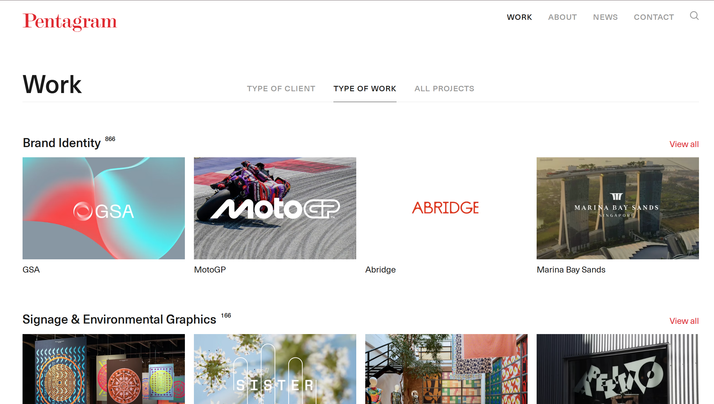
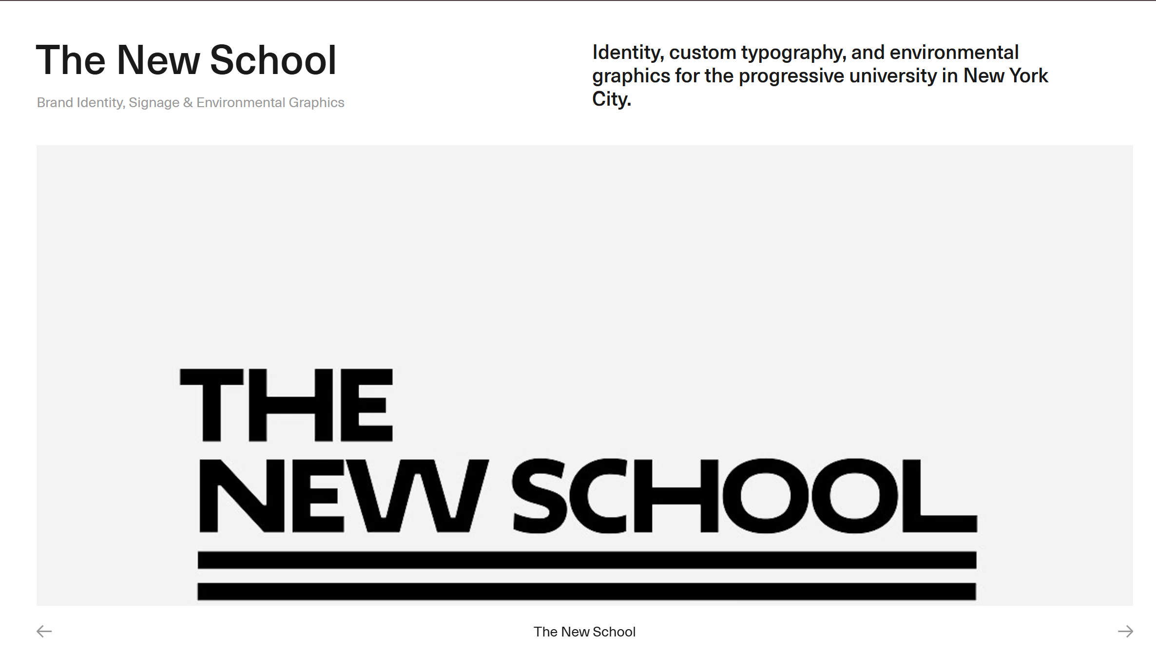
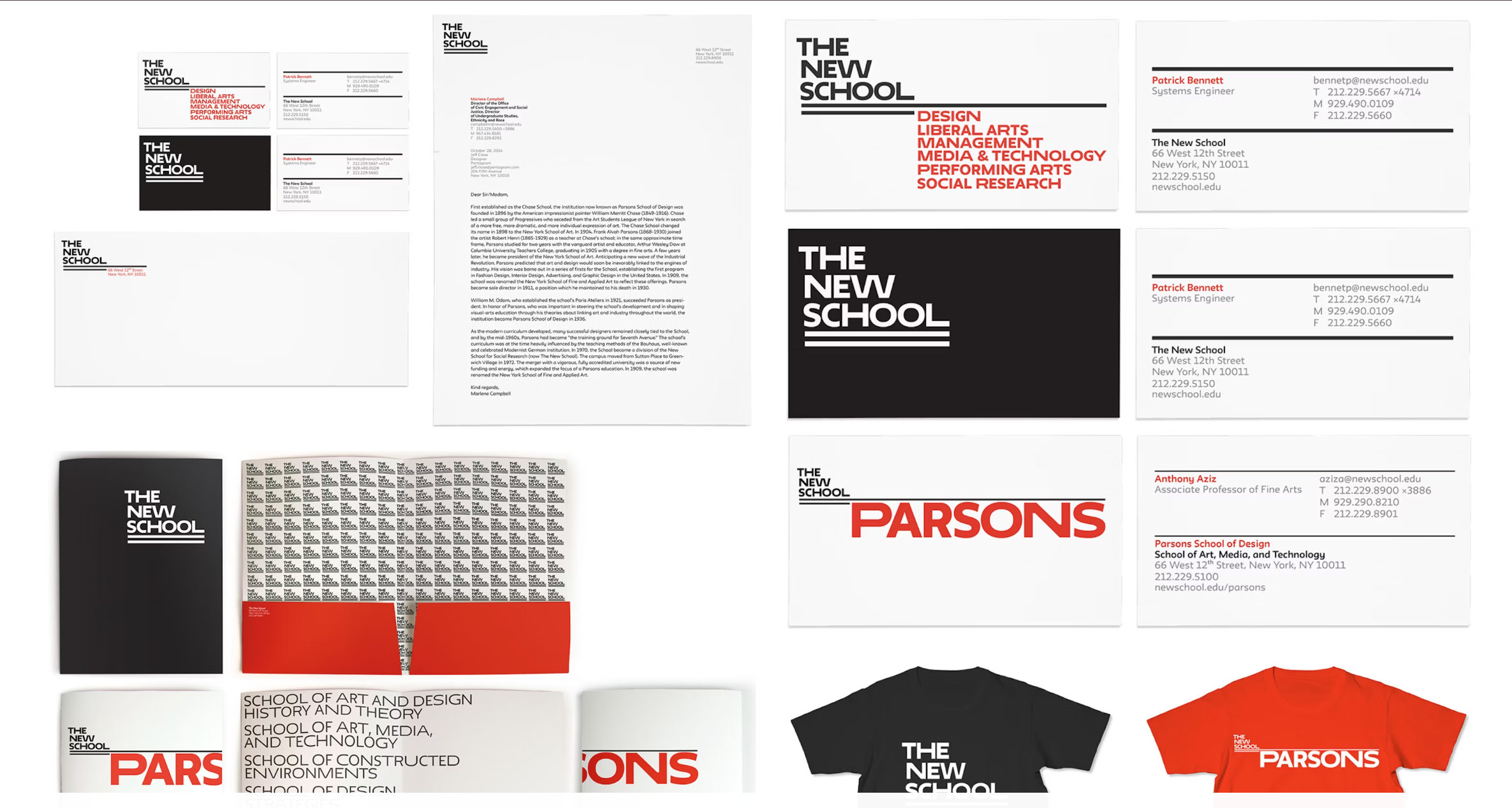
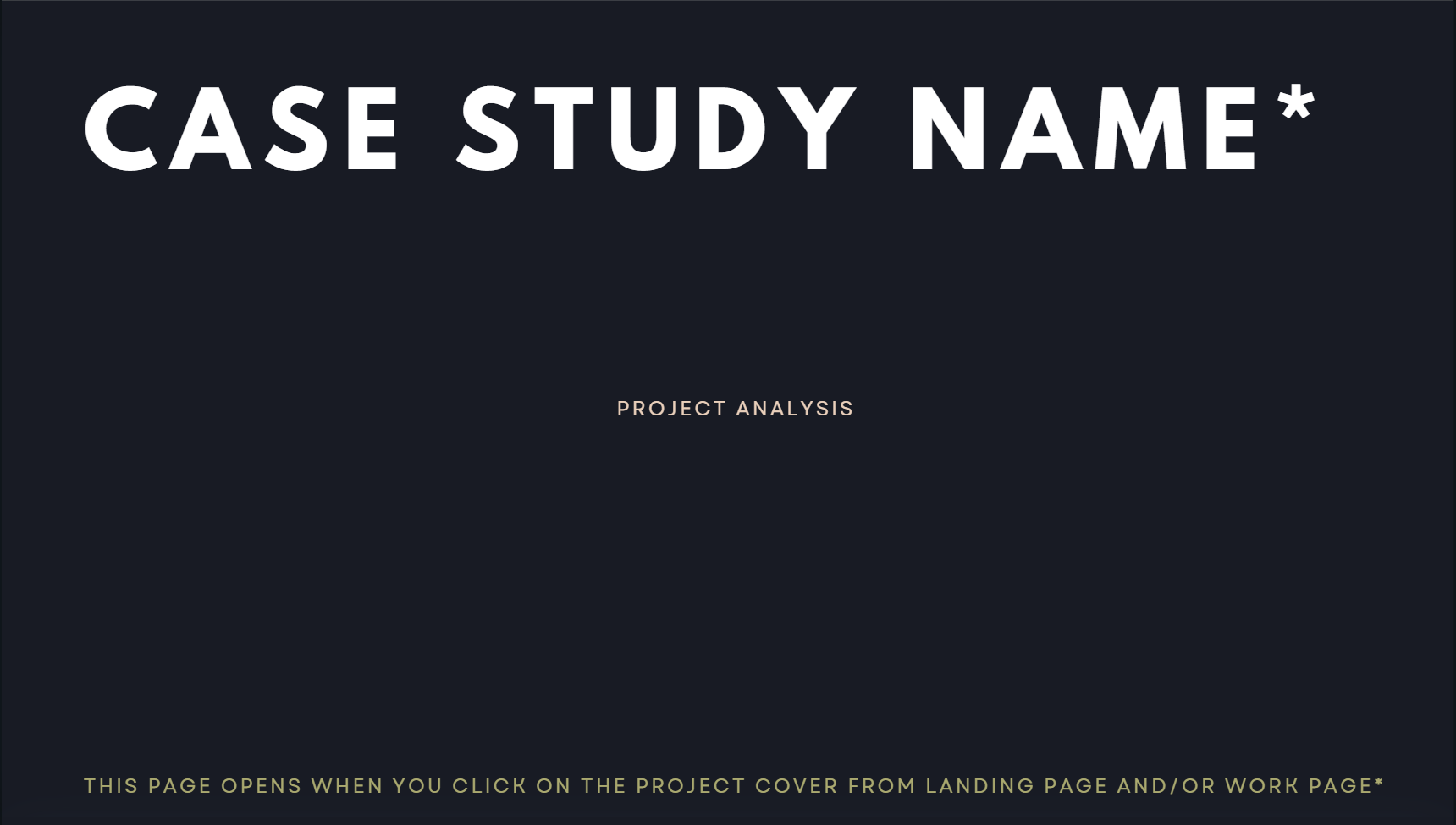
Next I looked at Pentagram as a way to organize my work. Pentagram is a leading independent design consultancy who has done work on a plethora of household names (including The New School). The work that they do is similar to the field I’m majoring in and want to work in so it was fascinating to see how they showcase their work. I wanted to do case studies for my projects and this is an area Pentagram really excels in and something I plan on mimicking.
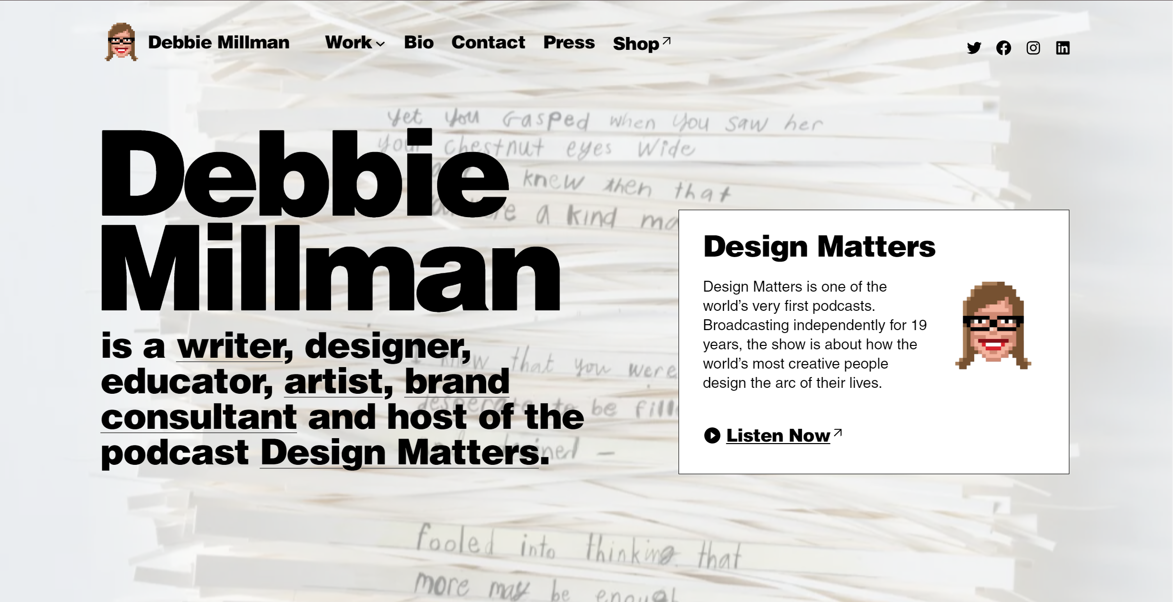
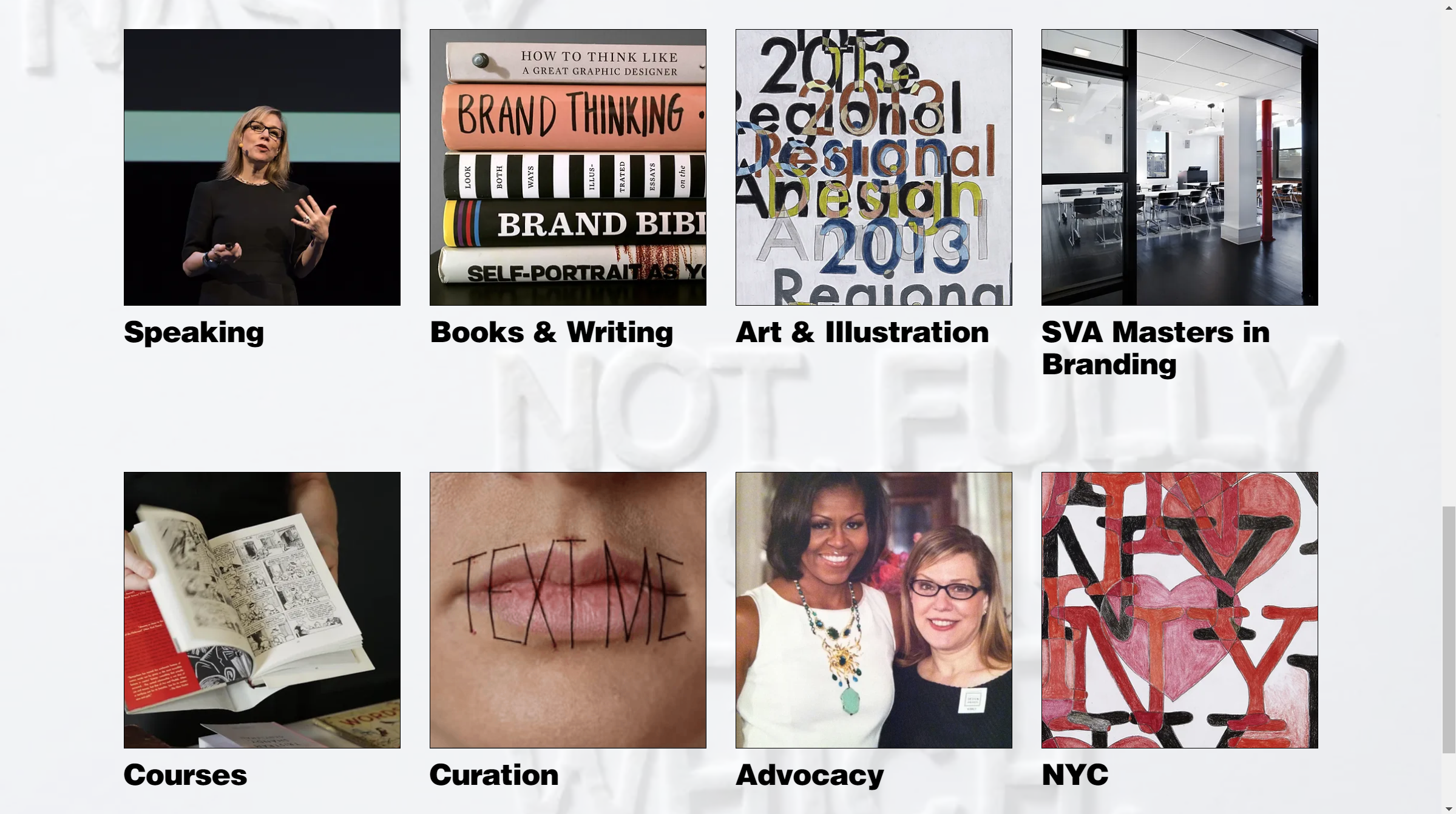
Now for my personal favorite and biggest source of inspiration, Debbie Millman. Looking at these photos, you can see it does a great job at showcasing Debbie’s personality and style. It plays with the typography, background design, and is very straightforward. I really love the large font size mixed with the visuals and it manages to capture the type of spirit I’m going for. On the other hand, what doesn’t work for me is that it feels a little messy. It certainly feels personal and like a look into Debbie as a person and the work she creates but I personally would want something slightly more polished.
Targeting The Audience:
My target audience remained the same, meaning I developed the website with the intention that this would be the website I can show employers when looking for jobs but also potential clients who need help getting their brands off the ground. For context, I want to go into Data Analytics and Trend Forecasting with a background in brand strategy as the foundation. Something all of these things have in common is research not just any research but the research that gets buried under piles and piles of content. I need to be able to showcase I can do that through my projects but who wants to dig through all of the different things I’ve done anyway. With that in mind, I designed my website to be straightforward, simple, and let it speak for itself. It’s the website for people who want to know who I am and what I can do without revealing my deepest darkest secrets.
Creating The Website:
Putting It All Together:
