Develop Your Idea
My website is a way to showcase my work and set myself apart from other designers; I want it to be a fluid, quick, and efficient experience. Some industrial design websites are confusing because the products they display don’t make sense at first glance regarding how they function and how they came to be. I want to try and simplify that by showcasing my products through the product’s story. Many of my products follow a particular narrative; whether a chair is derived from a set of squiggly lines, a carrying case inspired by the shape of a Japanese sakura flower, or a luminaire inspired by the movement of string in yoyo tricks, my goal is to incorporate storytelling into my designs. I believe there is strength in integrating the story behind the product, taking reference from brands like Kith and Aime Leon Dore; they market a story before they market a product, and it's that story that entices viewers to come in to take a peek. Perhaps my website could be a series of very simple line sketches that allude to the product's shape and form; when a user hovers over that drawing, an image of the actual product appears. My idea is to market my designs through simple, easy-to-understand visuals that showcase the product through the storytelling of the design process.
Discovery and Research
I took references from many existing online stores and industrial design portfolios. The ones that stuck out most to me were the ones that kept it straightforward. These websites were easy to navigate, their products were presented simply the way they were meant to be built, and many were presented in context to show how they should be used.
This website was why I wanted my product cover image as a simple line sketch. Without much explanation besides a sketch, viewers can easily understand what the product is; the “dumb downed” visual of the products also entices me to click on it to learn more about the final product and its function, and when I enter that page, I get taken into the design process it took to reach the final product.
I loved this one because the products were photographed in context to their intended use. If a table lamp is up for sale, it’s a picture of the lamp on top of a table in a dark setting; if a pencil case light is up for sale, it’s a picture of the light on a table with pencils and paper scattered across in a dark setting. It makes perfect sense and gives me no other room to question how else I’m supposed to use it. How often do you see a product on an online shop, and it's just the product's image on a white backdrop? There is no way to understand the scale and in-context use besides the dimensions given. This website helps to solve that frustration.
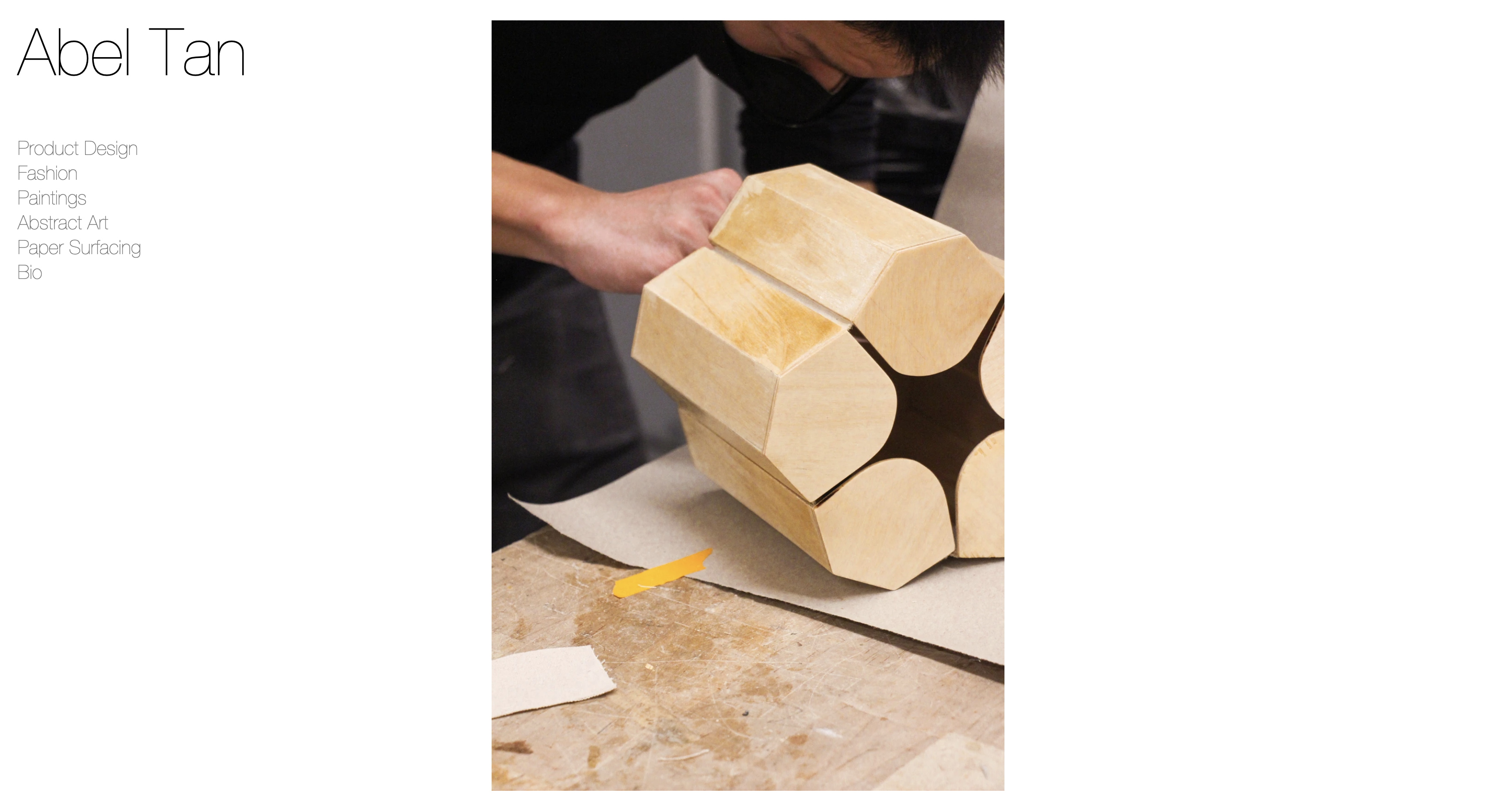
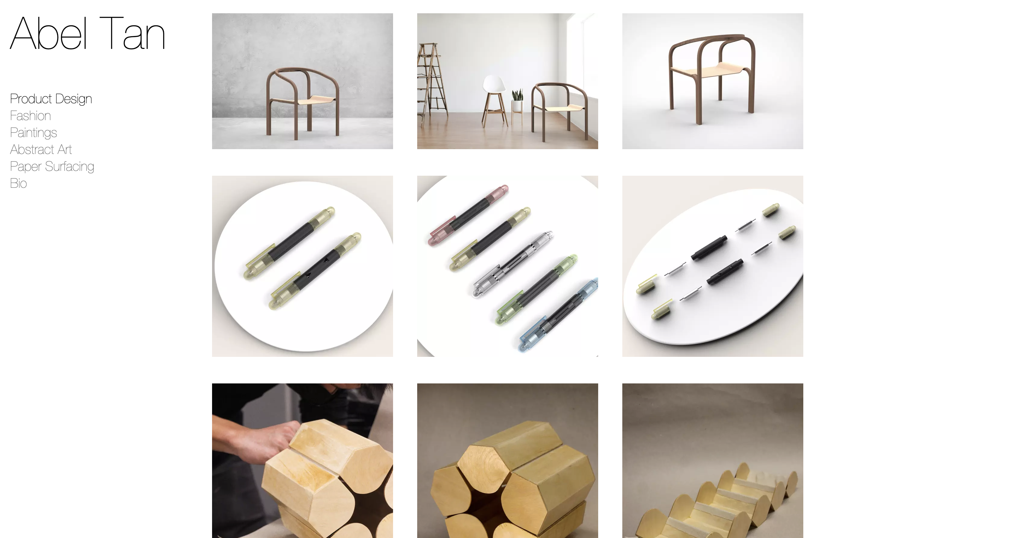
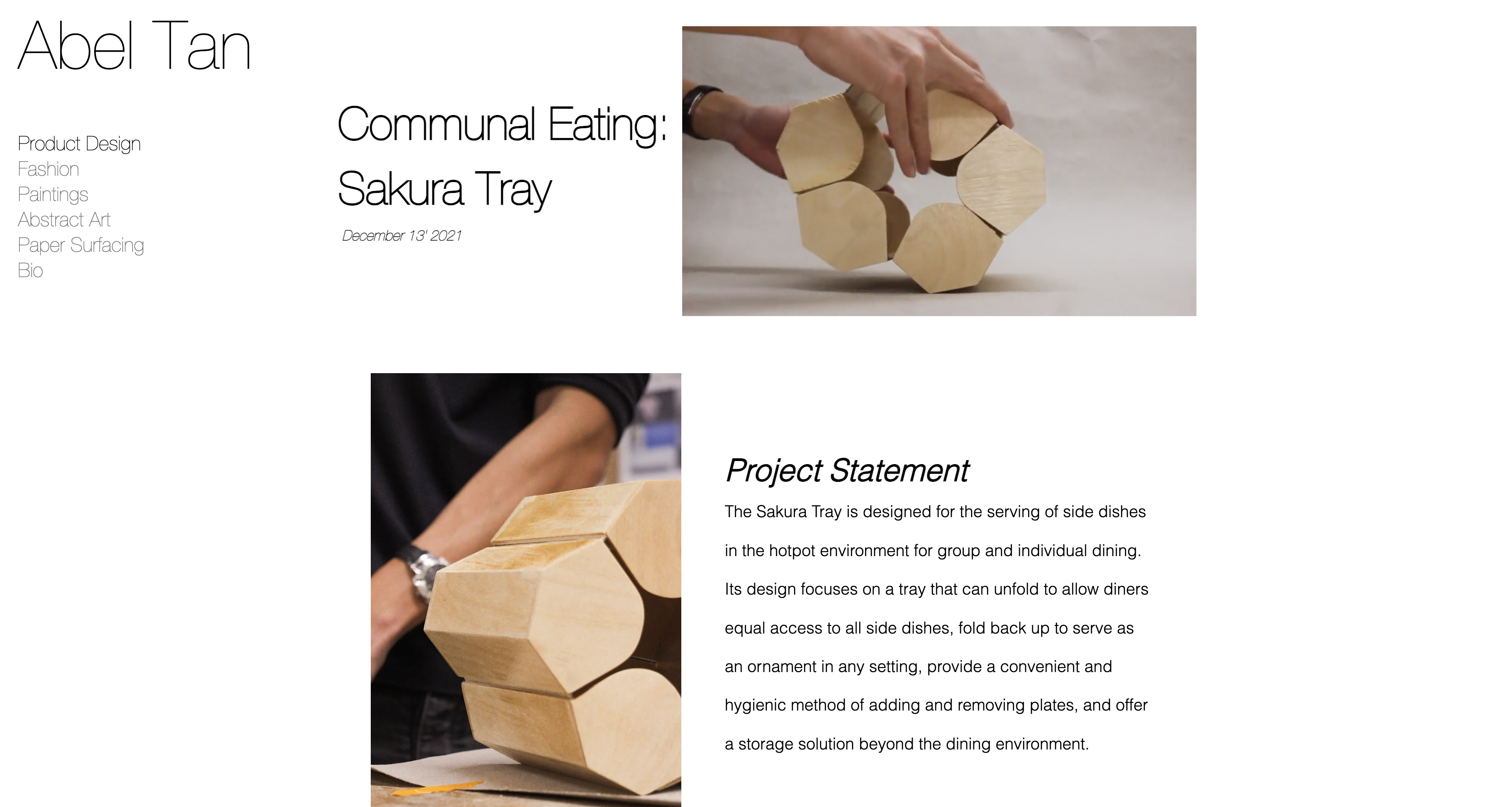
This is the website of one of my professors. Again, straightforward; what I liked so much about this site was that there were no fancy animations going on when clicking between links. One click takes you directly to the product page without blurring in and out; it's a very fluid and quick experience. I also enjoyed how his products were organized; again, there was no gimmicking or trendy wording, just simple labels: chair, seat, shelving, etc. I loved how his product's theme' matched the website’s overall ‘theme’; it felt like I was stepping into his studio.
Target your Audience
My target audience consists of recruiters and professionals in the field of industrial design that are looking for interns or full-time designers. It will also consist of any design-interested individual looking to view my projects for special commissions or to purchase a piece from my website. This summer, during my internship, my boss gave me a few tips on how to sell yourself:
- Story is critical - there needs to be a way for users to understand the journey you took to get to the final product; it’s a lot more engaging when there is a story involved.
- Don’t waste my time - be straightforward with what you want to showcase, and make intentional decisions. Don’t lure your audience into boredom waiting for you to get to the point.
- Keep it simple - following the previous point, my designs need to be displayed as simply as possible and organized so that anyone can easily understand them.
Inspiration and Concepts
I will be taking inspiration from the 3 websites I used for the “discovery and research” portion.
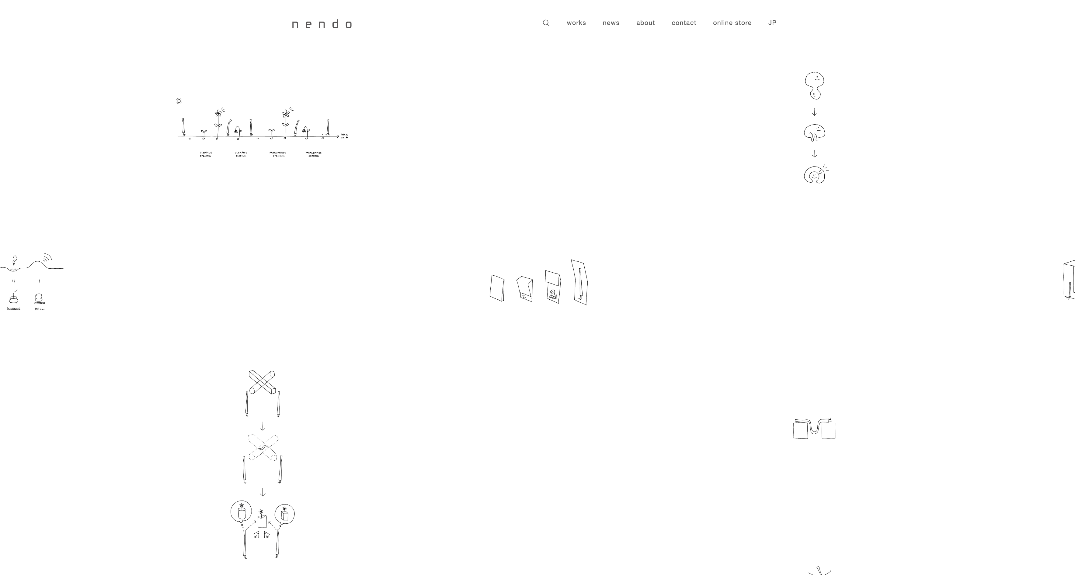
Pros:
- Plain, easy to understand, easy to navigate
- There is a download option for the images, videos, and sketches
- It is very easy to organize if I implement this into my website; all my products will have a doodle sketch as a cover, and users can click on it to view the actual product.
Cons:
- A little bit too simple, and I think a non-design person wouldn’t even be able to understand that I am trying to display my designs.
- It can be misunderstood as a graphic design website
- A lack of words could also be misleading and misinterpreted, viewers skim through websites quickly, and I’ll need to label each image accordingly. Minimal text is fine, but this one has close to no text at all. That will need to be fixed.
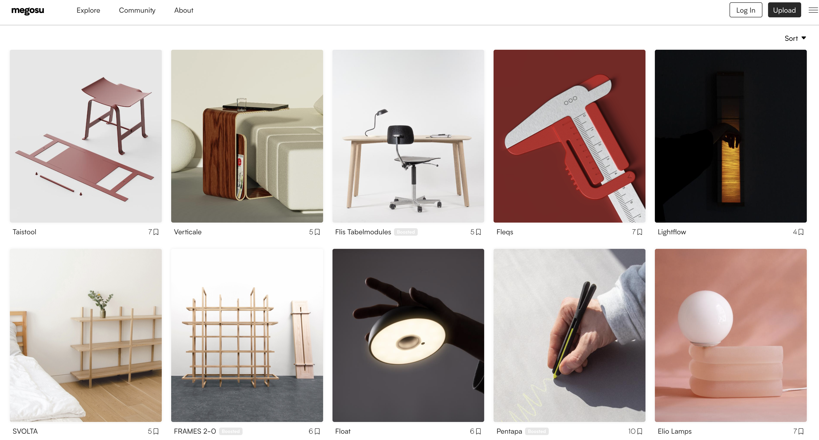
Pros:
- Most eye-catching of the 3 websites
- A simple layout with images that put the product in context is highly effective in showing what the product is and how it is used.
- Minimal text used, enough to tell the viewer what they are looking at
Cons:
- Perhaps the content needs to be more streamlined based on the type of job I am looking for. Furniture job: more furniture designs, homeware job: more table products, portfolio website: larger images with more detail
- Enlarge the text size on the navigation bar; it becomes difficult to view with the number of images on the front page.
- Too many images might overload the viewer with information.
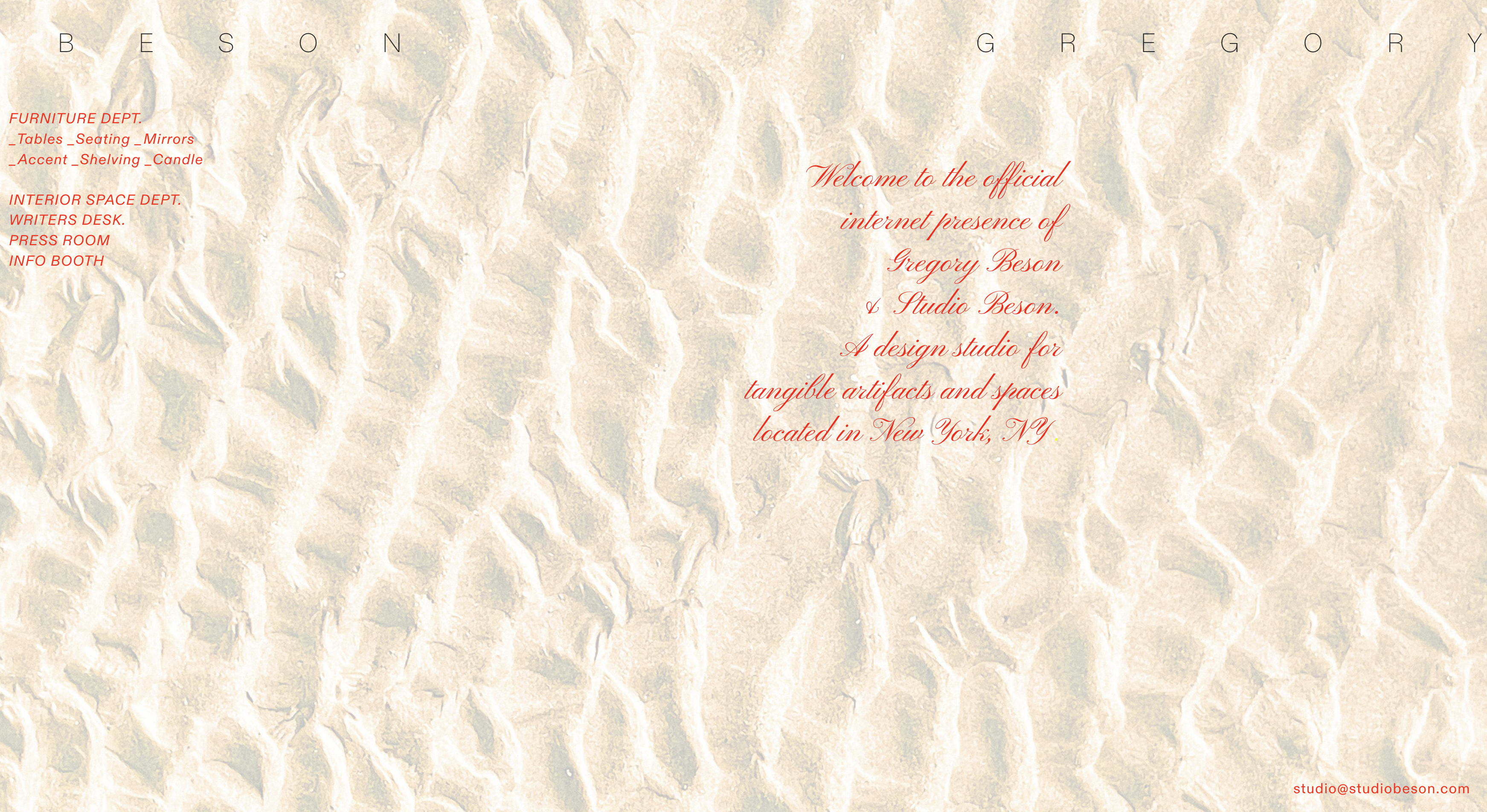
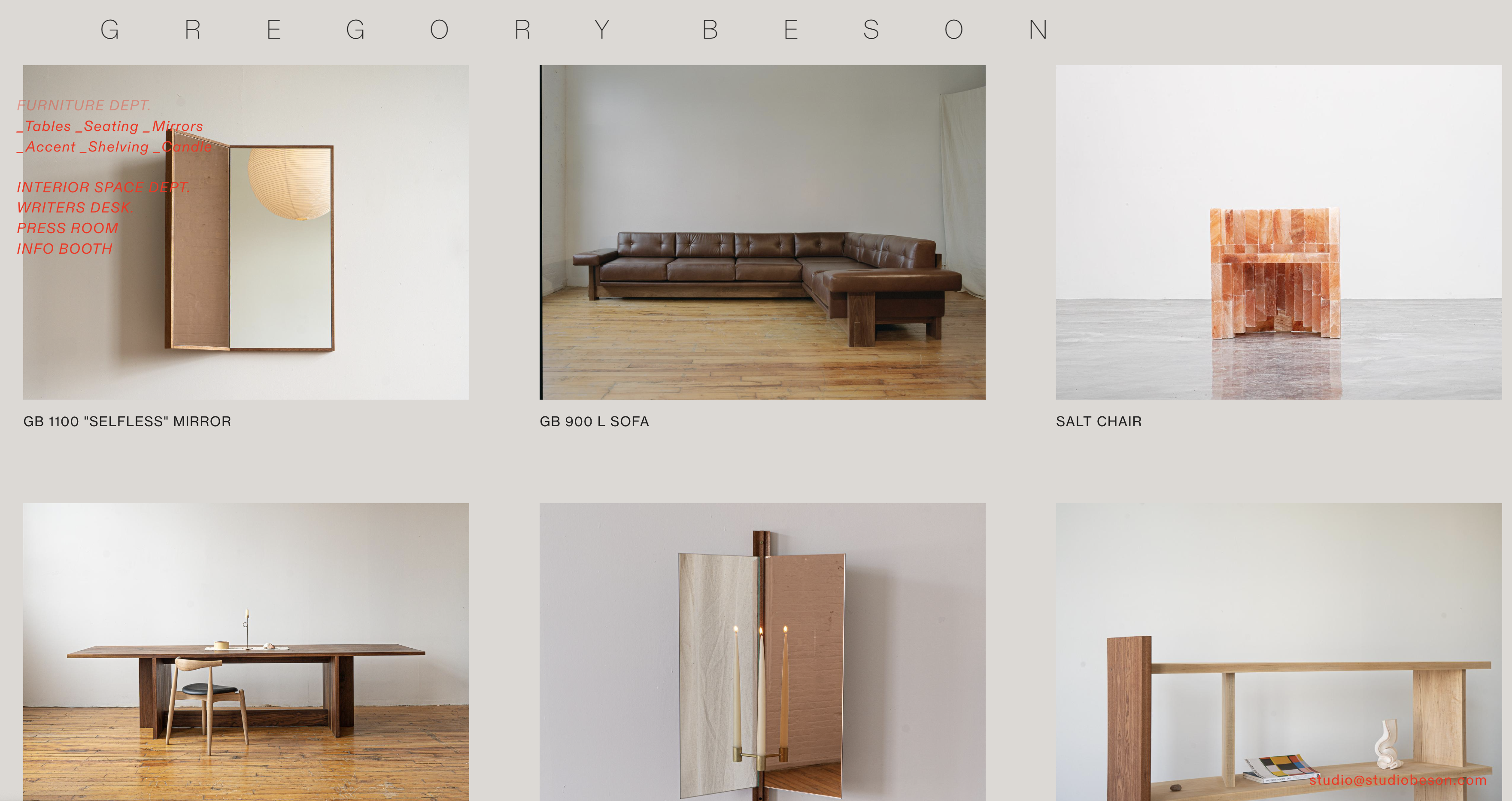
Pros:
- A lot more space between images helps to emphasize the products
- Easy to navigate, with very minimal words, helps to create a very fluid and quick viewing experience
Cons:
- The homepage is close to being empty, so users might be confused as to what the contents of the website entail.
- The menu page overlaps the images, and the designer's name is moving from left to right as if it was a billboard; it’s a viewing distraction.
Thumbnails and Sketches

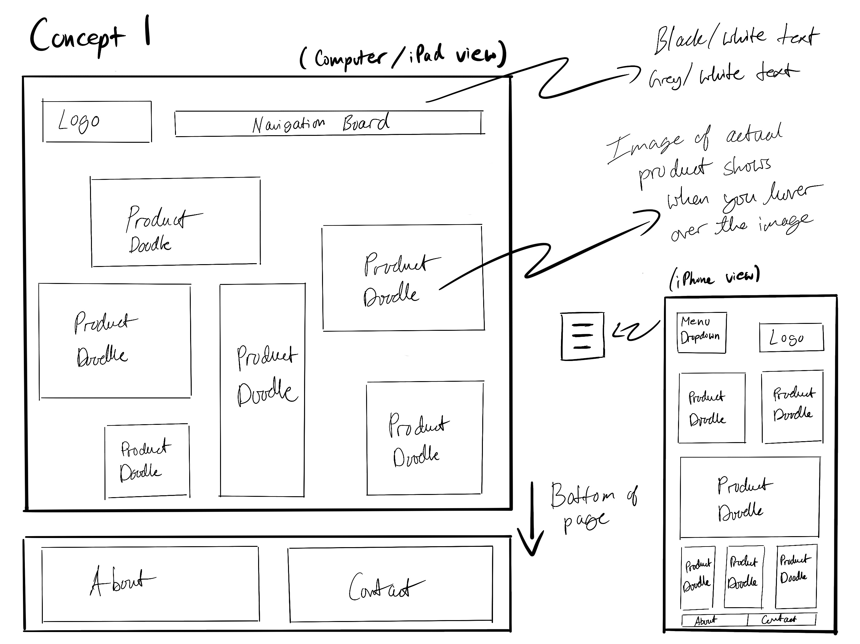
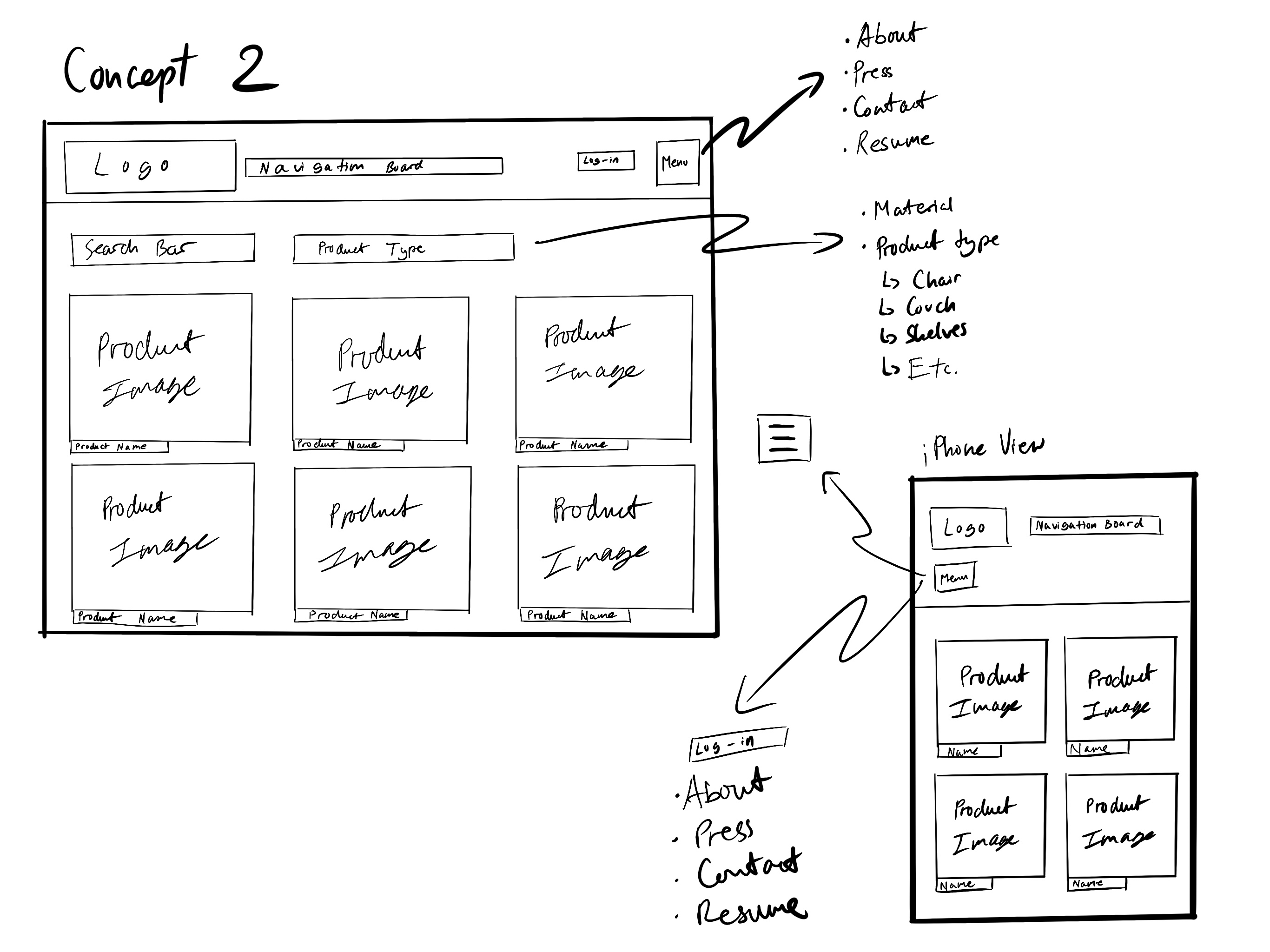
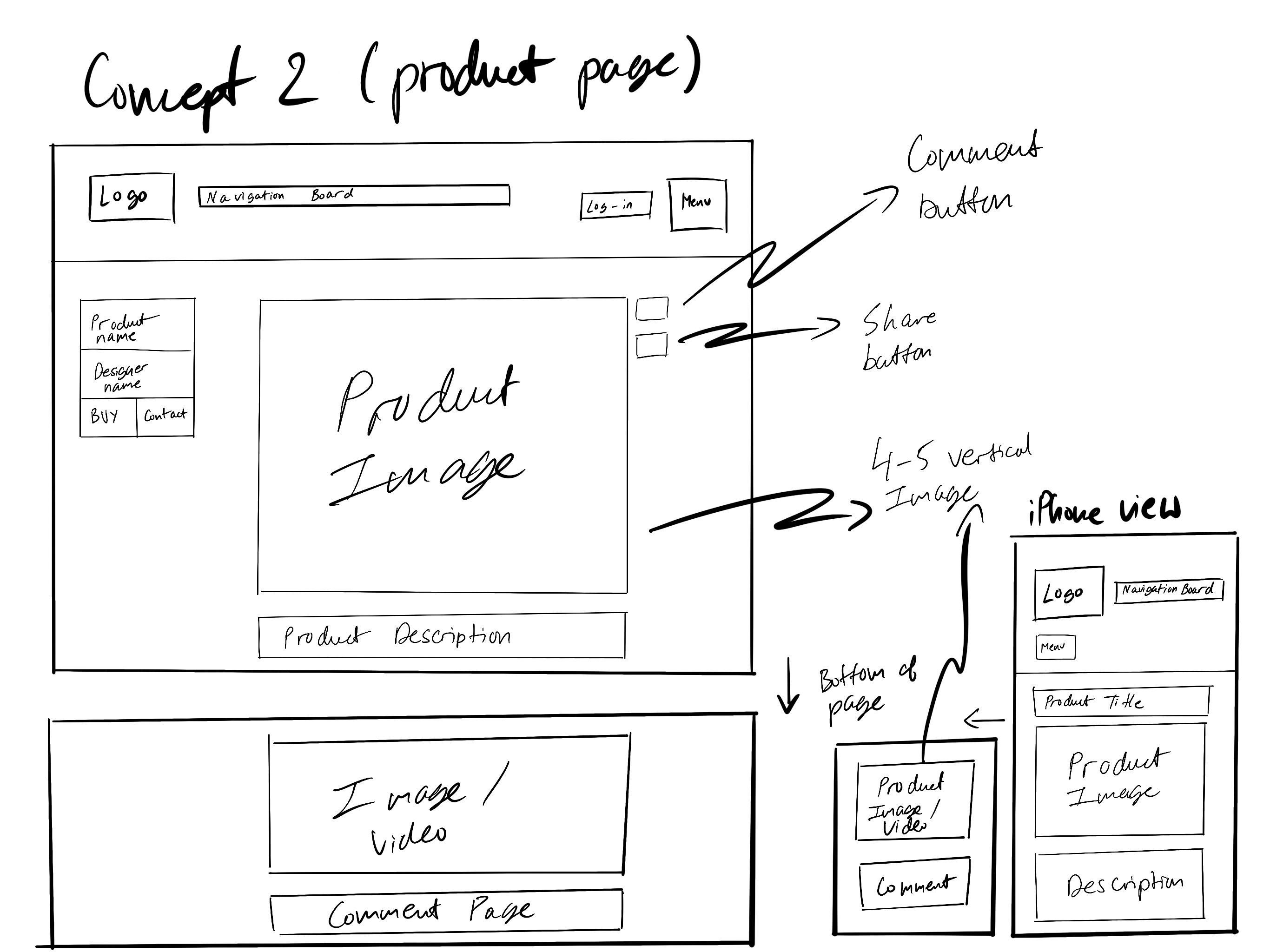
Wireframes and Prototypes
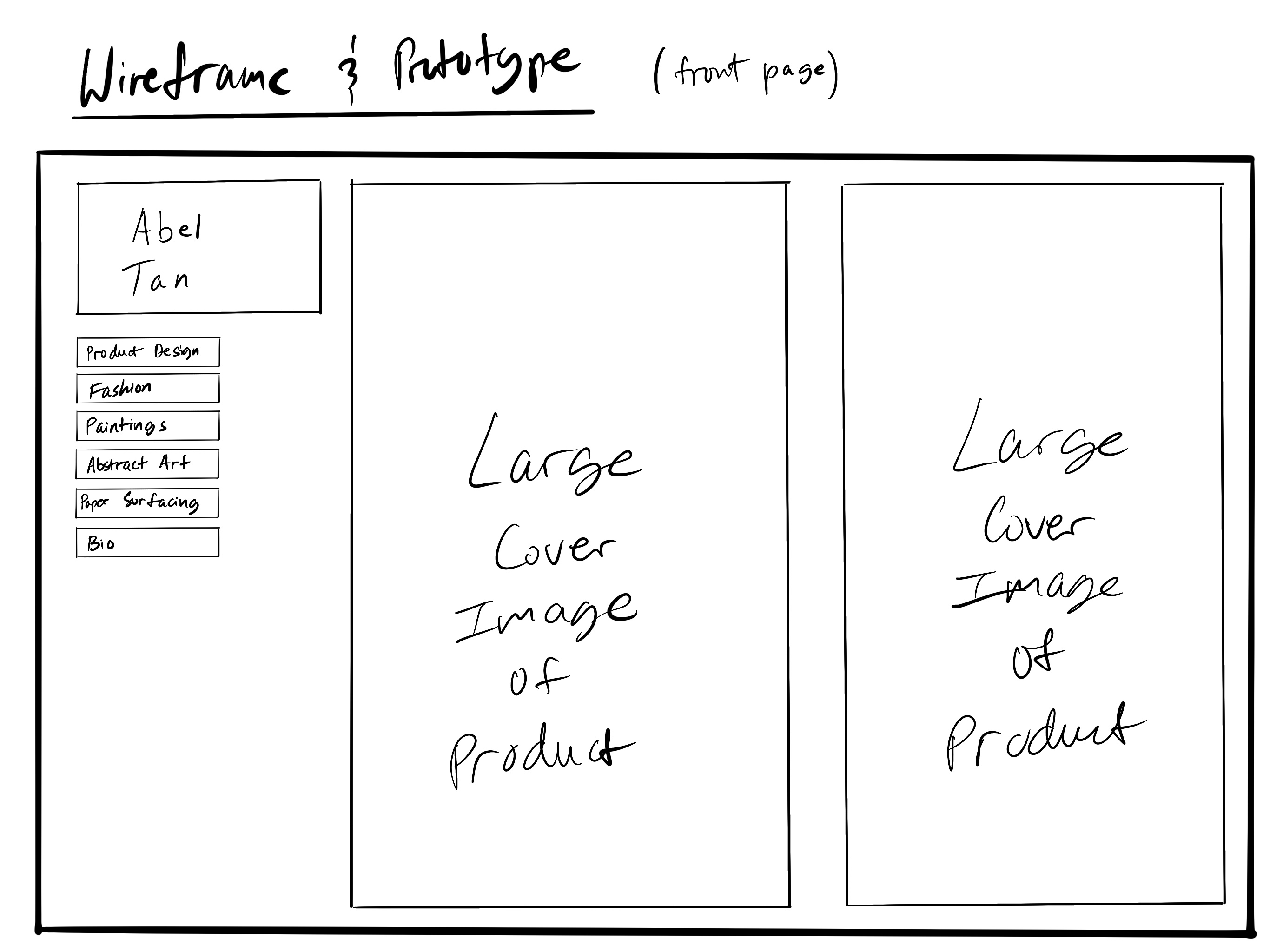
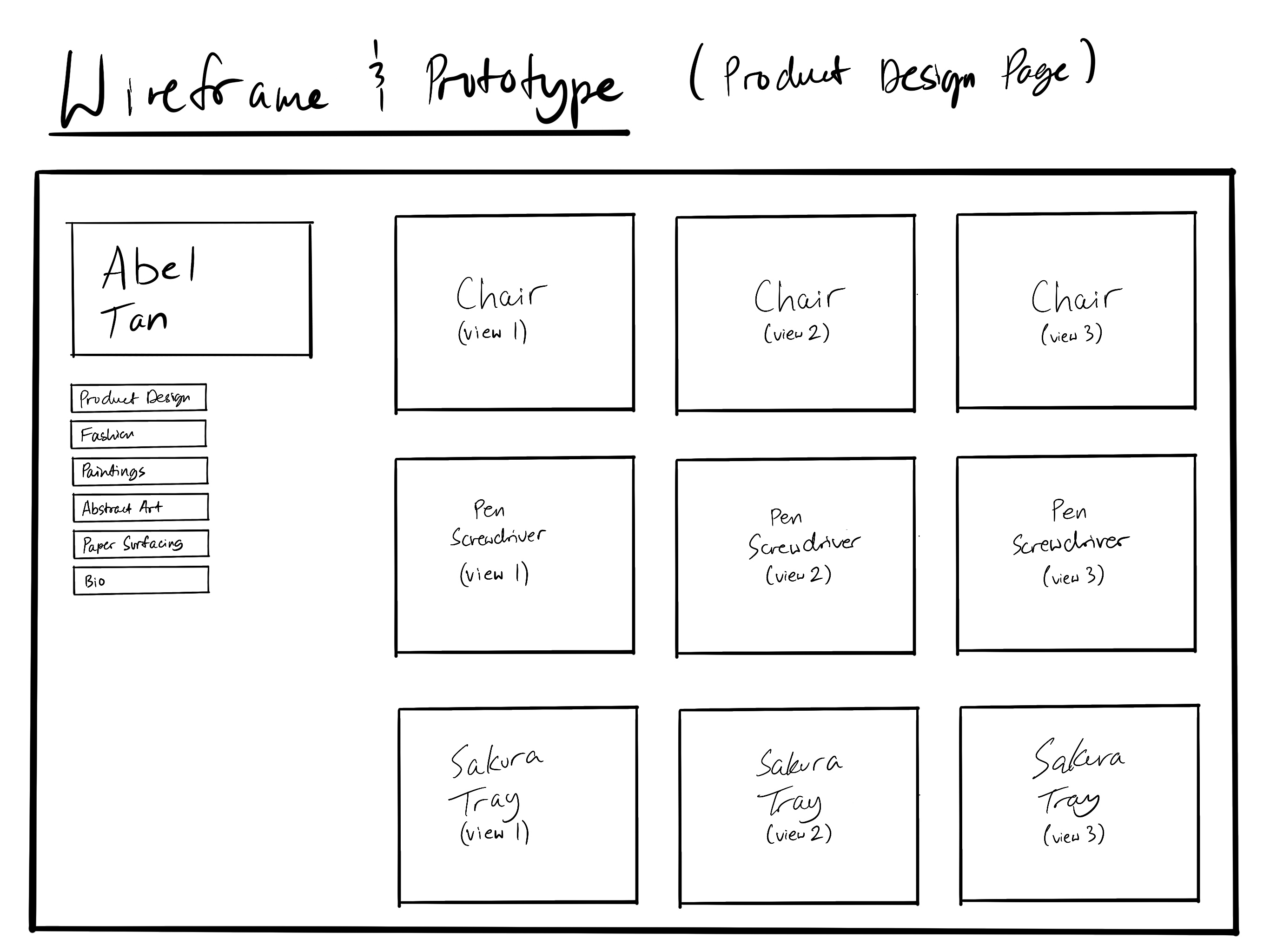
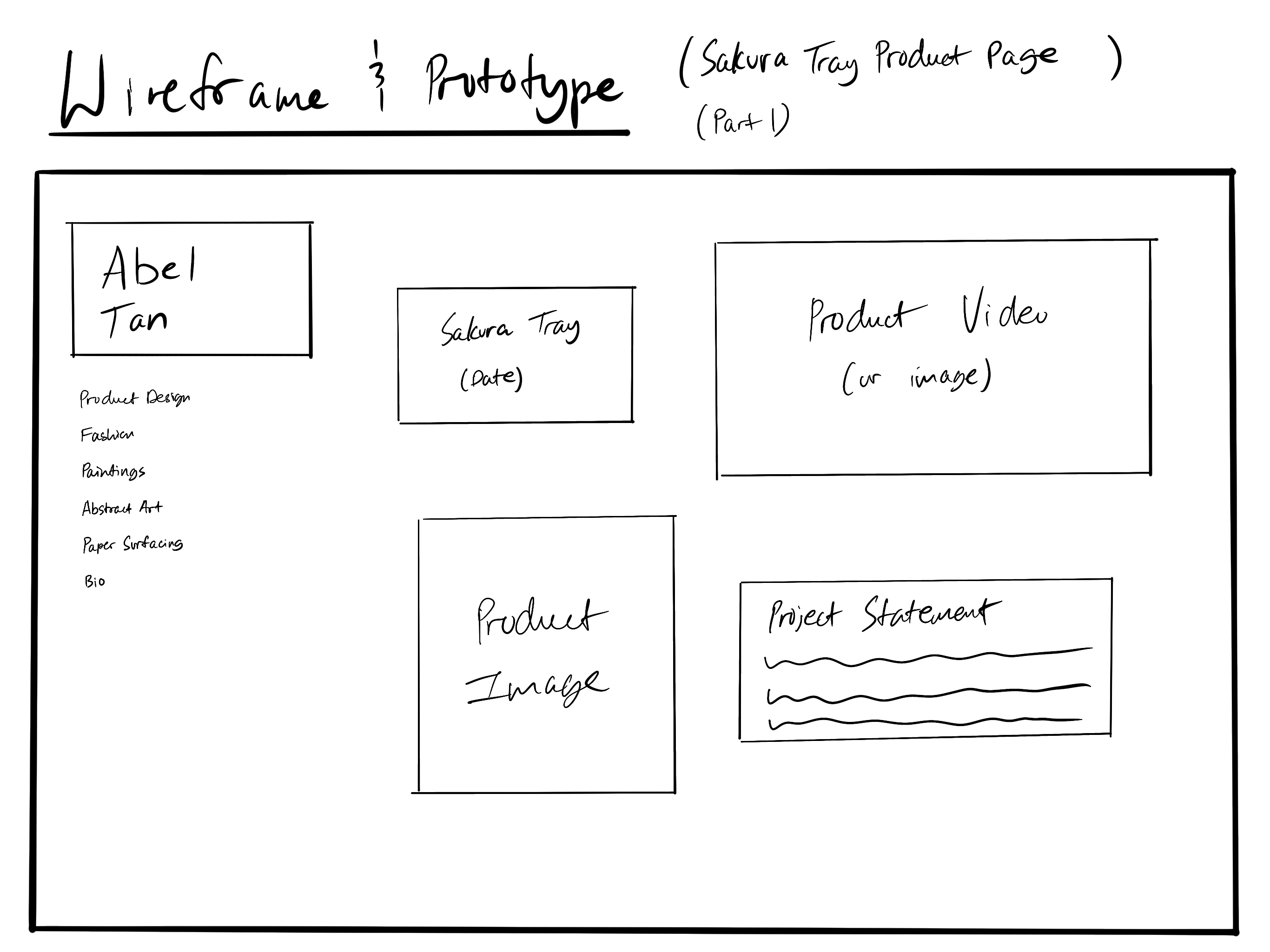
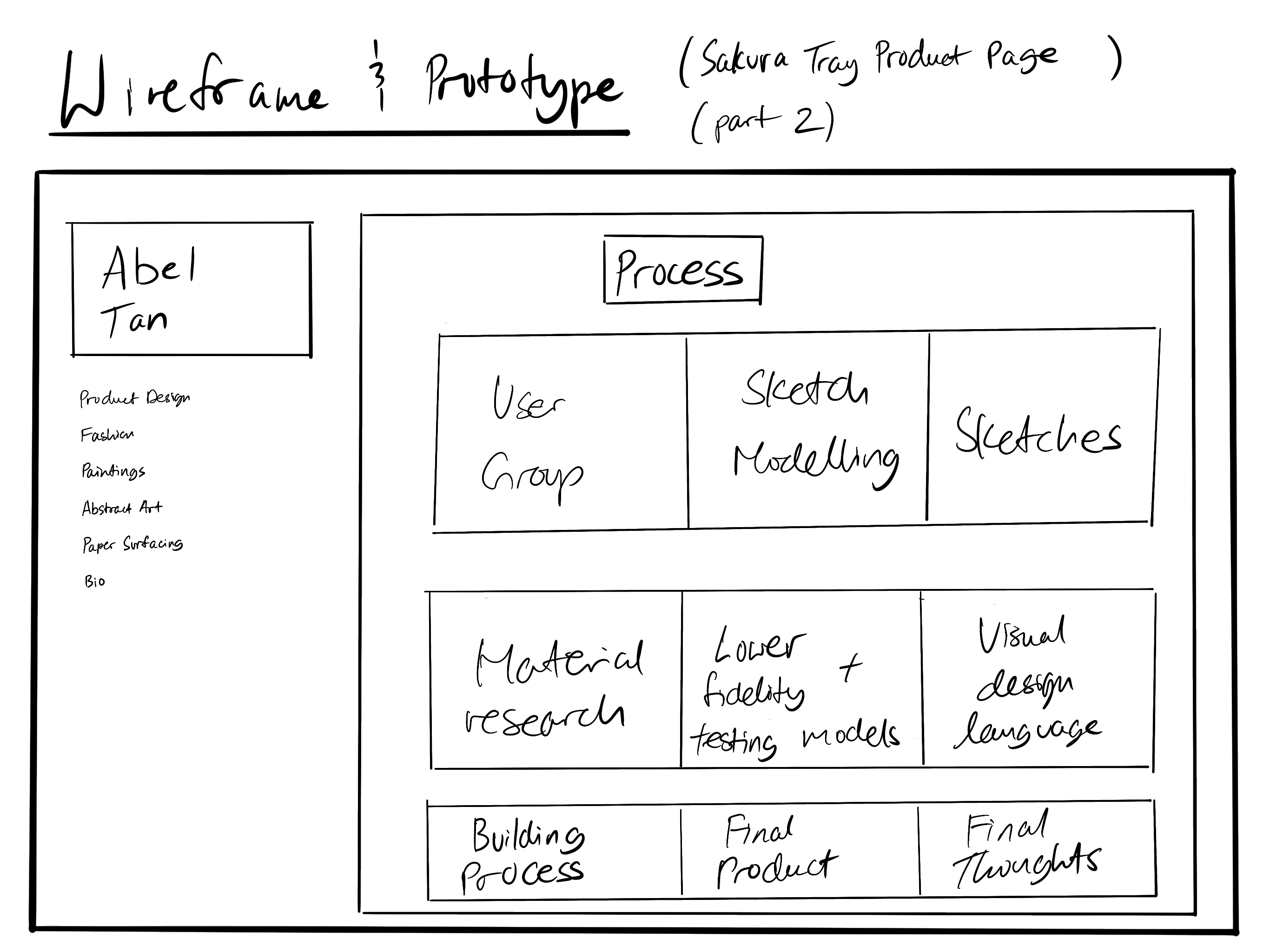
PhotoShop Comp
