I am rose blake dot com
digital style guide

Table of Contents
Intent:
To provide a portfolio for potential employers and to sell prints (self promotion).
Voice:
- Objective
- Straightforward
- Colorful
- Editorial
- Illustrative
Tone:
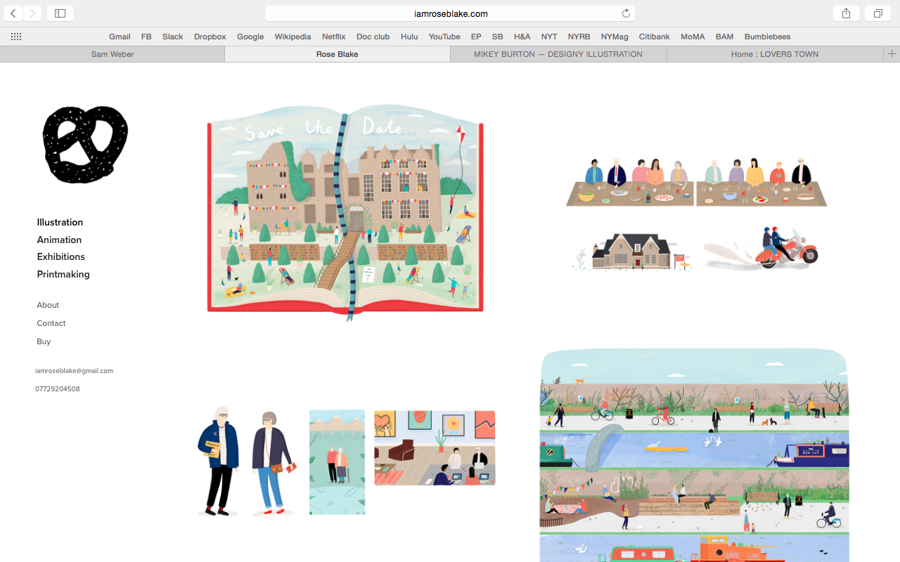
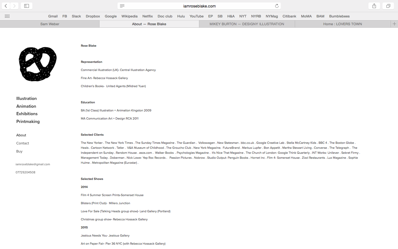
The tone of Rose Blake’s website changes from page to page. The landing page is illustrative and welcoming, with a large image that is being highlighted and limited text, yet the about page is cold, text heavy and informational. The tone reflects a removed author who is aiming to be objective about her own work and display it in the most effective way possible. For example, there is a lot of white space around the images and animations appear one by one above the fold.
Title
The title of the page “Now I am an artist” evokes a sense of ownership, strength as an artist, and personality that we don’t necessarily get in other parts of the website.
Landing Page/Illustrations/Printmaking
These pages are essentially the same. This page has a simple element of interaction that makes is extraordinary, which is the choice to view as a single large image or a series of thumbnails. It’s often a choice that a designer must make between these two things when designing the page, but she has given the choice to the user.

Animation
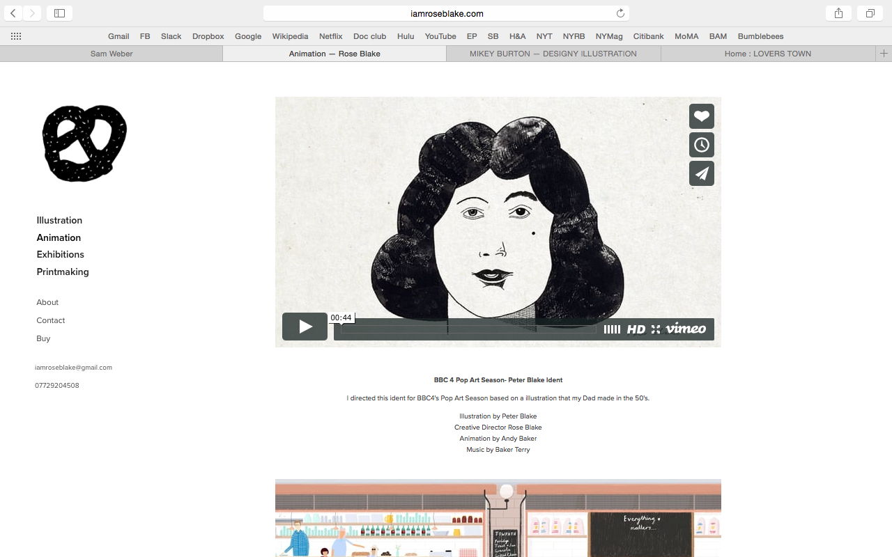
This page is straightforward, with the videos large enough, but not too large, and with a short description of the work and a list of credits.
Exhibition
This series of images are vivid but there isn’t an explanation or statement of her exhibition. However compelling the images are, they leave the user wanting more backstory.
About
The about page is informational, with just a resume and CV. The image and the text should be flopped and there should be a statement from the artist. There is too much of a gap between the quirky fun tone of the work and the cold, informational writing.
Brand:
The brand is only consistent visually and otherwise it is not established at all. The landing page should at least have the authors name, and if the pretzel logo is used as a mark, it needs to be associated with the artist’s name in at least one place. Otherwise, the toolbar on the left which is present throughout each page facilitates consistency in the application of the logo.
The brand itself seems to have two sides: professional and playful. The images themselves are warm, approachable, naïve, yet the voice of the text is professional and straightforward. The site could be improved by more written text that reveals the author’s personality.
Persona:
Artist/Designer
Morgan Taylor, a 28 year old graphic designer, is surfing the net for inspiration for her first silkscreen design. She stumbles across an article in Print Magazine about the best up and coming graphic designers under the age of 30 and scrolls through the link, semi-engaged and partially asleep. She sees the name Rose Blake and thinks of William Blake and his poem about the rose and the worm and wonders whether they’re related. Her interest is piqued bu the images she finds on the site, that are humorous, colorful and illustrative. She decides to use a similar color pallete as Rose for her first silkscreen design.
Buyer
Thomas, a forty two year old owner and operator of a small gallery in Portland, loves cats, needlepoint and veganism. He’s just moved in with his boyfriend and wants to brighten the space in the kitchen. He comes across Rose’s name on a site where her art is for sale and is enamored; he has to have one of her prints. He goes to her site to contact her and see if she has anything new for sale. He still has the print, but has moved it to entryway so it can be the first and last thing he sees in the house.
Potential Employer
Suzie has to get the best, most trendy, most “it” designer to illustrate the look book for the newly-launched spring campaign at her fashion company. She’s 53, divorced, and likes her martini with two olives. She debates between Rose and another designer, Timothy as she stressfully prepares for her meeting in the morning with her boss. Ultimately, after visiting Rose’s site, Suzie decides that her professionalism and the colors in her work make her the best option for the look book. She contacts her and the spring campaign turns out to be a hit.
Copy Deck:
Nav Bar
- Illustration
- Animation
- Exhibitions
- Printmaking
- About
- Contact
- Buy
- iamroseblake@gmail.com
- 07729204508
Title: Groucho Club- Hay Festival
Caption: An illustration to promote the Groucho Club's pop up at Hay Festival 2015.
Competition:
Rose’s site has the interactive element in which the user gets to choose whether to view her work as thumbnails or large images. This element puts her ahead of the competition. The site is not too busy and it’s not overly text heavy. Where Rose’s site could use some help is the branding and self promotion through adding her name to the landing page and adding more of a personal statement to her about page.