Problem
Design involves a lot of factors. Concept, process, research, inspiration, trial and error, failure and success. How do we present these complicated, multi-faceted ideas in a clear way? Through simplicity, through interface, through layout, by catering to the user and not imposing ourselves on the design. Start simple, then add dynamic elements to the simple, compositional starting point.
Main problems:
- simplicity
- design approach: how to integrate?
- color: balance the artwork but create brand consistency
- consistency: in layout, color, concept, brand
- animation: to create dynamism
Olympia Zagnoli
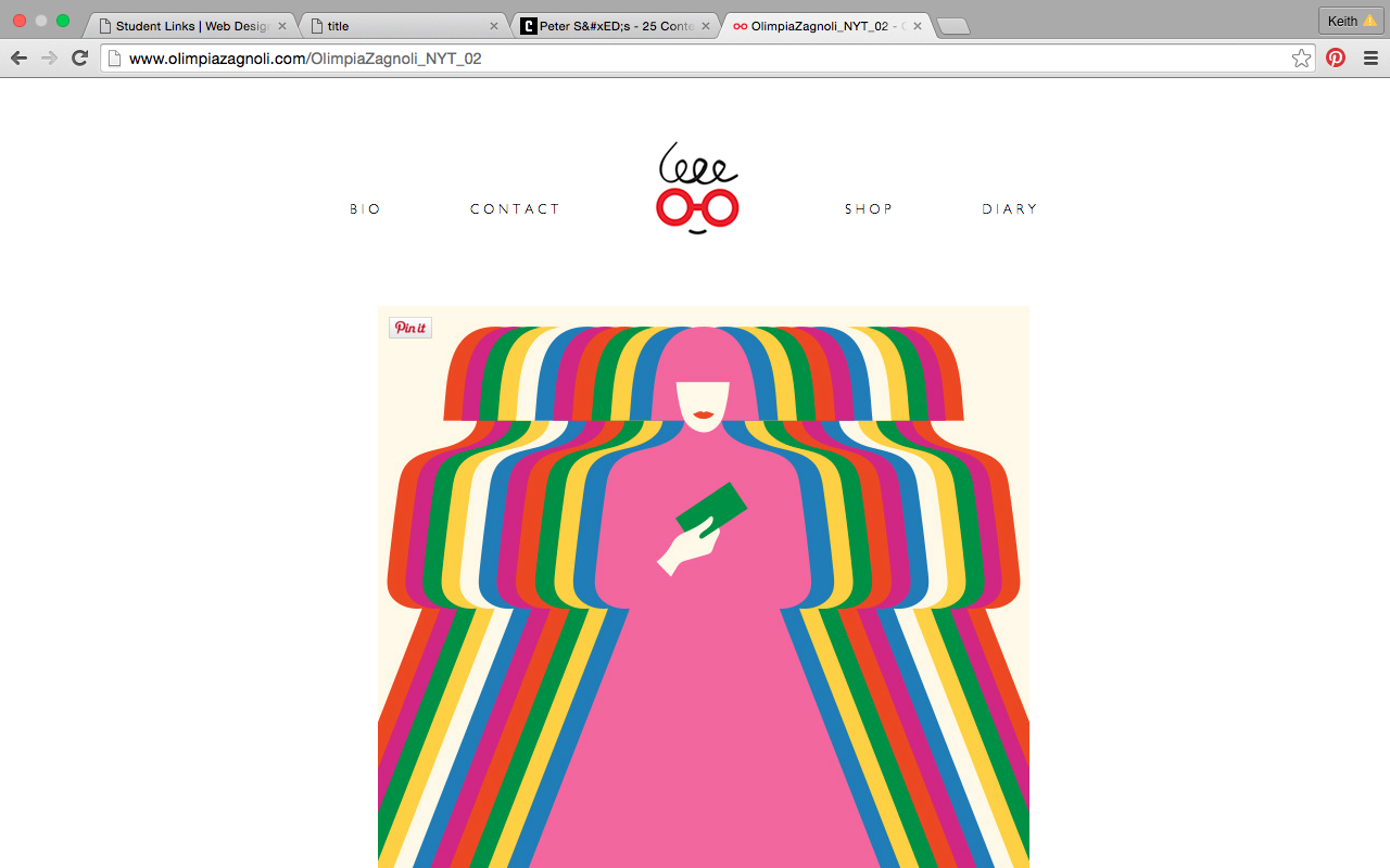
The layout is centered, but the white space around the grid gives space for the illustrations to breathe. Simple, without much explanation of the projects, which could use improvement. The about page is really nice with a third person explanation of OZ, Olympia Zagnoli, and a nice way of branding herself. It’s a nice snapshot of her (both the image and the description) and it’s graphic. The diary links to instagram, which is a nice touch. The work is always beneath each page, which allows the client a reference point to their work at all times.
Ben Wiseman
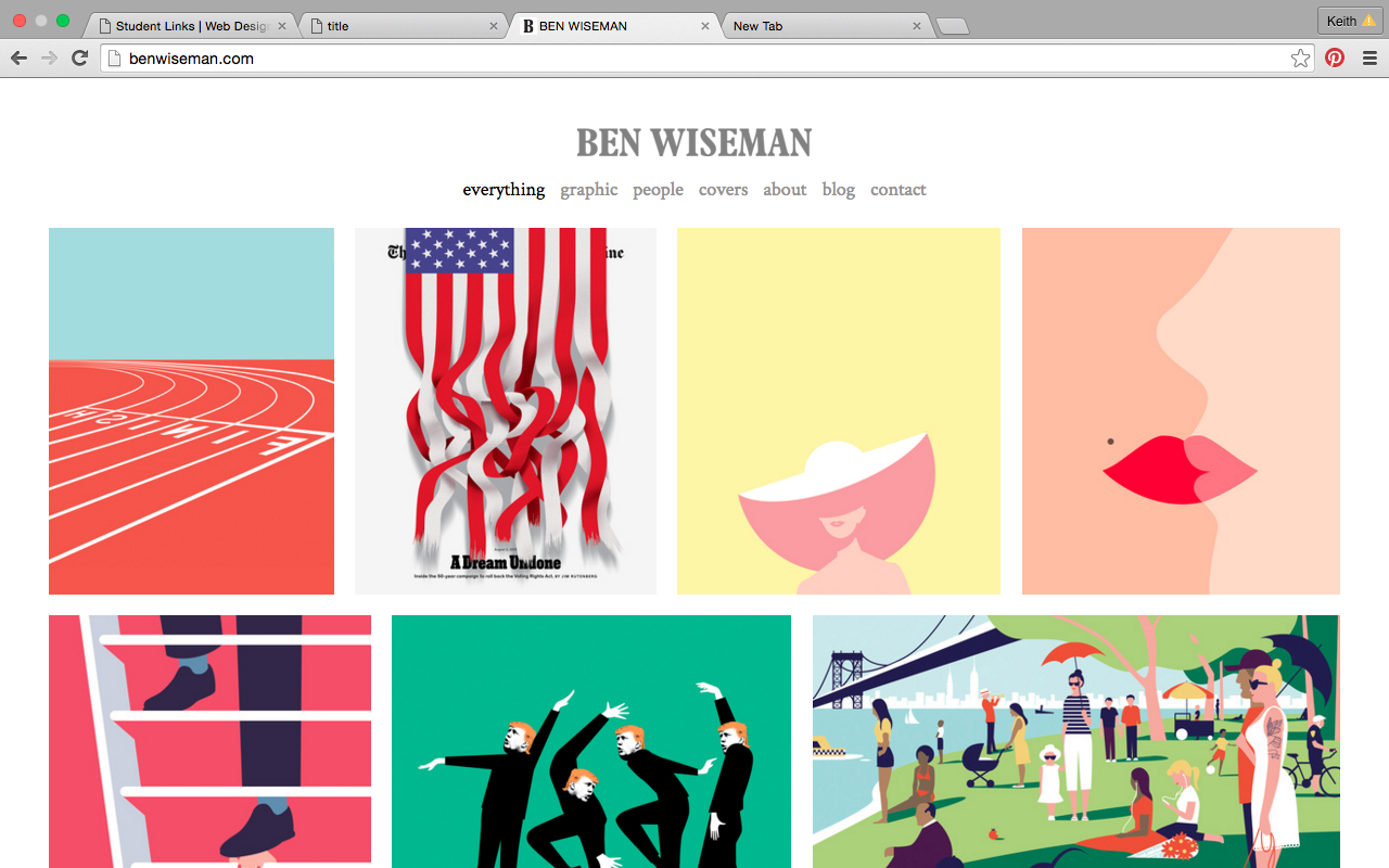
Similar to Olympia’s approach. Ben uses a simple layout on a grid. The work looks good, but not enough explanation again and he shouldn’t have a blog unless he actually uses it—it’s just an extension of his portfolio.
Mike Perry
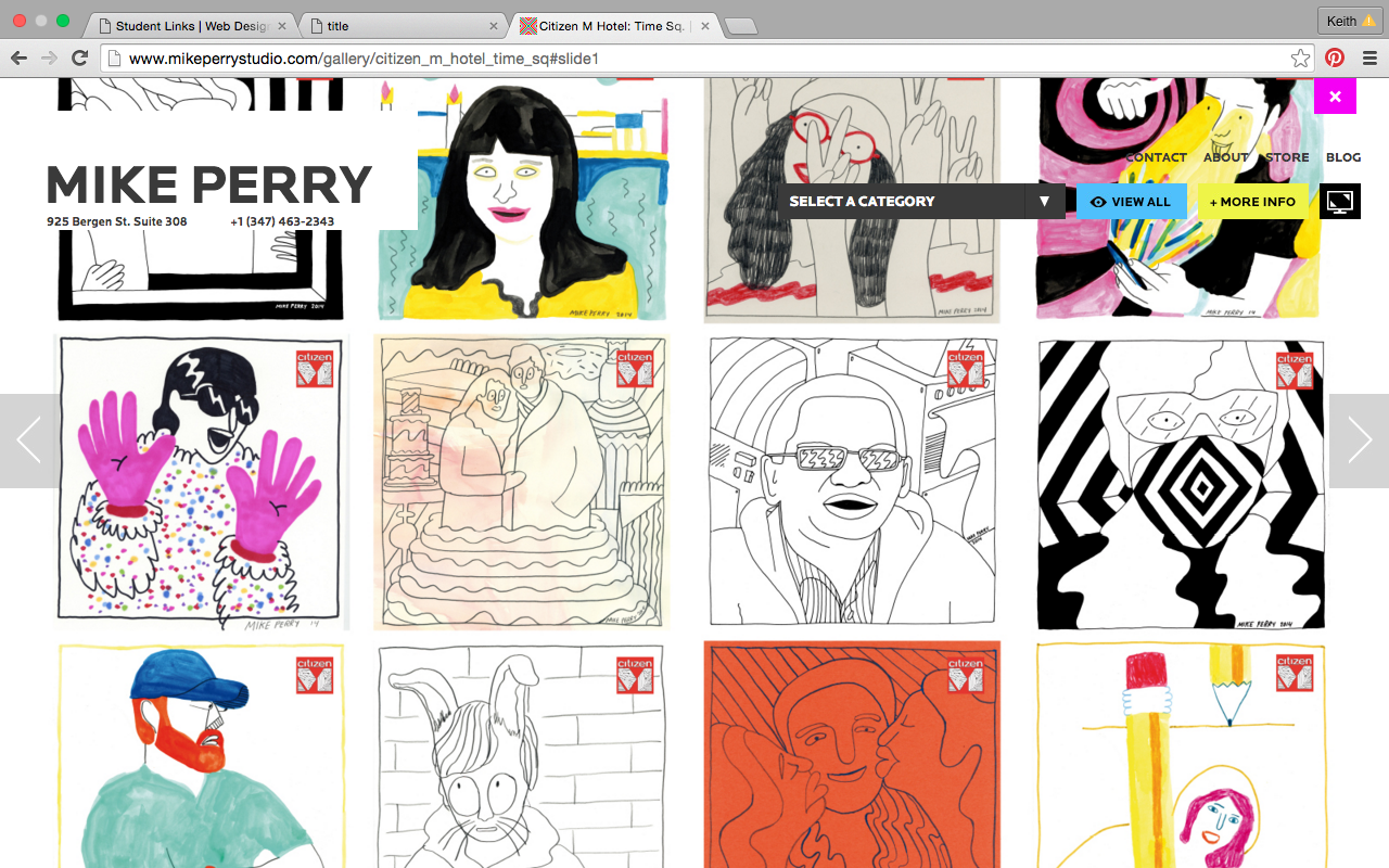
He adds animation to his gridded layout, which adds dynamism and white space. When you click on the work it goes full bleed which works nicely for his style but I don’t think it will work for me.
Amber Case
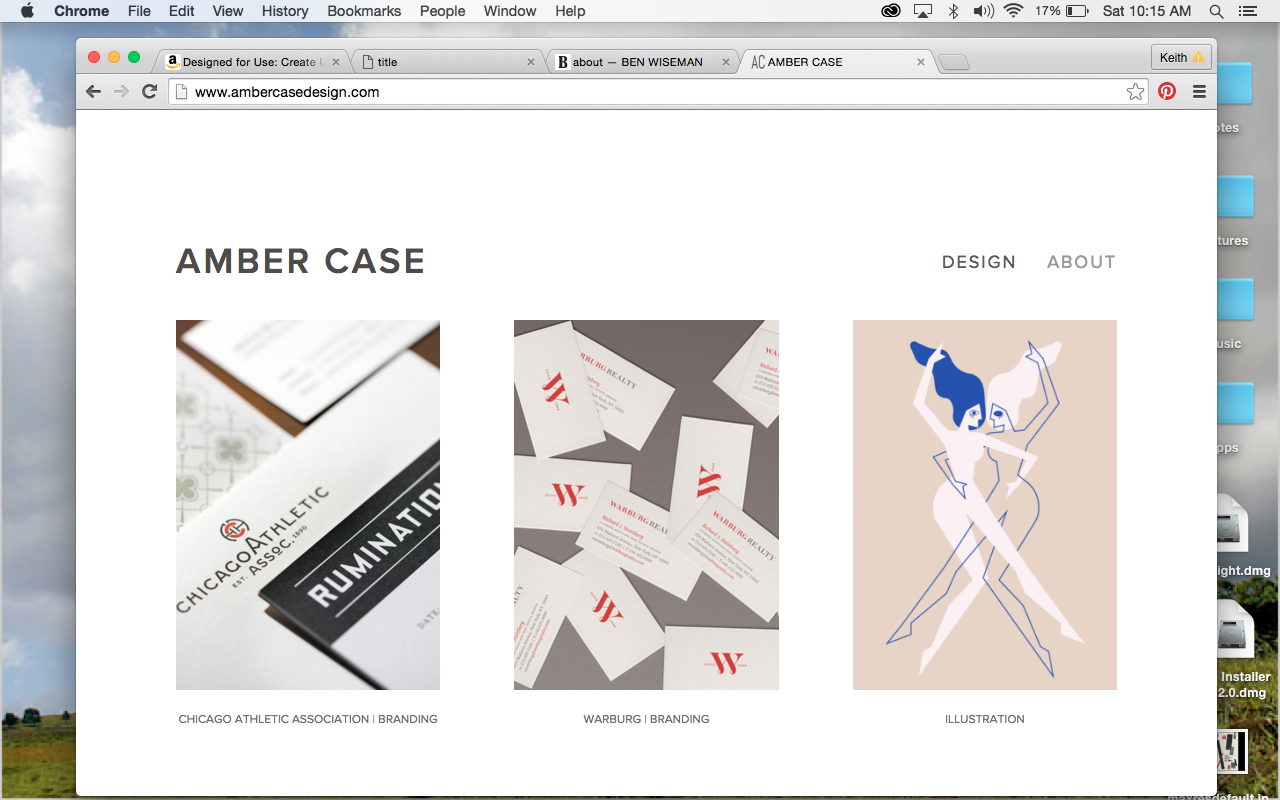
Amber Case’s website includes a description and its left aligned. I think a left aligned website would work well for me because on one side of the page I can include an explanation of the work and the process.
Inspiration
Pentagram
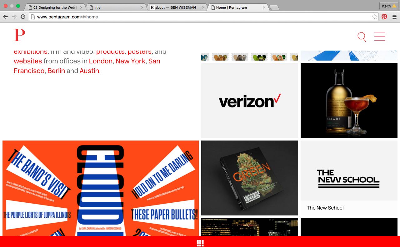
When you scroll down the page the work Pentagram on the left turns into a P and the right becomes three lines—it becomes more simple, which is a really nice touch. On the landing page you get the approach, which is left aligned and works well. I would like to include a typographic element on my site.
Mucca
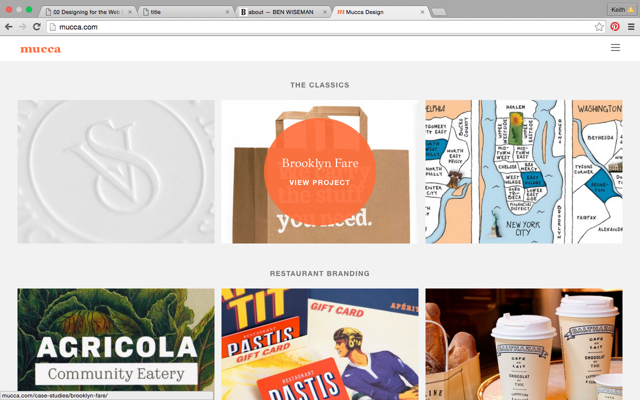
The branding in this site is fantastic. The orange and the element of the circle is used in innovative new ways through the website and creates a visual narrative. The toolbar is nice that the word “mucca’s” travels when you hover. Integrated movement adds dynamism. It’s like the website is talking to you, and has a bit of wit to it.
Moodboard
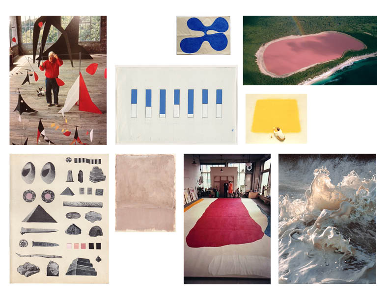
Thumbnails
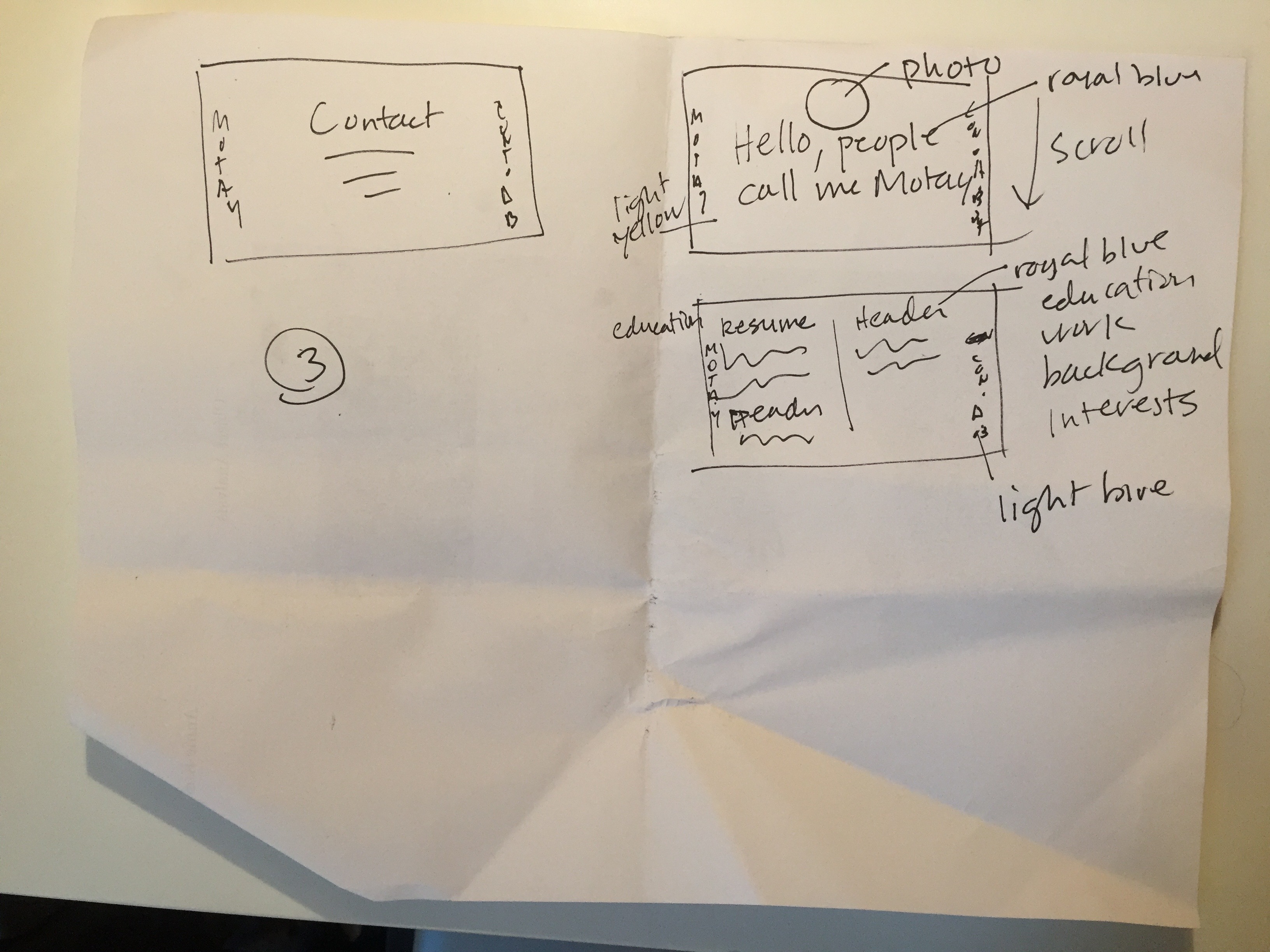
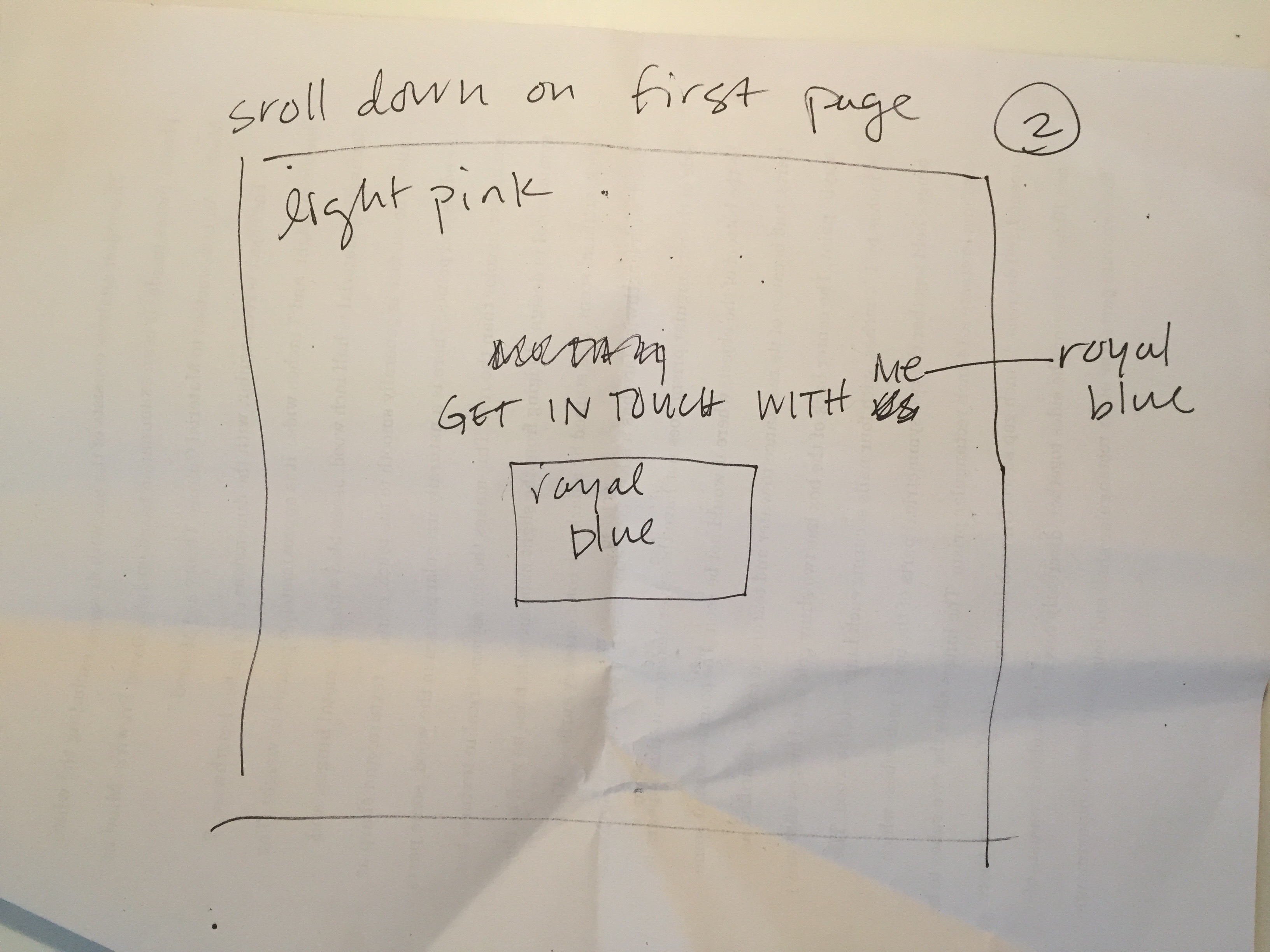
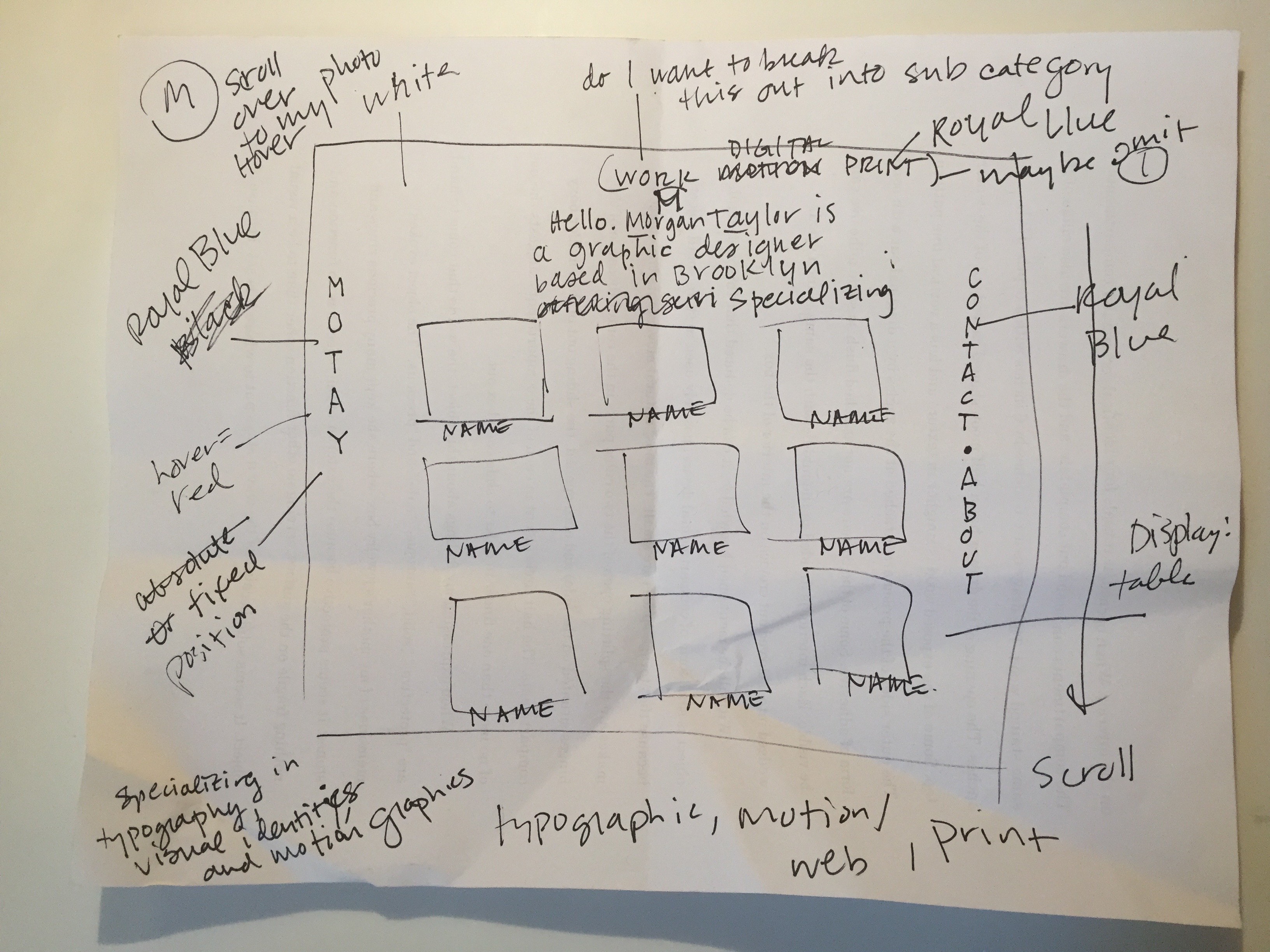
Wireframes
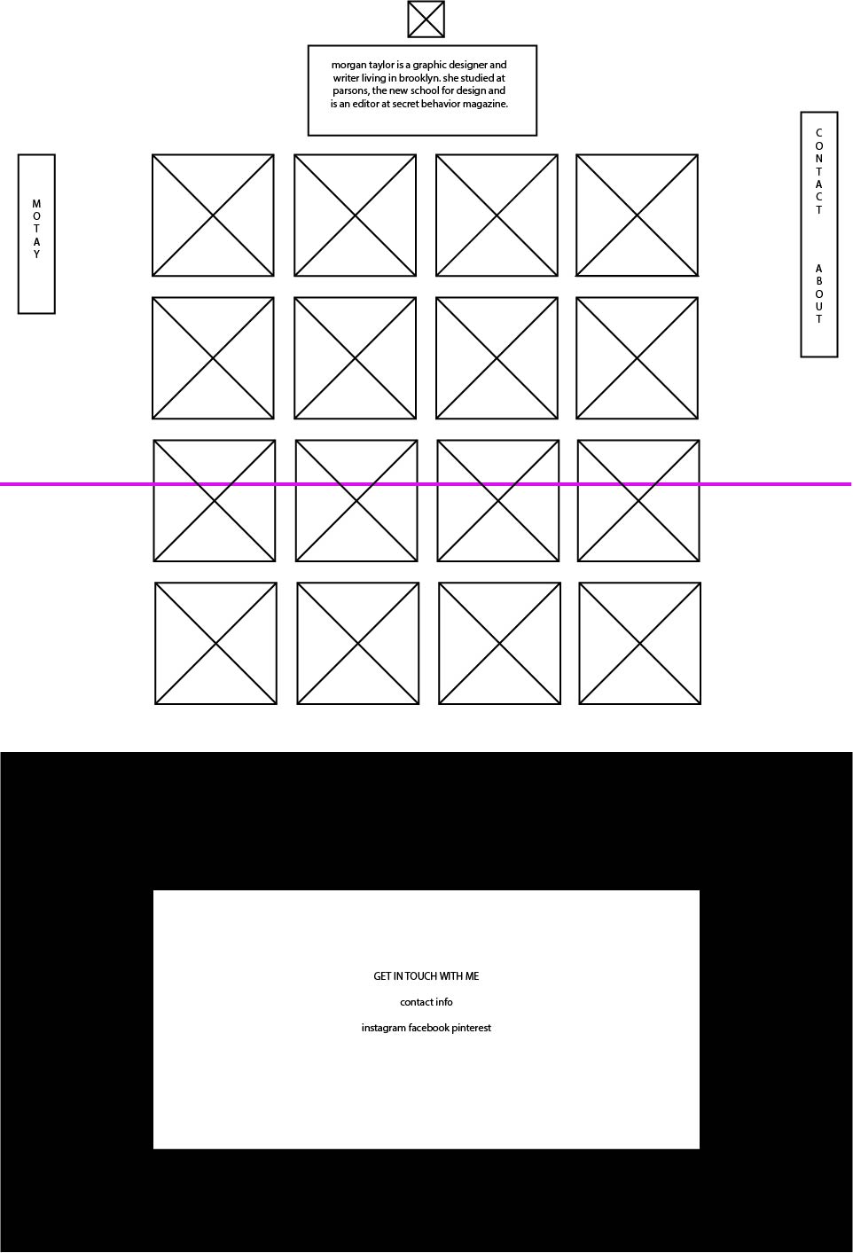
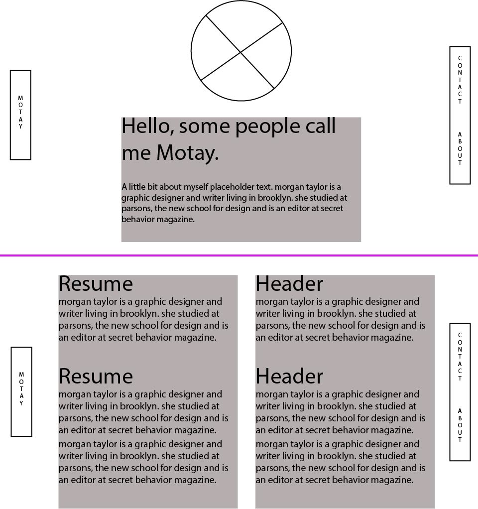
Photoshop Mockup
