Problem
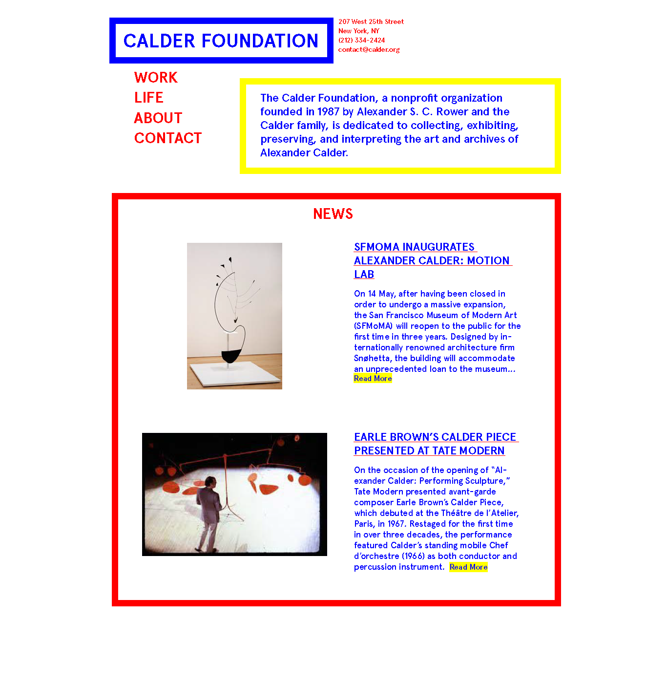
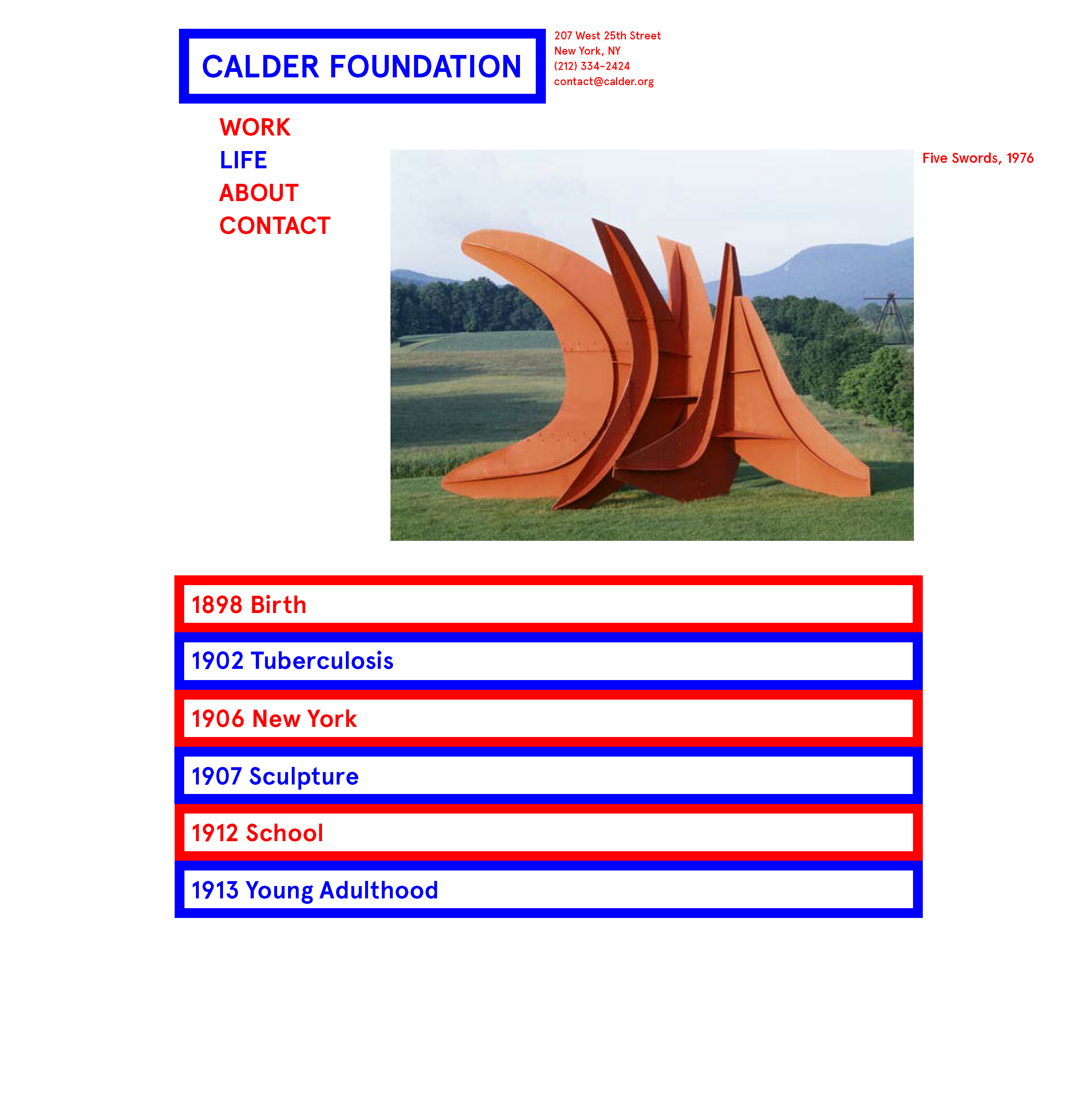
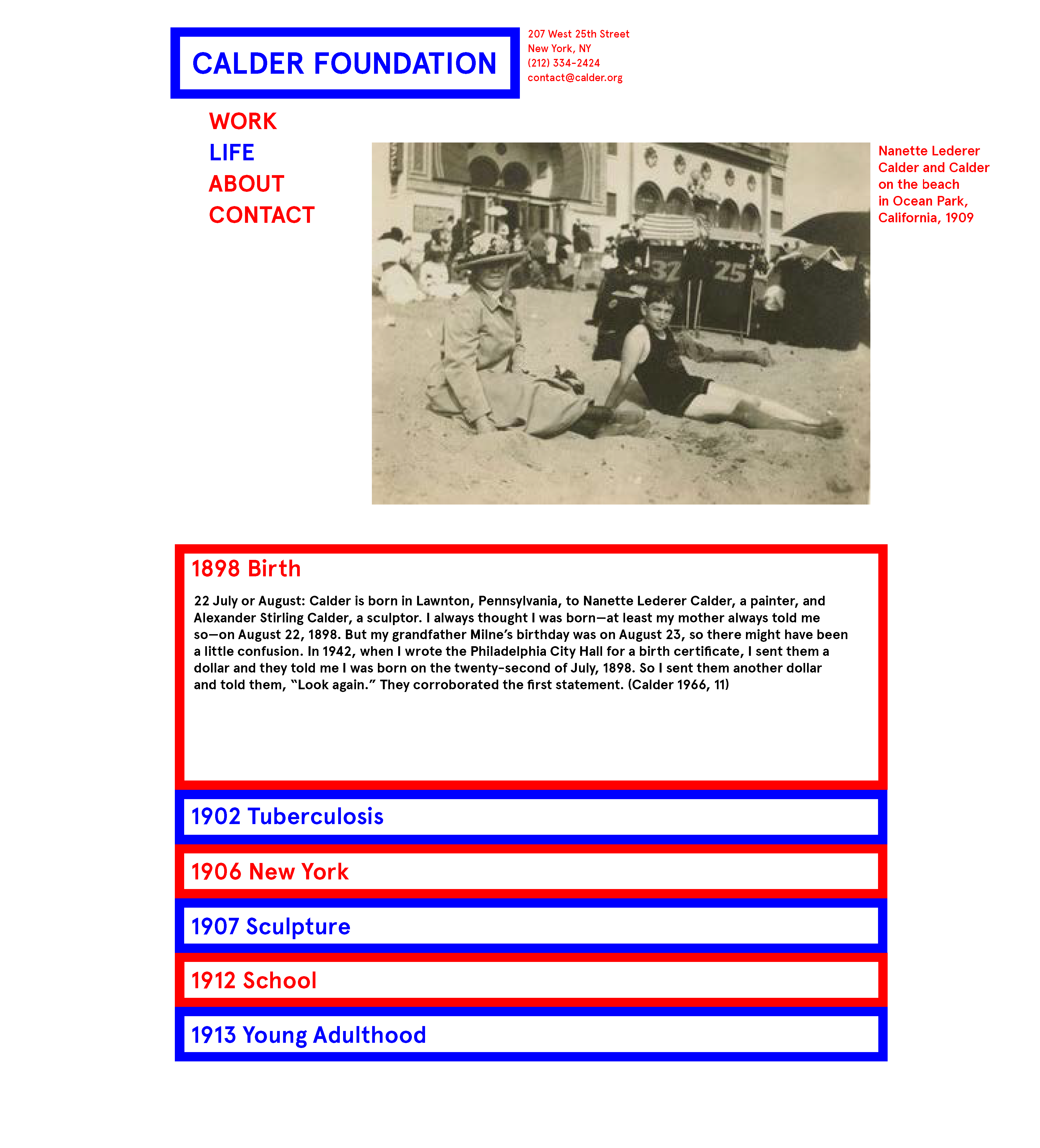
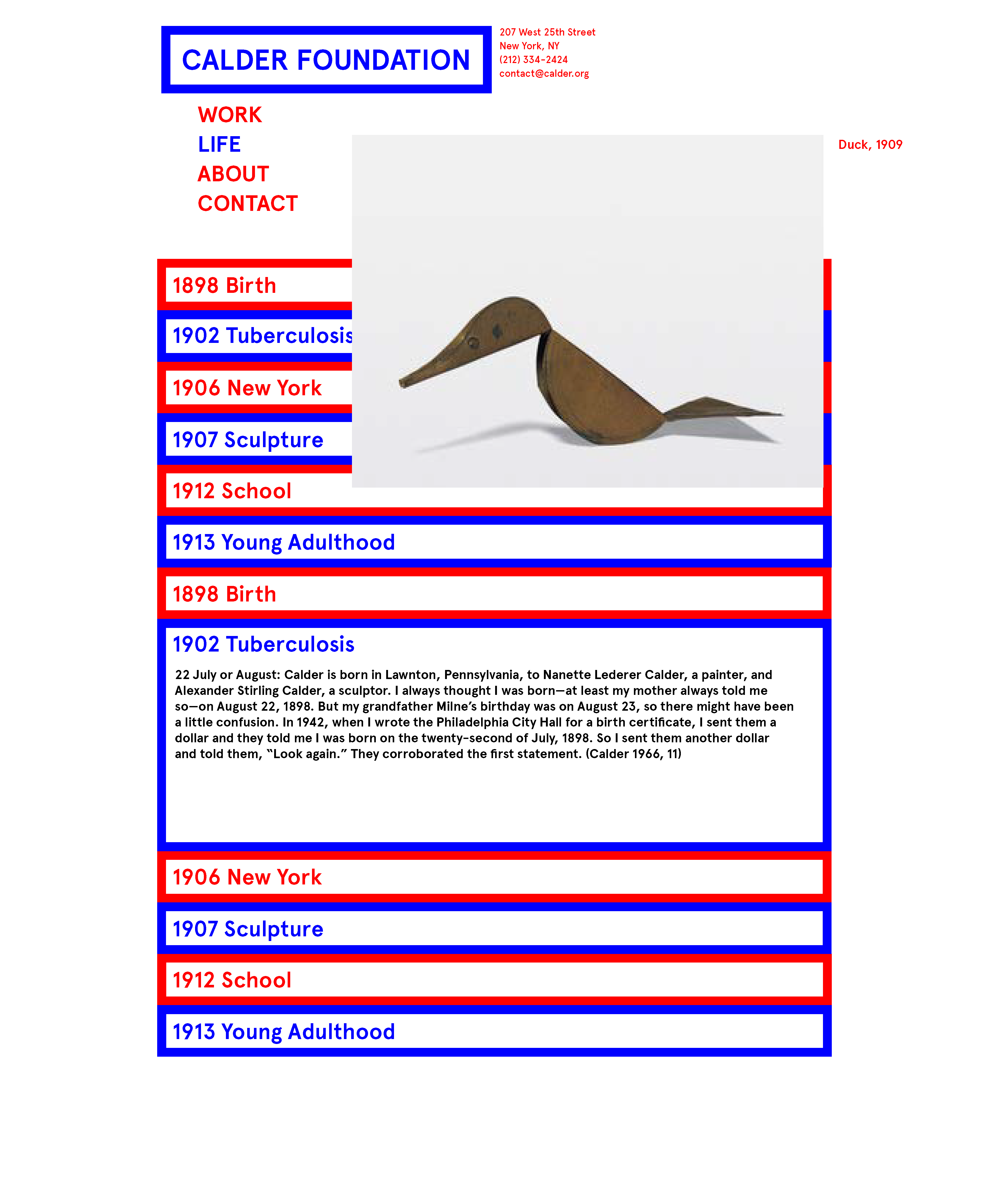
The mission of the Calder Foundation is to preserve the artworks of Alexander Calder and extend his legacy by providing information. They work a lot with photo rights and making sure the artworks are both displayed the way in which calder would have intended. The main problem with the site itself is that there is a lot of information, both visual and textual. The biography and chronology of Calder's life is broken down into a photo biography and a written chronology -- these are on two separate pages. I would like to combine these elements in a dynamic way.
Agnes Martin Foundation
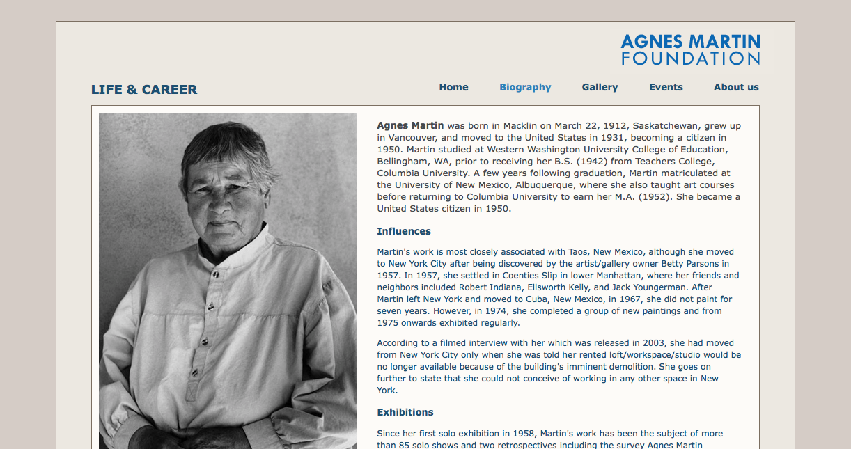
The Agnes Martin foundation is a relic that uses very simple code that is not very dynamic. The layout is static and uninteresting and there is not an aesthetic to the page. It seems that there was little thought put into the design and the navigation and the objective was to have a website, not to have anything more than a landing page and a little information that functions.
The Pollock-Krasner Foundation
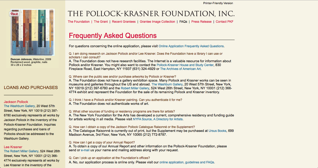
It seems that these artist foundation websites tend to have a theme--print design applied to the internet. The Pollock-Krasner foundation could just as easily have been a PDF.
Andy Warhol
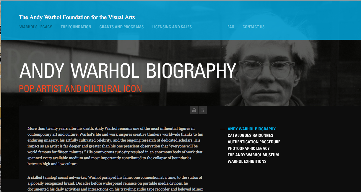
This is one of the better cases of print design applied to the internet. There are images integrated into the text in an editorial way to take a break from reading. It's refreshing.
Dia Art Foundation
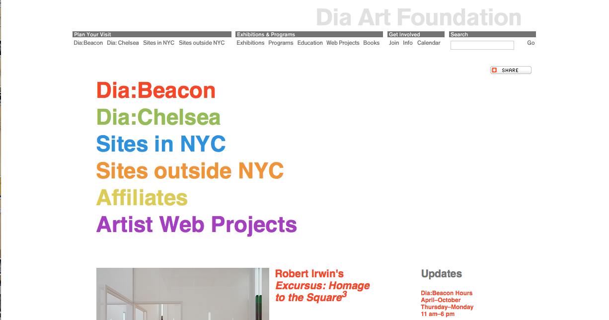
Dia Art Foundation is a great site with really nice branding as well. I love the use of color on this site. The grey of the foundation logo with all the subheadings in different colors, and with those colors applied to the nav, is a really nice thoughtful touch. The nav itself works really well and is very organized.
Inspiration
Linked by Air
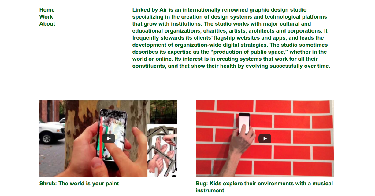
Linked by Air has created sites for many art world organizations, including The Whitney. I love their use of color, their aesthetic references to early internet technology and the playful intuitive sites that anticipate how the user will respond and interact with the page.
Tang Museum
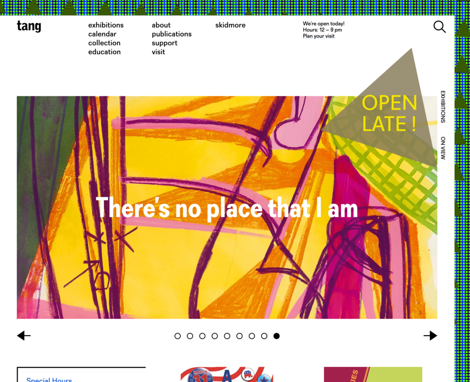
This site is so innovative. The pattern in the background is determined by the amount of page views each day on and off campus. I love the use of typography and the large text used here.
RiEx
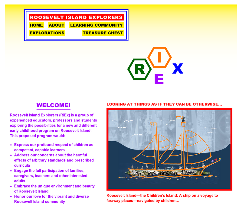
This site was made by Linked by Air for the Roosevelt Island Explorers. I love how playful it is, the use of color, the interesting and atypical layout. I love it all!
Thumbnails


Wireframes


Photoshop Mockup
