Introduce the idea.
I’m a visual designer from New York whose focus is at the intersection of graphic design and photography. I use my technical skills to craft compelling stories rooted in fashion and culture. My website is a personal portfolio with my work from the past three years studying at Parsons School of Design.
What are you selling?
I’m selling both my technical skills and my ability to direct projects that tell compelling stories with a strong visual identity.
This is the problem your website has to solve?
The problem is that my client is looking for a fresh, interesting visual designer to help them execute whatever project they have (art direction for a magazine, crafting a brand identity, executing an editorial fashion photoshoot).
How will the website solve the problem?
In the pursuit of solving their problem, they’ll see my website featuring all of the projects I’ve completed and feel compelled to hire me.
Is the proposal sound?
Yes.
How is it different from other, similar websites?
It’s different because of the way that it represents my work. The visual through line in most of my work will inform the design choices of my own personal brand identity present on my site.
How does it address the target audience?
My target audience is my clients. These are people from fashion brands, magazines, etc. who are looking for artistic voices to collaborate with on projects. These kinds of people are often busy and working fast, so it’ll be clear, easy to navigate, and to the point. No one wants to spend longer than they have to clicking through a website that's unnecessarily complex, so the simplicity of the layout will work in my favor.
Write down the problem you are solving and how the website will solve the problem. Include websites of similar products or competing products that helped you form your decision as to how to proceed in the work-sheet, as I will compare the pitch to the final website.
See above for problem solving.
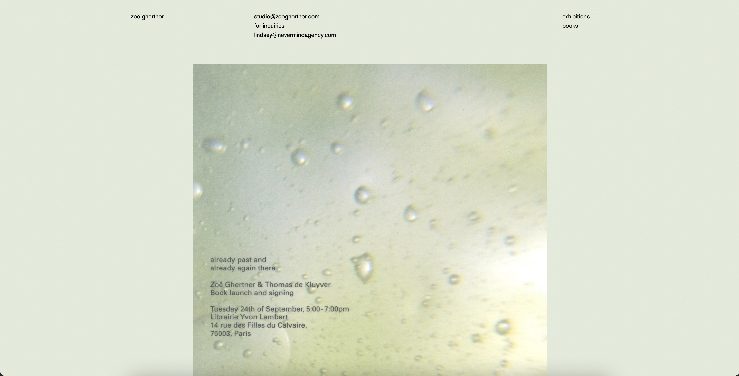
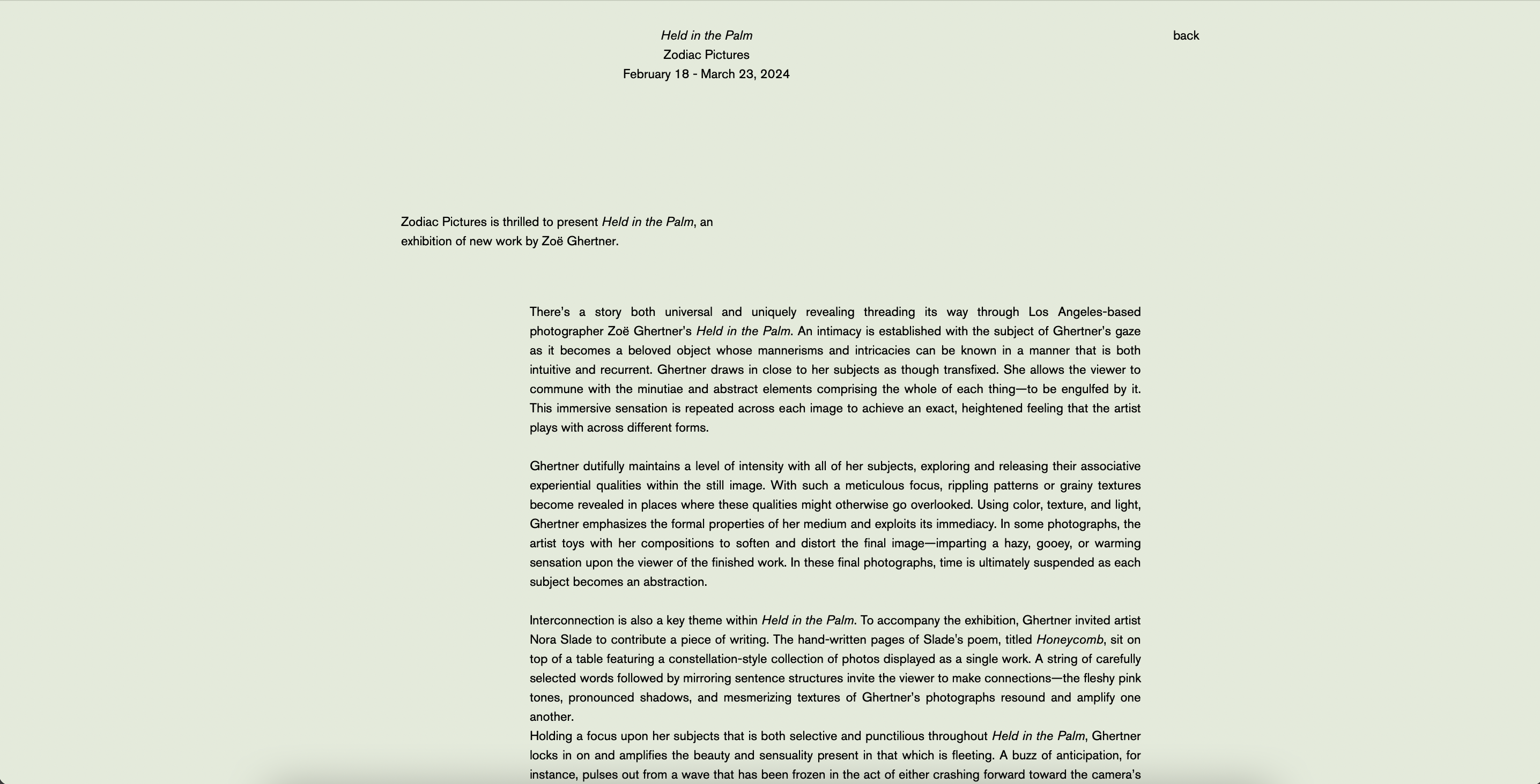
Zoe Ghertner's site is pretty plain, but works well in showcasing her stipped back style of fashion photography.
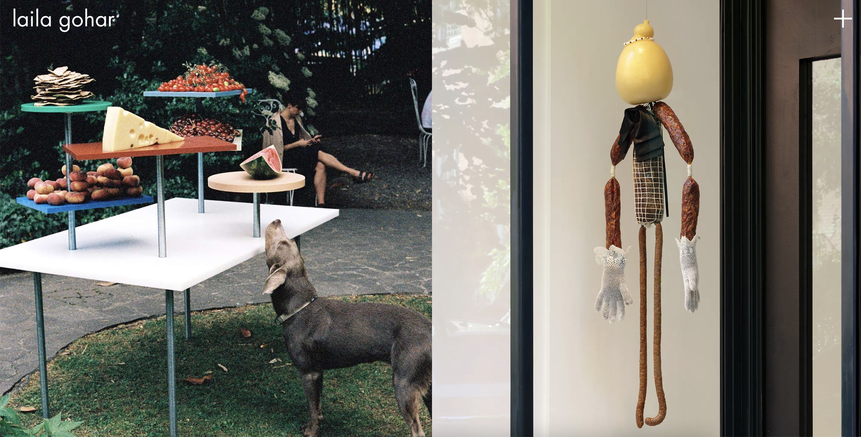
Laila Gohar's site features large images which capture the small details in her intricate food styling that fuels her artistic direction.

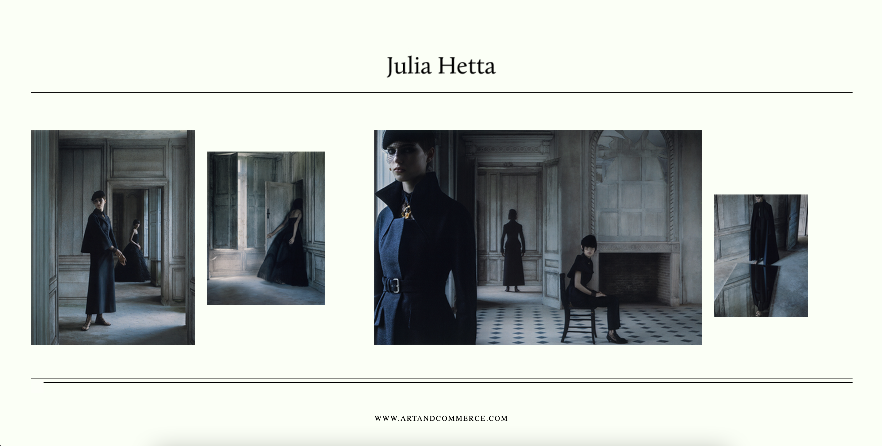
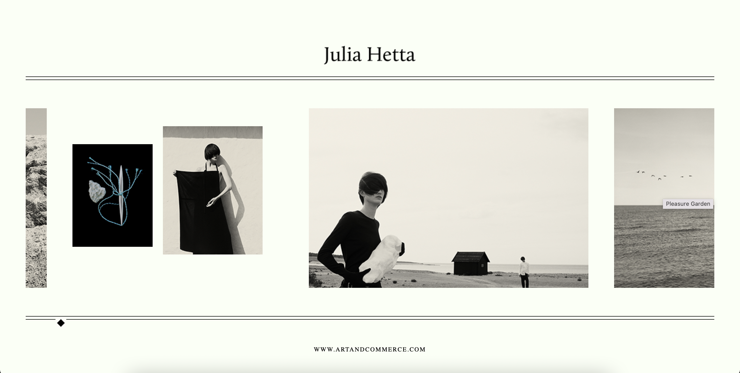
Julia Hetta's photography portfolio is pretty bare bones as well, which lends itself to the images, which the viewer is able to scroll through. The slider on the bottom of the scroll is a nice touch, stylistically.
