Hopes and Dreams:
This semester I hope to gain a better understanding of how to mark up and style web pages using HTML and CSS. In class I like structure, spending time learning new skills rather than having free work time, and having assignments with real due dates一as opposed to having all assignments due at the end of the semester一helps me to stay on track throughout the semester.
ChatGPT Exploration:
Me: I'm currently in my final year in the Integrated Design Program at Parsons School of Design, what do you think I will be doing in 1 year? In 5 years? In 10 years? Chat: Congrats on reaching your final year at Parsons! That’s a huge milestone. Your future will likely be influenced by your specific interests within design, your experiences during your final year, and the opportunities you pursue after graduation. Here’s a general idea of what you might be doing in the coming years: In 1 year: You’ll probably be diving into the real world of design, potentially working at a design firm, studio, or even starting your own venture. You might be focused on applying the skills you’ve honed at Parsons, building a portfolio, and networking to establish yourself in the industry. It’s also a time for exploring different career paths—maybe you’ll be working in graphic design, UX/UI, product design, or another area depending on your interests and experiences. In 5 years: You could be well-established in your chosen field, having gained experience and perhaps taken on more significant projects or roles. You might be working in a leadership position or as a specialist in a niche area. It’s also possible that you’ve continued your education or training, whether through formal courses, certifications, or self-directed learning. By this time, you might have a clearer vision of your career trajectory and could be contributing to major design projects or innovations. In 10 years: You might be at a prominent position in the design world, leading projects or teams, or even running your own design studio or agency. Your career might involve mentoring others, speaking at conferences, or contributing to design thought leadership. You could also be exploring new trends and technologies, pushing boundaries in design, or even branching out into related fields like entrepreneurship or education. Ultimately, the path will depend on your interests, the opportunities you seize, and how you leverage your skills and experiences. Stay curious and adaptable, and you’ll likely find yourself making a significant impact in the design world.
Website Analysis:
https://badbadbadbad.com/ Love this one. It’s a pretty basic graphic design portfolio, with the most recent + most high profile projects highlighted on the home page. I like how you’re still able to see the main text in the top left corner as you scroll down, and how the images just move over it. I also think the choice of typography is interesting - a bold sans serif as the title type with a smaller serif font for the subtitles/body text. There’s nothing excess, which I appreciate because when I’m looking through a designer's website and there’s too much going on—too many moving images or even too many pages—it distracts from their work. This definitely isn’t something I would want to happen if prospective employers were looking through my portfolio site, so I value simplicity with just a few interesting touches to elevate the site. The only other page on the site is an archive of all of the designer's past work. Every project is highlighted with one main photo and fits into a giant grid. This is pretty cool, because I often notice that designers will just remove their old work from their sites if it no longer fits a certain aesthetic. Also, with this kind of page a designer is able to show a greater breadth of work without having to put everything on one main page.
Style Guide:
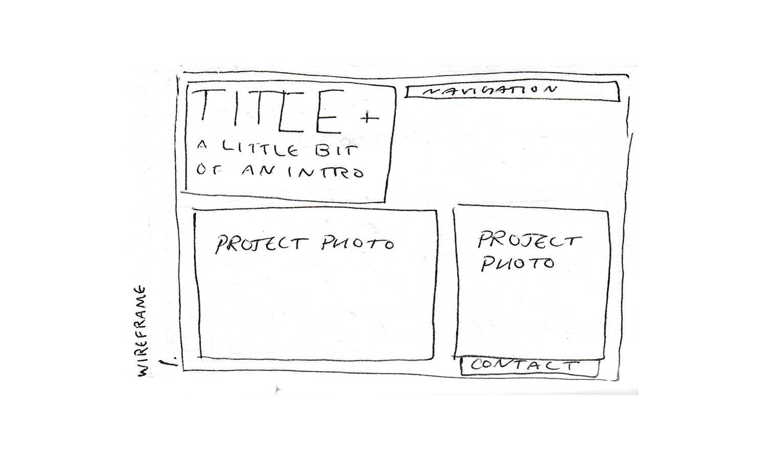
The intent of the website is to sell Quinn Briar’s services—graphic design and photography—and to inform potential clients of her multifaceted and adaptable skill set.
Quinn Briar is a graphic designer and photographer based in New York, NY. The voice of Quinn’s site is conversational, yet professional. It invites you in with its bold text and pops of bright colors and invites you to ask questions, to want to know more, and to reach out for work. Quinn Briar is chic, unique, and hard-working.
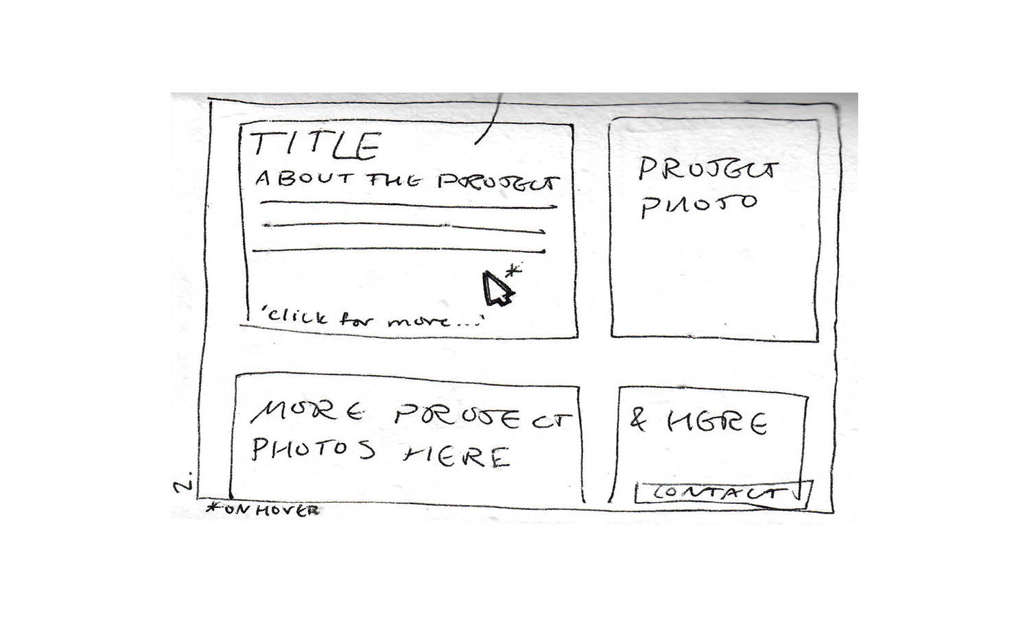
The tone of the main page is bold and inviting, maybe even bordering on in-your-face. Large scale photos with large title text highlighting select projects aims to be attention grabbing. When hovering over a certain project, a viewer is able to see more information as the text becomes scaled back, almost softer, inviting the viewer in.
The website establishes its brand through its use of text and color. It’s youthful but clean and refined. Bold text is balanced with small pops of color.
-
Bella, 22, Student
As a student at UConn, Bella has spent the last three years studying Communication. Recently, she’s reconnected with an old passion for the visual arts and has added a minor in Graphic Design, hoping to combine both her passions for communication and visual arts, and to find work in this field after college.
In close proximity to New York, Bella has spent time in the city on weekends and during the summer and hopes to move there for work after school. As she looks for inspiration for her own portfolio website as well as people who she can reach out to for advice or to make connections with, a search for designers working in New York within her desired field has brought her to Quinn Briar’s site.
She’s captivated by the bold text and photos of her projects. As she clicks around the site, she notices that Quinn Briar is a recent graduate from Parsons School of Design, not much older than herself. She looks for contact information, which she finds easily, and decides to reach out for advice on how to establish herself in this field as well as how to make her own website stand out.
-
Devin, 28, Musician
As a musical artist, Devin is in the writing process of her upcoming album. As the songs begin to take form, she thinks about the visual language of the physical album. She’s looking for someone to collaborate closely with to help her photograph and design the album cover, shoot promotional photos, and design marketing materials and merchandise.
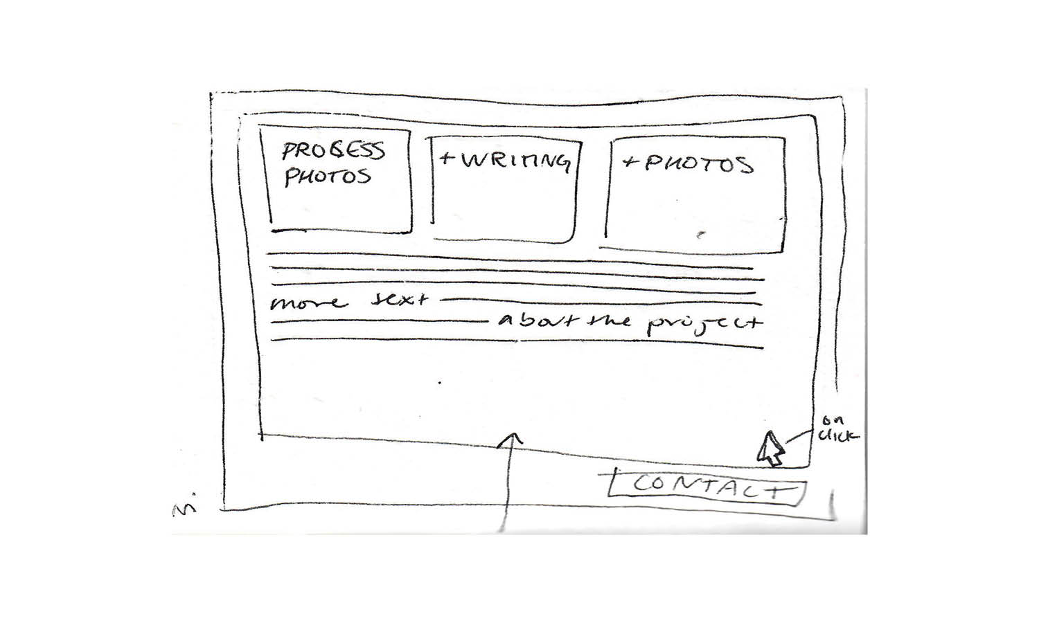
She’s heard about Quinn Briar through a friend of a friend, and is spending some time browsing her website. What she especially likes about her website is that she includes information about the process of creating her main projects, not just the finished project. Through seeing her sketches and process photos, Devin begins to feel that she and Quinn think in very similar ways and can tell that they’d collaborate together beautifully.
-
Mark, 46, Potential Employer
Mark is a senior designer at a studio that Quinn Briar has just applied to work at. He’s interviewed her, along with a few others, and is now taking the time to look through her website, along with the websites of the other interviewees, as he makes the decision of who he’ll hire to his team.
He finds the site nicely laid out and easy to navigate. As he looks through the projects on the main page, he remembers hearing about a couple of them from their interview, and finds it nice to see both photos of the process and the final project. From the addition of process photos and writings, he can tell that she’s the type of person to think through problems, to adapt when necessary, and to work closely with her team to overcome challenges. He’s impressed by her clear passion for her work as well as the skillset she displays in her projects and her website. Ultimately, he believes that she’ll be a great addition to his team and wants to hire her.


In comparison to the competition, Quinn Briar’s site feels sleek and clean. Competing graphic design sites might be too much to look at, so Quinn Briar tones it down, offering simple page layouts with small touches of flare here and there to elevate it above the competition. She understands her visual language and the website reflects that.