Grid / Flex Box Quiz
Instructions
This exersize will work with CSS flexbox and CSS grids. There are similarities between the two. Flexbox has one dimension in either direction, x or y axis, and grid does both x and y axis.
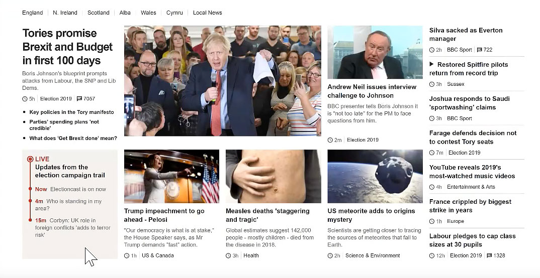
View Rachel Andrews video as she creates a layout, to get an overall idea of how to develop a layout using grids to do a layout from scratch. She copies a BBC page that is more complicated than what you will run into but following her is rewarding. Watch the first 45 minutes.
Setting up the grid.
- Changing the display of an element from block grid is all it takes to turn the direct children of the element into grid items.
- Target section and turn display to grid, add grid-template-rows at 1fr and give the section padding: 0 10px.
- Assuming that the grid takes up most if not all of the page, it will need to be responsive to gracefully end up with one column for a smartphone and more for larger screens.
- create a media query that puts the smartphone in the default position and the larger screen in the media query box using @media all and (min-width: 600px) {}
- Most of the CSS will target the full screen version in the @media box. Check to see whether the CSS I ask you to target is for the smartphone and place the rules in the default position, or the large screen, and place the rules in the media query box. I will indicate where I want you to put the CSS rule.
- Set up the page for viewing on smartphones.
- In the head set the viewport to the device screen size and force zoom to be 1:1 < meta name="viewport" content="width=device-width, initial-scale=1, maximum-scale=1">
- Put a border on the children so you can see them. Don't forget to style the border solid. Targeting the direct children requires > as in section>*. Using the universal selector here selects all the children.
- For the smartphone create a 3px solid purple border on the bottom and 10px of padding. {border-bottom: 3px solid purple; padding: 10px;}
- For larger screens create a full 1px purple border.
- Target images and set width to 100%;
Navigation flex box.
- Target the navigation links and set text-decoration to none, background to red, text color to white, padding 10px top and bottom, 20px left and right. margin 2px and display as block.
- Set the hover background to green.
- Remove list-style from navigation list items. Set it to none.
- The menu has to go inline for the large screen. There are a number of ways to do this. Traditionally it was done using display: inline-block or float. The flex-box option is the best.
- For the wide screen, turn the unordered list in the navigation element to display: flex and justify-content: center.
- Turn the nav list items to flex-grow 1 for wide screen. That should spread out the links to the width of the parent element.
Styling the grid in widescreen
- Target the wide screen grid divisions. grid-template-columns: 1fr 1fr 1fr;
- Span grid cells in header and footer. header, footer {grid-column: 1 / span 3;}
- Span id instructions to cover two rows. #instructions {grid-column: 2 / span 2;}
Video and Grid Resources
- Watch the first 45 minutes of Rachel Andrews as she works her way through a layout from scratch
- Check out here new series on Understanding Grid at Smashing Magazine, Creating a Grid Container, Grid lines
- Resilient Web Design A great book if you are one of those people who wants to know more about the nature of the web by one of its pioneers.
Finishing Up
- Target every odd list item in the articles with background color azure. :nth-child(odd). Color the even ones lightyellow.
- target ids empty and finishing, set to flex and color background azure.
Flex Box Articles
Learn more about flexbox by reading these articles written by Rachel Andrews.