Idea Development
This website should serve as my portfolio and act as a digital resume. In order to accomplish this, my website has to be clear and organized in a visually pleasing enviornment; this ensures it'll be easy for visitors to navigate through the different types of work I do.
Discovery and Research
To get started, I visited some websites that have purposes or styles similar to what I want for my own site. Specifically, I decided to look at websites by photographers I take inspiration from, since thier sites are similar to what I have in mind.
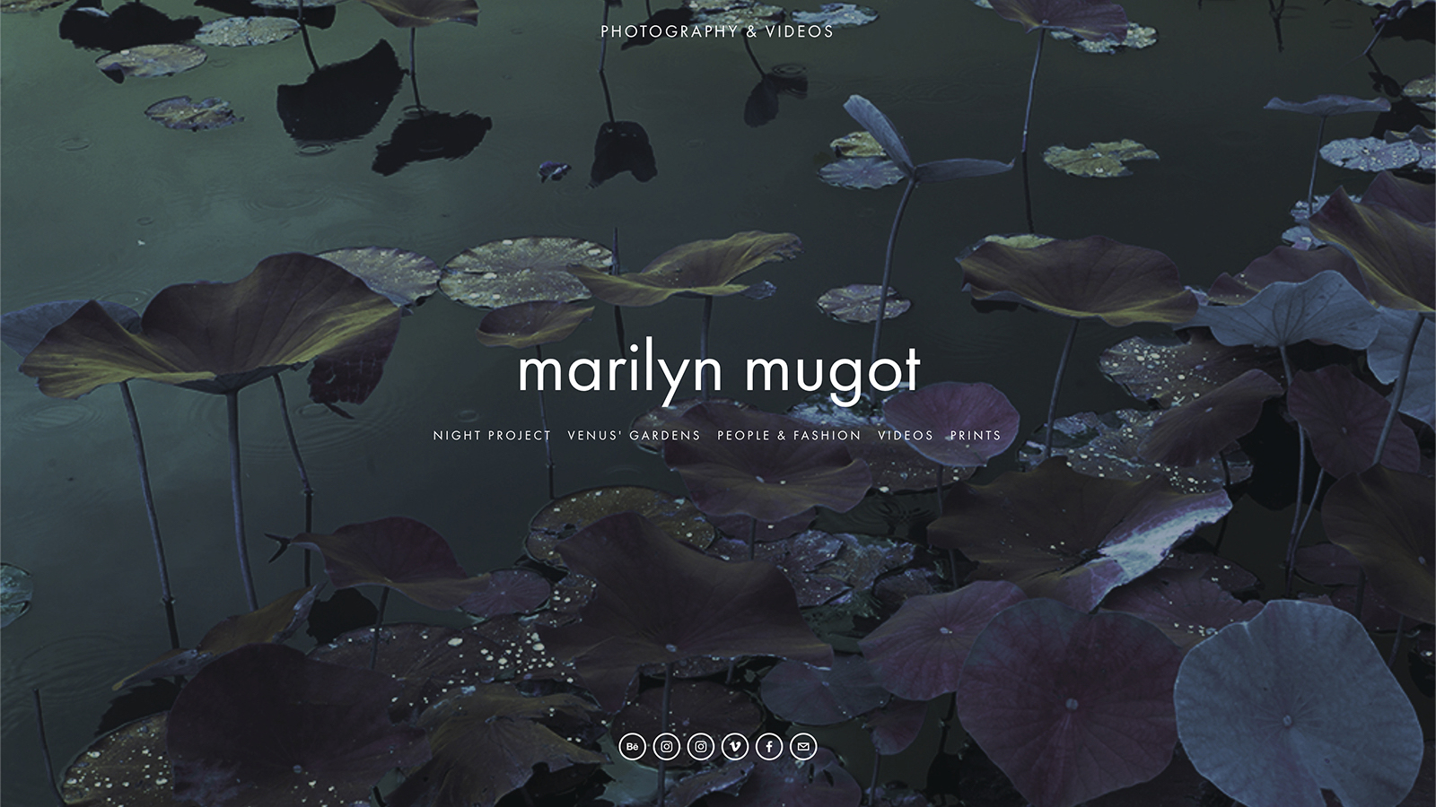
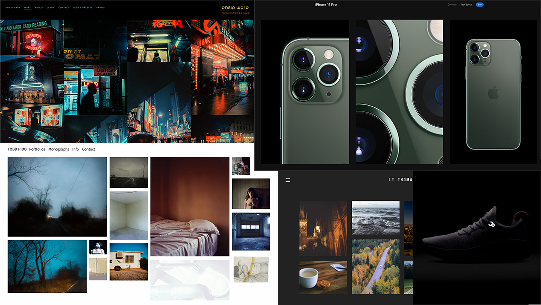
I already spoke about Mugot's site in the last assignment, but I liked her homepage the most. I'm drawn to the fact that it's clean, minimal, and most importantly, it quickly lets the viewer see all the website's pages at once. Unfortunately major downside of this site is that the images inside the galleries are a little too small for computer screens. On my site I'll make sure the images are balanced for both mobile and desktop viewing.
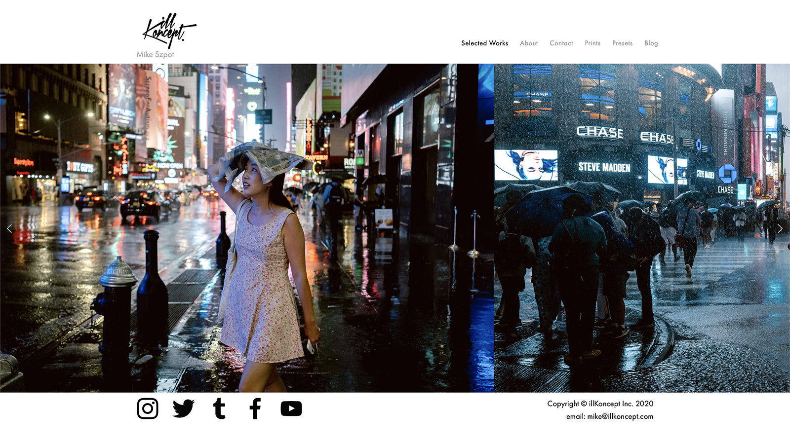
This gallery page is from Mike "illKoncept" Szpot's website. Although I'm not too crazy about the layout of this page, I still like how unconventional it is. Gallery pages typically use grids or lightboxes to showcase work, but in this case, Szpot is using a horizontal scroll to let viewers "flip" through images. This layout also seems to work almost better than other sites that follow the standard grid pattern because it inherently displays images larger than thumbnail size and guides viewers through the images. In some cases, grids can be overwhelming if an artist fills the page out with too many images.
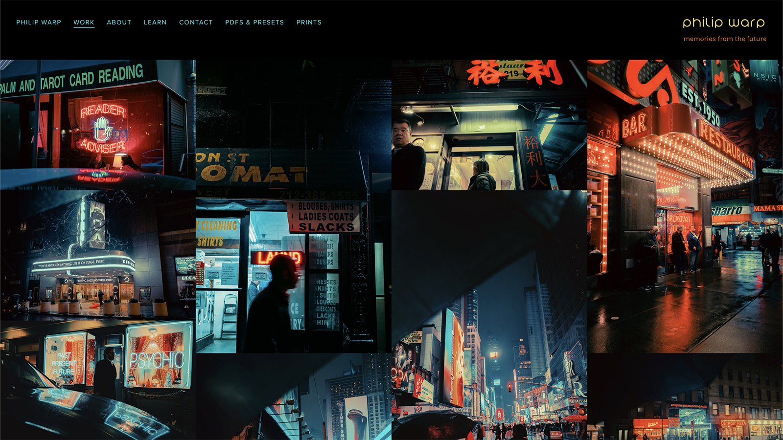
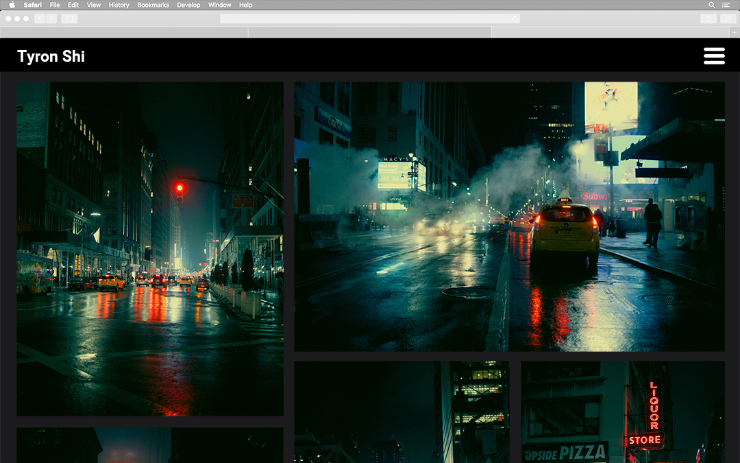
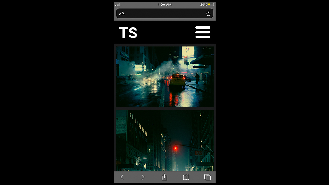
Overall, I like Warp's use of black backgrounds and punchy images, but I especially like his approach to his gallery. The galleries are an evolved version of the grid layout; images are still ordered as they would be on a grid, but they aren't constrained to a certain size or shape. Viewers can still view images together and click on ones they want to see closer. Additionally, viewers are able to see the fill image in the thumbnail view, while grid sites would crop in to fit a certain shape. Similar to Szpot's gallery, the only major issue I have with this gallery is that there aren't any spaces between images, which can sometimes be confusing to view.
Targeting Audience
With my site, I mainly target potential employers that want to see some examples of my work or new people I meet that just want to get a better sense of the things I do. Site design, code, and aesthetic will be my top priority to make sure the viewing experience is as seamless and as pleasing as possible.
Inspiration
Thumbnails
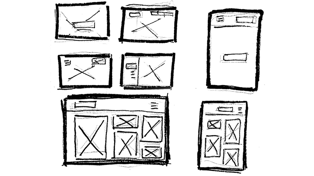
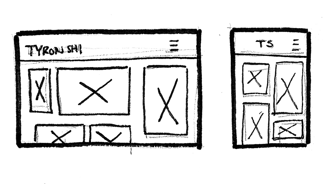
Wireframe
Photoshop Composite