Designing for the Web (8 Steps)
1. Develop Your Idea
I want to create a website that sells the 2D platformer RPG video game, III. The website must clearly convey important information about the game, including its visuals, gameplay, concept, etc. The UI and visuals of the website must reflect the game’s color palette, mood, and theme. The website should be visually appealing and informative, but still be straightforward and easy to navigate, as customers would want to quickly understand what the game is about.
2. Discovery and Research
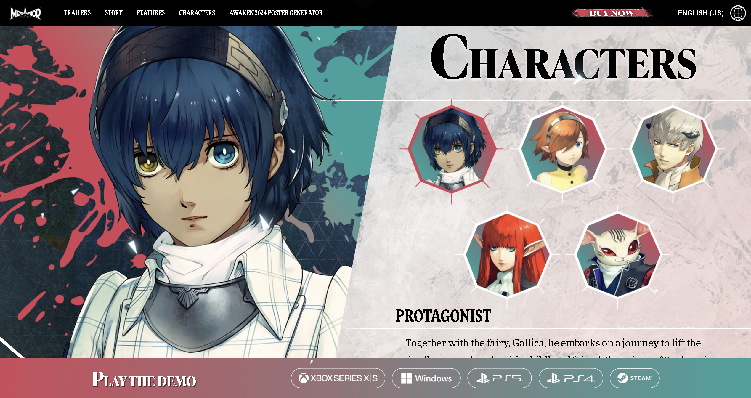
Metaphor: ReFantazio

Pros
- The whole website can be viewed by scrolling down, but can also go to other sections by clicking on the menu navigation
- Fixed footer with link to game, so that customers can get the game at any place in the website
- Particles flying around in the background → reflects game’s concept
- Boxes for text and videos have a paint brush style texture and outline to match the aesthetic of the game
- Character section where you can click onto different characters and learn about them
- Videos are automatically played for short videos; for long important videos (like trailers), video becomes big
Cons
- At the beginning and end of the website, the images of the game and texts look very incohesive to the game and the rest of the website
Super Mario Bros Wonder

Pros
- Each section is divided by colors
- Big image of the game at the beginning to show its visuals
- Big rounded boxes with various colors to emphasize its content
- Interactive element with the wonder flower, adding a filter to the website → visually shows the game’s element
- Character image gets bigger or moving when you put cursor on top
- Short description of each character
- Minor characters with speech bubble saying a game line
- In game coins used as decorations
- Moving elements → Website seems more fluid and visually appealing
- Same moving background for every character → Cohesiveness
- Vibrant bright colors to match the game’s color palette and vibe of a family-friendly game
- Moving line of images to show all the game environments
Cons
- The whole website can be viewed by scrolling down so you can’t quickly access the different sections
- You can’t get the link of the game until you reach the very bottom
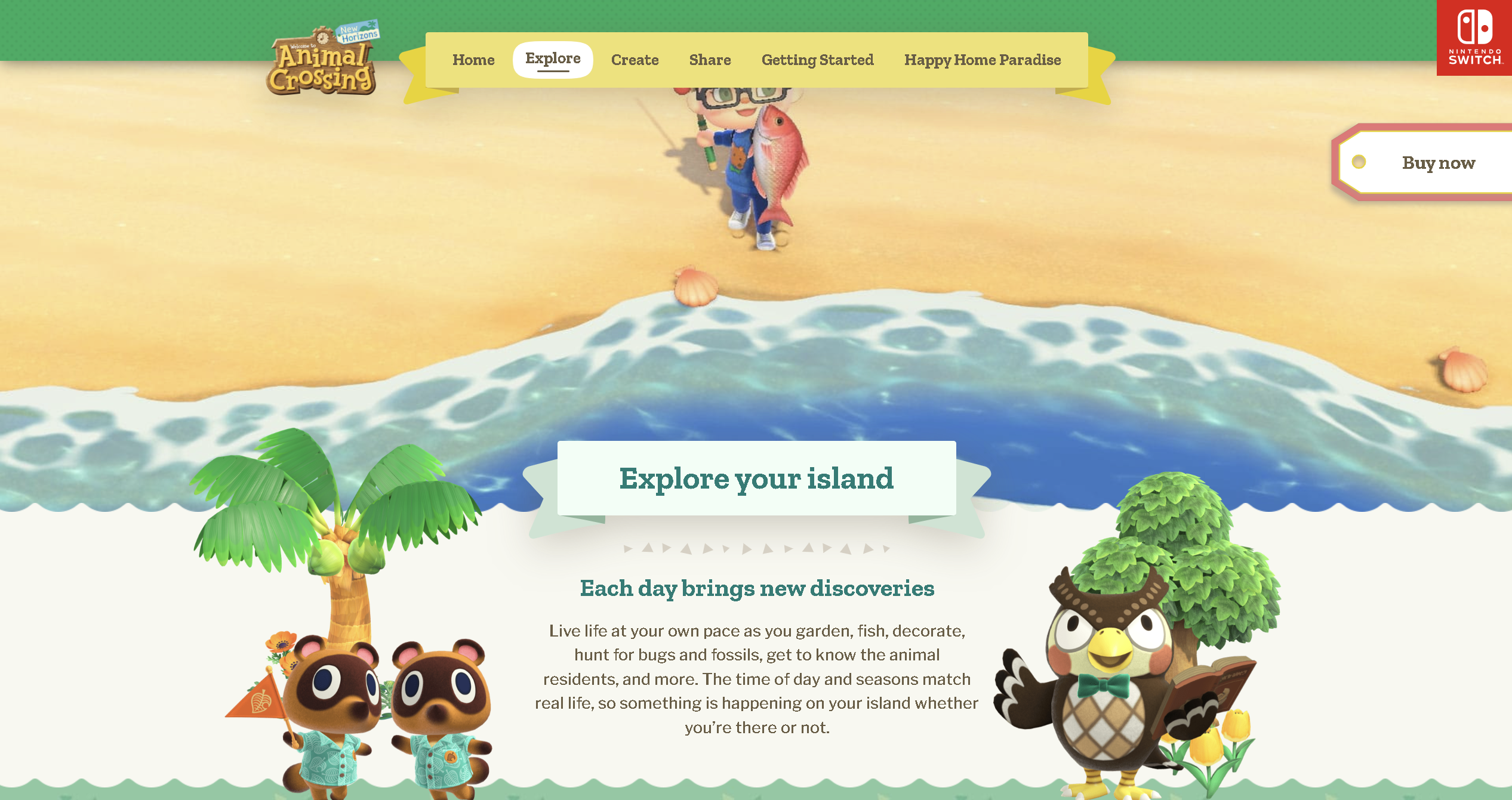
Animal Crossing

Pros
- Big image of the game at the beginning to show its visuals with small description of the game
- Elements show when you scroll down at different times → Makes the website more enjoyable to navigate through
- Fixed menu bar at the top, so that you can access them at any moment Separate pages for each section to include all the important details and information
- A picture or video to show the different interactions possible
- An image of a character doing the said interaction outside of the description box as a visual
Cons
- You can only get the link of the game at the very bottom or top of the page
- Background is very simple only using a small range of colors → Looks a bit boring and not cohesive to the content
3. Target Your Audience
Video Gamers, especially those who enjoy 2D platformers
4. Inspiration and Concepts
- Paint strokes to match the concept of the game which focuses on painting platforms.
- Video game concept to visually represent the fun and playable essence.
- Paper cut-outs to match the background texture of the game which uses Korean traditional paper.