hi
DRAWING AND IMAGING FINAL
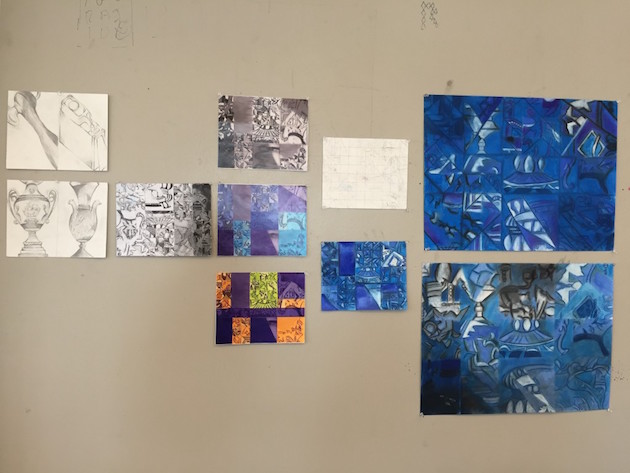
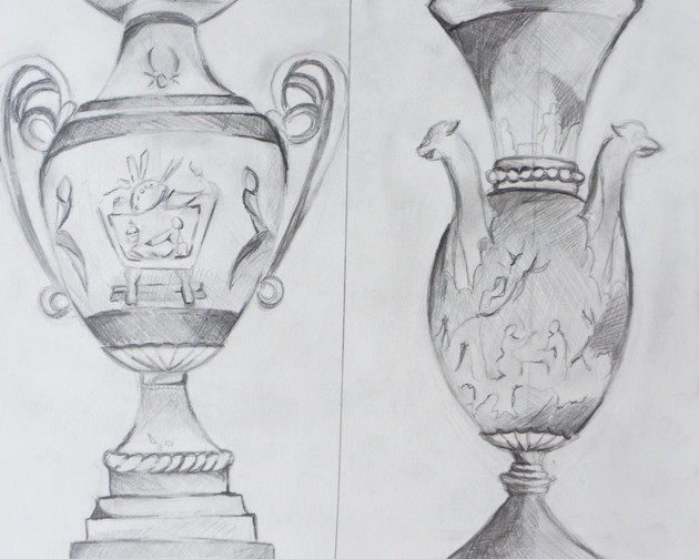
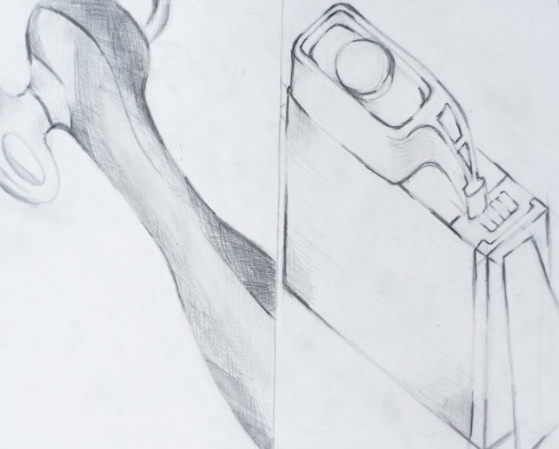
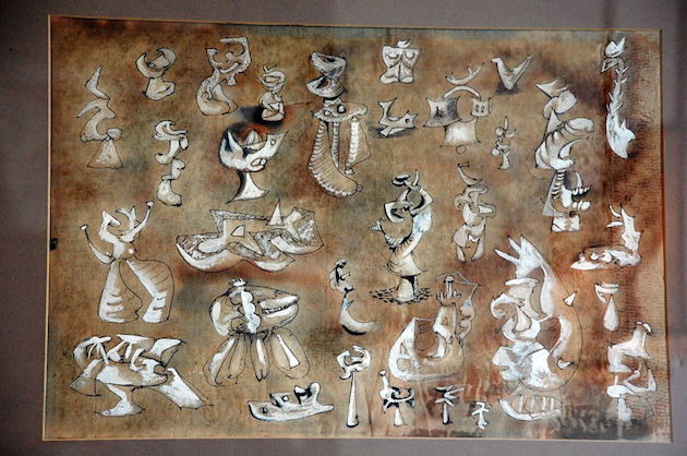
For the Drawing and Imaging Final Project, we went through several processes in order to get to the last piece. The first step was we went to the Metropolitan Museum of art and drew more perspective drawings of objects we found using the methods such as measuring angles and size we learned in previous classes. In the end we had a total of four drawings.
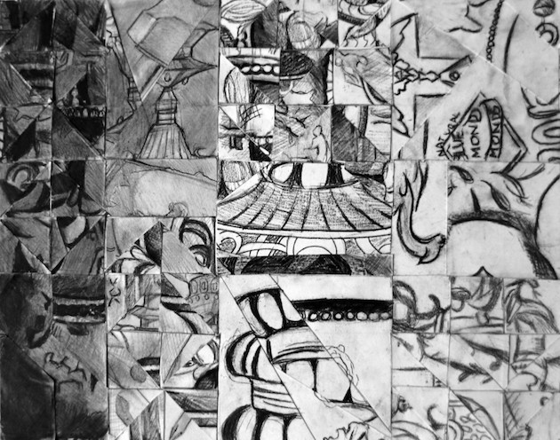
Next we gathered everyone’s drawings and cut them up to fit them onto a grid collage to learn about positive and negative spaces, shading, and values. We also learned about how placement can change the piece as we tried to create bigger shapes with the smaller shapes we cut out.
After the collage we stated transitioning into making the final piece. The goal was to first choose an artist to take inspiration to help us draw influence on how we should create the final piece.
I chose Roberto Matta. Last year I fell in love with the style of an illustrator named Gamma who typically makes pencil drawings using only one shade. Matta’s style had remind me a lot of Gamma’s, which was the reason I decided to choose him.
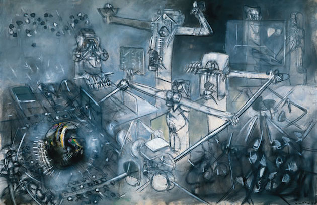
Roberto Matta’s style focused on surrealism, modern art, and abstract expressionism. He was born in Chille and his art represented European, Latin American and American cultures. He had a strong position on social ideology and would often reflect his views on politics and war in his work. His mediums consisted of etchings, sketches, aquatints, and more.
I enjoy this style because of how he emphasizes his highlights with white and is very simple when it comes to color. I also like how in some areas he is very sharp with his lines and then in other spots of his paintings he would blur his paintings out a bit more to make it look rough. Even though he did use more oil paints I felt like I could get the same effects using different color charcoal or hard pastels.
The two pieces that influenced me the most were L’Ultima Cena, made in 1985, and Pecador Justificado, made in 1952.
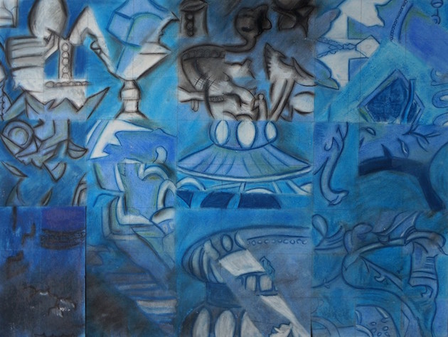
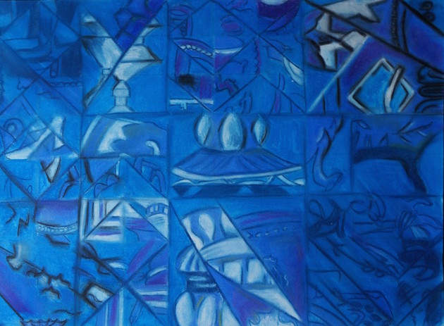
My piece kept up with the original images of my grid collage. I wanted to show more of his stylistic tendencies rather than concepts.
In my piece I clearly distinguished a lighter blue color for the background and pushed forward the objects using either a more purple color or white depending on which object was to be highlighted. This helped distinguish figure ground in my piece.
This piece stuck to the grid so the drawing isn’t really continuous. I tried to connect big sections together to create more continuous lines.
To create unity the color is what really brings the piece together.
Side Note: I did end up re doing my first piece as well as make a whole new drawing as the first piece not working as cohesively as I originally intended. There was a big shadow in the corner that was distracting from the rest of the piece, some of the whites were too bright, and the lines could have been pushed further with more dimension.