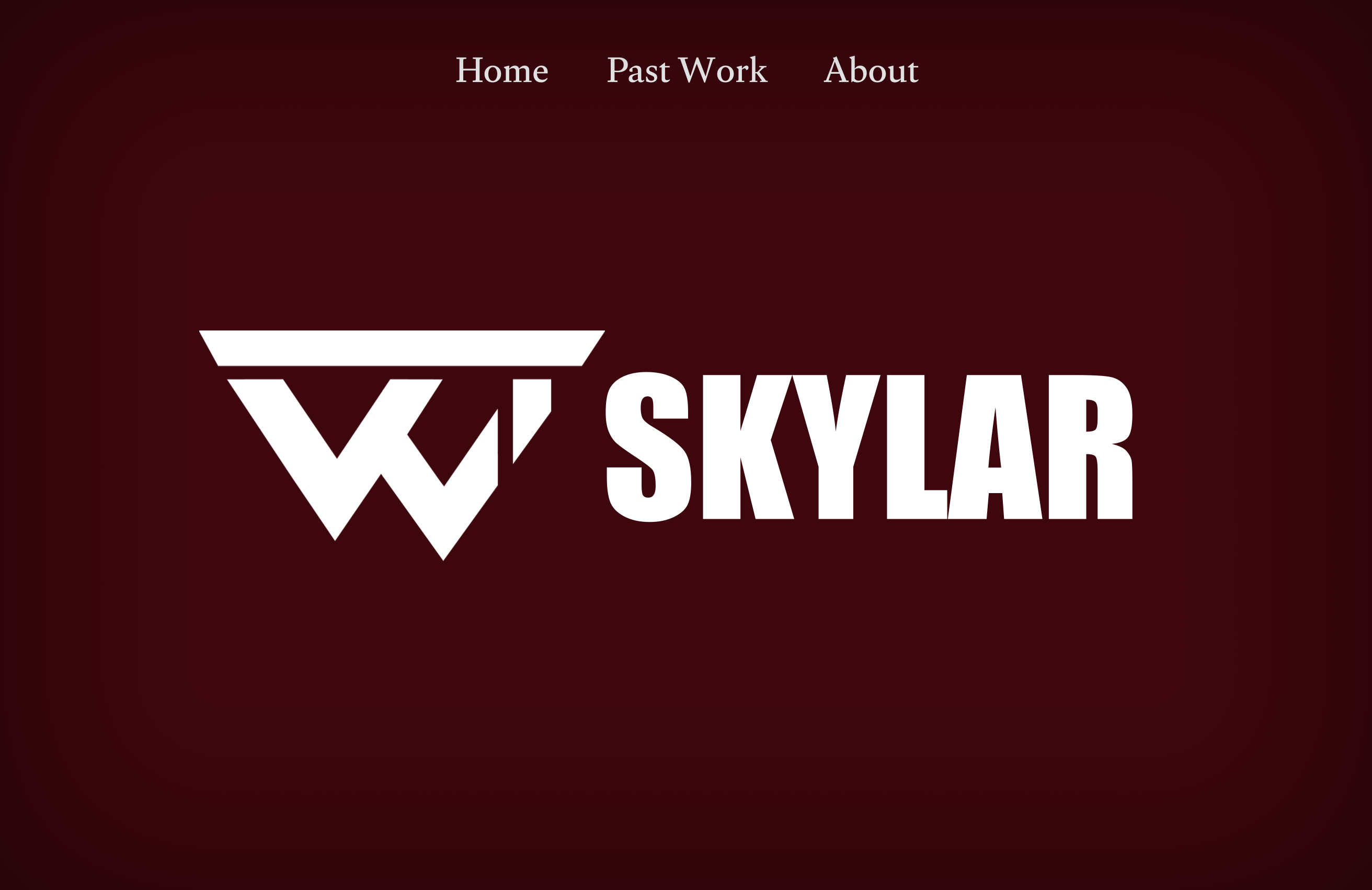
The main goal of this website is to create a personal space to showcase my work and promote my creative projects. I want a professional platform where I can sell my skills to potential employers and collaborators. By using a bold black and red theme, I hope to create a memorable impression that makes it easier for people to understand my style and get in touch with me.
Step 2: Discovery and Research
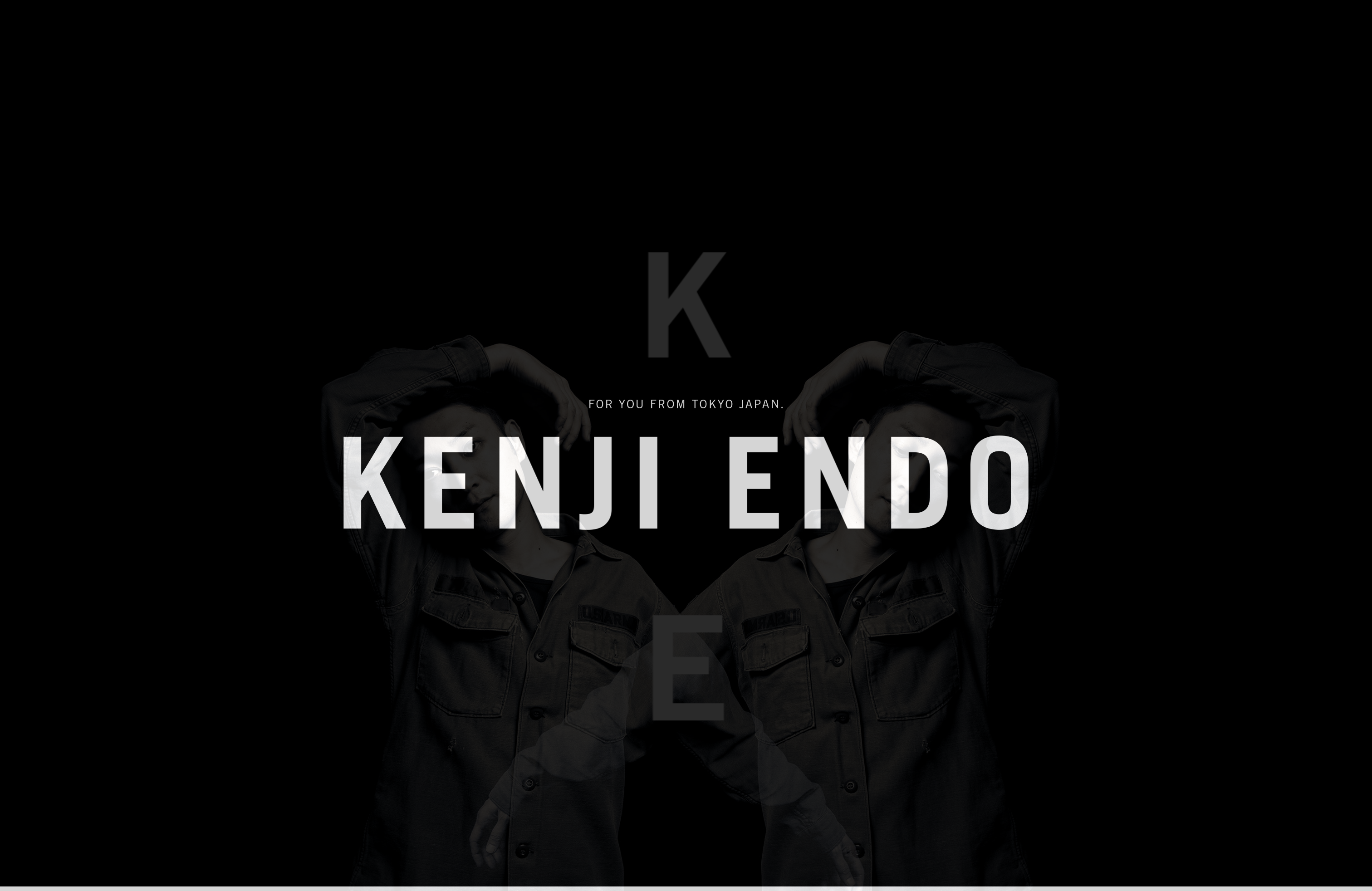
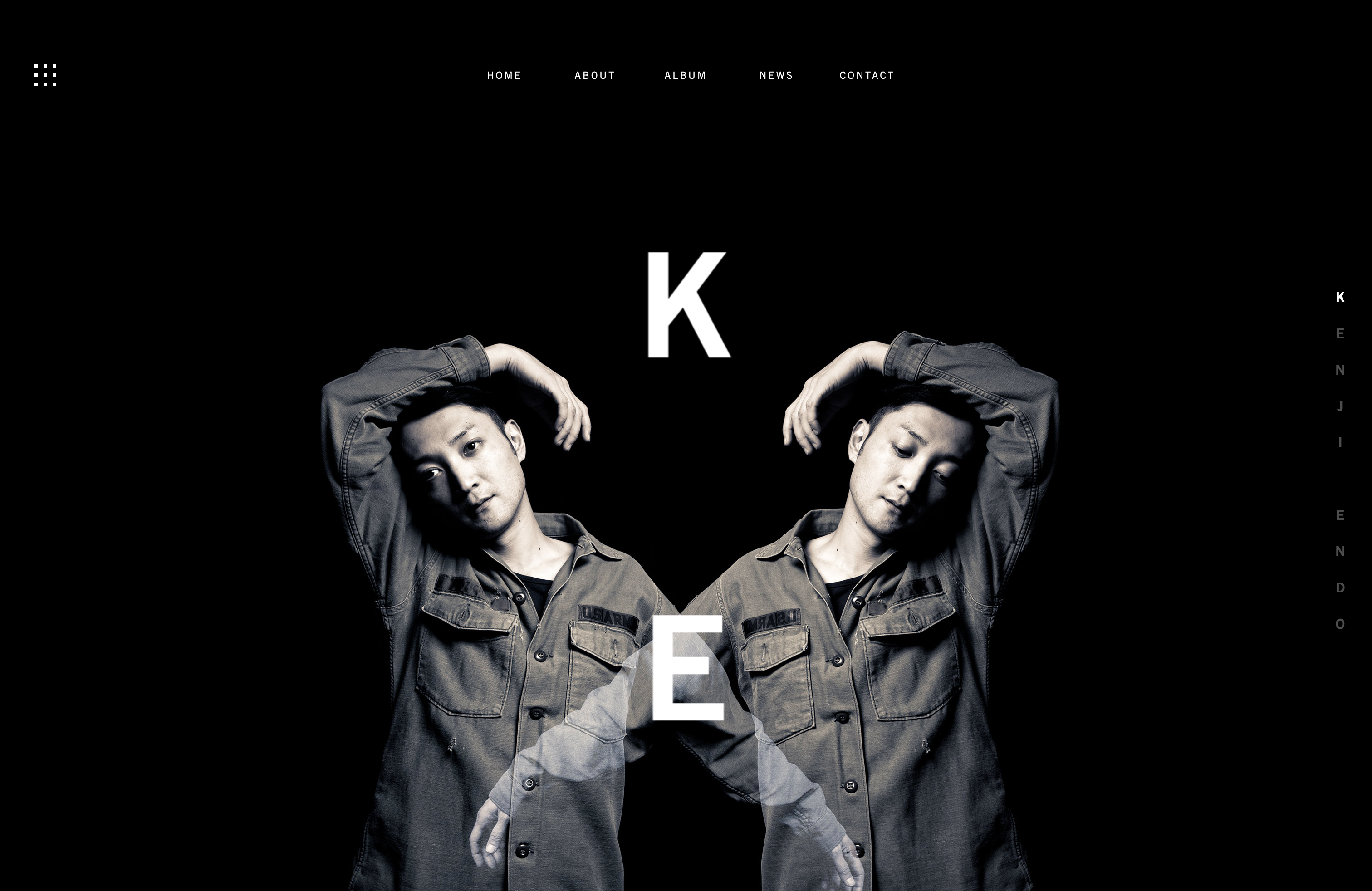
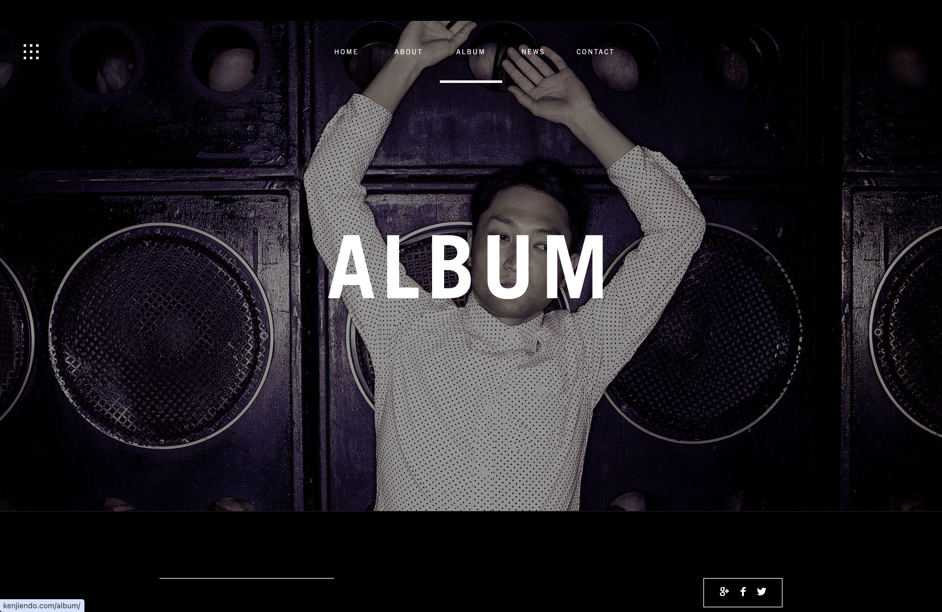
I looked at the portfolio of designer Kenji Endo, whose website stood out to me because of its strong visual style. The homepage uses large, high-quality images that fill the entire screen, creating an experience that feels more like a fashion editorial than a typical portfolio website.
This inspired me to think about using large images and a clean layout in my own site to present my work more clearly and professionally.
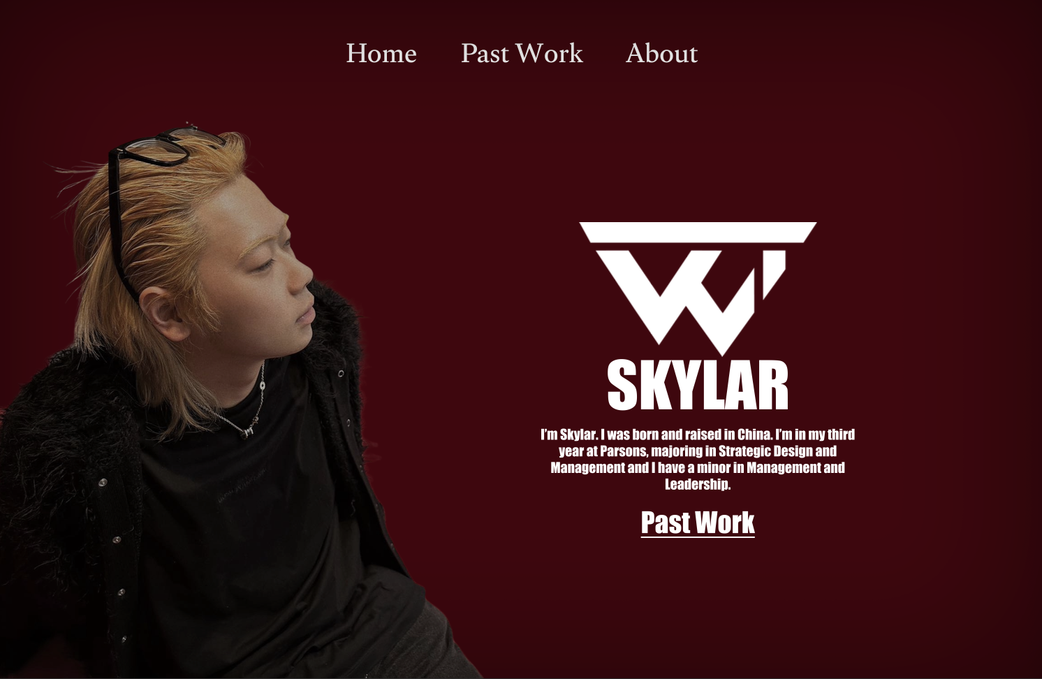
The intro page uses a large name and a portrait as the background to create a strong visual focus.The mirrored portrait layout creates a strong sense of symmetry and visual balance.
Step 3: Target Your Audience
The site is designed for a few key audiences in the creative field:
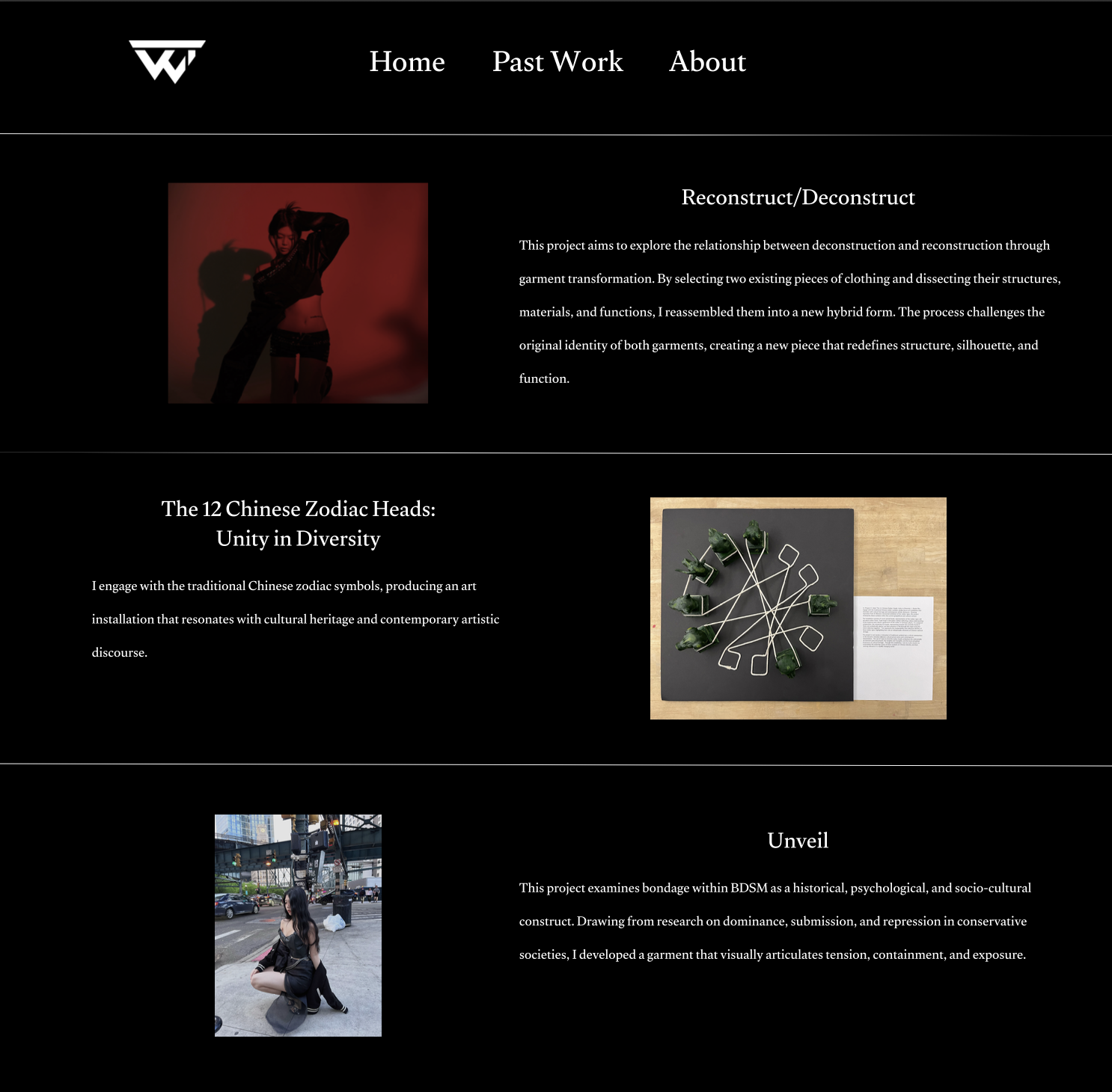
Fashion Creative Directors: People who are interested in designers with a strong visual style and storytelling ability.
Art Recruiters: Recruiters who want to quickly understand my skills in Figma, layout, and visual composition.
Potential Clients: Brands or individuals looking for designers to help develop visual ideas and creative projects.
Step 4: Inspiration
Step 4: Thumbnail
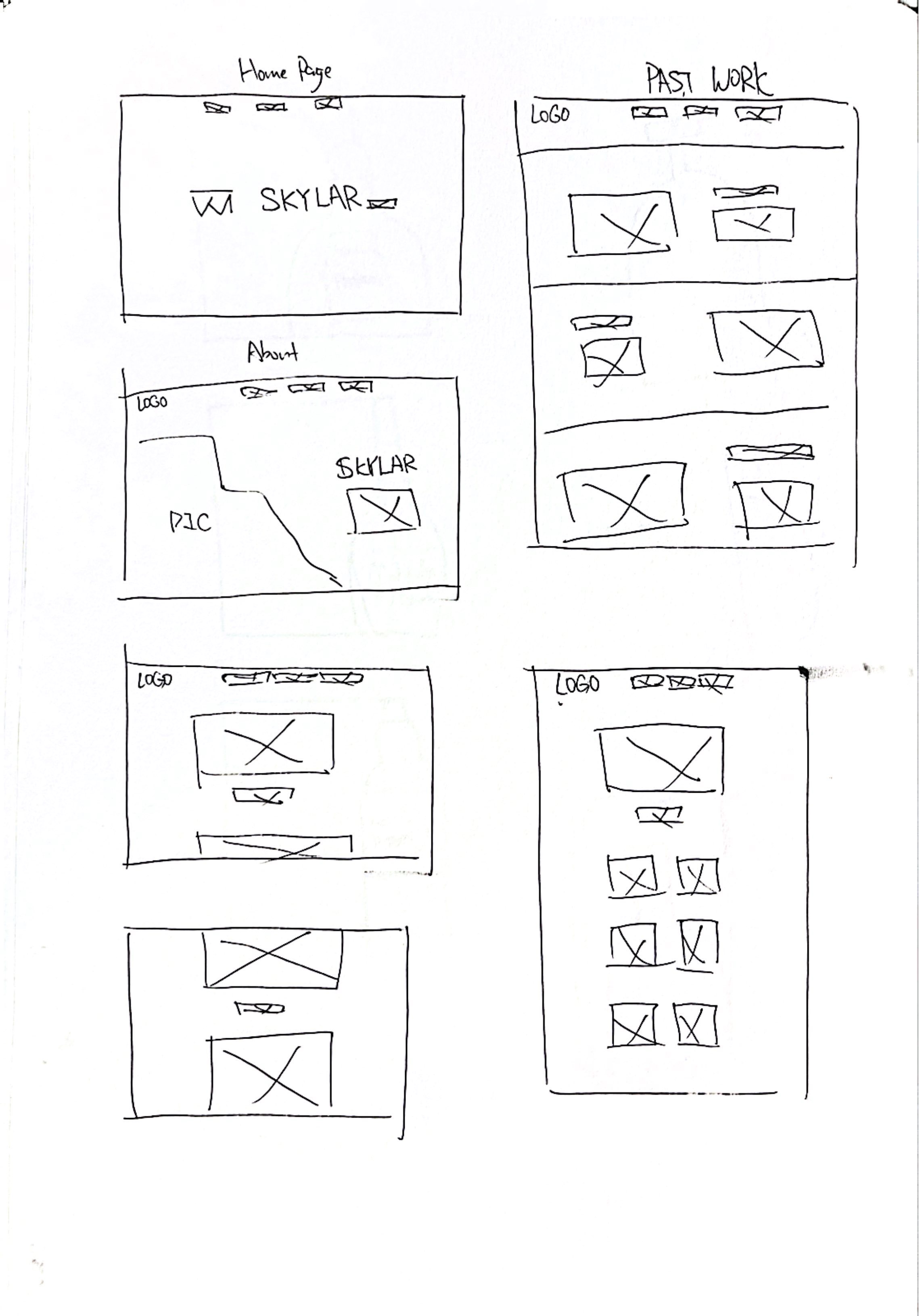
Step 6: Wireframe
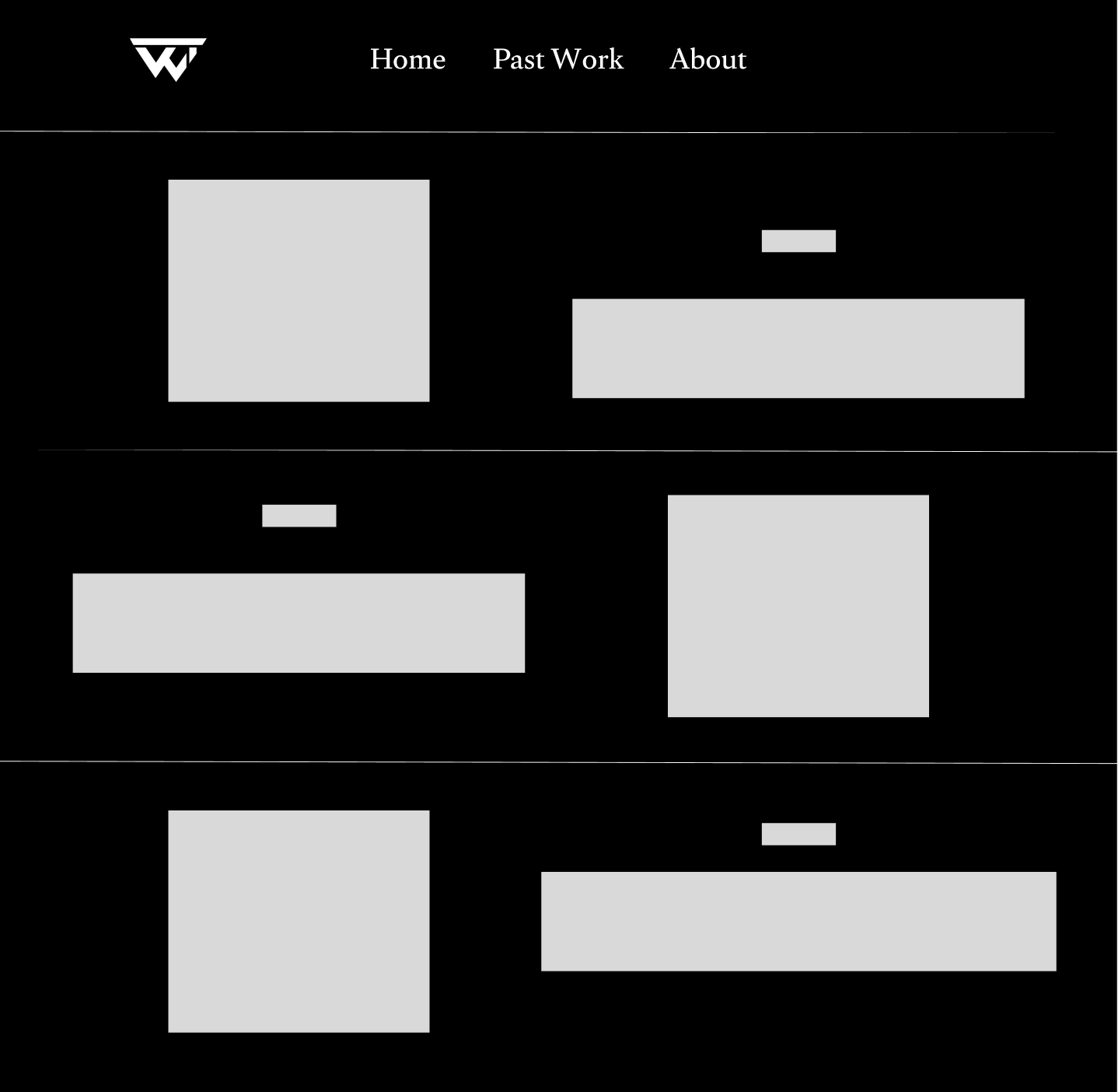
Step 7:Figma Comp
Instead of traditional Photoshop files, I used Figma to create my designs. This allowed for precise control over the black-and-red color palette and responsive auto-layouts for mobile and desktop screens.