Develop Your Idea
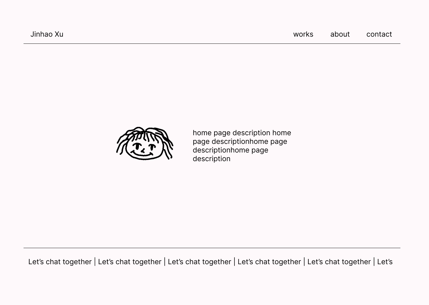
So I want to create a web page that showcase my work and introduce
myself. I envision a site with a playful and cute visual style, while
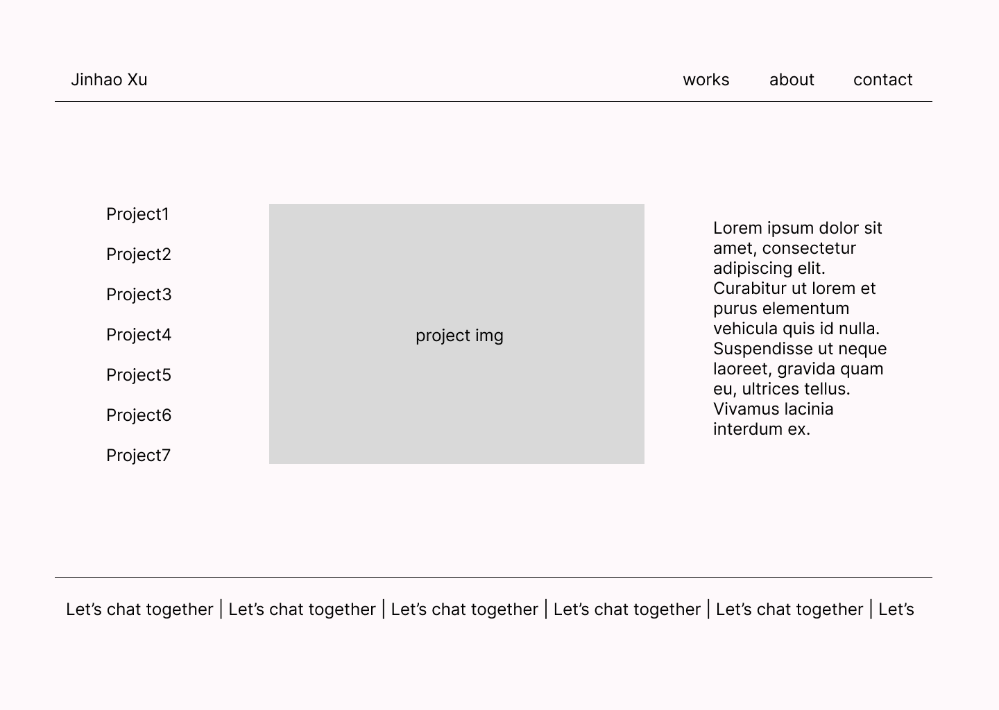
maintaining clarity and ease of navigation. The website will include
clear sections for my portfolio, skills, and experience, along with
interactive elements to make it more dynamic and memorable for potential
employers and collaborators.
Discovery and Research
I noticed that many game designers use Itch.io to showcase their game
projects. The layouts of these pages are very intuitive and visually
appealing, allowing users to quickly browse through each project. I want
to achieve this kind of clear and concise layout.
During my exploration, I also came across some other websites that are
more experimental and artistic, with less emphasis on commercial
aspects. However, I also observed that many restaurant or brand websites
feature very clean designs and strong interactivity. They often combine
a minimalist user interface with impactful visual presentation.
This made me realize that design should not only be aesthetically
pleasing but also ensure a smooth user experience and clear
functionality.
The Central Archetype
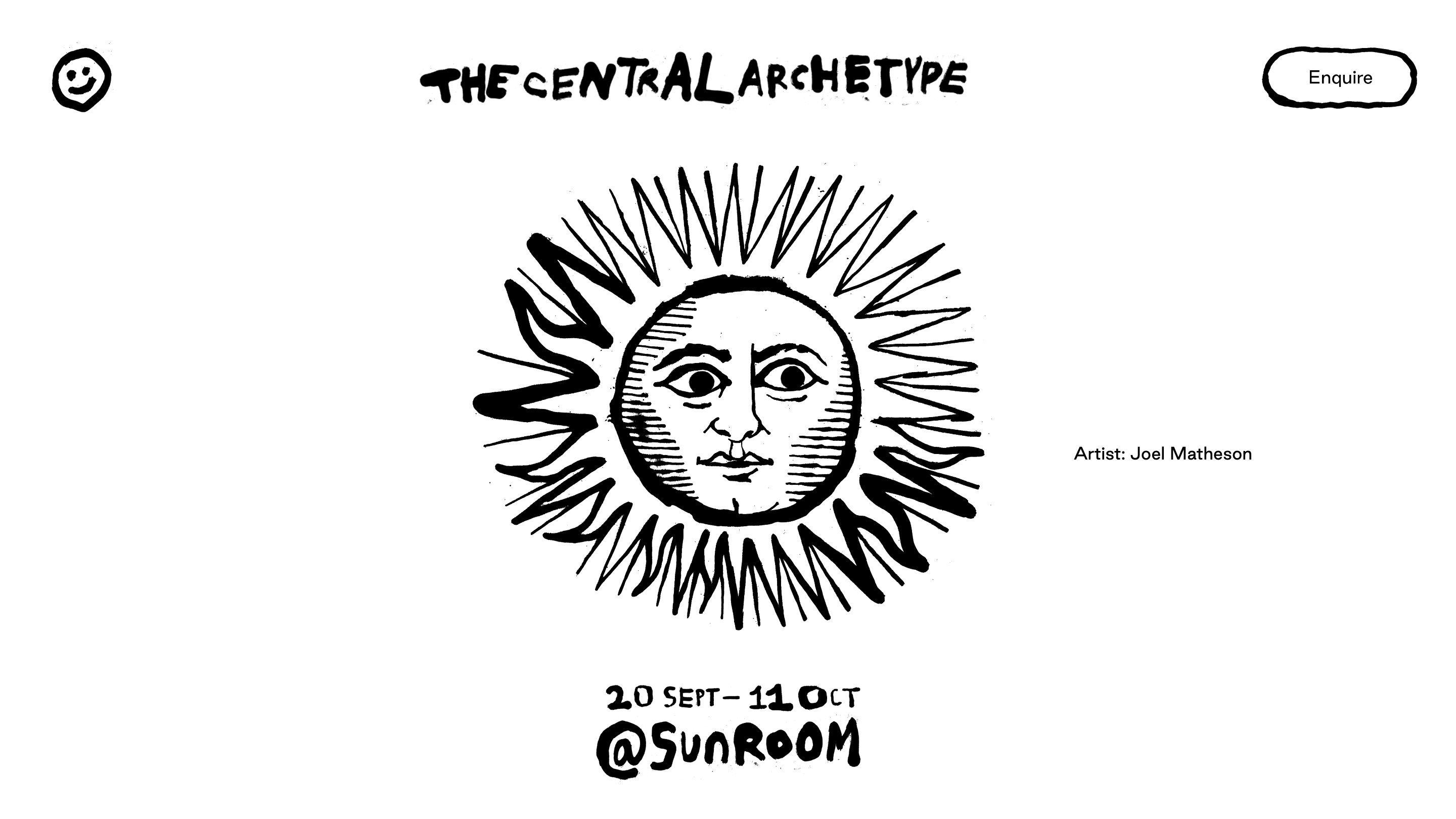
This website gave me a lot of inspiration. It features a minimalist,
hand-drawn style that creates an organic, approachable, and creative
atmosphere. The use of monochrome (black and white) emphasizes
simplicity and directs focus to the central visual—a stylized
illustration of the sun. The typography is bold, irregular, and playful,
evoking a handmade, quirky, and experimental feel. The asymmetrical
placement of elements adds a sense of movement and spontaneity. It
maintains user attention through large illustrations supported by subtle
textual elements. The hand-drawn typography and 3D patterns create a
distinctive and informal tone, making it ideal for creative portfolios.
Playful and organic visuals are seamlessly integrated into the design,
adding a unique character.
Vicrojo
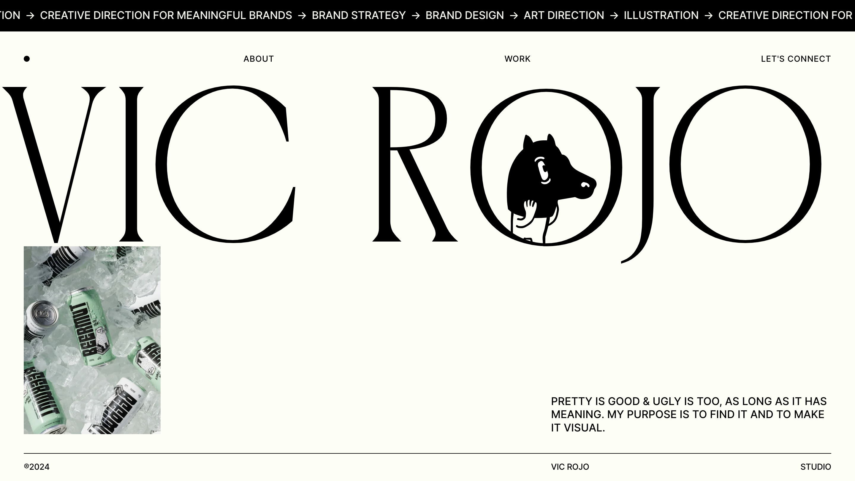
I also really like this website's design. It's polished, modern, and
high-contrast, with an elegant and refined tone. The overall elegant
tone combines large, eye-catching typography with simple illustrations,
conveying both professionalism and creativity. It uses monochrome as the
base with occasional highlights (like product images) to maintain focus
and provide visual rest. The large headings and spacious white space
give a clean, breathable feel, making the content easier to read and
process. The simple navigation, along with a mini menu, is both
intuitive and user-friendly. It successfully blends playful visuals
(illustrations) with a serious, professional aesthetic. The 3D mode uses
bold typography and white space, making the design clear and impactful.
It incorporates quirky illustrations or animations that add personality
without making the page cluttered. The project or sections are
highlighted through carefully selected visual contrasts, such as using
minimal color accents or featured images.
Target Your Audience
My primary audience consists of professionals in the fields of technology, design, and gaming, such as hiring managers, colleagues, and fellow designers and developers. They will expect a portfolio that demonstrates both projects and creative design technic, showcasing my ability to blend innovation with practical skills.
Inspiration and concepts
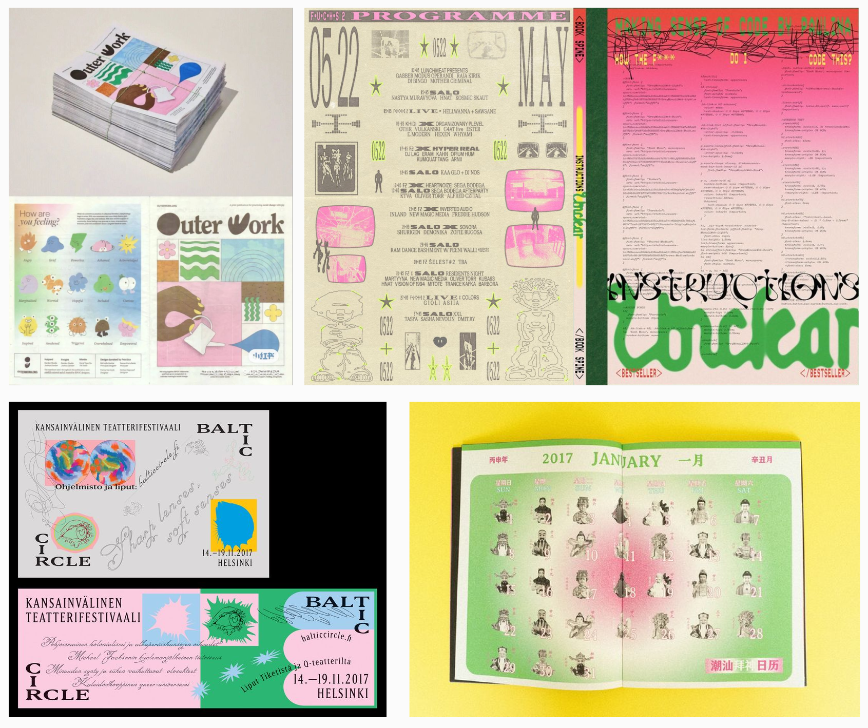
I wanted a muted color palette that included some hand-drawn elements, such as cartoon faces and organic shapes, paired with clean fonts and a harmonious color palette. Or create a retro-inspired event program with faux-aged textures and beige backgrounds combined with bold, stylized fonts and graffiti-style graphics. The chaotic layout adds to its quirky charm. I PREFER to use pink and green gradient, abstract shapes. Want an experimental and futuristic feel with a retro punk twist?
Sketches and Prototypes

Responsive Mockup

PhotoShop Comp
