Developing Idea
With all the types of environmental studies/science related websites, all that I have found were article based websites. As for what I would want in making an environmental studies related website is to combine my major with my passion for doodling in some way. As of now, it seems to be difficult for me to find a website (that already exist) that well demonstrates both components as one. More times than likely, I would run into websites are very separate, very mono (one subject). So my current goal would be to find a way to combine environmental issues and my interest of illustrations, in attempt to create a website that combine both topics to show what I can create. Such as text relating to environmental issues while also composing related illustrations for visual purposes. I eventually would also want to make something like a comic/blog platform but that can be for a future project in relation to this.
Discovery and Research
As given in the first assignment style guide thenatureofcities.com shows a clean design by displaying different types of articles for users to click from and look into. It is something I might want to look into in how I would like my website to layout. Outside of homework, I have also looked up some illustration, drawing based websites to see what kinds of designs and layouts were used to showcase art pieces in a way that would keep potential user’s attention. All of the websites have different ways of placing the image and keeping the overall website clean and easy to navigate. This demonstrated that even image and text placing can very well determine whether or not the user experience is a good one, or a bad one.
Target Audience
Students, Professors, other people who are interested/related to environmental studies or art can take a look.
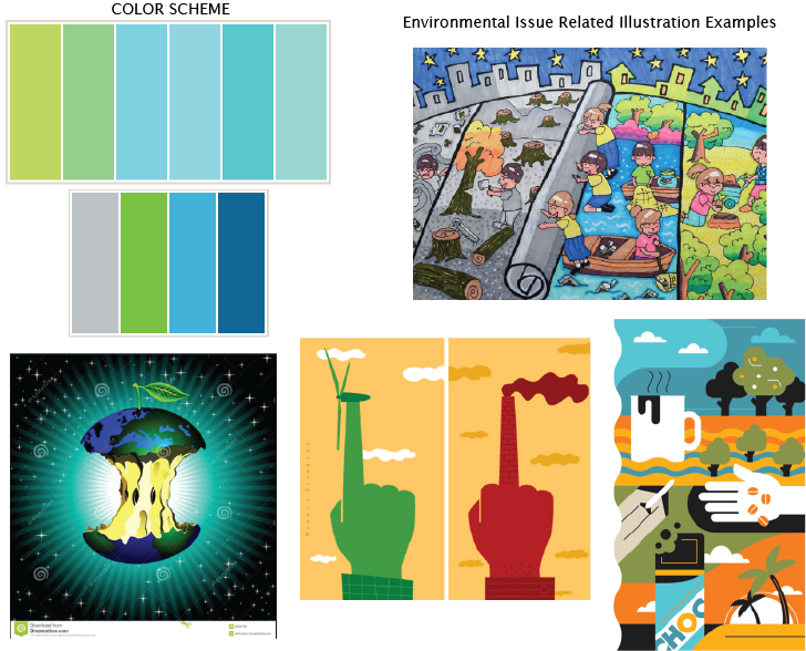
Inspiration
Thumbnail Sketches
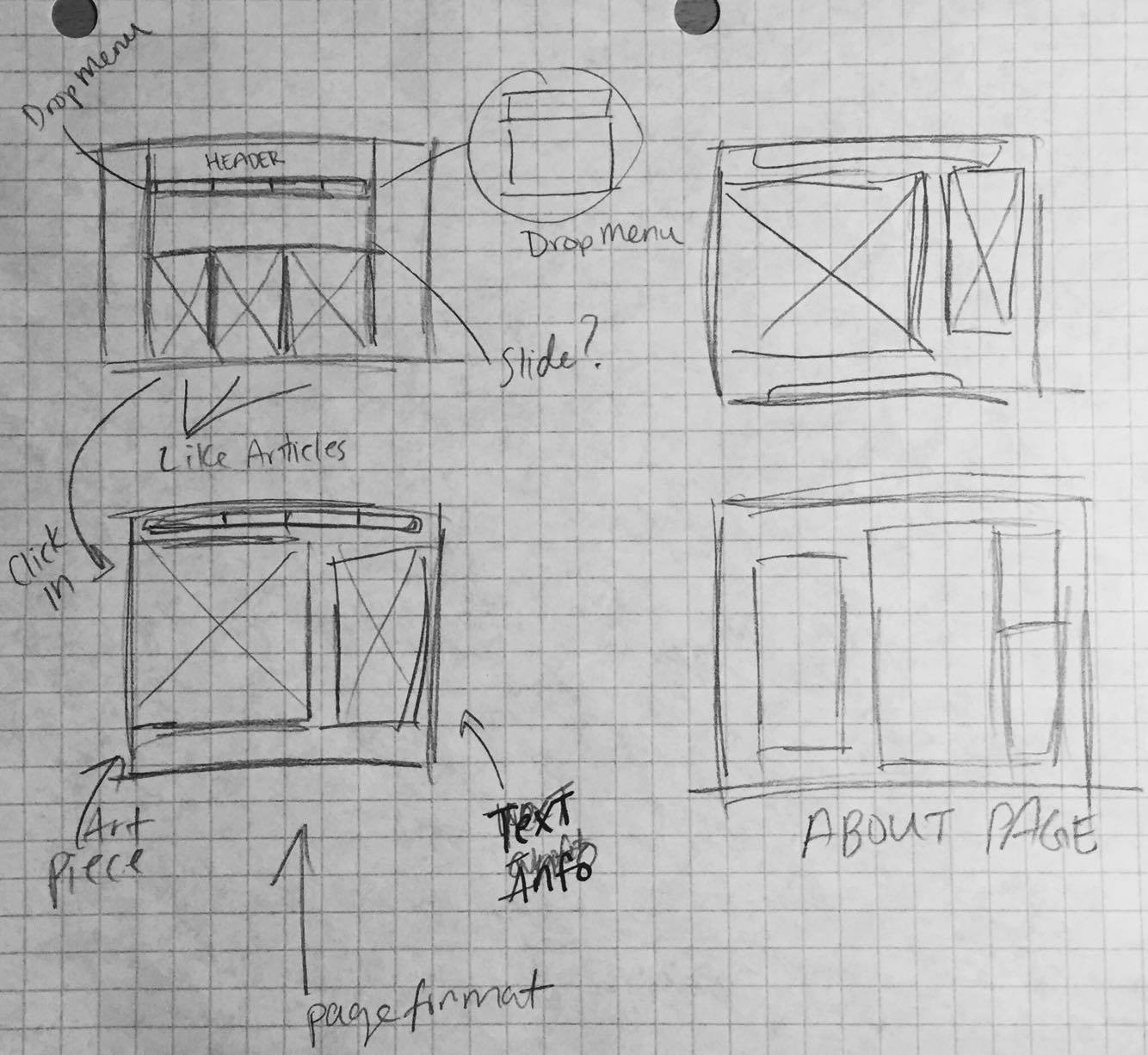
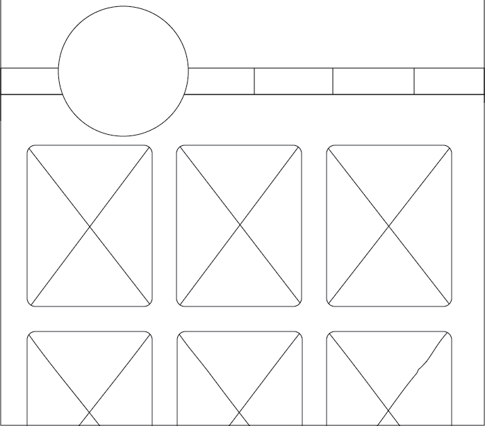
Here is my original thumbnail sketch of what I intended to base my photoshop comp and eventually my website page on. However after staring at it for a while, I felt like it could be better so I had sketched a revised thumbnail in which I am more happy with.
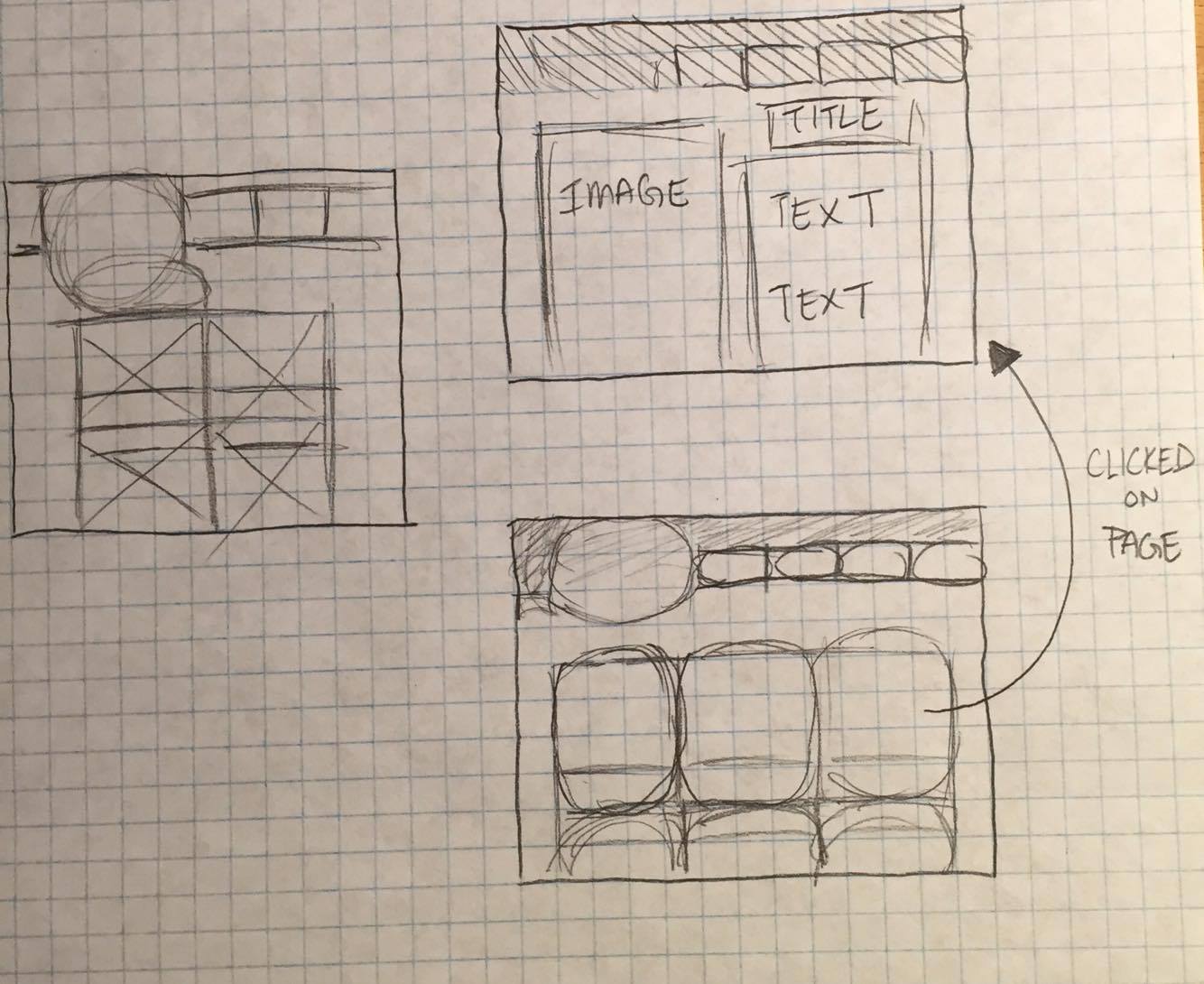
Wireframe
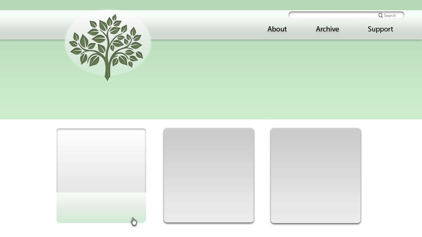
Photoshop Composition
