As a fashion student, Fashion weeks are one of those sources where I can grasp ideas of emerging trends and I am always keeping an eye on the runways that are happening. Therefore, since I and people like me who study or work in the fashion industry are so inspired by runways I decided to create a website about the runways for the new season - Spring 2022 Ready-to-wear. I am trying to sell and present the emerging trends for the upcoming season, as well as the fabulous garments and runways presented by various designers.
I went to multiple websites for inspiration and tried to grasp how fashion workers create their webpage. I was especially inspired by what I learned from looking at websites from Chanel, Vogue Runway, and Mytheresa.
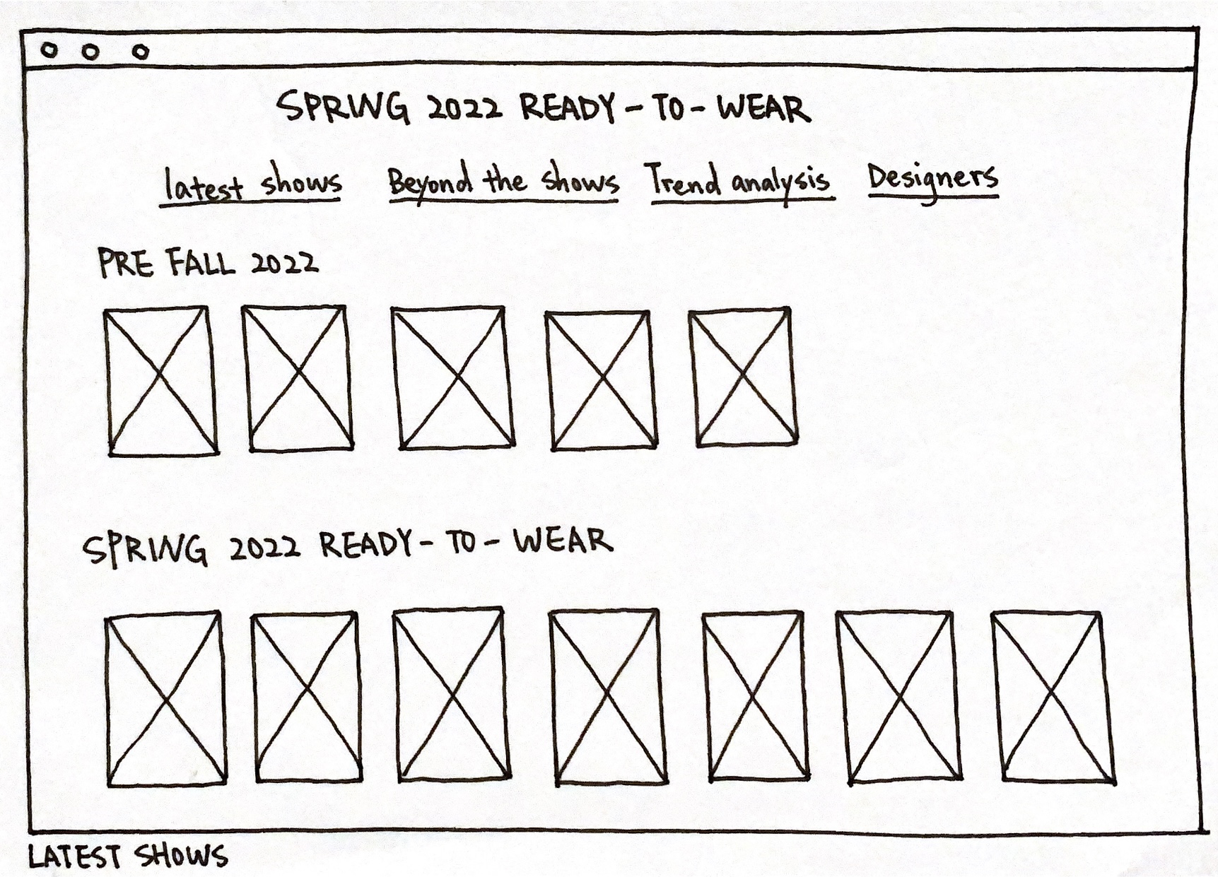
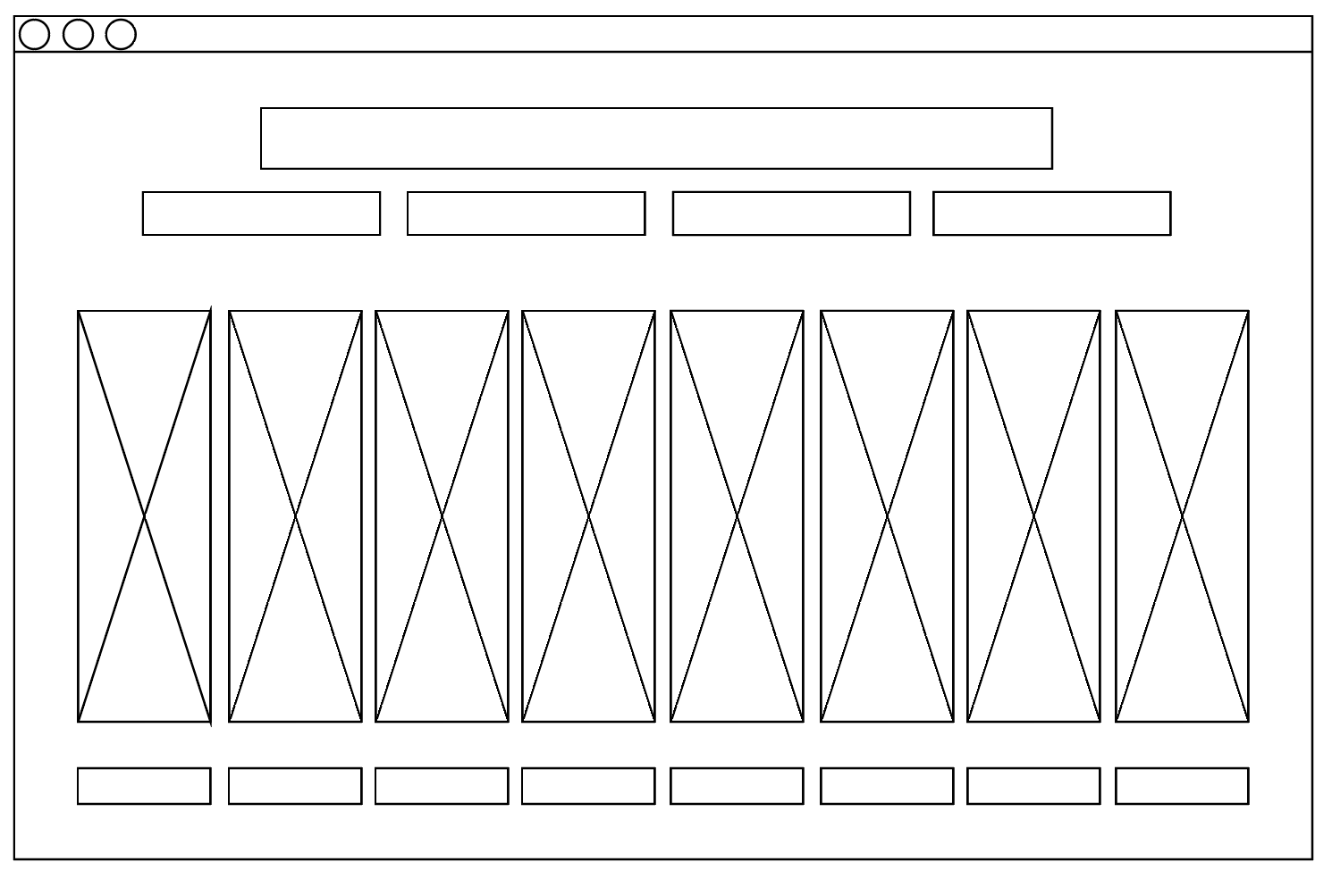
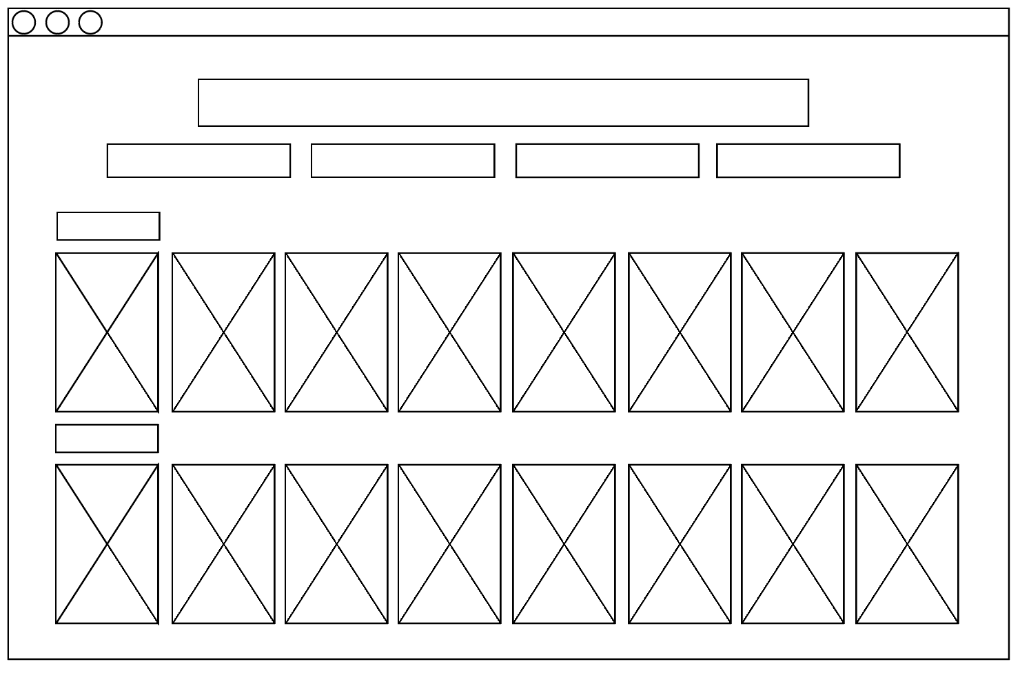
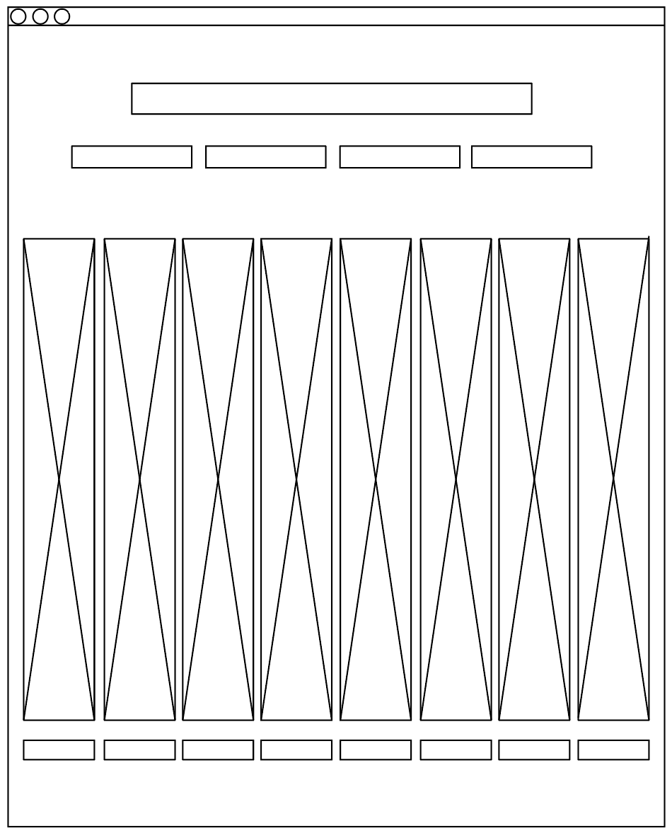
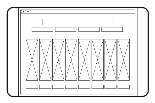
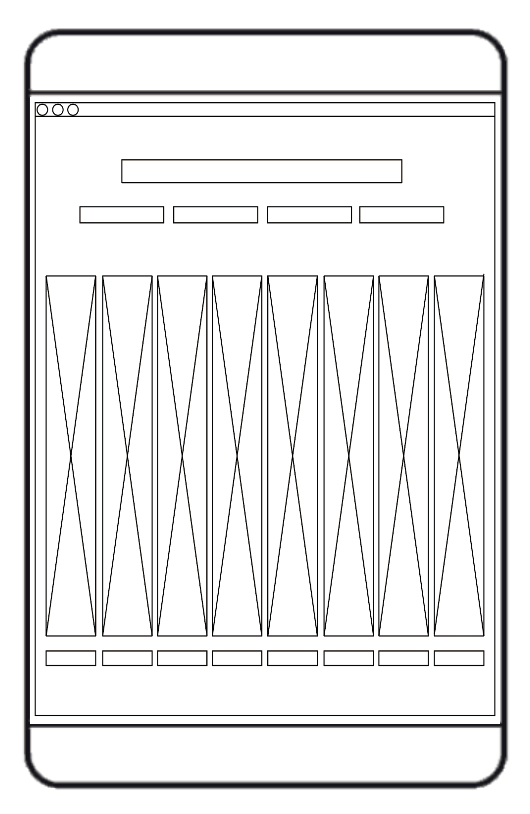
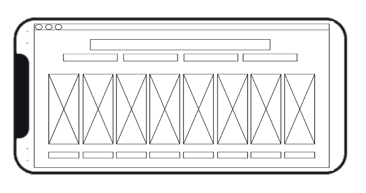
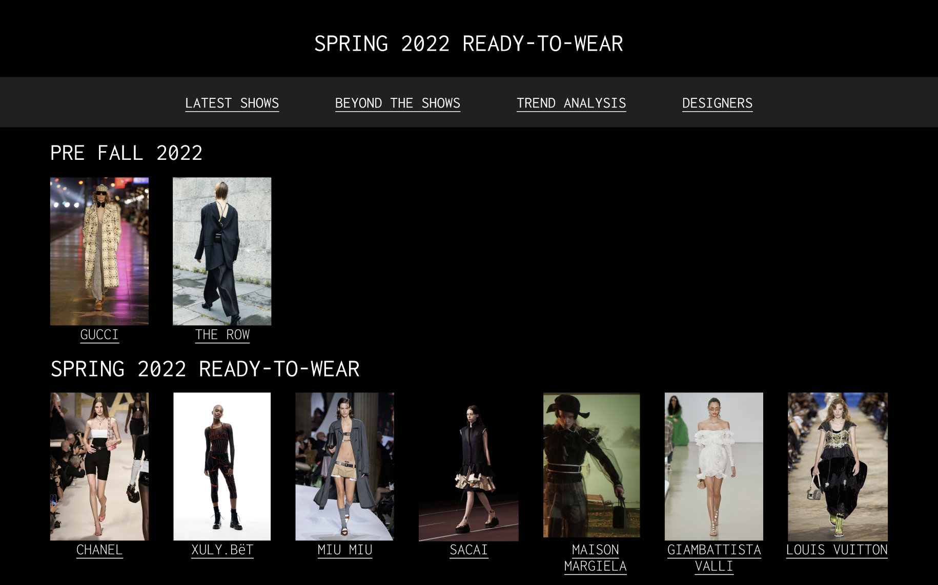
I learned that to create a professional-looking fashion runway website we need to have a comparatively "plain" theme but still connect pictures from different runways altogether like one to form a unity for the website, giving people a comfortable experience. Thus, it is better to avoid distracting background, and go "simple". Also, I found brands placing multiple images together on one page allowing people to scroll is a doorway to display all the looks. If the images are messy, and in various places and sizes then people don't have any ideas to make comparisons between the outfits and it would lead people to wonder why is one looks bigger than the other, is it highlighted for a certain reason? In my opinion, the goal for making a website is to give people a clear and organized picture of what they are seeing, we should always avoid confusing the users. I also found that brands tend to give a big and bold title at the top of the page, centered and highlighted, it is giving an elegant visual and stands out.
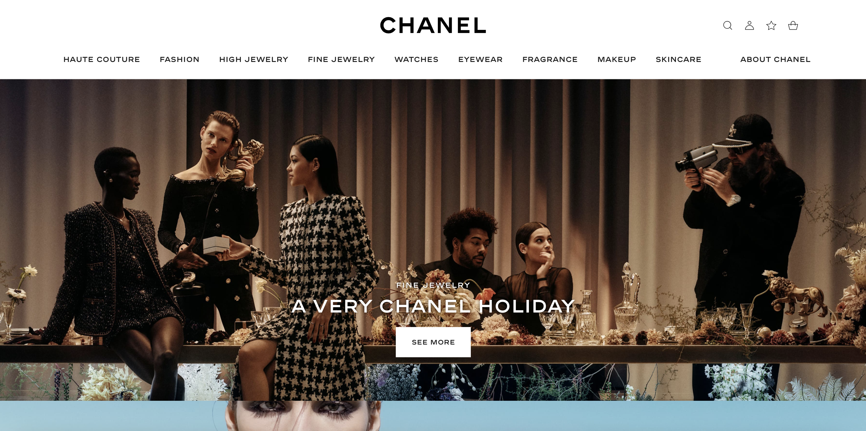
https://www.chanel.com/us/?utm_source=bing&utm_medium=cpc&utm_campaign=crp-us/en-b-crp-chanel_core_alone-exact&utm_term=chanel&utm_content=chanel_core%20alone
This is Chanel’s official website, and the homepage inspired me a lot. This image is very engaging, it is not distracting at all, in fact, the way it is only showing a few pieces of the looks only makes me an audience want to discover more. At the same time, keeping all the navigation aligned at the top is convenient for people to find where to go. This entire page is providing me a nice user experience, everything is well planned out and the colors are unified, nothing distracting is in the picture.
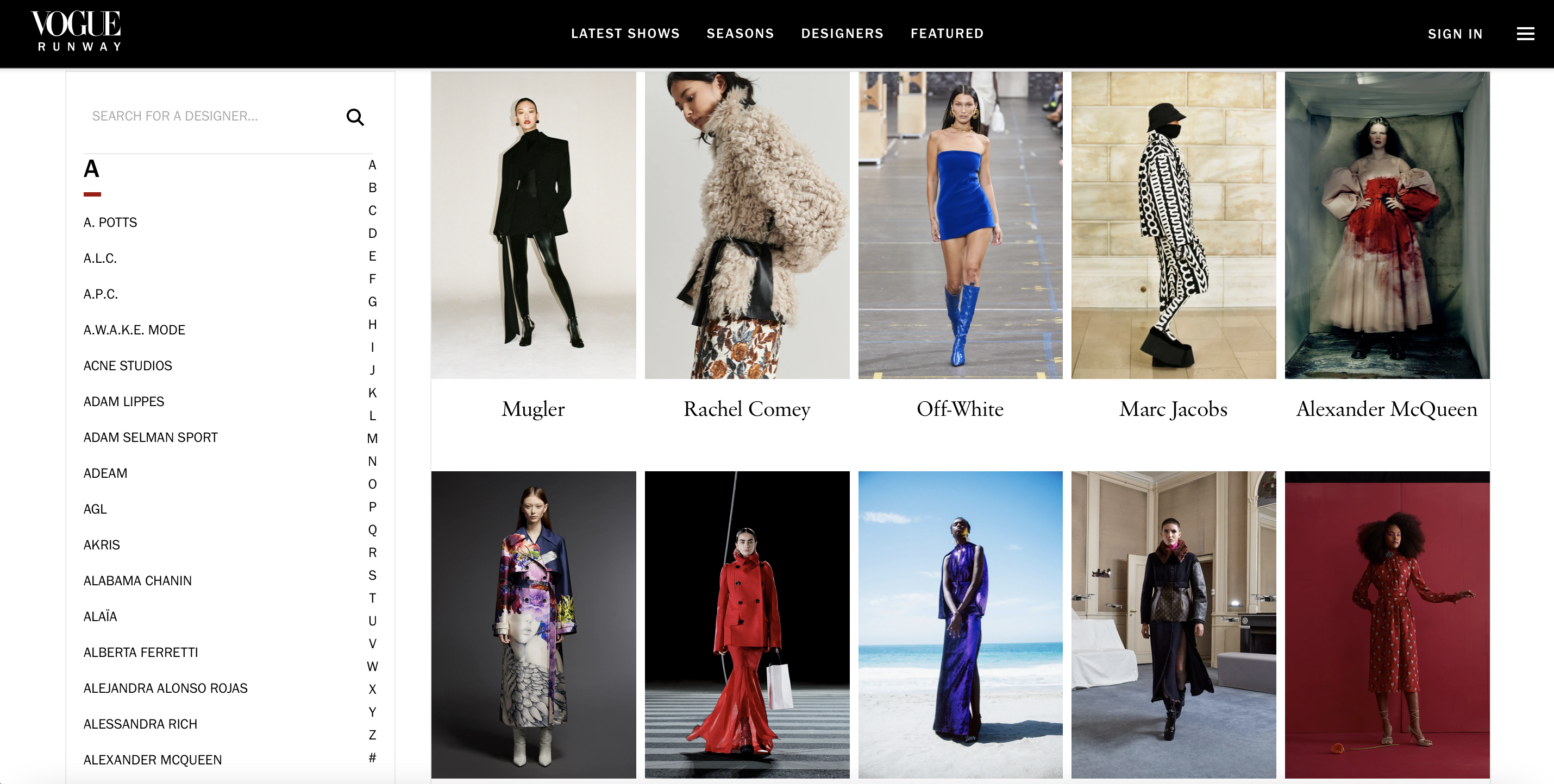
https://www.vogue.com/fashion-shows/fall-2021-ready-to-wear
This is a page from one of the previous fashion week seasons from Vogue Runway. This layout is very inspiring because they are all displayed in the same size with clear labels below each picture. We don’t see any confusing hierarchies, and there is nothing too distracting because the clean background is bringing everything together, it looks harmonious. Also, they place all their main navigation at the very top, which is very organized.
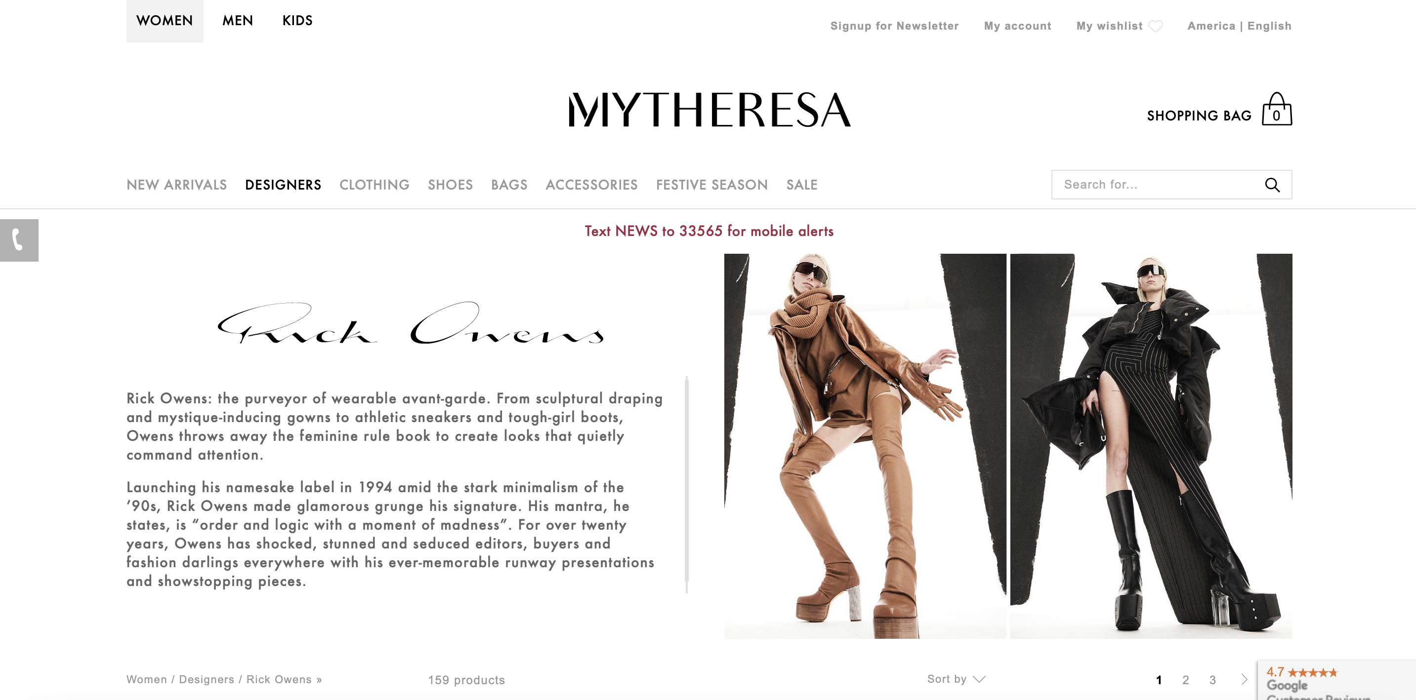
https://www.mytheresa.com/en-us/designers/rick-owens.html?utm_source=sea_nb&utm_medium=bing&ef_id=f8e5997dd62f1d636bc0f8ec5c2b4e60:G:s&gclid=f8e5997dd62f1d636bc0f8ec5c2b4e60&gclsrc=3p.ds&&msclkid=f8e5997dd62f1d636bc0f8ec5c2b4e60&utm_source=bing&utm_medium=cpc&utm_campaign=Diamond_en_US&utm_term=rick%20owens%20com&utm_content=Rick%20Owens_General_en&gclid=f8e5997dd62f1d636bc0f8ec5c2b4e60&gclsrc=3p.ds&slink=1
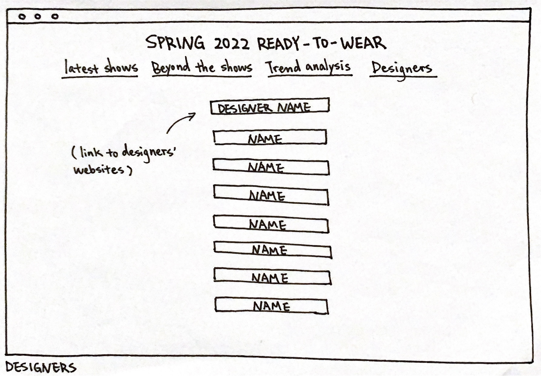
This is the home page of Mytheresa, I like how it is defining and providing information about the designers. Nowadays, people are almost ignoring these designers who work so hard behind the making process of those fabulous garments, they only know the brand names but never the designer. Originality is always important, and we need to show more respect and appreciation towards them. Therefore, I am very inspired and I will be mentioning the designers on my runway website as well.
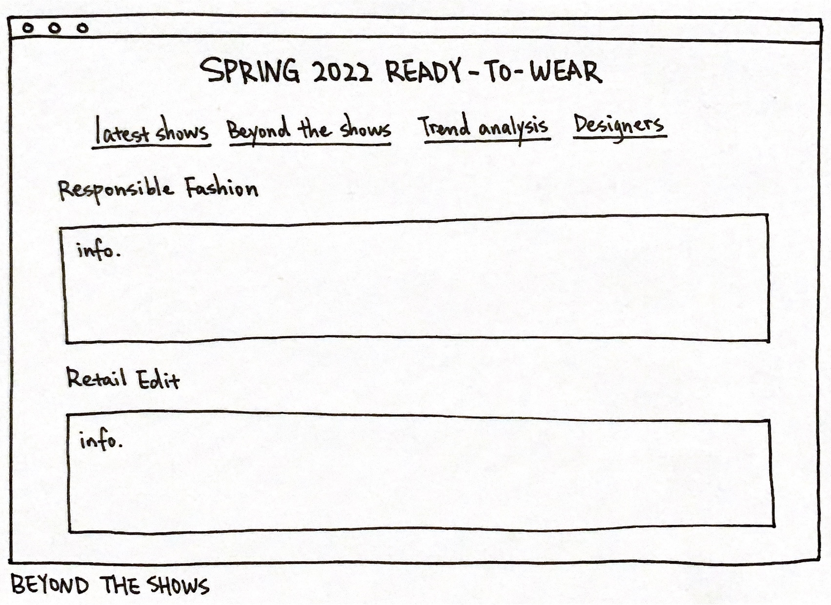
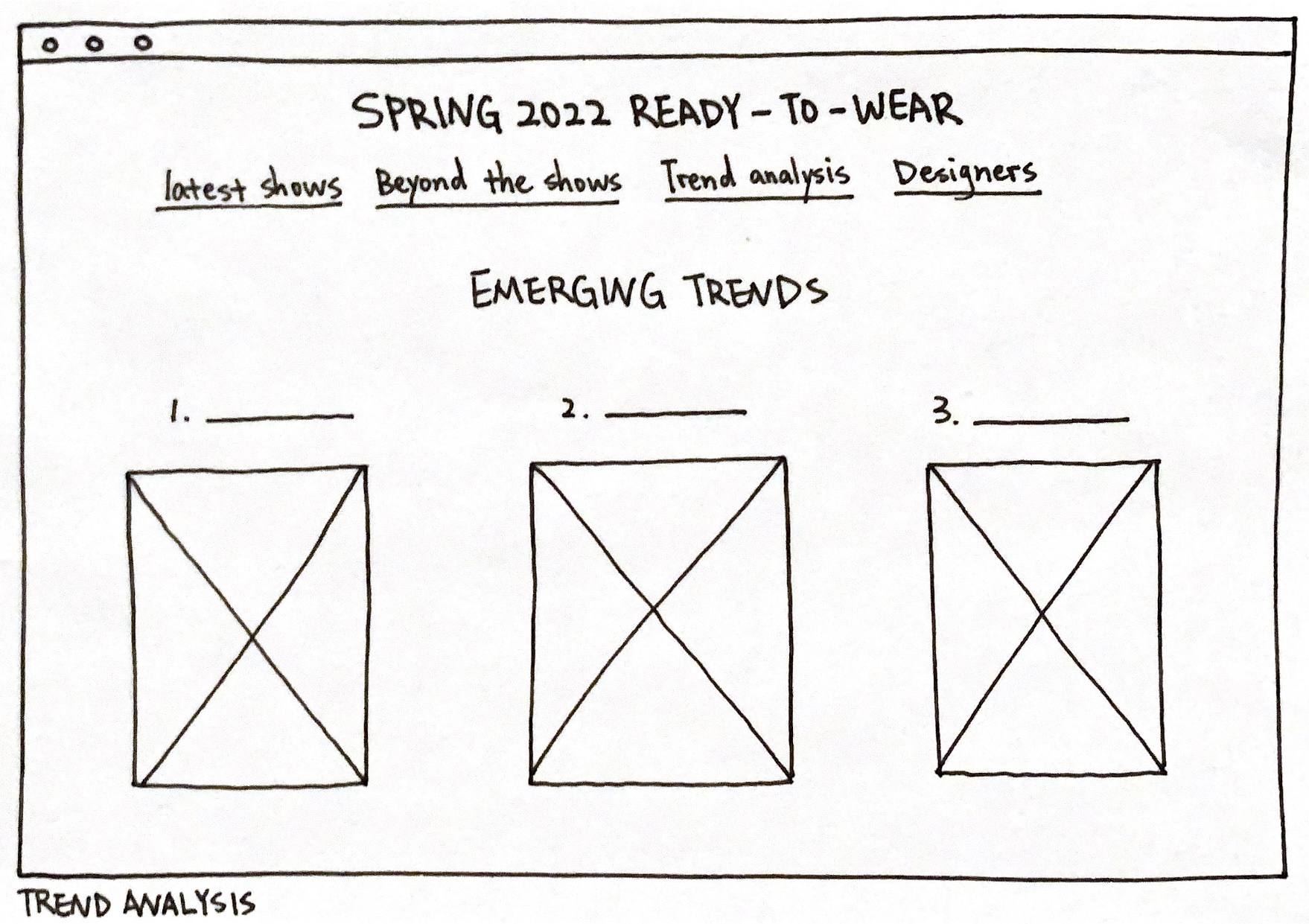
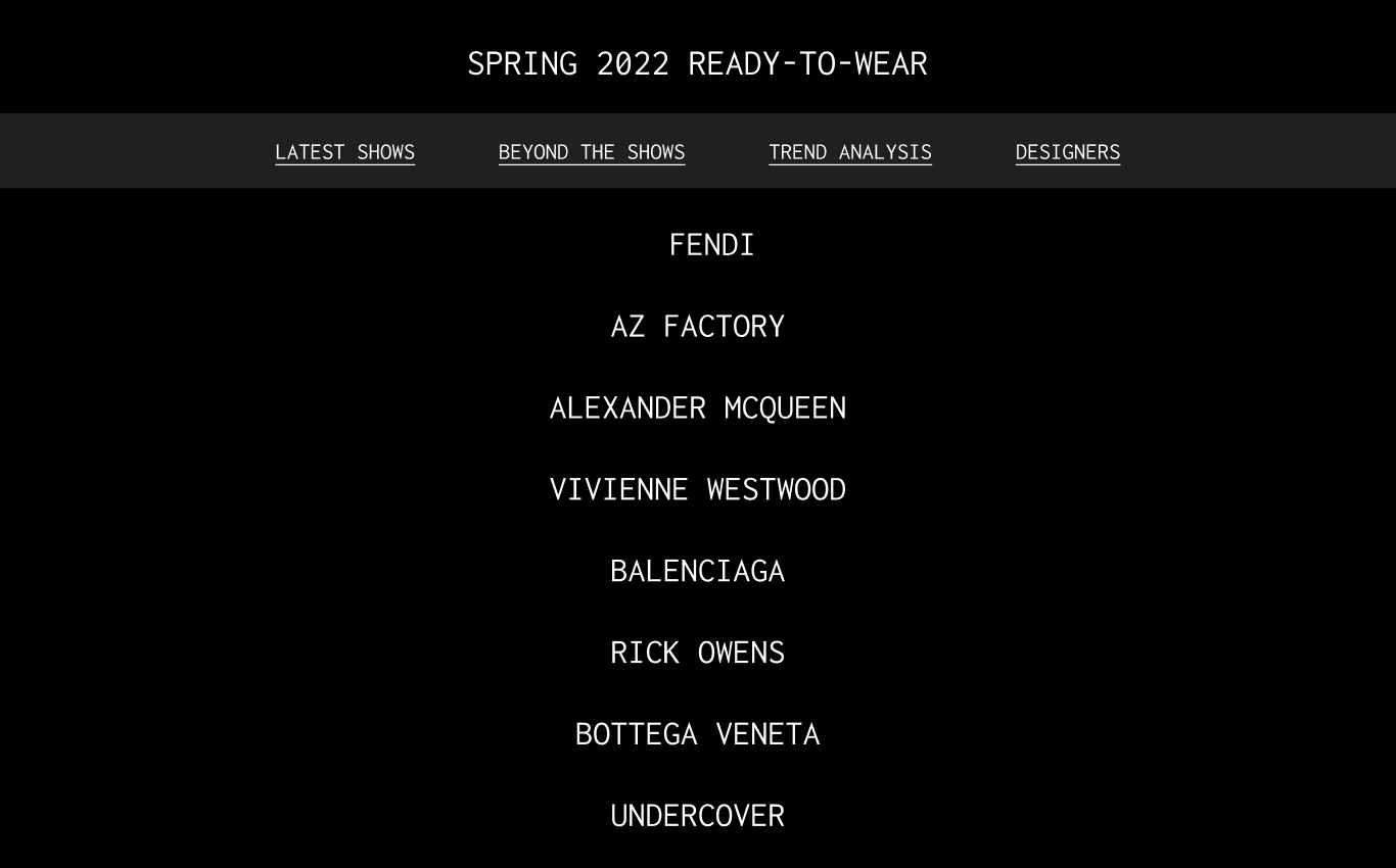
My target audience would be those people who major and have a strong interest in fashion shows and trends, as well as those who work in the fashion industry needing to keep a close eye on emerging trends and designs. I believe this website will be very inspiring for these people because the contents included are “highlighting shows”, “latest shows”, “beyond the shows”, “trend analysis”, and “presented designers”. This will give people ideas about what are the latest designs, what is happening behind what we see on stage, as well as highlighting necessary discoverings about fashion. It can work as an inspiration for students, or a place for designers to gather information.
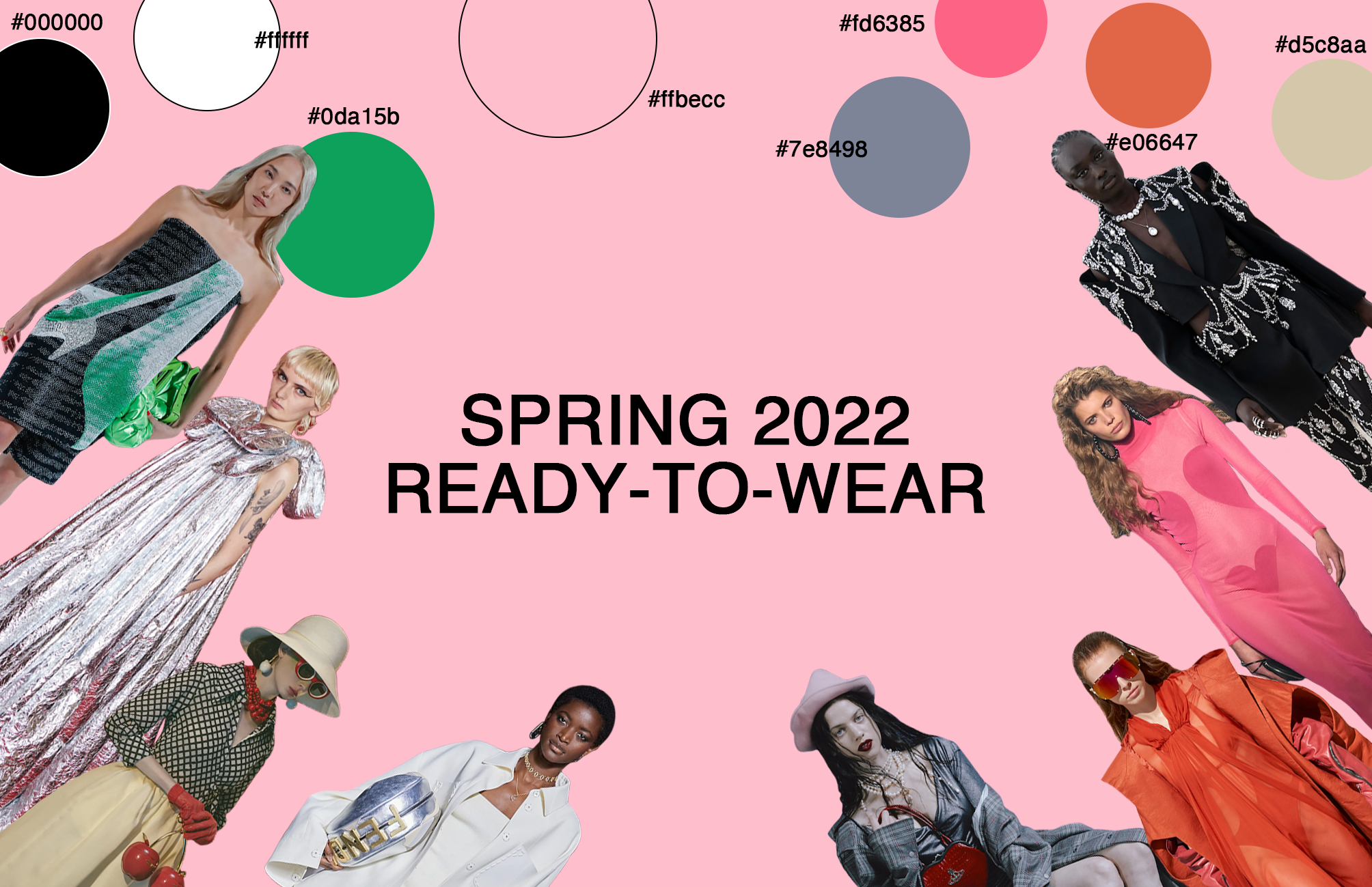
This is a mood board of a playful theme of the homepage that I am looking for building for my website. I wanted to show the playfulness and how much joy fashion is bringing people through my website. Even though we see that sometimes high fashion gives lots of hidden meanings to their designs and there are also symbolizations everywhere on the designs, but at the end of the day seeing them on runways and wearing them in stores are bringing people happiness and joy, and this is the most important, the engagement and enthusiasm.
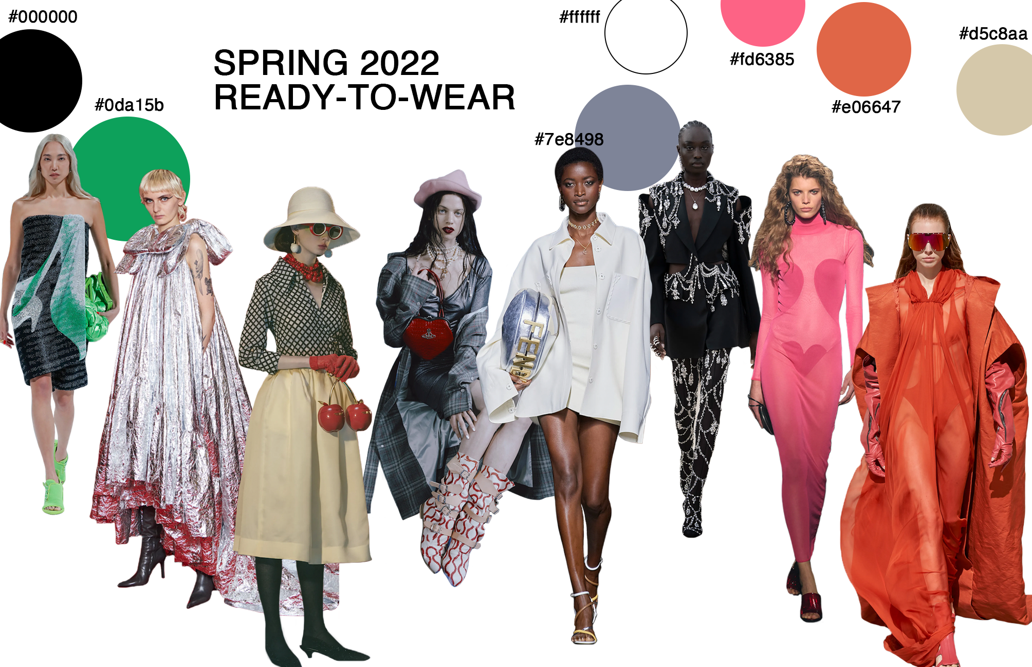
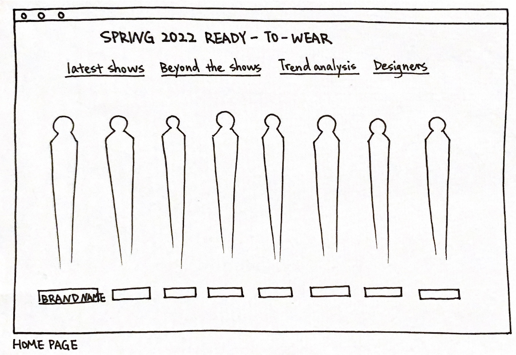
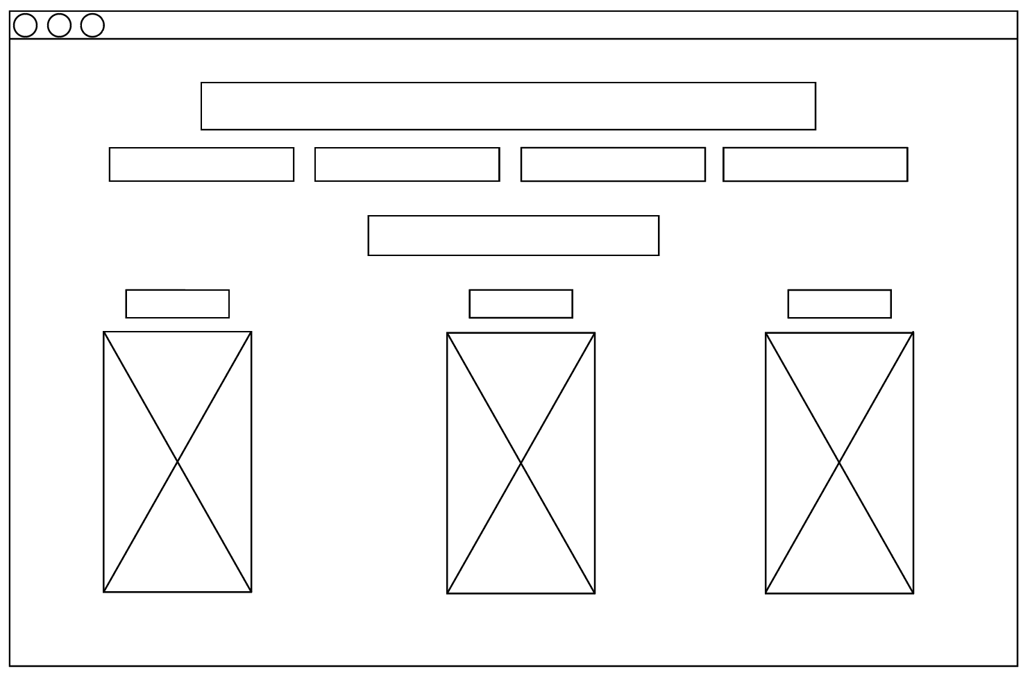
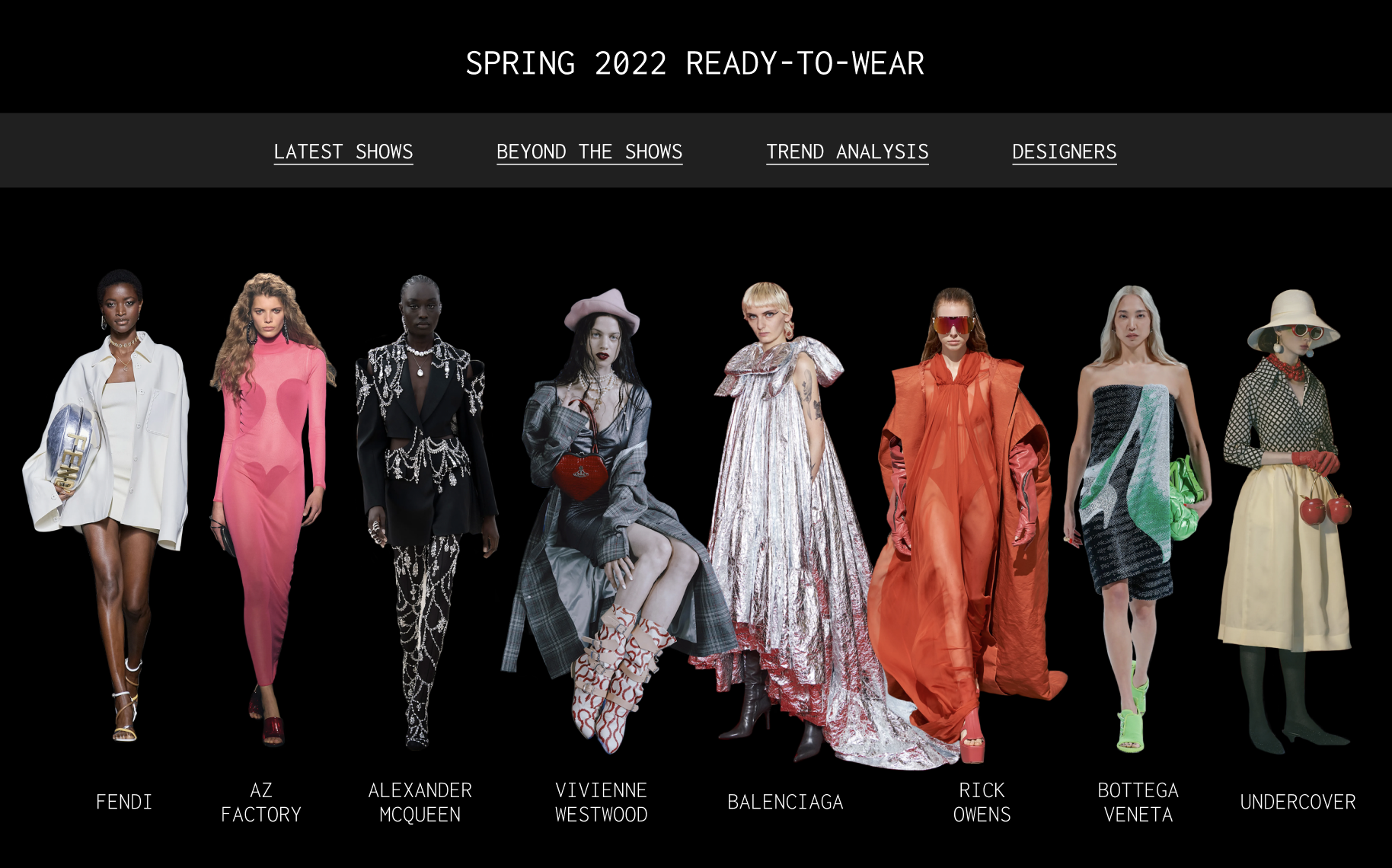
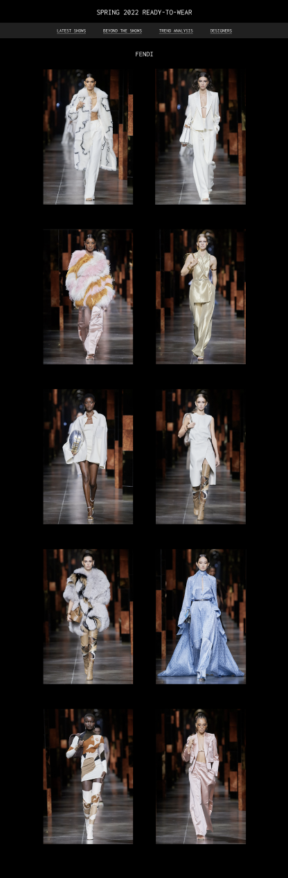
I wanted to show the representative brands by selecting one model from each of the brands and placing them together on the homepage. This way all brands do not look separated, instead, they look unified. Fashion, after all, is oneness, people keep building upon the idea of fashion in their ways, creating new branches and pathways. However, all those design concepts, brands, materiality, shapes, and forms all belong to that one root, which is fashion.
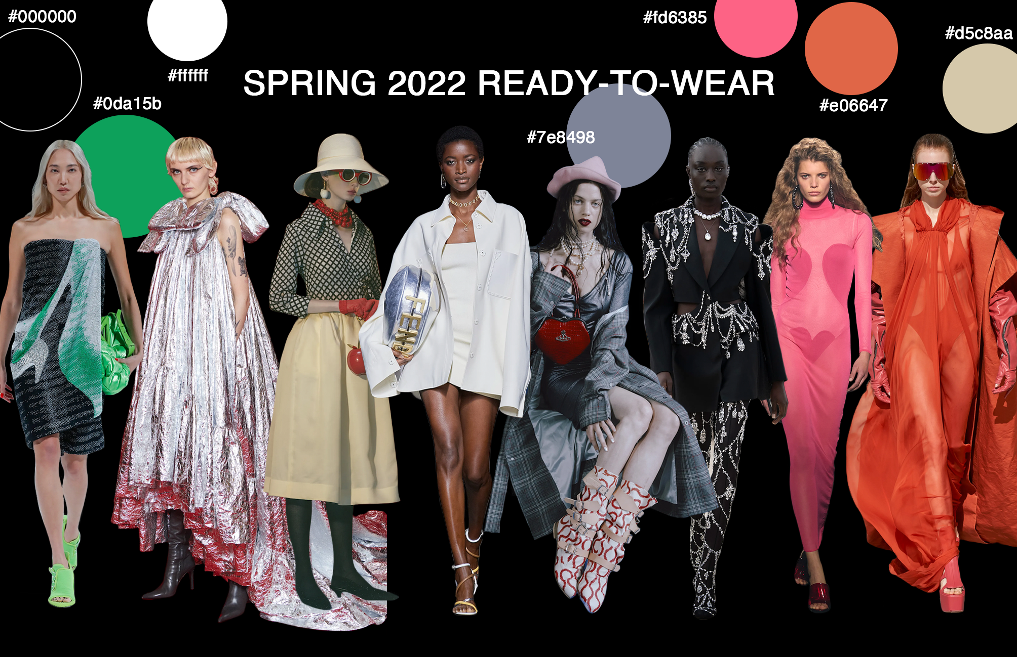
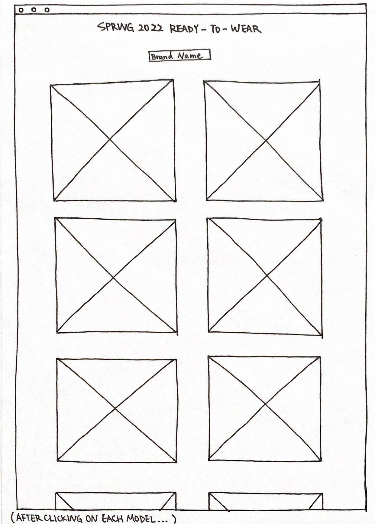
This mood board was created to show the idea of all the models is walking towards the user. This visual shows how I want the user to see and almost experience that they are there on a runway with all these models. Each of these models is selected from various brands and we join them together to form this harmonious show. At the same time, if we click on each of these models, we will be able to see a more detailed show of each brand. I always believe that providing interaction as well as options is more engaging for audiences.