There are many resources for NYC food spots and activities, but few cater specifically to busy individuals looking for unique, Friday-specific experiences that seamlessly fit into a weekend routine. The goal is to create a site that captures the essence of a Friday night out, helping users discover food spots and places that start their weekends on the right note.
Research Findings:
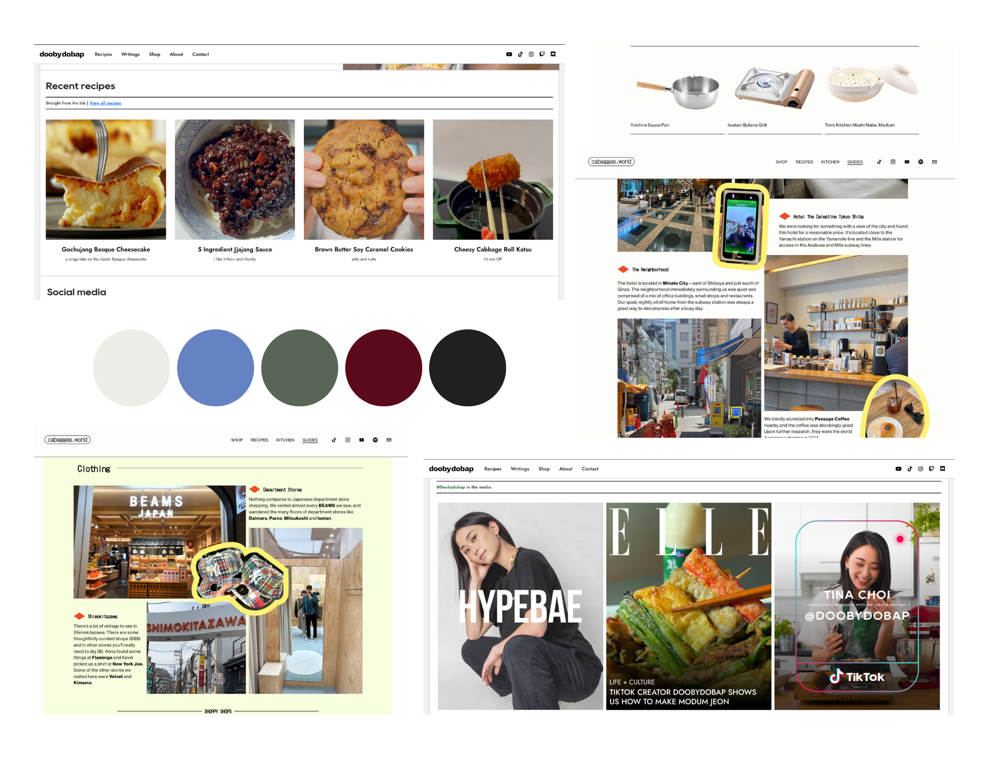
Cabbages World is minimalistic with engaging photography, focusing on specific dishes. Its clean design and focus on visual storytelling are inspiring for highlighting food in an artistic yet accessible way.
Cafe Maddy emphasizes personable, detailed content and food narrative. This style could work well for a blog that feels like a trusted friend’s recommendation.
Doobydobap combines recipes with a lifestyle focus, creating a friendly tone and approach that appeals to a broad audience.
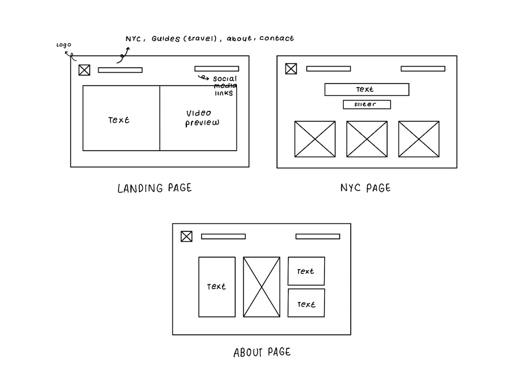
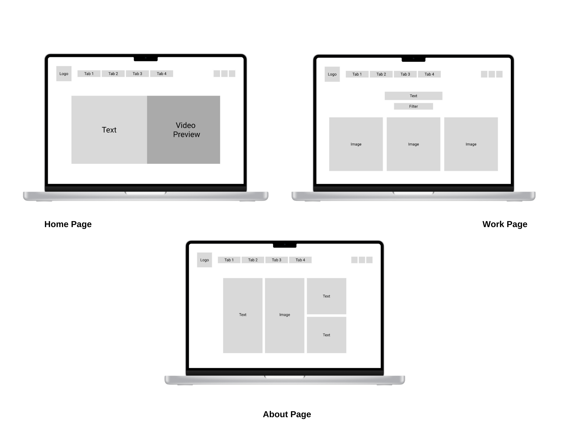
Conclusion: I’ll blend a clean, visually-driven design with friendly, approachable content. Each page will emphasize photos and short, informative descriptions, allowing users to browse quickly while getting valuable tips.
Young professionals and students in NYC who are foodies or weekend explorers. They seek unique, often Instagram-worthy locations to unwind, explore, and try something new without lengthy planning.


