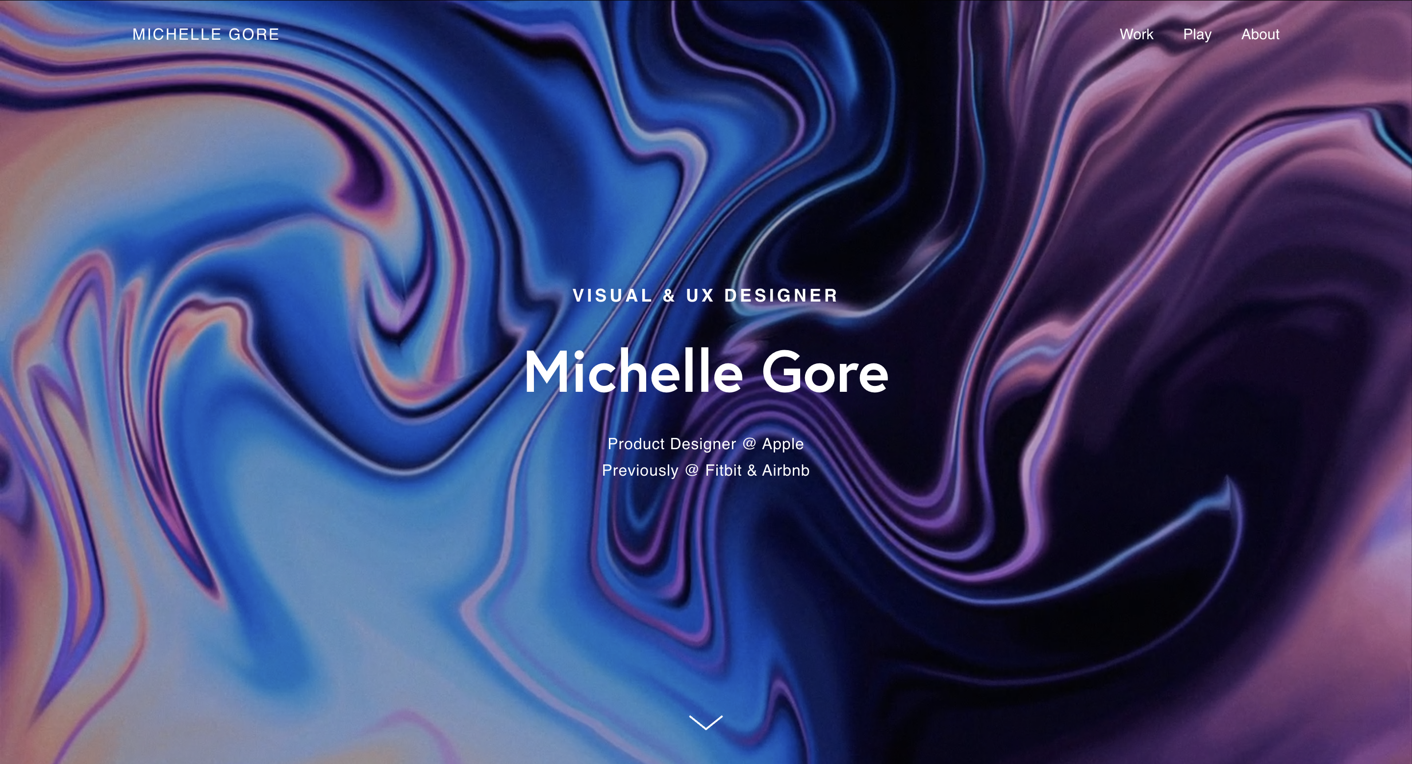
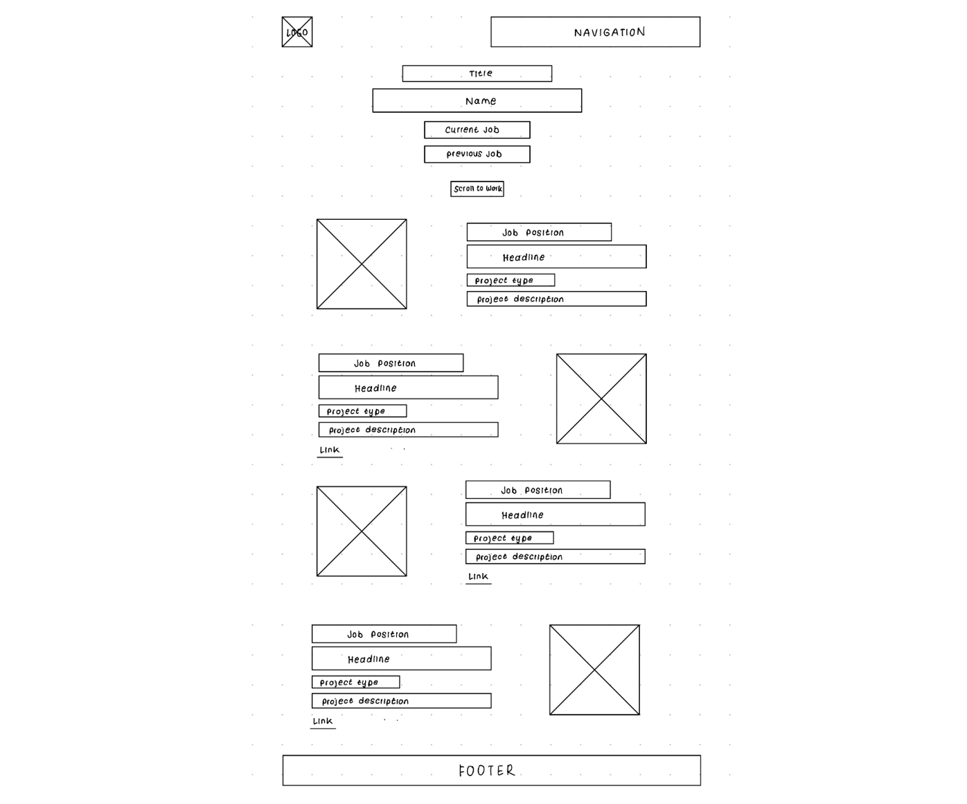
Website Analysis on Michelle Gore


To establish her personal brand and showcase her design skills, experiences, and projects to potential clients, employers, etc.
Confident, Professional, Creative
Home page: The tone of the home page is welcoming and impactful, grabbing attention and inviting exploration.
About page: The tone here is more personal and conversational, fostering a connection with the designer’s background and experiences.
Work page: The tone of the work page is professional, focusing on project details and showcasing credibility and expertise.
Contact page: The tone here is encouraging and welcoming, showing that the designer is approachable.
The website is branded as a professional, creative, and upscale site to appeal to potential clients, agencies, and employers. It has a clean, minimalist design with a consistent color scheme and typography.
Age: 22
Occupation: Design Student
Location: New York City
Background: Kandice is a senior at Parsons studying illustration and is interested in UI/UX.
Goals: She seeks inspiration for her portfolio and guidance on creating case studies.
Attraction: Drawn to the site for its structured case studies and project diversity.
Repeat Engagement: She would revisit for inspiration and guidance on building her own portfolio.
Age: 36
Occupation: Senior Tech Recruiter at a Start-Up
Location: San Francisco
Background: David seeks candidates with strong design skills.
Goals: He looks for designers who can handle diverse projects and communicate effectively.
Attraction: The site’s range of projects and clear communication in case studies.
Repeat Engagement: David may save the site for future recruitment needs or explore more of the designer's work.
Age: 30
Occupation: Finance professional transitioning to UI/UX Design
Location: Boston
Background: Zoe is transitioning from finance to UI/UX.
Goals: She seeks industry insights and portfolio guidance.
Attraction: The designer’s experience provides credibility and insight.
Repeat Engagement: Zoe may refer back for guidance and potentially reach out to the designer for advice.

| Strengths | Weaknesses |
|---|---|
| Michelle has different tones for different pages of the portfolio which suits each content well. | Her resume is hidden at the very bottom which could make it hard for recruiters to find. |
| The site has a confident and creative voice which shows Michelle’s expertise and professionalism. | |
| The site has a clear and consistent branding all throughout. | |
| The site uses high-resolution images and clean design elements. | |
| The site is easy to navigate. | |
| The portfolio provides comprehensive case studies with detailed project breakdowns, including the thought process and design approach behind each work. |