Timo Kuilder is a well-known designer, illustrator, and developer. His website "https://timokuilder.com/" is known for his whimsical and often humorous illustrations. He uses bright colors, bold lines, and imaginative characters to create visually engaging artwork. The voice of his website is diversified, informative, energetic, conversational, and professional. Timo Kuilder's website aimed to propagate and communicate his observation of nature and ongoing curiosity, utilizing simple shapes to tell stories and elicit specific responses with his illustrations, whether it's joy, humor, curiosity, or empathy. Timo Kuilder's versatile portfolio website is open to the general public, which attracts a broad range of viewers and collaborators. Images are left mostly unexplained to allow the work to speak for itself. His ability to appeal to multiple audiences is a testament to his talent and the universal appeal of his artwork.
Timo Kuilder is ……

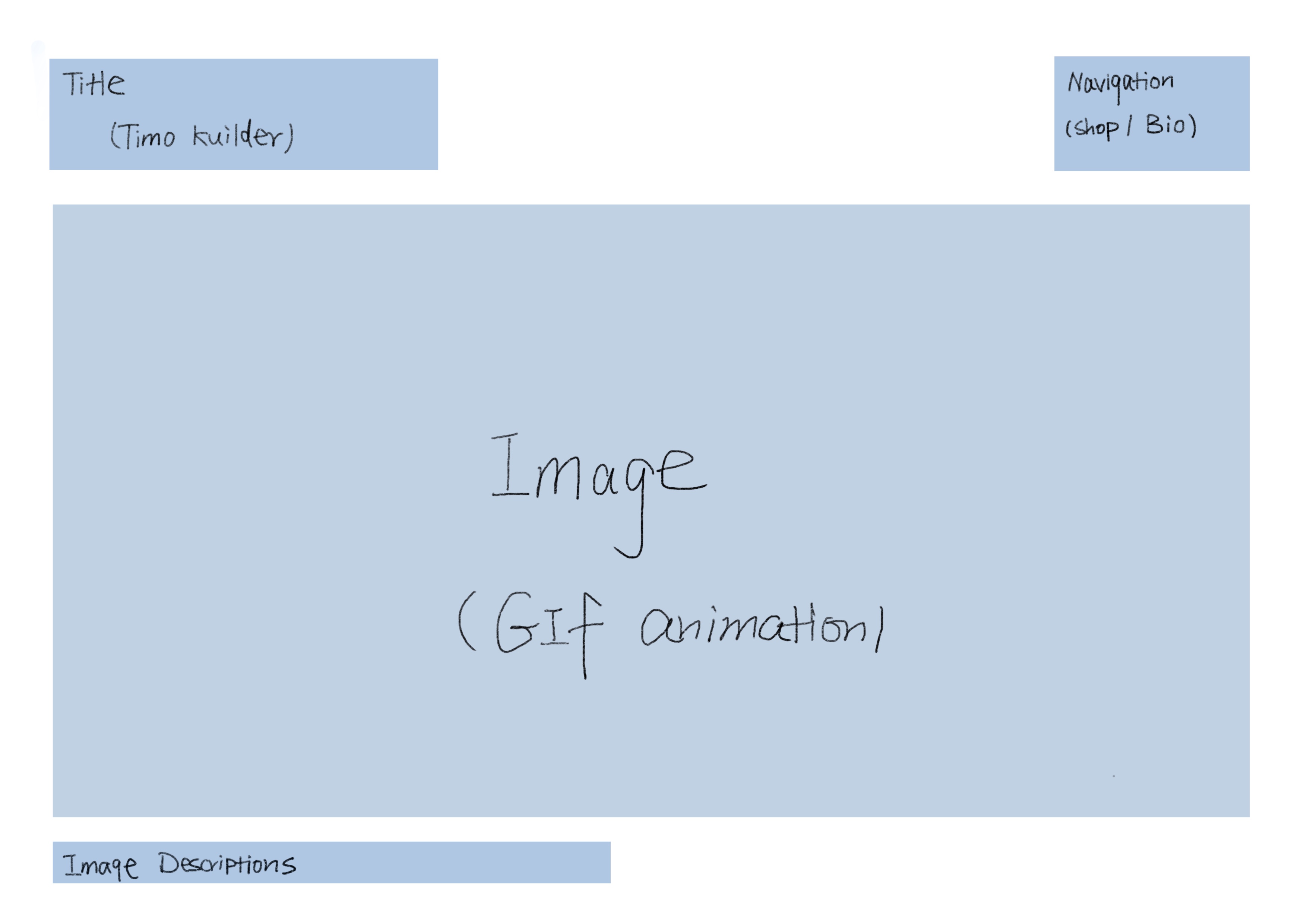
The tone of Timo Kuilder's website varies depending on the page. For instance, the information page is mainly conducted with text, since the bio of the artist might not necessarily be familiar to the casual viewer, thus, a decent amount of explanation is required. While the Home page is more focused on presenting images containing no text; allowing the viewers to immerse in the creative world and allow space for free interpretations The effect is impersonal and can leave the reader encouraged to understand and resonate. Home: Illustration is a visual medium, and showcasing images prominently emphasizes the artist's primary skill and the essence of their work. It allows visitors to immediately engage with and appreciate the artwork. A website fulfilled with visual images can make an immediate and powerful impression on visitors. Another reason being visual content transcends language barriers. Illustrations can be understood and appreciated by people from different linguistic backgrounds, making the website accessible to a global audience. Visual-heavy websites tend to have a more aesthetically pleasing and artistic feel. This aligns with the artistic and creative nature of illustration and can enhance the overall user experience.
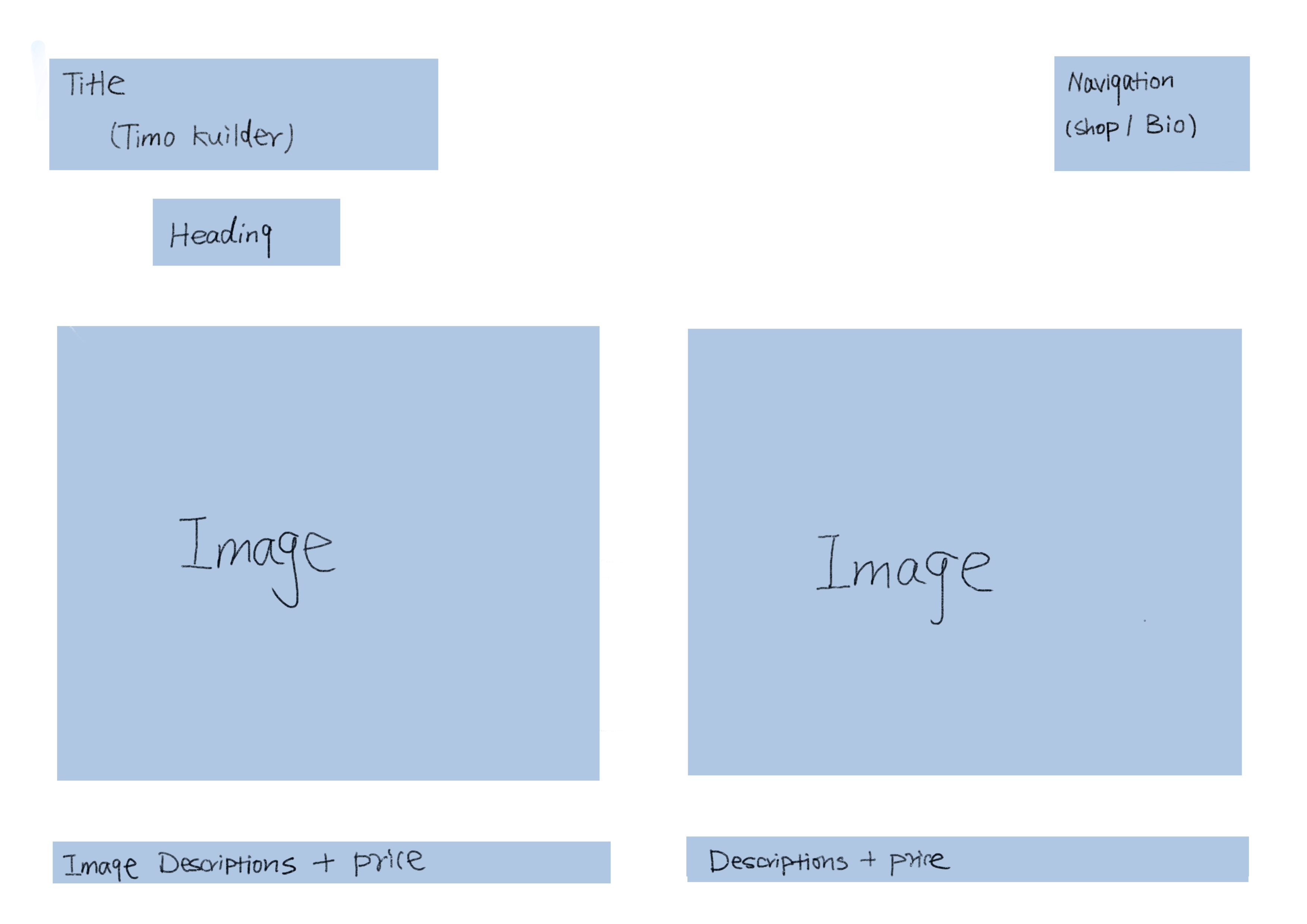
This page gives each work a detailed shot. Its tone is essentially similar to the home page. The text is factual, indicating the price with a rough description of the piece.
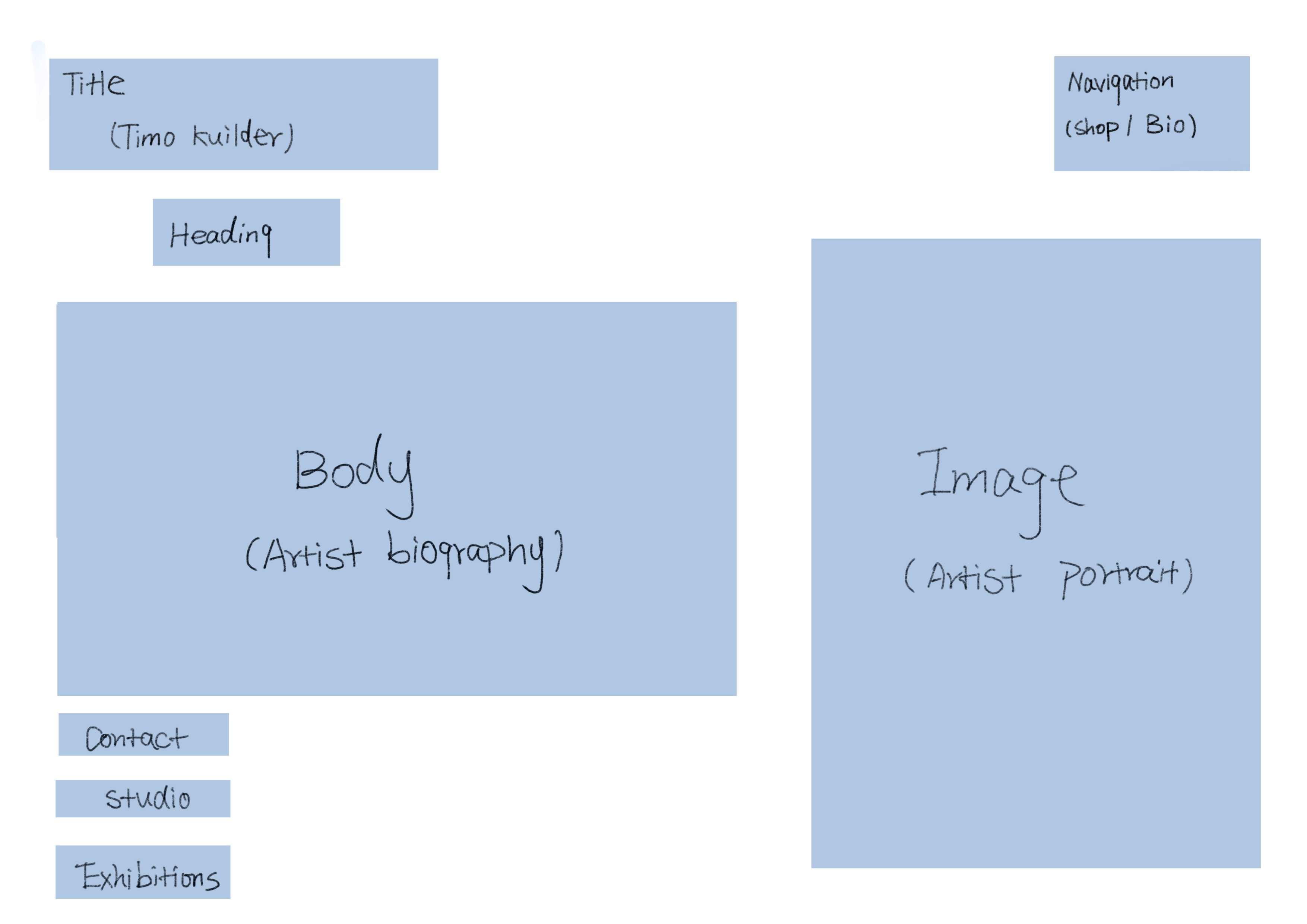
The biography is text-dominated; it gives an idea of his upbringing and personal life, with a focus on the professional experience. The projects and editorials he has worked on are all mentioned, highlighting the achievements and successful collaborations in his career. The assumption is that viewers often perceive an artist based on his reputation and achievements instead of the piece of art they created.
Contact: The text provides contact info for the artist, his studio, and the address for all his exhibitions shown. The section successfully allows viewers to link with the artist in the best way possible.
A website can establish its brand through various elements, in this case, ensuring consistency and conveying a specific tone or image. Timo Kuilder applies his style to both his personal work and website design, meaning consistency across his whole portfolio, which is full of pared-back characters, simple color palettes, and tight linework. The website's visual elements, such as color schemes, play a significant role in brand establishment. Timo Kuilder tends to use a small number of colors, whereas his website remains a simple white background. Consistency in these elements across the website's pages reinforces the brand's identity. Interactive storytelling with moving images also creates a narrative that resonates with the audience and contributes to brand identity.

A local Daily newspaper seeks illustrators who can raise public contemplation with simple visual language. The newspaper aims to compete with other news magazines with a fresh touch of visual elements. They have seen Timo Kuilder's illustrations in the New York Times, Vogue, Firefox, and Google. The skills and work experience are convincing. They are considering featuring his illustrations on the front cover to attract interest and attention. Thus, they visit his website to see other examples of his work and learn how they can contact him.
Home page: The minimalist line works are vibrant on the blank surface, and the images are powerful and mind-blowing, yet not too much that still allows space for text or information. The newspaper company is satisfied with his style and layout, and his background as a font designer certainly adds on. However, as they scroll down the page, the colors and still-motion images seem more appropriate for the website of an illustrator of fashion magazines; which feels a little informal for newspapers. They have noticed that some of Timo's illustrations address social and cultural issues. In such cases, people may react by engaging in conversations about these topics, sharing their perspectives, or appreciating the artist's ability to convey meaningful messages through art.
Biography (Information): They did not pay too much attention to his background, since it contains information they find redundant. The Website lists contact info on several different platforms, and exhibitions shown. The newspaper company decided to go to one of his exhibitions to see what these works looked like physically.
Shop Page: Clicking through the shop page, the newspaper company had an idea of the budget they might spend to feature his illustrations. They noticed the price varies quite large depending on the scale and content.
Daisy is a Junior at Parsons majoring in illustration. She is collecting inspiration for her application portfolio. She has recently started to create interactive images and frame animations in the studio. And she is attracted to Timo Kuilder's illustrations while seeking inspiration online. She decided to investigate the artist further for her practice. At this stage, she also hopes to create a website that effectively demonstrates her skills as an illustrator and interact with the public who may not see her work in person. Home page: Daisy hopes to make her animations flow on the web page like Kuilder did. She also noticed the artist blends his still and moving images naturally throughout the website, hinting at the website with a sense of movement yet still allowing viewers to focus on the details of his illustrations. Timo Kuilder’s work is simple and surrealistic. There is no description of its themes. Daisy thinks this is a great way to aspirate imagination and personal interpretations from the audience and make his piece resonate with the public.
Shop Page: Daisy noticed that having a shop page could be helpful for her future career.
Biography: Daisy carefully reads through this because she is interested in what inspired the artist to create these illustrations. However, the biography did not focus too much on their personal life, but on his charming achievements. The tone is formal and somehow dry, and the information is so spare that her eyes quickly glaze over. She hopes there is a section where the artist talks about his experiences and the pathway that he went through.
Contact: Daisy follows Instagram and tries to create a link with the artist on the linked page Ultimately, Daisy thinks Timo Kuilder's page is inspiring. It makes a great example of an interactive portfolio.
"Melody is a professional buyer working for soft decoration companies. She needs to collect line-style drawings to display in the hall of a fashion company. While browsing on Chrome, she came across Timo Kuilder's illustrations and became interested in learning more about him and his work. She believes that one of Kuilder's prints would be a perfect fit for the company's hall.
Home page: As Melody browses through the homepage, she becomes excited because the style aligns perfectly with what she's looking for. Her only concern is that the animations appear more appealing than the still images, and she's unsure about the visual impact of displaying them in the hall.
Shop Page: Melody finds crucial information about which pieces are available for sale and their respective prices. This panel proves to be extremely valuable for buyers like Melody, making her job significantly easier.
Biography: Melody is less interested in the artist's biography and instead focuses on obtaining more information about the mediums used. She is also disappointed that the homepage did not provide any indication of the media and dimensions of the pieces. She has to click on each illustration to access basic descriptions. f text," and she ends up skimming through the information."
Timo Kuilder's website competes with other illustration websites on several fronts. What sets Timo apart is his uniquely recognizable style. It's distinct and memorable, offering a competitive edge as clients often seek something different. His website's simplicity is another competitive advantage, allowing it to adapt seamlessly to a variety of projects and client needs. The choices he made with the layouts of his website showcased technical proficiency and meticulous attention to detail, strengthening his position among fellow illustrators. In contrast to many other illustrator websites filled with elaborate designs and excess imagery, such as Alex Fisher's vivid and colorful site with minimal negative space, Timo Kuilder's website offers a refreshing and focused user experience. Each section is thoughtfully laid out and extremly interactive, ensuring clarity for viewers, a notable departure from the cluttered aesthetics often found in the field. Competition within the illustration website landscape is fierce, with numerous talented professionals vying for clients and projects. To stay competitive, Timo Kuilder, like his peers, must continuously refine his skills, maintain adaptability, and effectively market himself through his website to attract and retain clients.
