Interested Viewers, Other artists, Galleries, etc.
The website consists mainly of visual images and not much text telling me that it functions mainly as a portfolio than anything else
The site presents curated sets of work and contact information for anyone interested.
Content Strategy:
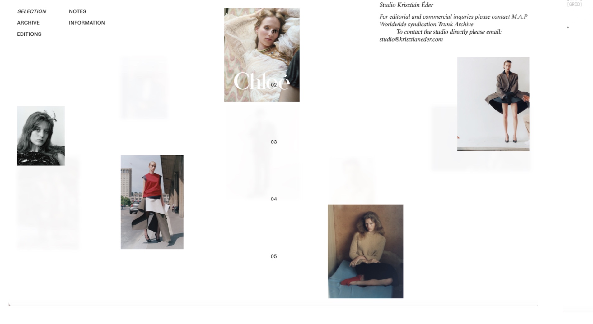
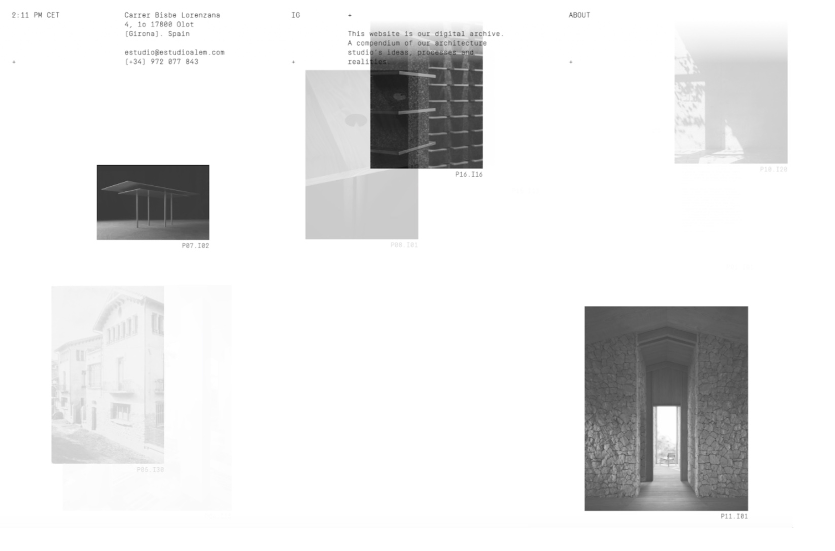
Work sustains interest and attention mainly through putting the focus on the work itself. The rest of the website includes interesting graphics but is kept mostly as minimal as possible.
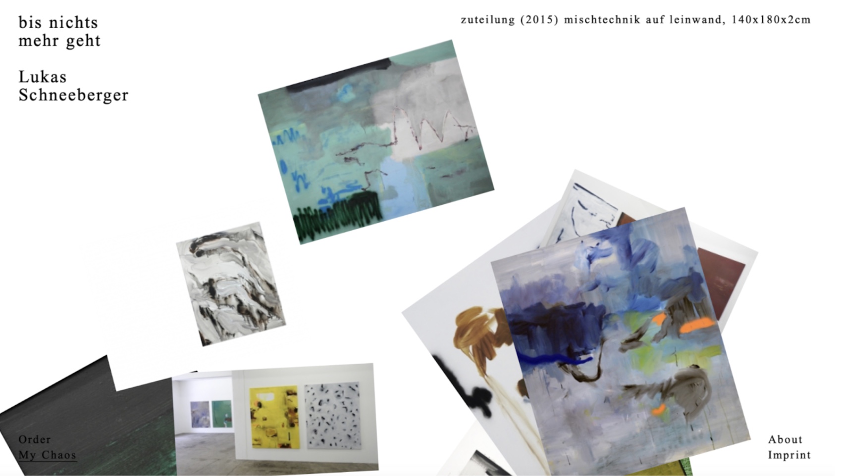
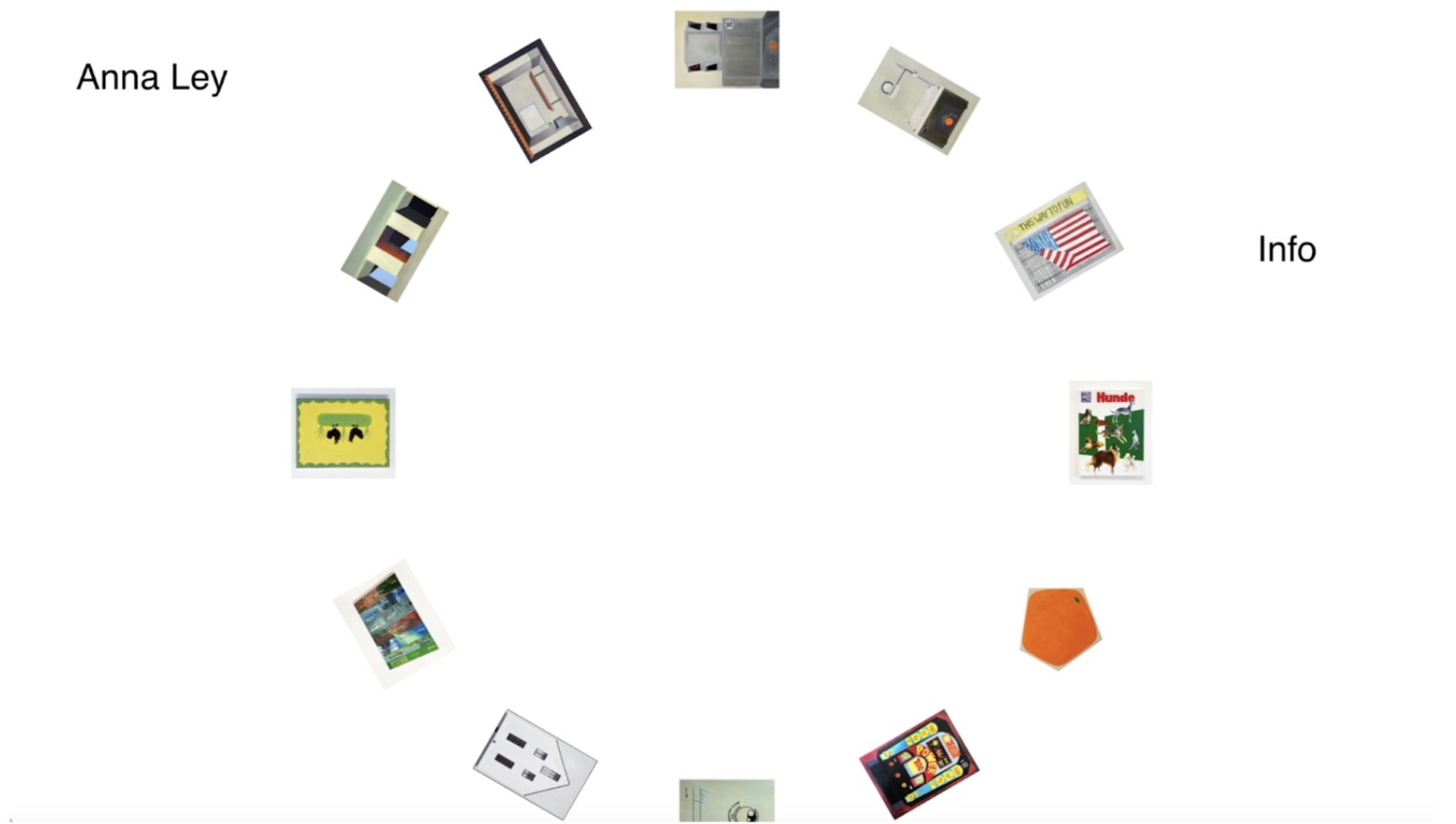
Conceptual coherence through the grouping of images. Exhibition rather than individual pieces?
Minimal explanatory writing: the silence could read as confidence in just the visual, it speaks for itself
Intentional restraint? Site operates more like an exhibition space and less like a website
How Should the Navigation Work:
Consistent minimalism, should be simple and not take away from the work itself
Easy to scroll through and also click in and out of images
Visual Design:
Chaotic layout mirrors the conceptual work of the images (abstract)
Forces the viewer to actively navigate through the chaos
Feels asymmetrical and unpredictable
Constructed chaos, there is synergy within the layout and still feels curated
Intentionally heightening the attention of the viewer?