Josie Allison Design
01 — Intent
What is this website for?
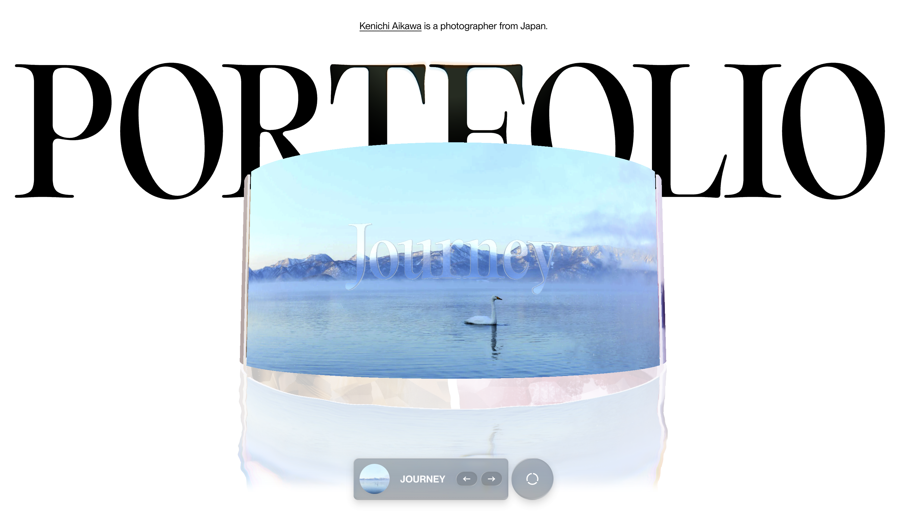
This visual-first portfolio is designed for commercial clients who rely on strong visual storytelling and offers a clean, editorial presentation that foregrounds the photographer’s range. The structured categories make the work easy to navigate and allowing efficient presentation for brands and agencies. i am inspired by the entrance graphics and
02 — Tone
How does this website feel?
The tone is quietly confident, cinematic, and deeply observational. Rather than introducing himself through large blocks of text or personal statements, Kenichi Aikawa lets the photography do almost all of the talking. The site feels less like a portfolio presentation and more like walking through a curated gallery, where each image is given space to breathe and speak for itself.
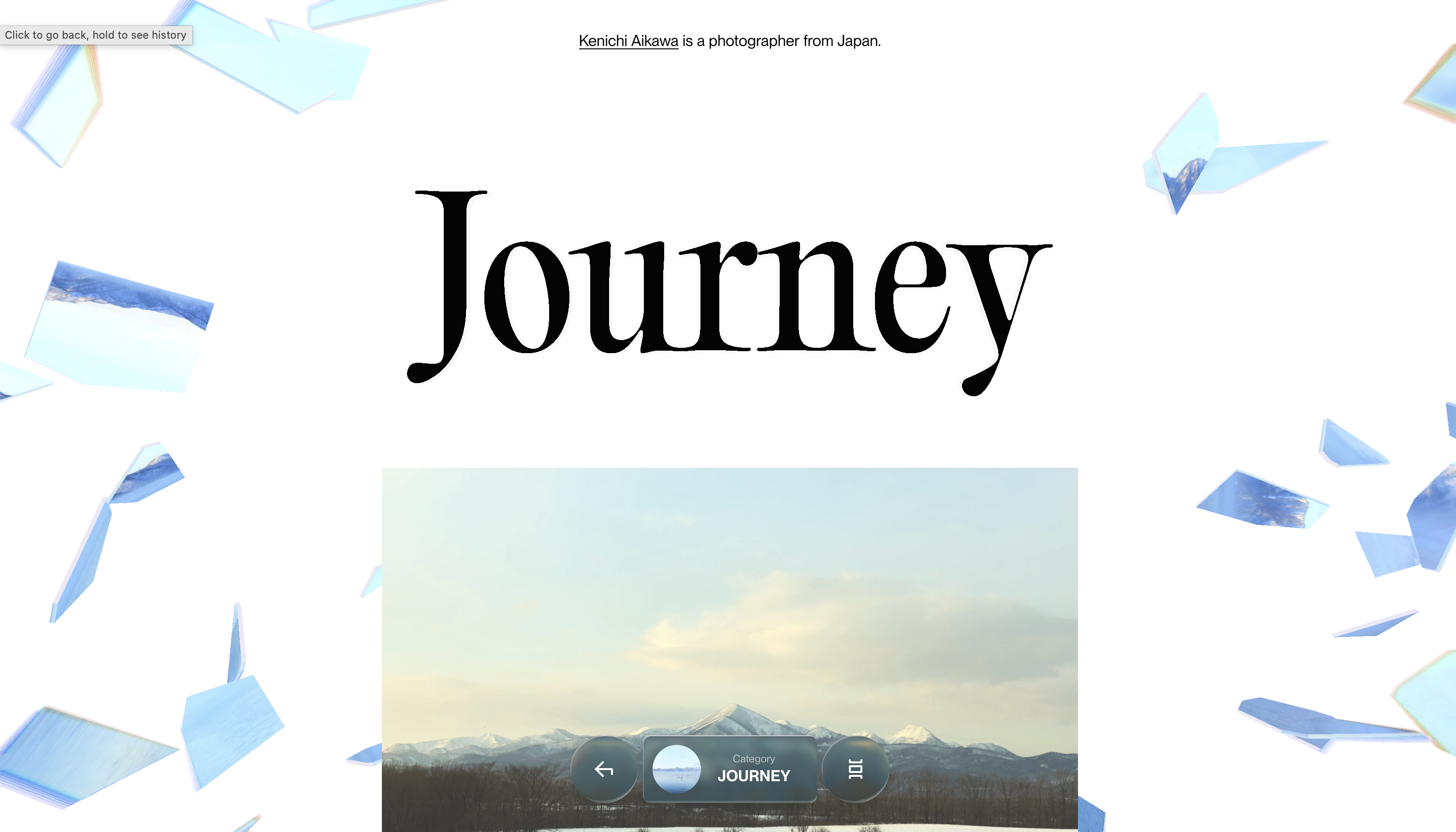
Visually, the website is minimal, elegant, and editorial. The interface is stripped back to the essentials: clean typography, generous whitespace, simple navigation, and large-format imagery. There are very few elements competing for attention. This restraint creates a feeling of trust, suggesting that the work is strong enough that it does not need decoration or explanation.
03 — User Personas
Who visits this site?
The Creative Director
Fashion & Commercial Clients
A creative director, art director, or brand team looking for a photographer with a refined visual style. They browse the work galleries first, looking for consistency, atmosphere, and the ability to tell a story through imagery.
The Editorial Client
Magazines & Publishers
An editor searching for photography that feels cinematic and authentic rather than overly commercial. The blend of fashion, portraiture, and travel work demonstrates versatility while maintaining a distinctive point of view.
The Fellow Creative
Photographers & Designers
Other photographers, designers, and visual artists visit for inspiration. The minimal presentation and emphasis on imagery make the site feel less like a portfolio and more like a curated visual archive.
04 — Competition
What makes this different?
Most photography portfolios either feel like commercial archives or polished fashion showcases. AikawaKenichi.com stands apart in a few key ways:
- Photography-first experience: The work introduces the photographer before any biography or explanation.
- Gallery-like presentation:Large imagery, minimal text, and generous spacing make the site feel more like an exhibition than a portfolio
- Quiet visual language:Instead of relying on bold colours, animations, or effects, the site uses restraint and lets the images carry the experience.
- Mix of fashion and everyday life: The portfolio moves between editorial, lifestyle, portrait, and travel photography, creating a broader and more human perspective.