JG
RESPONSIVE MOCKUP / THREE KINGDOMS
user@jason ~ /parsons/responsive_mockup
Responsive Mockup: Three Kingdoms_
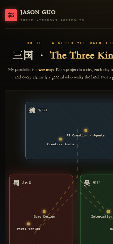
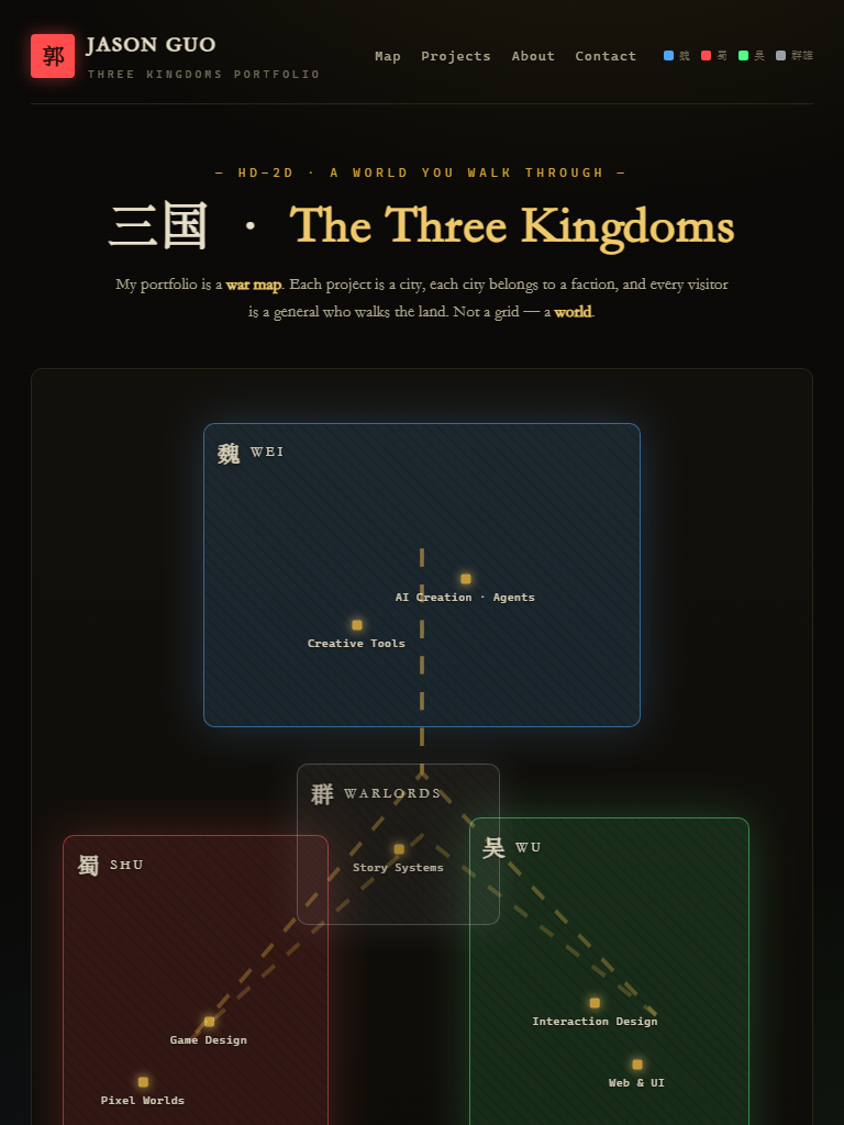
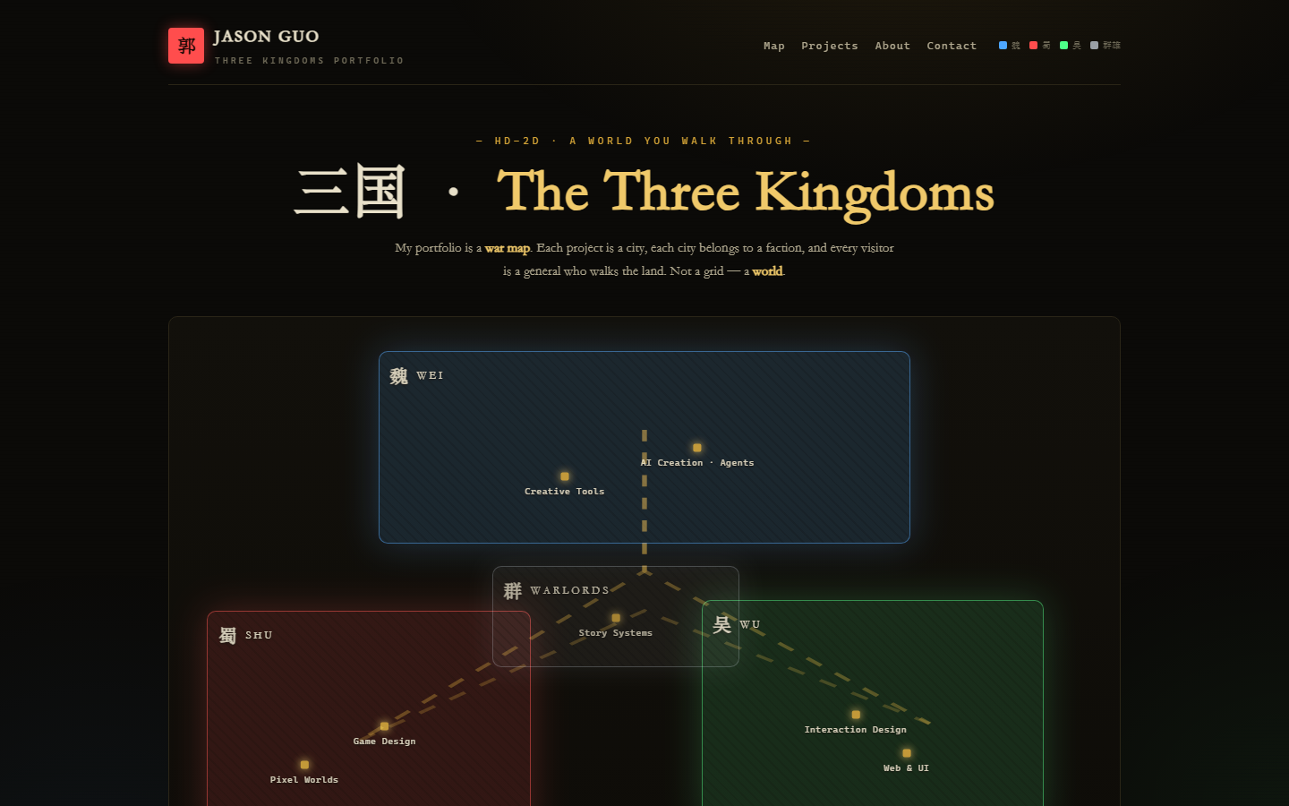
This is the responsive comp for my Concept B, the portfolio as an HD-2D Three Kingdoms world. Visitors walk a war map, and my projects are the cities on it, grouped into four color-coded factions. This page shows how the same design re-flows across a phone, a tablet, and a desktop.
01 / The Comp
Three Devices, One World
Same map, same factions, same navigation. I just restructure it for each screen. On a phone the map simplifies into a vertical flow. On desktop it opens into the full war map with project cards.
02 / Faction Color System
Four Factions, Four Colors
| Faction | Color | Work it holds |
|---|---|---|
| 魏 Wei (north) | #4da6ff | AI Creation, agents and tools |
| 蜀 Shu (southwest) | #ff4d4d | Game Design, pixel worlds |
| 吴 Wu (southeast) | #4dff88 | Interaction Design, web and UI |
| 群雄 Warlords (scattered) | #9aa0a6 | Story Systems, experiments |
03 / Responsive Behavior
How the Layout Re-flows
- Phone (≤560px): one column. The nav collapses to a hamburger, the map stacks the four territories vertically, and the project cards sit in a 2-up grid.
- Tablet (≤900px): the map keeps its full frame, the cards switch to two columns, and the legend stays visible for orientation.
- Desktop (1440px): the full map spans the width with all four territories and their city nodes, and below it a row of four project cards, each tagged with its faction color.
- What stays the same: the ink-wash background, the gold city dots, and the four faction colors. That's what keeps it feeling like the same world at every size.