Step 1: Develop Your Idea
Intent: Create a visually striking "false" pet matchmaking website. Unlike modern minimalist design, this project aims to imitate the aesthetic of Chinese dating websites (such as the early Zhenai.com and Huailai.com) around 2005 through Visual Irony (visual irony). It will provide pet owners with a humorous social interaction platform in a "rustic cool" and life-like manner.
Step 2: Discovery and Research
Tone: Enthusiastic, noisy, straightforward and full of "honesty".
Research:I conducted a thorough study of the typical features of the Web 1.0 era: such as the red and blue color scheme of early 世纪佳缘/珍爱网/百合网, dense text links, and the flashing effects of the Flash era. I compared the sliding logic of modern Tinder and decided to go against the trend, adopting the old-fashioned "list arrangement" and "badge authentication system" to enhance the serious contrast of "aiming for marriage".
Step 3: Target Your Audience
Primary Audience: Gen-Z pet owners seeking subcultural expression and Retro/Y2K enthusiasts.
Persona - Auntie Wang (The Traditionalist):A retired pet owner eager to find a "stable partner" for her Corgi. She dislikes complex animations; she needs large fonts, blinking "Trust-Certified" icons, and blunt descriptions of the other party's "assets" (e.g., a 3-story cat tree).
Persona - Kevin (The Retro Hunter): A design student visiting for "low-fi" inspiration. He is captivated by the un-closable pop-up ads in the corner and the pixelated heart-shaped cursor, sharing the site on social media as an aesthetic "vibe."
Persona - Professor (The Evaluator): An instructor looking for CSS mastery. They will notice how I use CSS Grid to simulate outdated Table layouts and how I recreate the nostalgic marquee scrolling text using CSS keyframes.
Step 4: Intro Framing & Concluding CTA
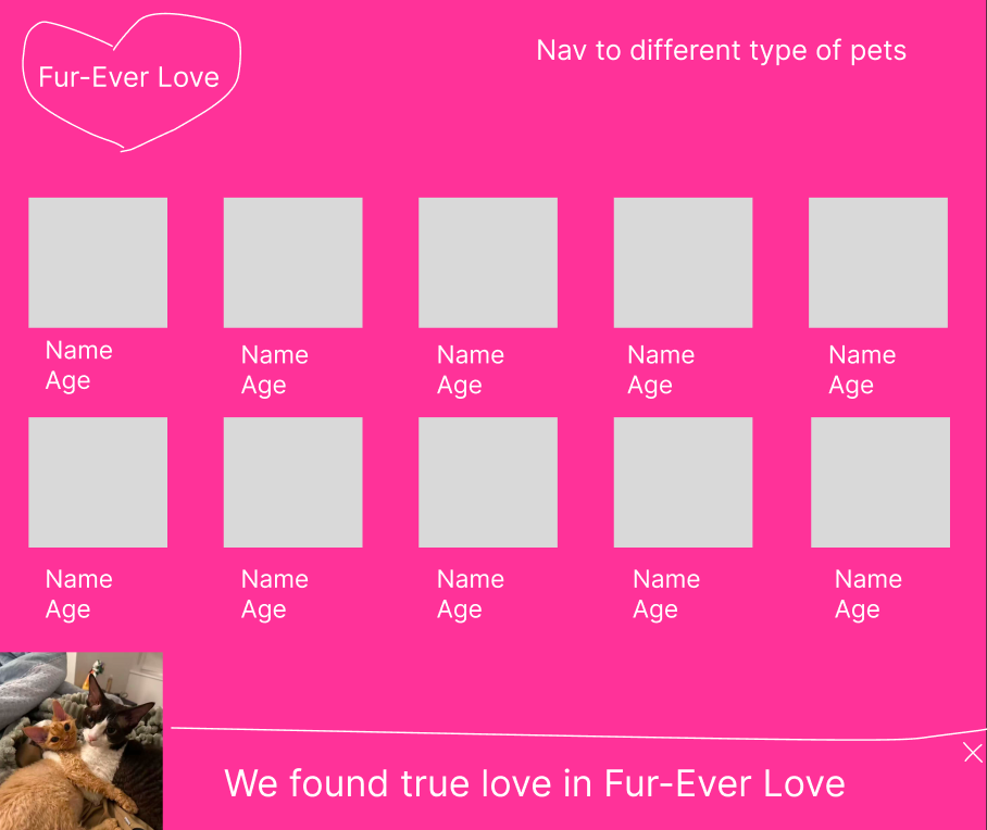
Intro: At the top of the homepage is a large, flashing headline: "They Find Their Love in Fur-ever Love" accompanied by two pixelated pictures of cats and dogs holding hands, instantly creating a sense of time and place.
CTA: At the bottom of the page, there is a prominent red gradient button: "Register your pet immediately and get the golden canned package!" Clicking on it will redirect to a registration page that is full of "survey questionnaire-like" elements.
Step 5: Inspiration and Concepts
Concept: The classic #ff0000 (bright red) is used as the highlighting color, symbolizing joy and success. The background is colored in pink to symbolize love.
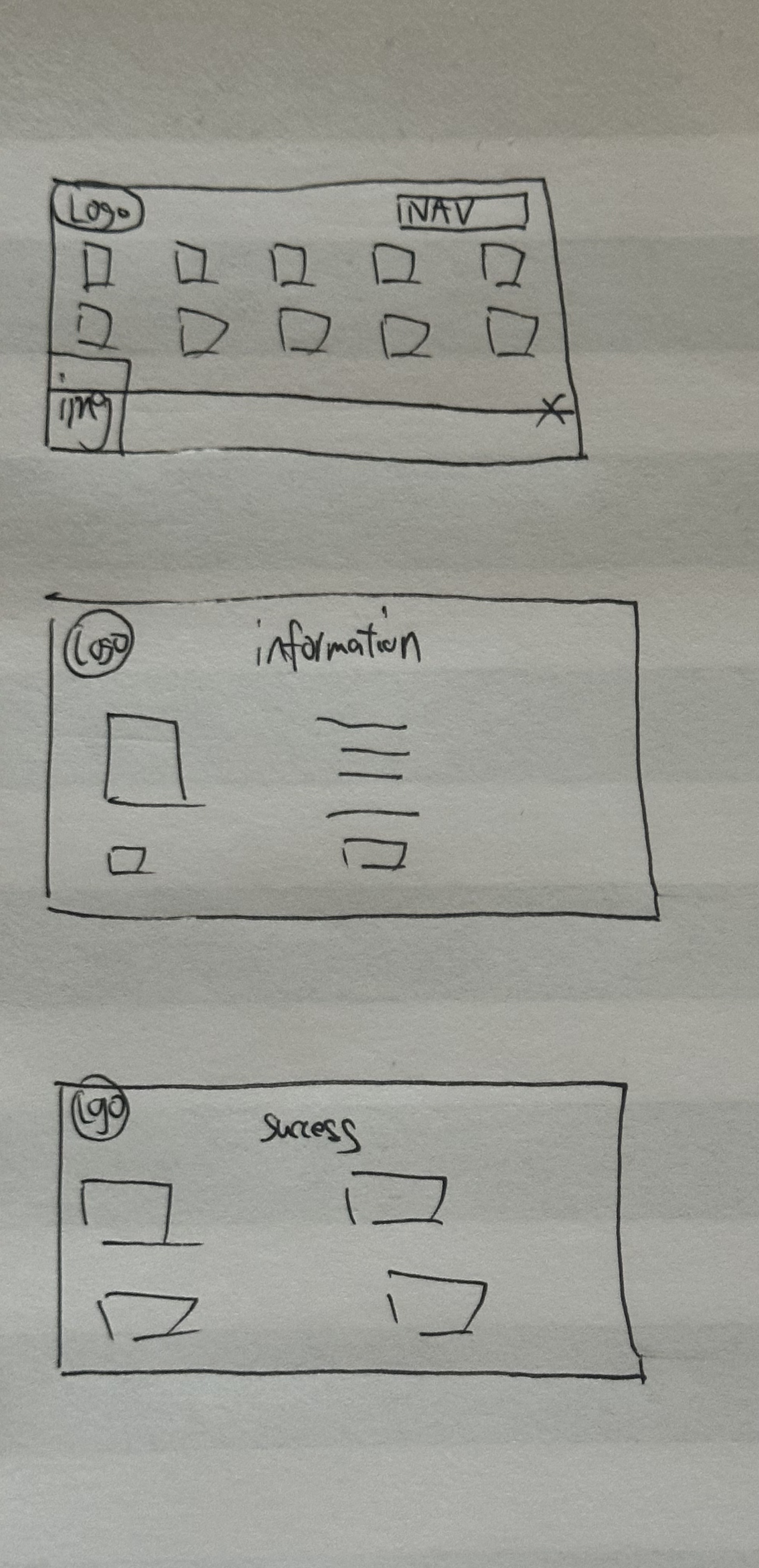
06. Thumbnails & Sketches
07. Wireframes and Prototypes
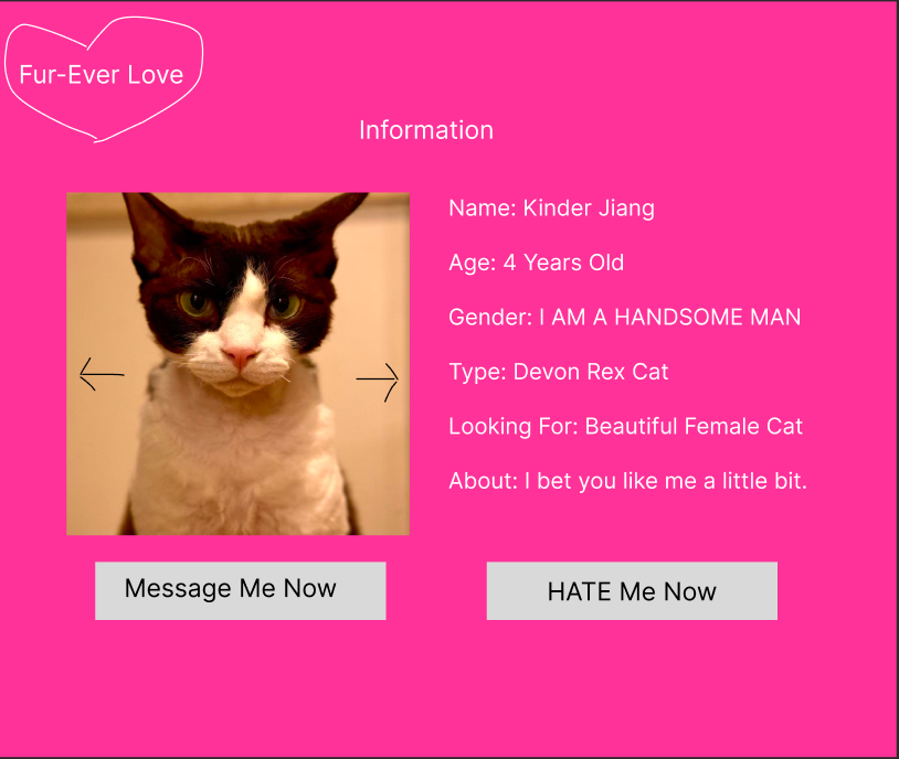
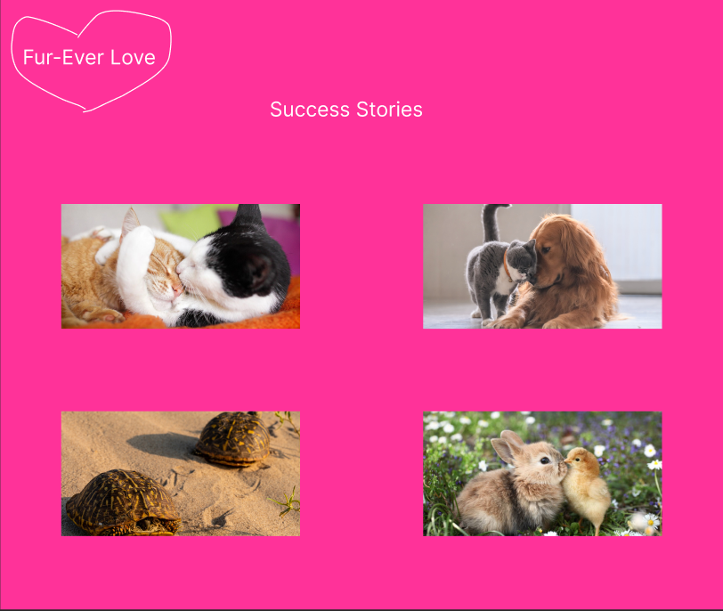
08. Final Delivery
This website is a "visual disaster" constructed with HTML/CSS. I deliberately gave up the aesthetic purism and used a large number of 3D raised buttons (border-style: outset), marquee scrolling text, and heart-shaped mouse icons. It is my naughty counterattack against modern minimalism: sometimes, something that is "ugly" but logical actually has more vitality than something that is "beautiful" but repetitive.