Overview
For this assignment I chose to analyze the portfolio website of Sasha Satchi, an art director and still life photographer. I'm studying interaction design, not photography, but her site caught my attention because of how creatively it uses UI and UX to support the work rather than compete with it — which is exactly the kind of thinking I want to bring into my own portfolio.
Website Style Guide
Intent
The site's own description sums it up well: Sasha Satchi "creates conceptual still life photography, sculptural object compositions and visual narratives for brands, editorials and art projects." The intent isn't just to display photographs — it's to present each project as a considered object or narrative in its own right, and to let the site's interaction design carry that same level of intention.
Voice
Minimal. Confident. Understated. The site doesn't need to explain itself — the restraint of the design communicates a quiet, assured expertise rather than an energetic or conversational one.
Tone
The homepage feels playful and exploratory — hovering over photos triggers different images in different rotations, which invites you to keep interacting. Inside an individual project, the tone shifts to something more focused and curatorial: the asymmetrical grid and scroll progress indicator make each project feel like it's being presented deliberately, one considered piece at a time, rather than just scrolled through.
Brand
The brand reads as upscale and editorial without being cold. Consistency comes from the restraint carried across every page — the same minimal type, the same generous white space, the same subtlety in the hover interactions — so the site feels considered rather than assembled from a template.
Personas
Persona 1 — The Art Buyer
Priya, 38, is a creative producer at a mid-size advertising agency in New York. She's browsing
dozens of photographer portfolios a week to shortlist people for an upcoming still life
campaign. She doesn't have time to read artist statements — she needs to see range and
consistency fast. The homepage's hover interactions let her preview a lot of work in a short
amount of time without committing to opening each project individually, and the "Commercial"
filter lets her instantly see what Sasha has done for paying clients versus personal work — which
is exactly what she needs to judge fit. She'd bookmark the site and come back when a relevant
brief comes in.
Persona 2 — The Fellow Creative
Dan, 27, is a junior art director at a design studio, scrolling portfolio sites on his lunch
break for inspiration on how to structure his own site's project pages. He's drawn in by the
asymmetrical grid and the scroll progress indicator — small interface details he hasn't seen done
this way before. He spends longer on the site than he meant to, partly studying the photography
and partly reverse-engineering how the interactions were built. He'd share the link with his
team as a reference in a design crit.
Persona 3 — The Design Student
This one is basically me. An interaction design student researching portfolio sites for a class
assignment, not looking to hire a photographer at all — but studying how someone outside my own
discipline uses UI and UX to elevate their work. What pulls me in isn't the photography alone,
it's how the interface never competes with it: the hover states, the minimal type, the way
filtering by "Commercial" reorganizes the whole grid instantly. I'd come back to this site
specifically as a reference point while building my own portfolio.
Wireframe
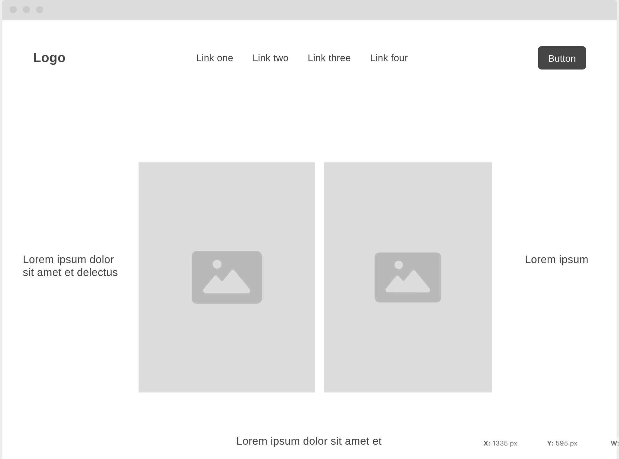
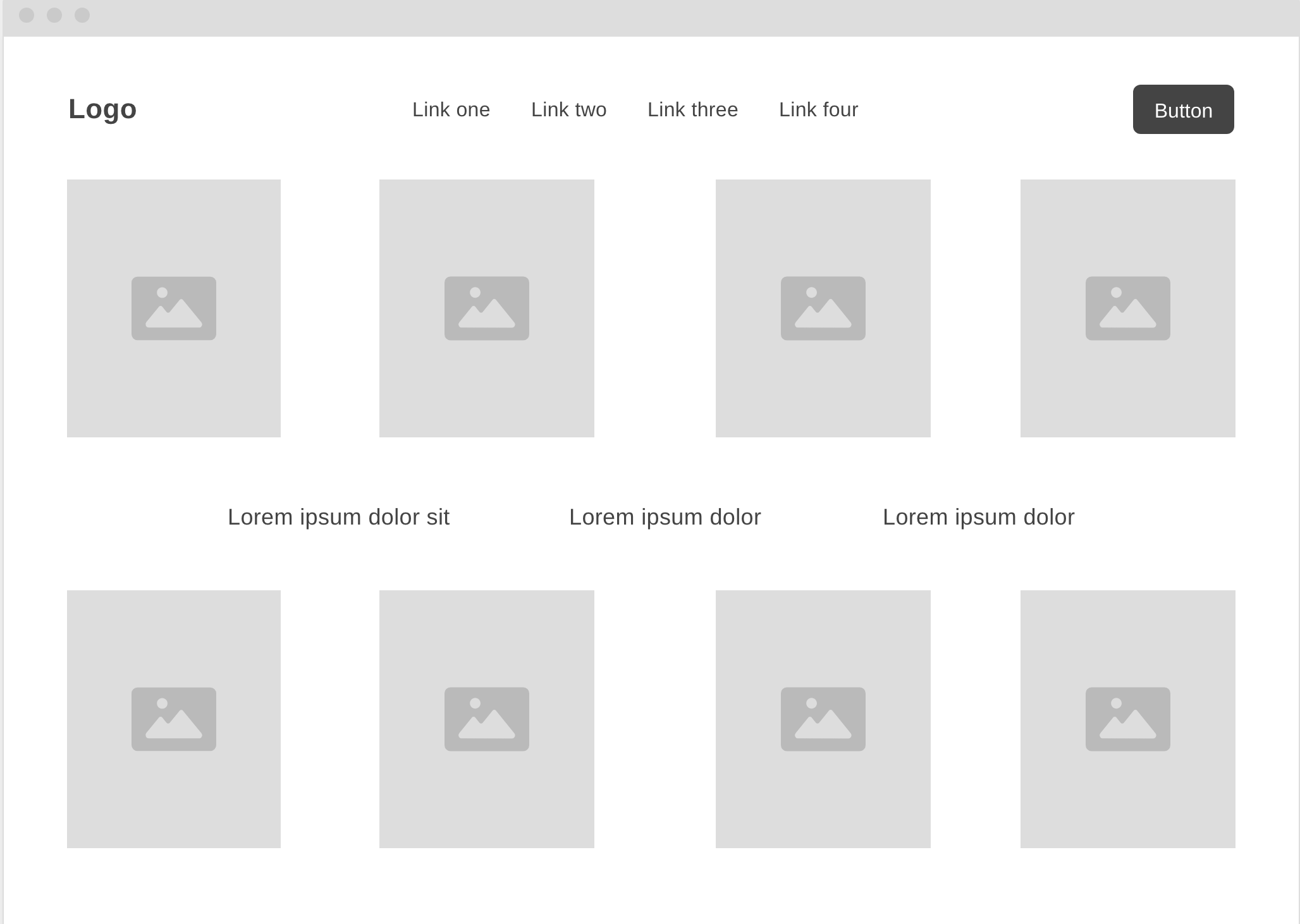
Below are my own sketched wireframes for the site's two main page types: the homepage/hero, and the project-index grid.
Copy Deck
Text pulled directly from the live site, broken into labeled chunks:
| Label | Content |
|---|---|
| Header — Left | "Sasha Satchi" |
| Header — Center | "Projects, Objects, Information" |
| Header — Right | "Still life artist" / "Art director" / "Photographer" |
| Filter Tabs | "All Projects (46)" / "Commercial (35)" / "Art Work (11)" |
| Project List — Titles & Index | 01. Ekonika x Cosmoscow — 02. Visual Research — 03. Still-life — 04. Untitled collages — 05. Prisakaru — 06. China Research — 07. abcb — 08. A study of presence |
| Project Detail — Meta | "Still-life" / "2022–2026" — short line beneath: "Exploration of forms…" |
| Project Detail — UI Chrome | "Info (↓)" — scroll percentage (e.g. "21%") — "Close (X)" |
Worth noting for the analysis: project titles are kept to one or two words each — often just a place, material, or feeling ("Prisakaru," "China Research," "A study of presence") rather than a full description. Combined with the running index number and the live scroll percentage, the copy does almost all of its work through small numeric and typographic details rather than sentences.
Competition
Rather than comparing Sasha Satchi against other still-life photographers directly, I found it more useful to look at two sites in completely different disciplines that handle interaction with the same level of intent — since that's really the lens I'm analyzing her through anyway.
JinLee Office — the Seoul-based creative practice of designer and art director Jin Lee — uses subtle animation across its photography grid that gives the whole site a sense of life and movement, closer to watching something happen than browsing a static archive. It's a different mechanism than Sasha Satchi's hover-triggered rotations, but it's solving a similar problem: how do you make a grid of still images feel alive without adding any explanatory text?
Camille Schneider, a Swiss architect, takes a more structural approach — you click into coloured grids to open each case study, and every project is assigned its own colour, so you can zoom in and view details up close within that colour-coded system. It's a strong example of interaction being used to organize and differentiate a body of work, rather than just decorate it.
What ties all three sites together, despite being in three different fields, is that none of them treat the interface as neutral. The grid, the hover state, the colour, the scroll position — in each case, some piece of the interaction design is doing storytelling work that plain text or a static gallery couldn't do on its own. That's the main thing worth carrying into my own portfolio: the interface can be a design decision, not just a container for the work.