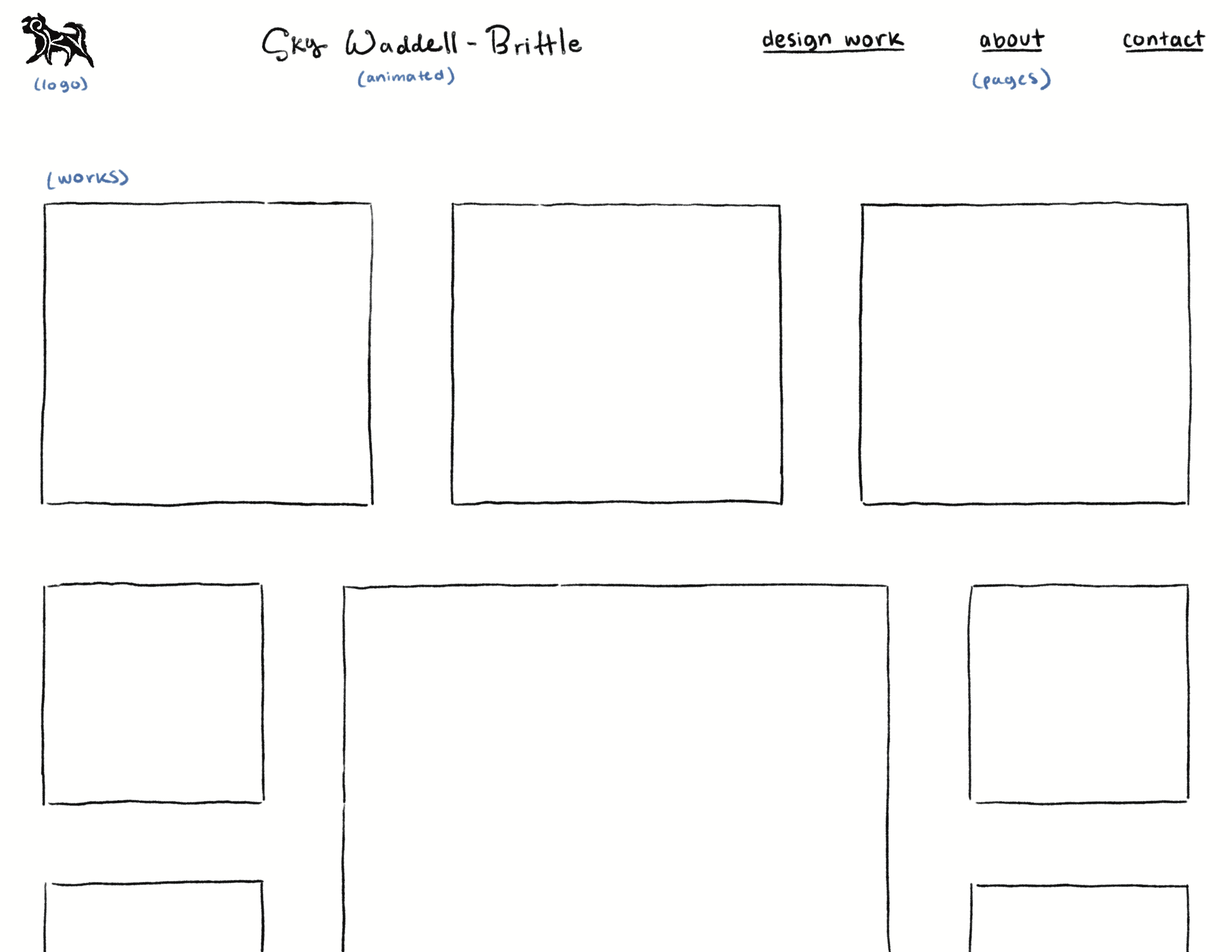
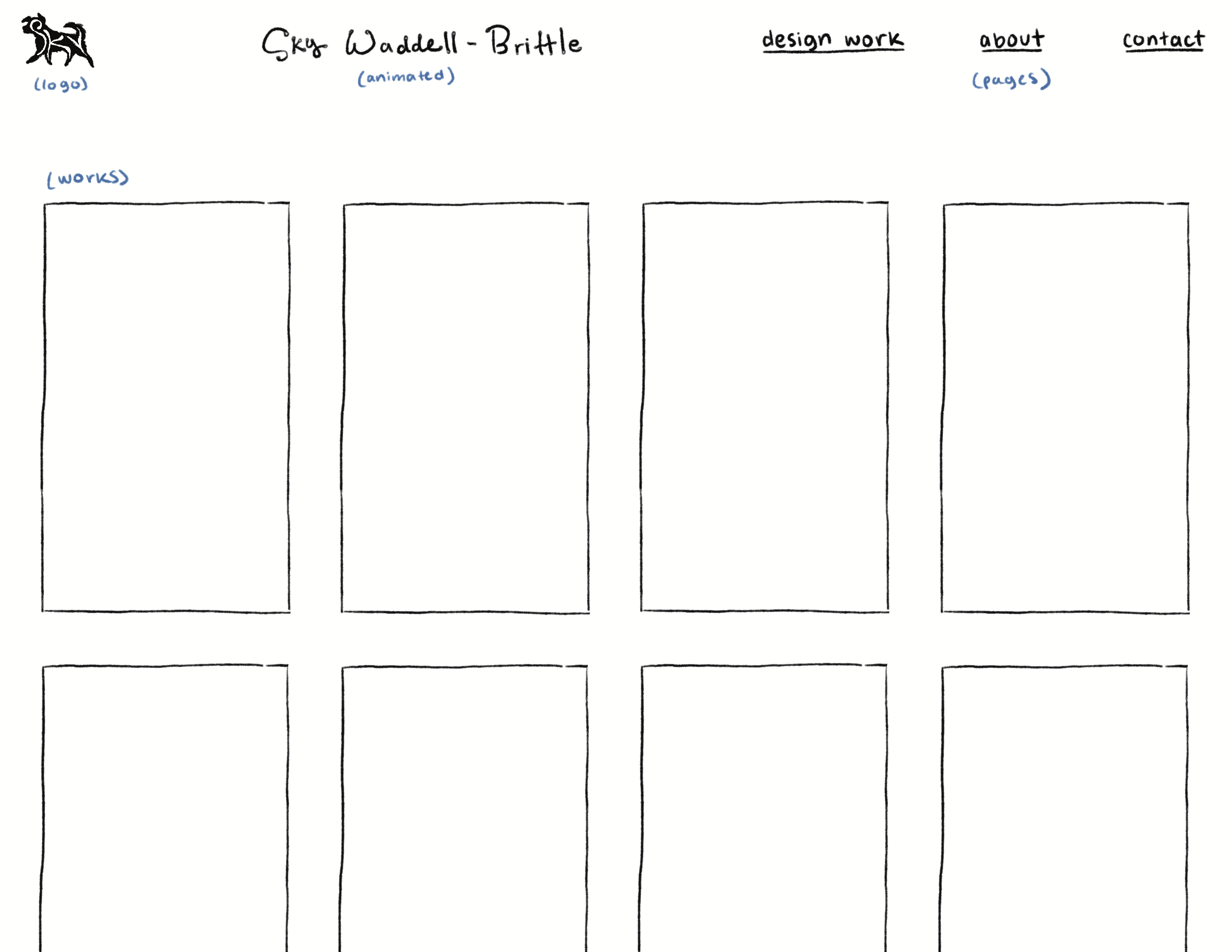
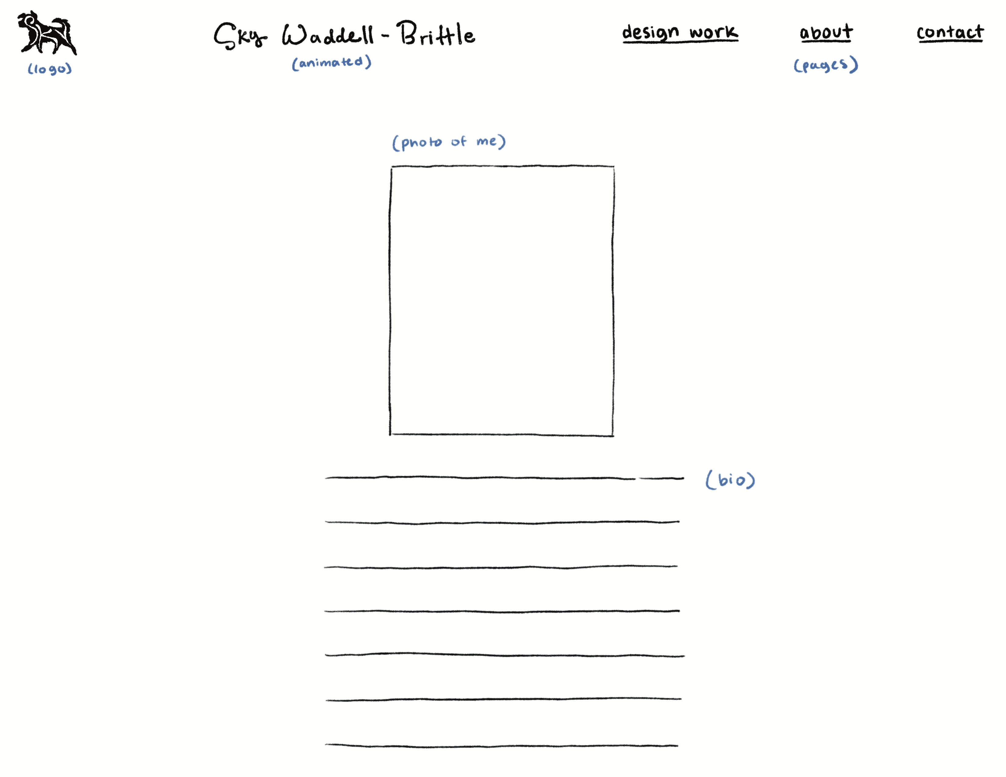
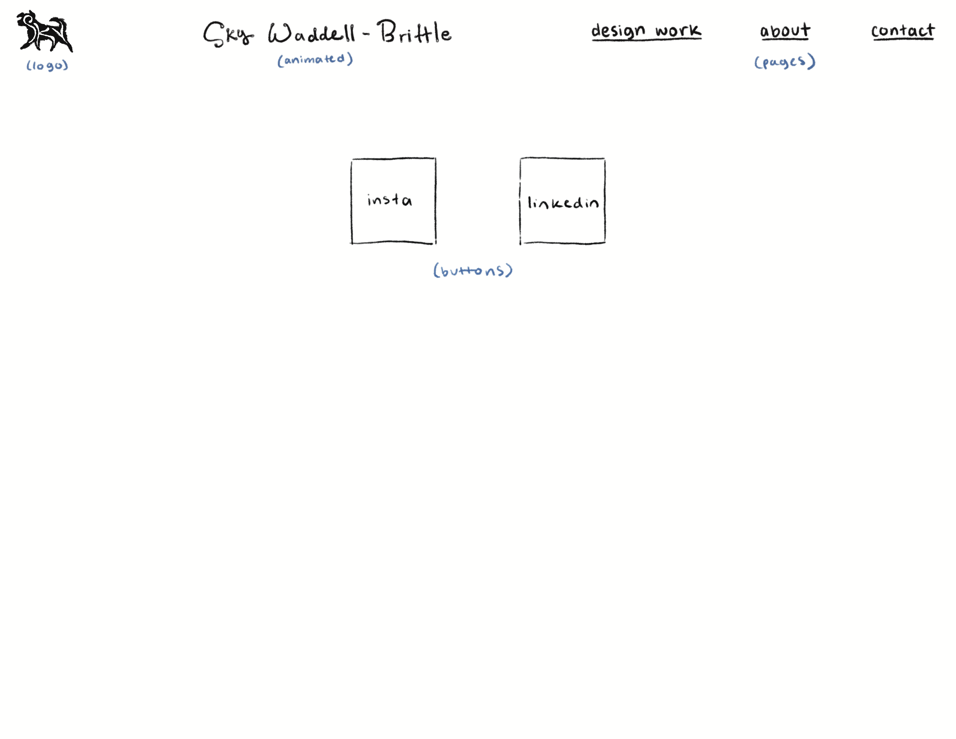
I’d like to create a portfolio website that demonstrates my creativity, rather than existing solely as a blank canvas to showcase my work. It should feel cohesive and unique, without being overwhelming or difficult to navigate. This can be achieved by focusing on how the different elements interact, with specific attention given to color and personalized elements (such as a special cursor, animated logos, etc.)
Step 2: Discovery and Research
As someone with no coding experience who appreciates the aesthetics of retro technology, early internet websites will serve as good inspiration for my own portfolio design. I was recently introduced to Geocities, where I found a few unique sources of inspo.
What caught my attention about this website was the illustrated header. I really like this detail because it lets the visitor know exactly whose website it is, and what kind of work he does. Rather than just writing out “Piero Tonin, illustration, animation, cartoons,” he incorporates his work into the website design.
I was drawn to this website even though it’s quite ambiguous. Clicking on the elements takes you to new pages that are difficult to navigate from, and the content doesn’t seem to have a single unifying factor, (although I didn’t examine it too closely.) That being said I really like the hand drawn icons, and the project overall feels very authentic.
Takeaways: hand drawn icons, ability to “get lost” in the content.
I really love the design of this website, and the upclose snapshots of the different objects. I think the zoomed in images are intriguing to the visitor, and invites them to click and learn more. The text also flows nicely with the general design, making it feel very intentional. Overall, I think this website aged “the best” out of all the ones I checked out.
Takeaways: grid images/buttons, intentional text design.
Step 3: Creating a Style Guide
Intent: To sell myself as an illustrator and graphic designer.
Voice: Passionate, assured, unique, and experienced.
Tone: Illustration section: authentic and soulful tone, graphic design section: professional tone.
Brand: Consistent hand drawn style that feels unique and memorable.
Persona: Fellow artist and designers, clients, managers, etc.
Create 3 Personas:
Design Company Hiring Manager: Looking that I have experience designing within specific style parameters, with a focus on legibility.
Print Company Hiring Manager: Looking that I have a unique style that could be applied to various topics/products, and would be desirable to viewers/customers.
Potential Collaborator: Looking that I have a cohesive vision that could be expanded upon/a willingness to collaborate.