Develop Your Idea
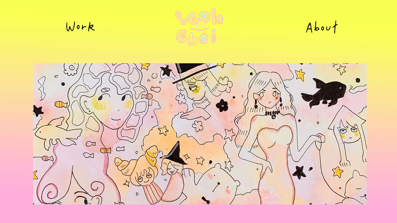
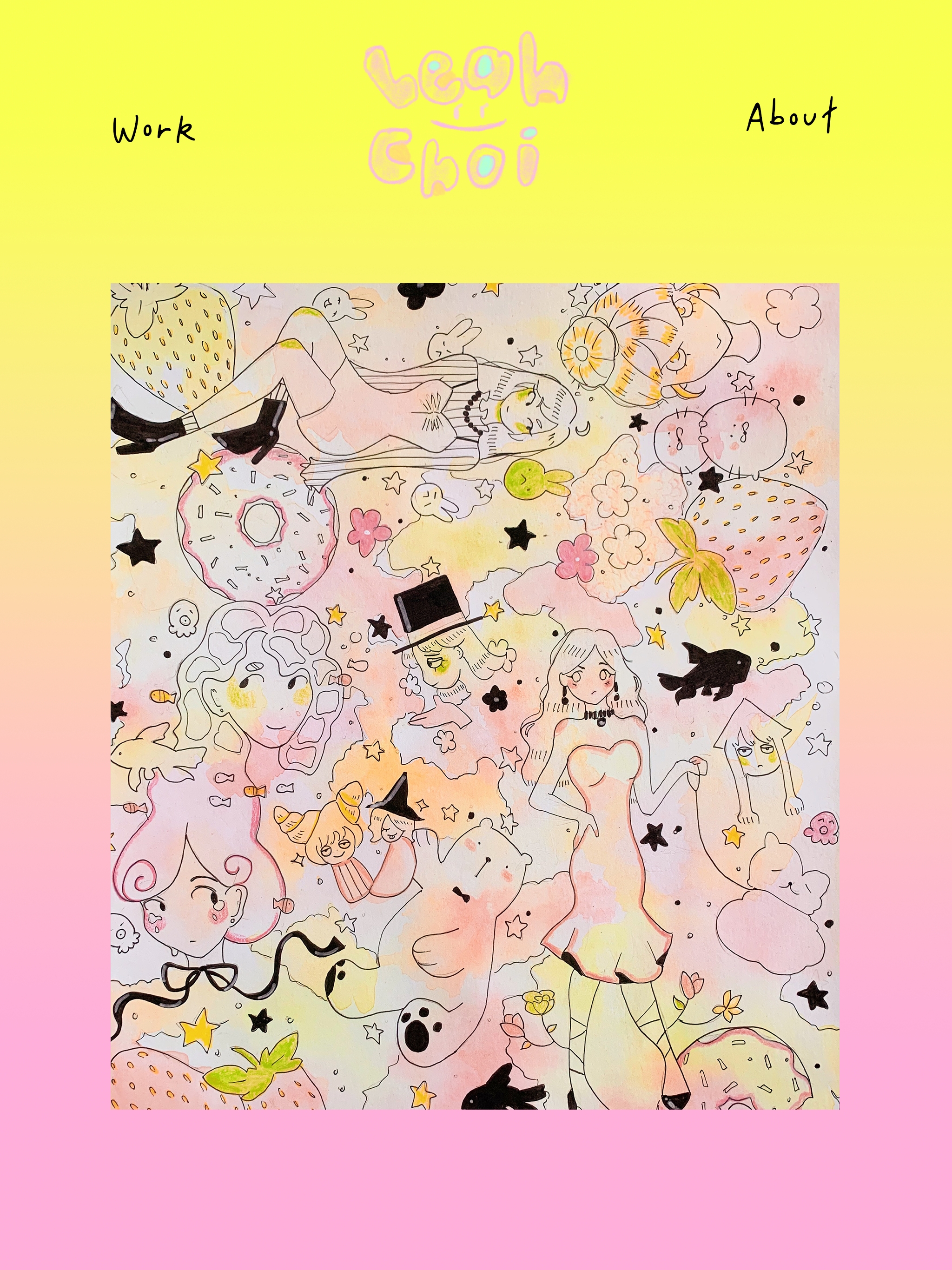
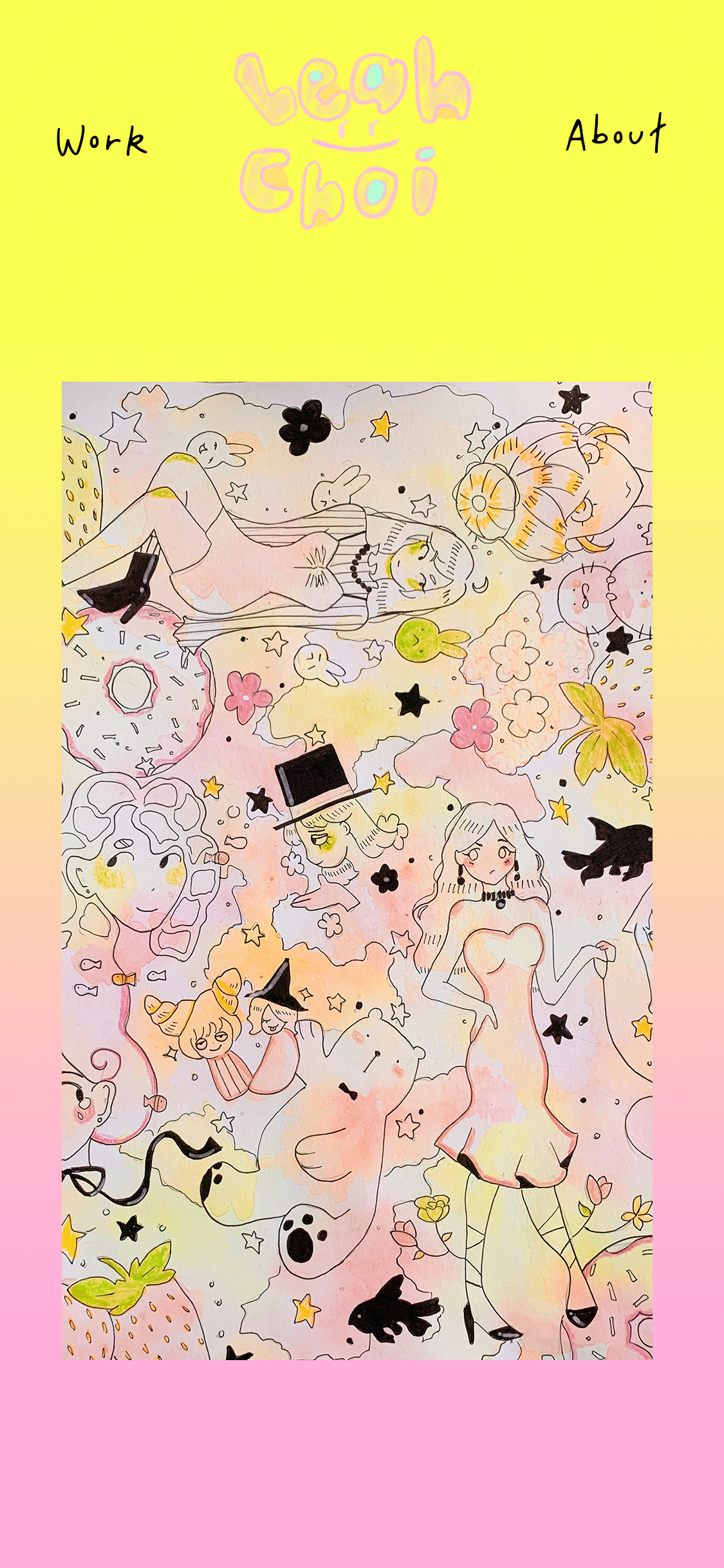
I want to create a portfolio website to showcase my skills as an illustrator. I envision my website to have a very simplistic yet unique design to draw in companies and studios to my work.
Discovery and Research
Essentially, I would want to create a website that both is unique and is more illustrative but also organized and simple to navigate around. I would lean towards a more simplistic layout with minimal elements just so it can be easily translated to the viewer.
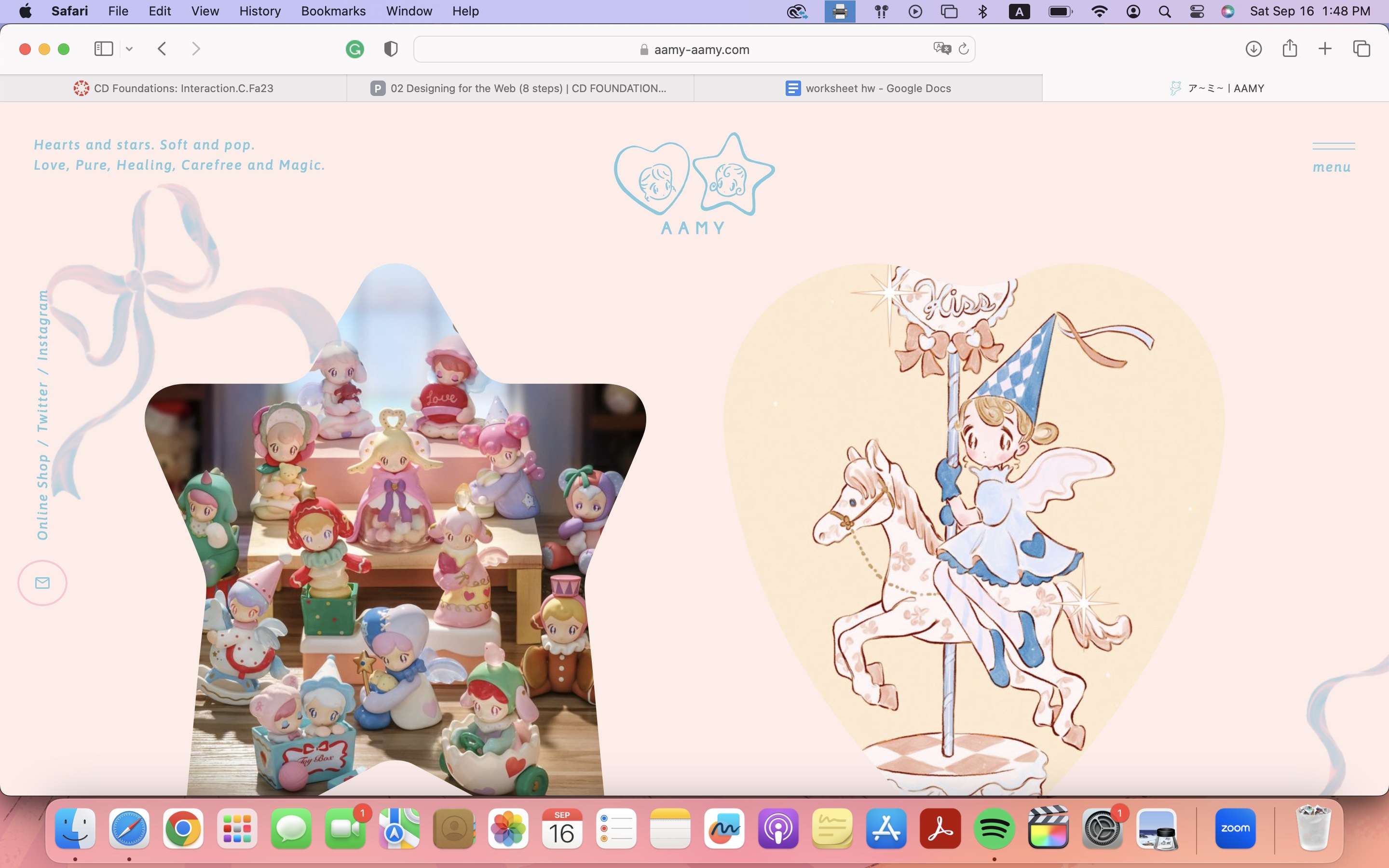
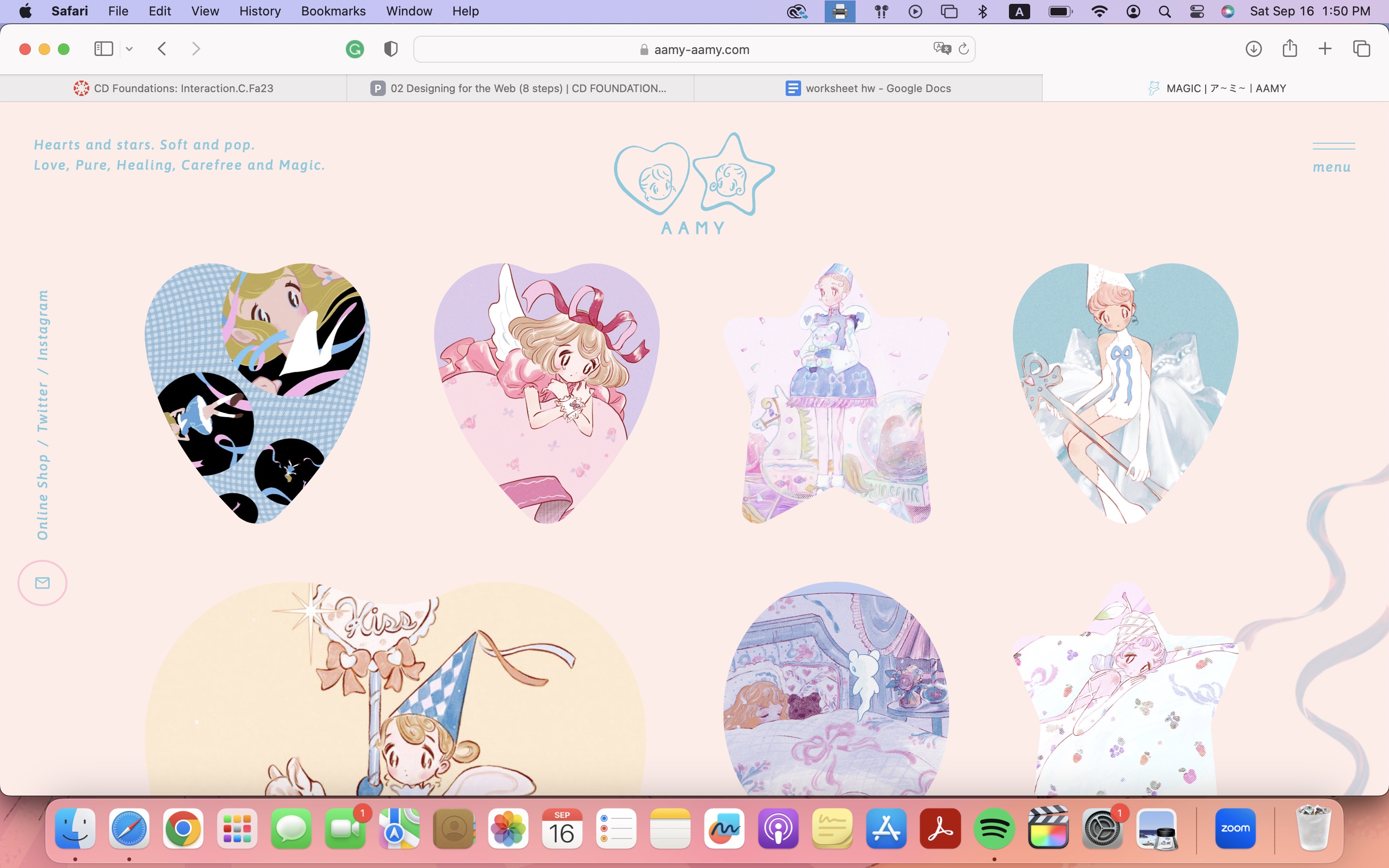
AAMY: I love aamy’s work as an illustrator and her website really shows me her character. I admire the color palette she uses as well as the added illustrations she incorporates in the background. It’s cute and soft and quite simplistic in navigating.
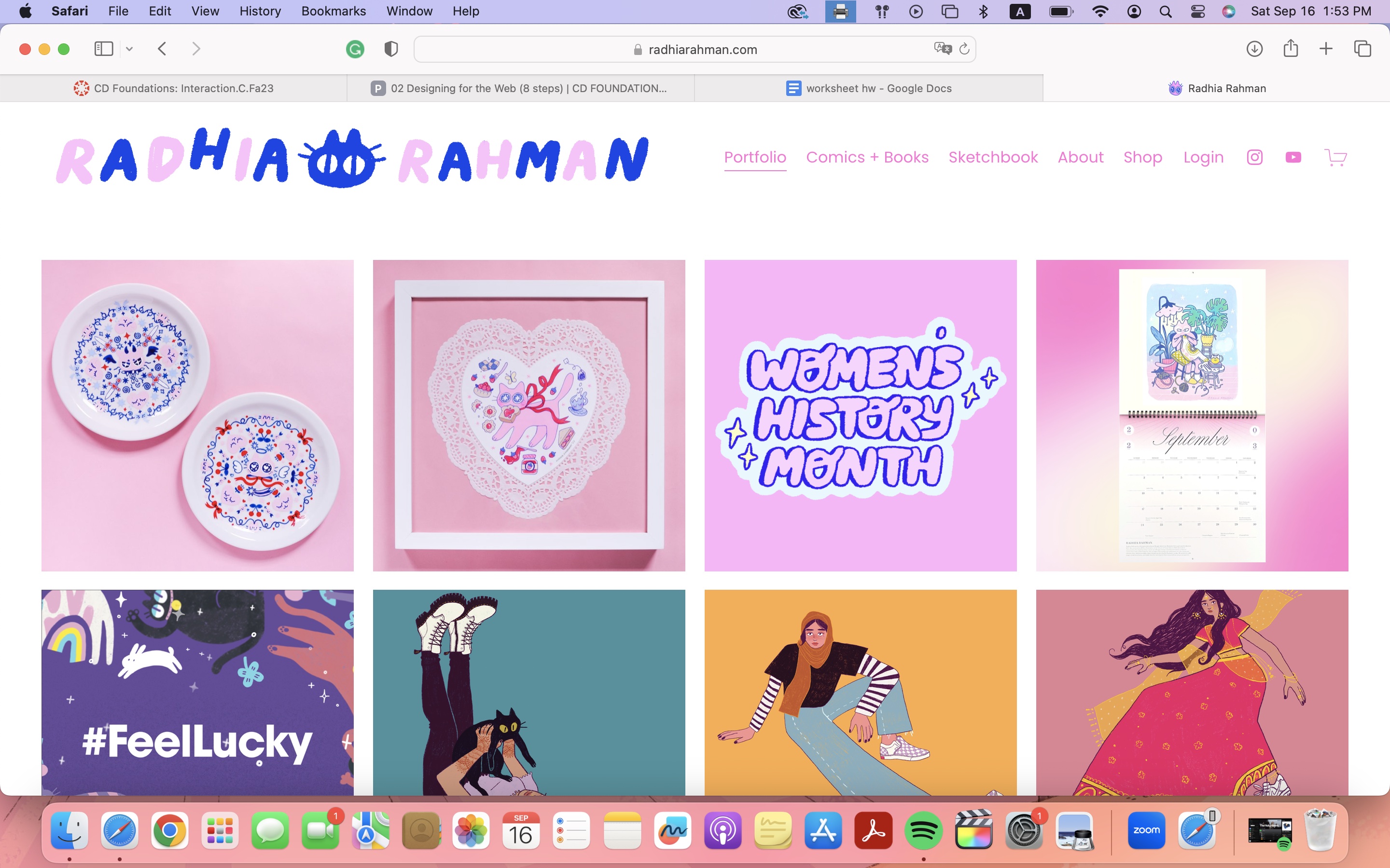
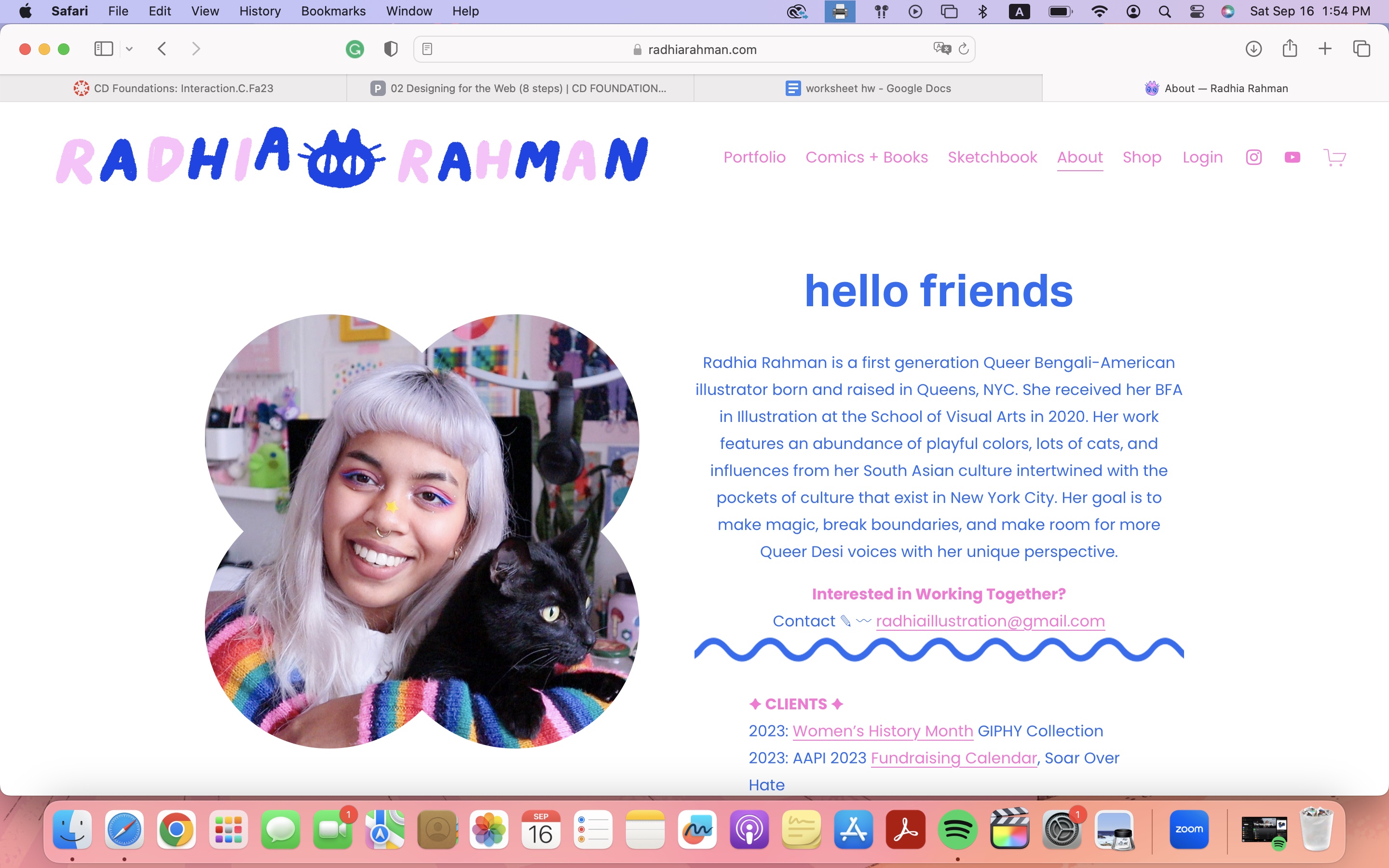
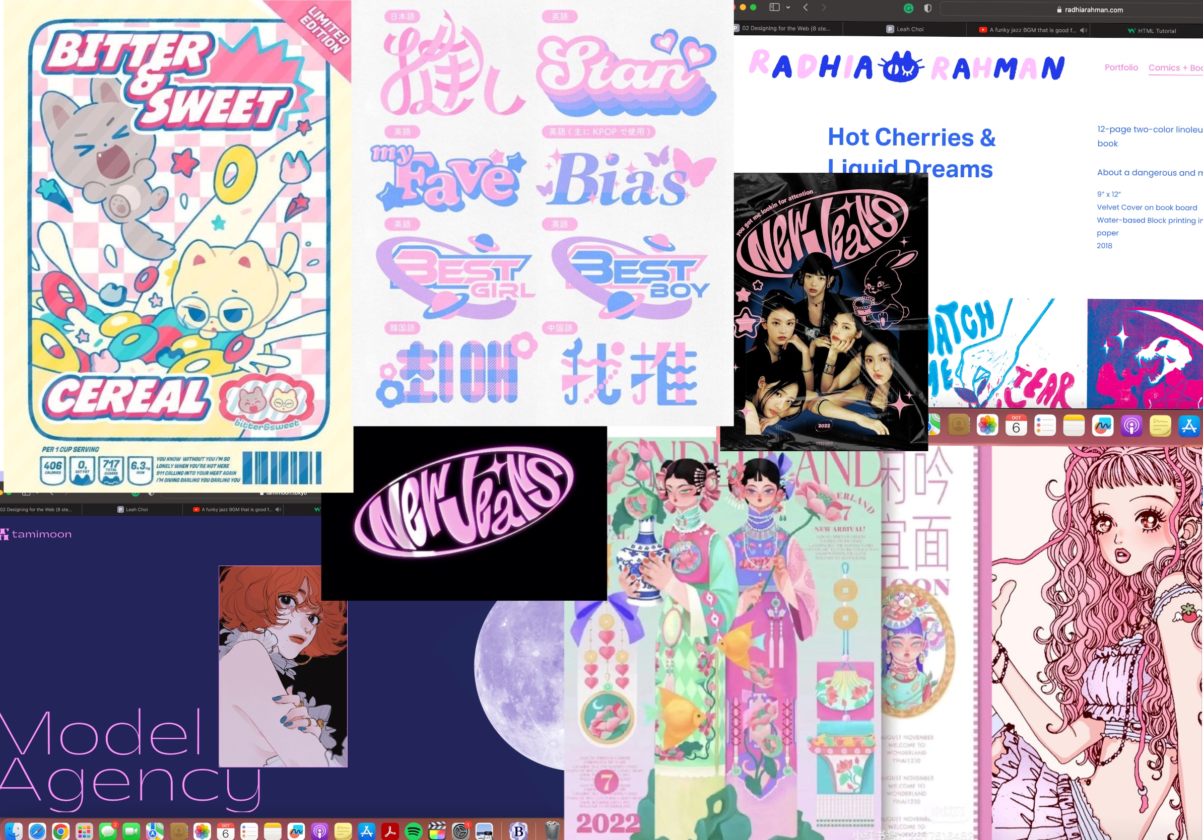
Radiha Rahman: Her website contains more information than AAMY’s, but it is very simplistic and organized. I admire both the color palette and her logo as a GIF. I would like to include that element in my website as well to seem more interactive. The mouse also turns into a cat’s paw that spekas to me and is a nice touch in contrast to her simple layout. She also uses more organix forms to outline certain information. For example, her About page contains a flower outline element that frames her profile picture.
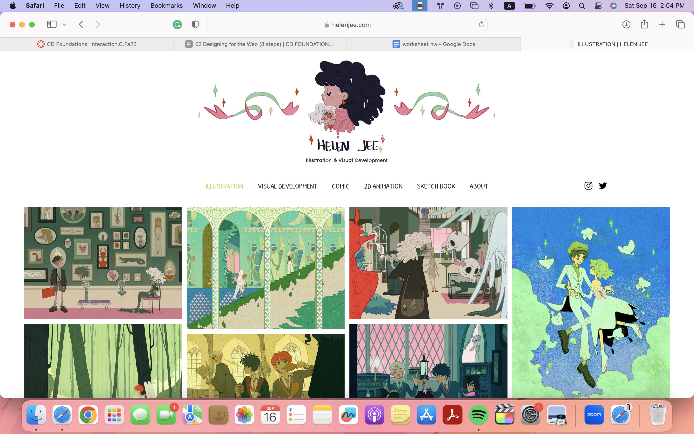
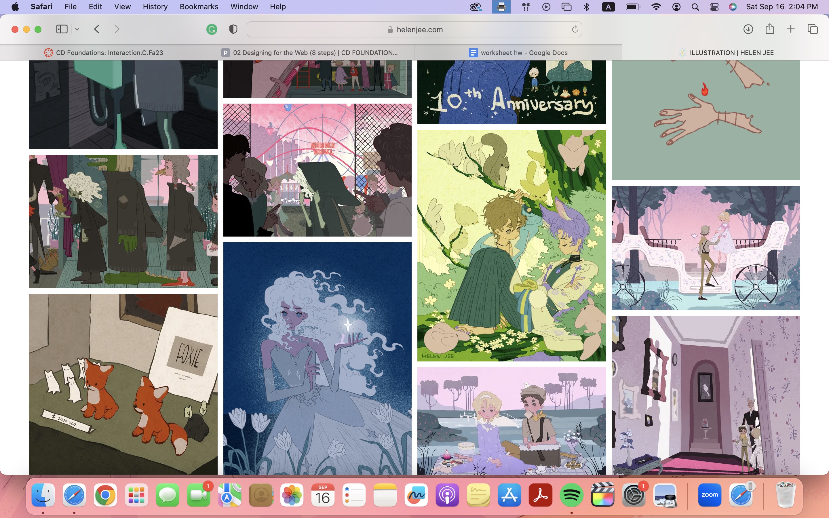
Helen Jee: Her layout is also very simple but her work speaks for it all. Her Illustrated logo is also very nice. Not only do I want to include more whimsical elements in my website, I also want to make sure that the viewer is not overwhelmed with any busyness on my website and have it look more clean and organized like Helen Jee’s.
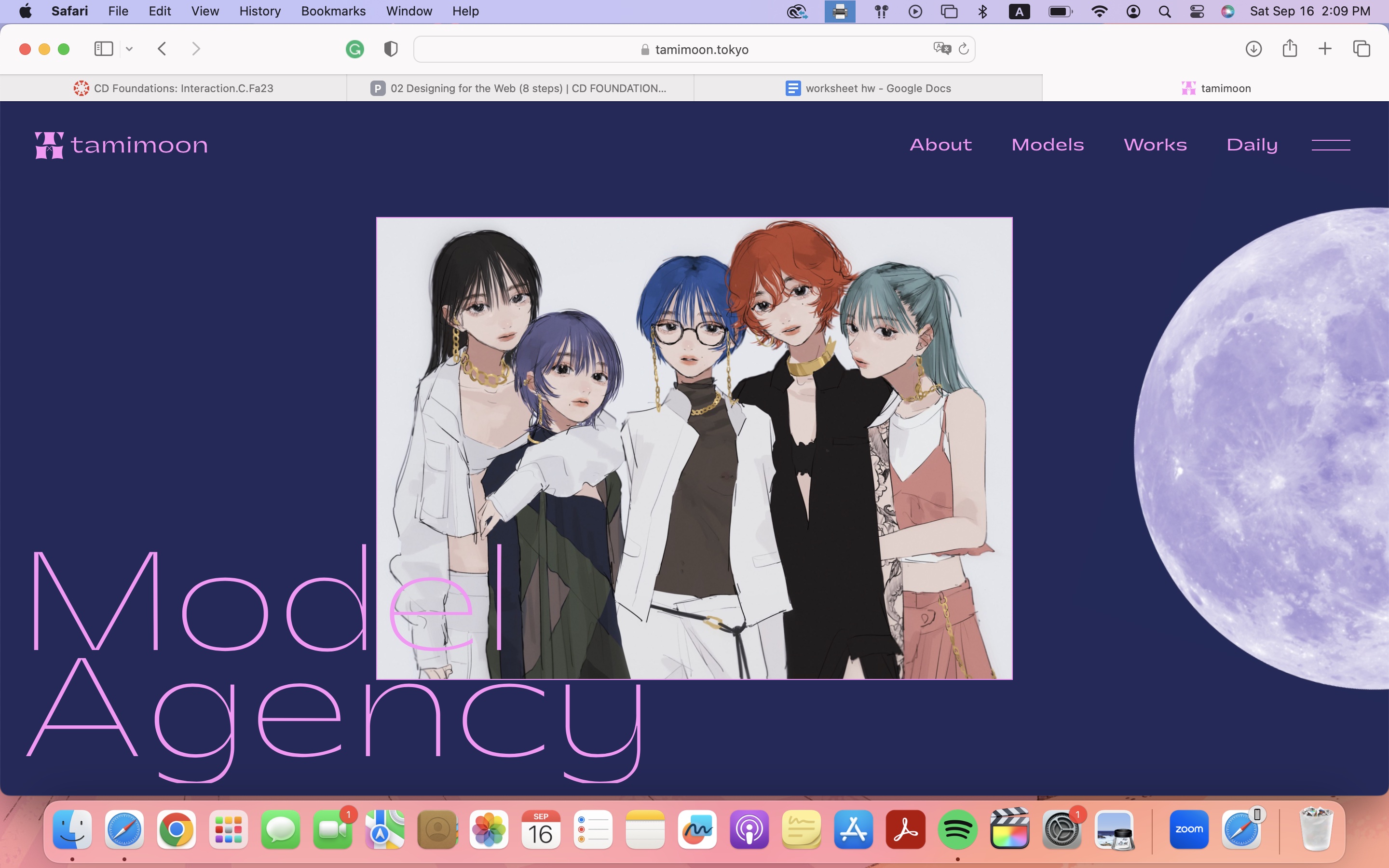
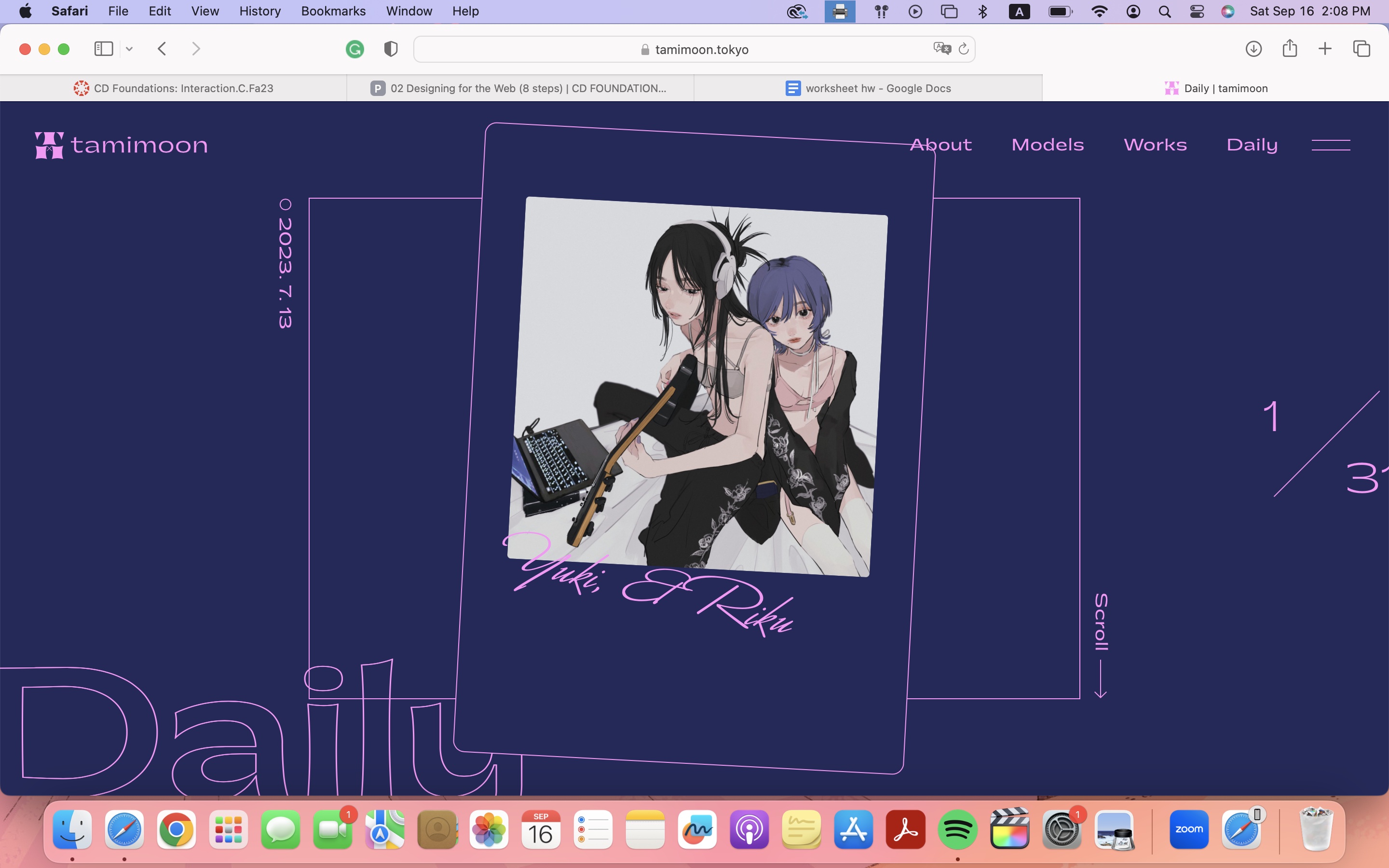
Tami Moon: Tami Moon’s concept was very eye-catching. In terms of design, I admire the flow and transitions of how certain elements of her website show up. For example, when clicking on her navigation button, the whole page splits like a door and shows the navigation page. I would like to include something with such a smooth transition in at least one part of my website. Compared to the other websites I shared, hers is more modern, more sleek. It is a different approach to most portfolio websites and I hope to channel something similar in my own style.
Target Audience
clients, anyone interested in my work, studio and companies hiring. Therefore, I need to both create a unique and clear voice/direction.
Inspiration and Concepts
Thumbnails and Sketches
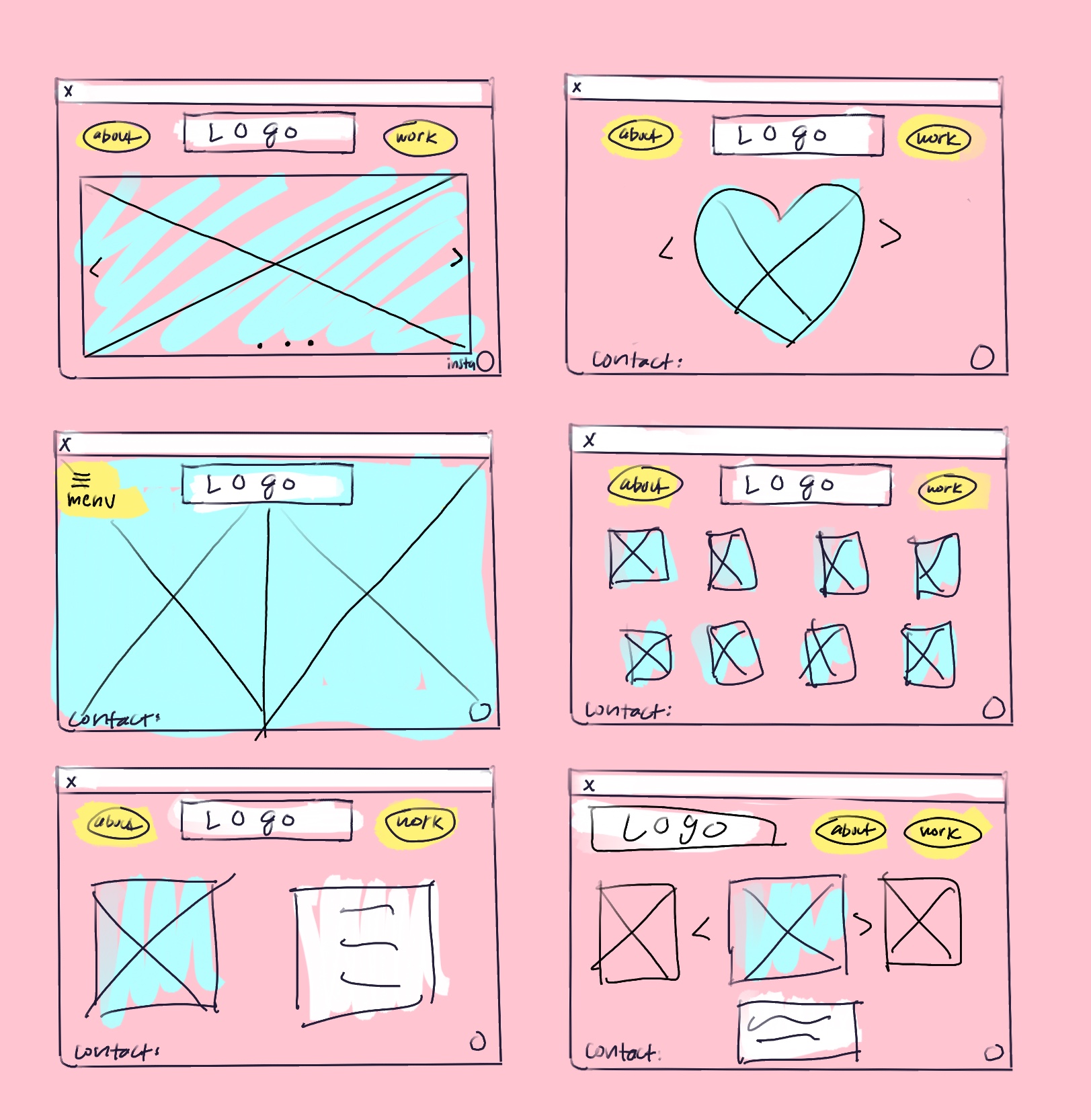
Wireframes and Prototypes

Responsive Mockup
link to mockupPhotoshop Comp
