- Contents
- What is CSS?
- Inheritance
- Selectors
- Demonstration
- Specificity
- Rule Placement
- Browser Style Sheets
- Default Style Sheet
- CSS Reset
- Last Style Wins
- The Cascade
- Cascade Layers
- CSS Rules
- Selectors
- Pseudo Classes
- Not Example
- IDs and Classes
- Pseudo Elements
CSS, or cascading style sheets, describes the presentation of web pages, including colors, layout, and fonts. It does this through properties that style HTML elements.
Think form and content. CSS is the form, HTML the content.
CSS is separate from the content and is able to adapt the presentation of the content to different types of devices such as large screens, small screens, or printers.
The separation of CSS from HTML makes it easier to maintain sites, share style sheets across pages, and tailor pages to different environments.
CSS developed along side of HTML. Read its history here (by the creators of CSS).
CSS is deceptively easy to apply when it is done inline. That means you write the code right into the HTMl tags using the style attribute. You write these locally applied rules like this: style="inline CSS rules go here". The addition of the code style="color: red" to the paragraph tag <p > looks like <p style="color: red">, and colors the following paragraph red.
Changes are seen as soon as you update the browser. This immediacy and the simplicity of the syntax makes CSS appear easy, which it is when there is no cascade or style sheets to worry about.
It is possible to write all of your presentation in the tags themselves but you would find that to be highly inefficient. It is generally frowned upon to write CSS locally and defeats the purpose of the cascade.
What is CSS?
CSS gets its power from inheritance, the style sheets and the cascade. It is called CSS, or cascading style sheets. With that power comes the responsibility of keeping track of all the selectors that target the html element, and when there are many overlapping rules it can become difficult.
Not all properties are inheritable but those that are can be set in the <html> or <body> element, and every child element that is inside of these containing or parent elements, will inherit these properties.
The cascade describes how the CSS rules in the style sheet are applied globally. The CSS styles are a list of rules prefaced by one or more selectors. These rules can be placed in the header of the page or can be in an external style sheet, a blank text file saved with the .css extensiont, in which case, a link to that style sheet is placed in the header of the page.
Selectors provide the link between the rules in the style sheet and the HTML elements that receive the rule. The browser parses the document, figures out every element in the document tree, heals any errors it may find, and tracks all of the selectors used by the style sheet to target the different tags so that it can assign the rules of properties and their values to each element, so that the page ends up looking the way it does.
Inheritance
Every element is a child of the <html> element. If you target the <html> , or the <body> element, many properties will be inherited but not all.
For example, a child element inherits the font property of its parent but it will not inherit the background property. Other automatically inherited properties are: color, font (and related properties), letter-spacing, line-height, list-style (and related properties), text-align, text-indent, text-transform, visibility, white-space, and word-spacing.
Properties not automatically inherited are: background (and related properties), border (and related properties), display, float and clear, height and width, margin (and related properties), min- and max-height and -width, outline, overflow, padding (and related properties), position (and related properties), text-decoration, vertical-align, z-index. There are more but this gives you an idea.
Inheritance prevents certain properties from having to be declared over and over again in a style sheet allowing the developers to write less CSS and the users to view faster-loading pages.
Inheritance plays a large roll in CSS but it’s not overtly visible. Be aware that it’s constantly determining what the elements on the page look like. In the cascade, inherited properties lose out to any properties provided by a selector.
CSS Selectors
Central to this process is the selectors that connect the CSS properties to the element when the properties are no longer written in the element itself.
There are many kinds of selectors, and W3C has a whole list of them, I have a reduced set of them below. It is best to keep things simple and start with the type selector.
You can select all paragraphs in a document by using the type selector, like this: p {css property: value;}. It is possible to limit the scope and target only the paragraphs in the header for example. This is done by placing header before the p like this header p {css property: value;}.
An interactive demonstration can be of great help when conveying this information. What follows is the first of many such interactive demos.
Interactive CSS Selectors Demo
The following demonstration selects all of the text contained by <p> in this document. You can change the font, the type color and the type size (or anything else if you write in the rule).
Words inside of /* */ are comments. They are there to help you come up with values that match the properties. For example, /* green, #abc, hsl(35 100% 50% /1) */ are suggestions to replace black with green, blue grey or orange in color: black. You will see the content surrounded by <p> tags go to the default color black while typing in the new value. When CSS does not recognize a value it ignores it and applies the default value.
Your changes could render the document unreadable. To reset the document, refresh the page. The selector <p> selects all paragraph elements.
If you find something you like (this concerns other demos more than this one), copy the declaration and use it in your project.
CSS Code View
If you colored the text green, you will notice that the paragraph above that was originally colored red is still colored red. Why did the color not change? The same is true of the font-family.
We will explore this in much greater detail but know that the cascade determines which rule wins out over all the other rules that target the element.
You can overpower the cascade order by using !important, which is inserted right after the value and before the semicolon. Try inserting green !important in the demo, and you will see that the global CSS rules now override the local inline rules in the cascade. The red type in the introduction will be green.
The !important quickly destroys the cascade and quickly makes the CSS unusable, so it is not recommended unless you have no other options. I use it mostly for testing purposes, to check on whether I’m actually targeting an element or not in WordPress template that I did not create.
Specificity and Grouping Selectors
It’s not always desirable to select all the paragraphs in the document. We usually want to select very specific paragraphs, or elements, in the document. This paragraph or that paragraph but not all of them. This is achieved including one or more containing or parent elements, each separated by a space.
Selectors move up the DOM tree to achieve greater specificity. In the following demonstration, each line is targeted individually by nesting the selectors. Use a space “ ” between selectors to specifically select the child element inside of the parent element:
Selectors can also be grouped to share the same rule. Use a comma “ ,” between the selectors to include all of the selectors to which the rule will be applied. This is the case with the last two selector in this demonstration:
CSS Code View
Header in div
Paragraph in div
- Item 1 of list in div
- Item 2 of list in div
The blue div has the 120% applied twice, and is larger than all other text in this demonstration. Another example of the cascade at work. Play around with the demo to see how specificity is able to narrow the targeted section to exactly the element that you want to style.
The HTML code for this example is:
<div id="example0">
	<h2>Header in <span>div</span></h2>
	<p>Paragraph in <span>div</span>
	<ol>
		<li>Item 1 of list in <span>div</span>
		<li>Item 2 of list in <span>div</span>
	</ol>
</div>
CSS Rule Placement
There are three places where to put style definitions. CSS styles can be written in the tag itself, called inline styles, in the head of the document, called embedded styles and in an external style sheet.
Inline Style definitions
You can write the style directly in the tag itself. The attribute style has as its value whatever properties are to effect the HTML element style="color: red".
<p style="color: red">
Embedded Style definitions
The CSS can be put in the <head> of the document between <style> and </style> tags. Using a p selector it’s possible to target all the paragraphs in the document with the embedded style.
<style type="text/css">
p { color: red}
</style>
The declarations are now enclosed in brackets and is called the declaration box, and in front of the bracket is the selector that targets which element is to be affected by the rule. The rule can be applied to many elements. Many rules can target the same elements and that increases the complexity. Different selectors with conflicting rules can target the same element. Which rule will win out to style the element? That is the question.
This is were it can get difficult as several rules can target the same element. When that happens, the browser has to select which rule wins out in what’s called the cascade.
Embedding the styles is more efficient than writing them in each paragraph element but it’s still not ideal, since the rules can only targets the HTML elements in the page. Websites almost always consist of multiple pages.
External Style Sheets
The most efficient place for styles is in an external style sheet. The external style sheet is a simple text file saved with a .css extension with nothing but CSS style rules on it. They can be written in any way, as spaces, returns and tabs are ignored by the browser. Start out by separating all of the properties in their own line, as in the following example, so that they are easy to read:
p {
	color: red;
	background: white;
	width: 400px;
	padding: 20px;
	border: 2px solid green;
	margin: 20px auto;
}
It’s also possible to write the declarations in one line:
p {color: red; background: white; width: 400px; padding: 20px; border: 2px solid green; margin: 20px auto;}
There is no difference, as all the white space is collapsed. I tend to write all of my declarations in one line as that reduces scrolling in long style sheets. Once I finish I sometimes clean the styles so each declaration is on its own line.
The file is saved with a .css extension, often in its own folder called CSS, in case there are more than one external or imported style sheets. Note that it is required to exit the folder when linking to an external resource like a picture: use ../ in front of the resource to get out of the css folder.
Each HTML page in the site refers to that style sheet by linking to it by including the following code in the header of each document:
<link rel="stylesheet" href="css/styles.css" media="all">
You can copy this into your pages, though it is already included it in the HTML5 template.
It’s possible to link to or import several style sheets and some think it’s a good organizing principle to break the styles into several style sheets like the CSS reset, typography, navigation, layout or alternate styles for depreciated browsers.
The downside to all this organization is that each stylesheet requires a server request. That is, your browser has to ask the server for one more file to complete the page. The lag time involved in asking the server for each style sheet can take more time than the actual loading of the stylesheet itself. Because of this a more common approach is to put all the styles into a single style sheet.
Browser Style Sheets
There are three style sheets.
User Agent styles are the default style sheet the browser uses, which are modifiable by an end user.
Author Styles are the styles that you create when you design the page.
User Styles style information specified by the user apart from the default style sheet.
Browser’s Default Style Sheet
Even if you do not write any CSS, the HTML has formatting applied, so that an <h1> tag looks different from an <h2> or a <p> tag. Where do these styles come from?
Every browser has a default style sheet, called the user agent style sheet, like this one from Safari that formats the markup.
If you look at Safari’s default style sheet, you will see that it determines how the p element is to be displayed:
p {
    display: block;
    -webkit-margin-before: 1__qem;
    -webkit-margin-after: 1__qem;
    -webkit-margin-start: 0;
    -webkit-margin-end: 0;
}
A paragraph not yet styled looks as specified by the browser style sheet. If you start styling the elements with your own styles in an author style sheet, they are built on top of the styles specified in the user agent style sheet. That may lead to problems when the page is looked at in a different browser. To solve that problem a CSS reset is used.
Resetting Browser Default Style
To counteract the possibility that your author styles change with different browsers, you need to neutralize the default user agent style sheet the browser uses.
To counter this we implement a CSS reset. The CSS reset was initiated by Eric Meyer, and he recently released a second version. Take the following code and place it at the beginning of your style sheet, and it will neutralize the default styles of the browser style sheet.
/* Begin CSS Reset */
/* http://meyerweb.com/eric/tools/css/reset/
   v2.0 | 20110126
   License: none (public domain)
*/
html, body, div, span, applet, object, iframe,
h1, h2, h3, h4, h5, h6, p, blockquote, pre,
a, abbr, acronym, address, big, cite, code,
del, dfn, em, img, ins, kbd, q, s, samp,
small, strike, strong, sub, sup, tt, var,
b, u, i, center,
dl, dt, dd, ol, ul, li,
fieldset, form, label, legend,
table, caption, tbody, tfoot, thead, tr, th, td,
article, aside, canvas, details, embed,
figure, figcaption, footer, header, hgroup,
menu, nav, output, ruby, section, summary,
time, mark, audio, video {
	margin: 0;
	padding: 0;
	border: 0;
	font-size: 100%;
	font: inherit;
	vertical-align: baseline;
}
/* HTML5 display-role reset for older browsers */
article, aside, details, figcaption, figure,
footer, header, hgroup, menu, nav, section {
	display: block;
}
body {
	line-height: 1;
}
ol, ul {
	list-style: none;
}
blockquote, q {
	quotes: none;
}
blockquote:before, blockquote:after,
q:before, q:after {
	content: '';
	content: none;
}
table {
	border-collapse: collapse;
	border-spacing: 0;
}
/* End CSS Reset */
A more nuanced CSS reset is accomplished by normalize.
Last Style Definition Wins
There is a pattern here. The styles in the author style sheet override the styles in the user agent style sheet. In the order in which CSS rules are compiled, subsequent declarations override previous ones.
If you repeat the same property twice, the second one will style the element. {color: green; color: red} The type will be colored red, not green.
This is also true of the three places where you can place the rules. If the same rule is found in the user agent style sheet, the author’s style sheet and any other imported external style sheets, the embedded or internal style sheet and repeated once again inline, that is, in the element itself, guess which rule wins out?
The inline rule wins out. The rule of thumb here is that the closer the style definition is to the element being styled, the more likely it is to triumph over the other rules and style the element. The insight we are given is that the order in which the browser concatenates the various style sheets is as given above, with the default style sheet first, then external style sheets, then the internal style sheet and finally it arrives at the elements themselves.
That the last style definition wins is part of the cascade:
The Cascade
CSS stands for cascading style sheets. The cascade is the ordering of selectors that determines which selector wins out over to style the element. In writing CSS you intentionally determine the cascade by how each selector targets their element(s).
CSS rules can be written in a number of places. In each place it is possible to have many declarations targeting the same HTML element. It is, therefore likely that element are targeted by several rules at once — from inline rules to embedded rules to external rules, to user stylesheets. When there are several rules targeting the same property with different values, only one of these rules wins out to determine the presentation of the HTML element. Figuring out which rule ends up styling the element is important.That is why it is necessary to figure out how the cascade works.
For example, <span style="color: red">red</span> this text’s inherited default color of black is overridden by the inline style that colors the type red. That tells you that the inline style trumps the inherited style.
The browser needs to figure out which rule to use when there are multiple conflicting values for a property. The cascade refers to the selection process in which these styles are evaluated so that only one value ends up styling the element.
Generally speaking, the closer a style definition is to the tag, the more likely it wins out. The inline style wins out over the embedded style, the embedded style trumps a linked or imported style sheet which in turn wins over the browser’s default style sheet, and they all trump inherited styles.
The cascade takes the selector’s specificity into its calculation. One selector ends trumping all the other selectors. There is a formula that determines the cascade. It prioritizes ids over classes, for example. Classes win out over structural tags and structural tags trump typed tags.
The new CSS transition and animation take top spots.
You can pull out the big gun and place !important after a rule if you absolutely want it to be the case no matter what.
Be judicious in your use of classes, ids, and especially !important, as you can easily make a document unmanageable. The rule of thumb is to use as low a cascade value as possible to select an element.
A fun interactive explanation of how the CSS cascade works It explains the cascade hierarchy in importance, origin, specificity, and position, and quizzes you on each of these points. If in doubt, take the quiz.
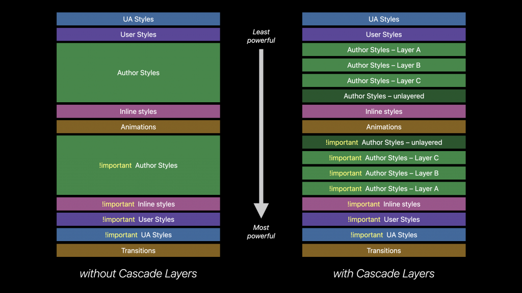
Cascade Layers
Cascade Layers are designed to ease CSS development on large projects. Cascade Layers provides a powerful way to organize styles into layers, where specificity is calculated independently inside each layer.
/* establish the layer order, so the "override" layer takes precedence */
@layer framework, override;

@layer override {
  @keyframes slide-left {
    from { translate: 0; }
    to { translate: -100% 0; }
  }
}

@layer framework {
  @keyframes slide-left {
    from { margin-left: 0; }
    to { margin-left: -100%; }
  }
}

.sidebar { animation: slide-left 300ms; }
In this case the override layer has a higher cascade priority than the framework layer, so slide-left will animate using the translate property rather than margin-left.
Cascade Layers are for advanced websites and are outside the scope of this class.
The Elements of a CSS Rule
CSS has a simple syntax and uses a number of English keywords to specify the names of various style properties and values. That makes it easy to use. A style sheet consists of a list of rules. Each rule or rule-set consists of one or more selectors and a declaration block. A declaration-block consists of a list of declarations in braces. Each declaration itself consists of a property, a colon :, and a value. If there are multiple declarations in a block, a semi-colon ; must be inserted to separate each declaration. The rule-set is applied to the target element by a selector. The combination of a selector with a rule-set completes the CSS statement.
The CSS Rule
The CSS rule contains both the selectors and the declarations.
Example: h1 {font-size:1.5em; font-weight: 700; color: #333; }
The Declaration
The declaration is a property-value pair and is part of the rule that describes how the selector will style the element. When the style sheet is embedded in the document, convention is to follow each declaration inline:
Example: h1 { font-size:1.5em; font-weight: 700; color: #333;}
While in an external style sheet, convention is the put each delectation on a new line with a tab in front:
Example: h1{

    font-size:1.5em;

    font-weight: 700;

    color: #333;

}
With the advent of @media queries in responsive design my preference is to write all CSS rules inline to minimize scrolling.
The Declaration Box
Declarations determines how the selector will style the element. it’s always bookended by curly braces { }.
Example: h1 { font-size:1.5em; font-weight: 700; color: #333;}
Properties
A property describes an aspect of an elements’s presentation such as color, font-size or border-width. The property is always followed by a value and the two are always separated by a colon:. There are a lot of properties, so it’s best to have a place where you can look them up, though repetition will acquaint you with the ones you need.
Example: h1 {color: #356590; padding: 3px 16px;}
Values
A value describes a specific appearance, such as a specific width, the name of a color, or some set value, such as for text-decoration: none; which removes the underline from text, often used to remove the underline that the browser’s default stylesheet gives a link. The value commences the declaration statement, and you signify that to the computer by using a semicolon ;. While it’s not necessary to tell the browser that there are no more declarations in the declaration box, it’s a good practice to close the last declaration as well.
Example: h1 {color:#356590; padding: 3px 16px;}
CSS Selectors
Selectors are patterns that match the elements of a document that will then have the declarations applied to them.
The easiest selector to understand is the type selector, in which p selects the paragraph element: <p>.
Selector Hierarchy
There are six different types of selectors,
The type selector selects the element by the tag itself:
Type: p { }
Use the type selector whenever possible. Use other selectors when the type selector cannot target an element.
The universal selector selects all elements:
Universal: * { }
The scope of the universal selector can be restricted through specificity.
Universal: nav * { }
The universal selector only selects all elements inside the nav element.
The attribute selector selects elements on the basis of their attributes. Example of attribute selector selecting all image tags with an attribute of “alt”:
Attribute: img[alt] { }
Example of attribute selector selecting all links to pdf files.
Attribute: a[href$=".pdf"] {color: #45a2f4;}
The pseudo class selects different states of an element, most often used to target the different states of a link like hover.
Pseudo Class: a:hover { }
The class selector selects all elements belonging to the same class on a page. Example of a class selector that selects any element with a class=”example”:
Class: .example { }
Example of a pseudo selector that selects any link and creates a hover class:
The ID selector selects an ID attribute. The value of each ID should be unique, assigned to only one element per page. Example of a ID selector that selects any element with an id=”container”:
ID: #container { }
Selecting, Specificity and Grouping Selectors
Use a space to separate nested elements. body header nav ul li a would target the link in the nav of the header. Easier to use only the required elements header nav a. That would get all links in the nav contained in the header. If there were no other navs in the document, you could get alway with nav a
To make selecting elements more precise:
- selectors can be combined by using a comma
, - a greater than sign
>for limiting that combination to a child of the selected parent - a plus sign
+for selecting the following sibling, meaning the directly adjacent element - and the tilde
~for selecting indirectly adjacent selectors. For example, #french~p selects all the ps that are adjacent selectors of the element that hasid="french".
Space: article p { } selects all <p> elements in <article>.
Greater Than: article>p { } selects only the <p> elements that are children of the <article>.
Adjacent: article+p { } selects only the <p> elements adjacent to the <article>.
Tilde: article~p { } selects all indirectly adjacent <p> elements to the <article>.
Grouping Selectors:
When several selectors share the same declarations, they can be grouped into a comma-separated , list:
example: h1, p, img, nav { }
Pseudo Class Selectors
Pseudo classes are based on the structure of the document rather than attributes or things found in the document.
A pseudo-class selector acts as if you have added a class to an element in your markup. It defines a special state of an element. It can be used to style an element when a user mouses over it, style visited and unvisited links and style an element when it gets focus.
Pseudo-class selectors make it possible to select the first, last or alternate lines to alternate the color in a set of links, for example:
First Child: tr:first-child { }
Last Child: tr:last-child { }
Nth Child: p:nth-child(2) { }
Nth Child: p:nth-child(odd) { }
Nth Child: p:nth-child(even) { }
Pseudo Classes
Pseudo classes create a class of an element that already exists but where there is no predetermined class. You can select a link, the anchor tag but there is no class to select the hover state of that link. This pseudo-class selector creates a pseudo class that can be styled as the link’s hover state. Many of these pseudo classes are structural, meaning that they use information that lies in the document tree to select different elements.
here is a list of pseudo classes:
- :nth-child(N)
- Matches elements on the basis of their positions within a parent element’s list of child elements (N here stands for the number of the element but it can also support odd and even, as in li:nth-child(odd)).
- :nth-last-child(N)
- Matches elements on the basis of their positions within a parent element’s list of child elements.
- :nth-of-type(N)
- Matches elements on the basis of their positions within a parent element’s list of child elements of the same type. CodePen
- :nth-last-of-type(N)
- Matches elements on the basis of their positions within a parent element’s list of child elements of the same type.
- :last-child
- Matches an element that’s the last child element of its parent element.
- :first-of-type
- Matches the first child element of the specified element type.
- :last-of-type
- Matches the last child element of the specified element type. CodePen
- :only-child
- Matches an element if it’s the only child element of its parent.
- :only-of-type
- Matches an element that’s the only child element of its type.CodePen
- :empty
- Matches elements that have no children. CodePen
- :target
- Matches an element that’s the target of a fragment identifier in the document’s URI.
- :checked Pseudo-class
- Matches elements like checkboxes or radio buttons that are checked.
- :not(S)
- Matches elements that aren’t matched by the specified selector. It is useful to exclude elements from a particular selection.
Pseudo Classes: not
Sophisticated example of the pseudo class not.A collapsable guide to the layout modes. All of the work is being done by the last CSS rule using the pseudo class not, as in not target or hover li:not(:target):not(:hover) .
CSS Code View
Live Demo
Ids and Classes
HTML uses the Id and Class attributes for general naming of the elements. This is used by Javascript as well as CSS to select these elements.
In the markup the id uses a hash mark # before the name #this in the style sheet and the HTML code looks like <div id="this">, while the class uses a period . before the name .that in the style sheet and the HTML code looks like <div class="that">.
An id is to be assigned only once per page, while classes can be assigned multiple times per page. That difference gives ids more weight than classes when it comes to the CSS cascade.
Ids and Classes so obviously connect the rule with the element that they were over-used in the past when other selectors could have worked just as well. If it were a screaming contest, it was an outright cacophony. That particular affliction, along with the overuse of the generic div element, is called divitis and classitis. It is best to be as quiet as possible, and not jump to using classes and ids unless necessary.
Pseudo Elements
CSS can create markup where there is none. These are called Pseudo Elements, and you can style them as if they existed.
For Example, if you wanted to style the first letter of a paragraph, you can target it even though there is no markup. There are four pseudo elements all together: ::first-letter, ::first-line, ::before and ::after. All of them are written using another selector, two colons :: and the pseudo element, as in p::first-letter {} (The double colon is new, so a single colon is also accepted). Some use cases for before and after.