Develop your idea
For my website, I want to create a site that reinforces my hireability. From what I’ve gathered, this comes from being seen as intelligent, and likable. As such, my site needs to prove that I am intelligent, with some sort of a personality, while still being conservative enough for the corporate world. Luckily, I do have some leeway - being in the fashion industry, I can have some moments of experimentation. That dichotomy is definitely something I want to explore further!
Discovery and Research
While not necessarily a formal “portfolio site,” Faith Popcorn is a famous futurist, and many of my fashion professors have referred me to her site. In many ways, she accomplishes my goal of being intelligent and likable. She does this by creating a vision-first approach (the first page reads “If You Knew Everything About Tomorrow…”), with facts supporting her underneath.
Target Your Audience
For me, my audience is mainly people in corporate roles, specifically HR people and hiring managers. As such, my information should be succinct and impressive. In many ways, it may be advantageous to consider “visualizing my resume” here in some way…still figuring out how I might be able to do that!
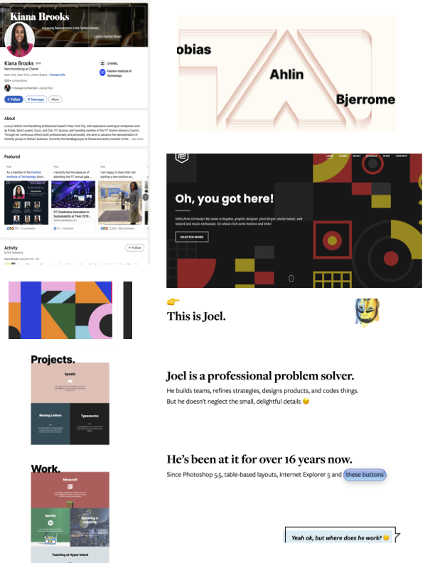
Inspiration and Concepts
I struggled to find adequate inspiration that formally came in the form of a portfolio, but I did see some ideas I want to emulate. Namely, I enjoyed minimalistic styles that use color to draw attention to important pieces of information. One of my inspiration pieces even had an “interactive” resume, which is something I enjoyed.
Thumbnails and Sketches
As for thumbnails, I decided to keep it somewhat conservative, since I will be entering the corporate side of the fashion industry. To infuse my personality nonetheless, I am hoping to add pops of color strategically.
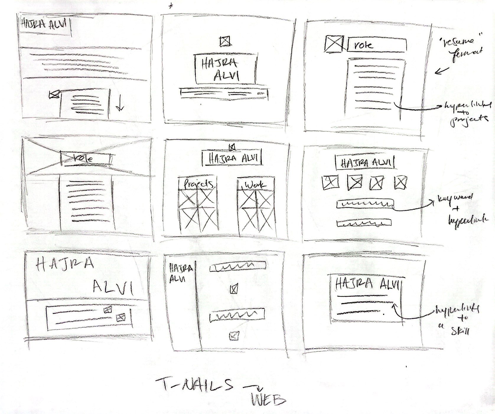
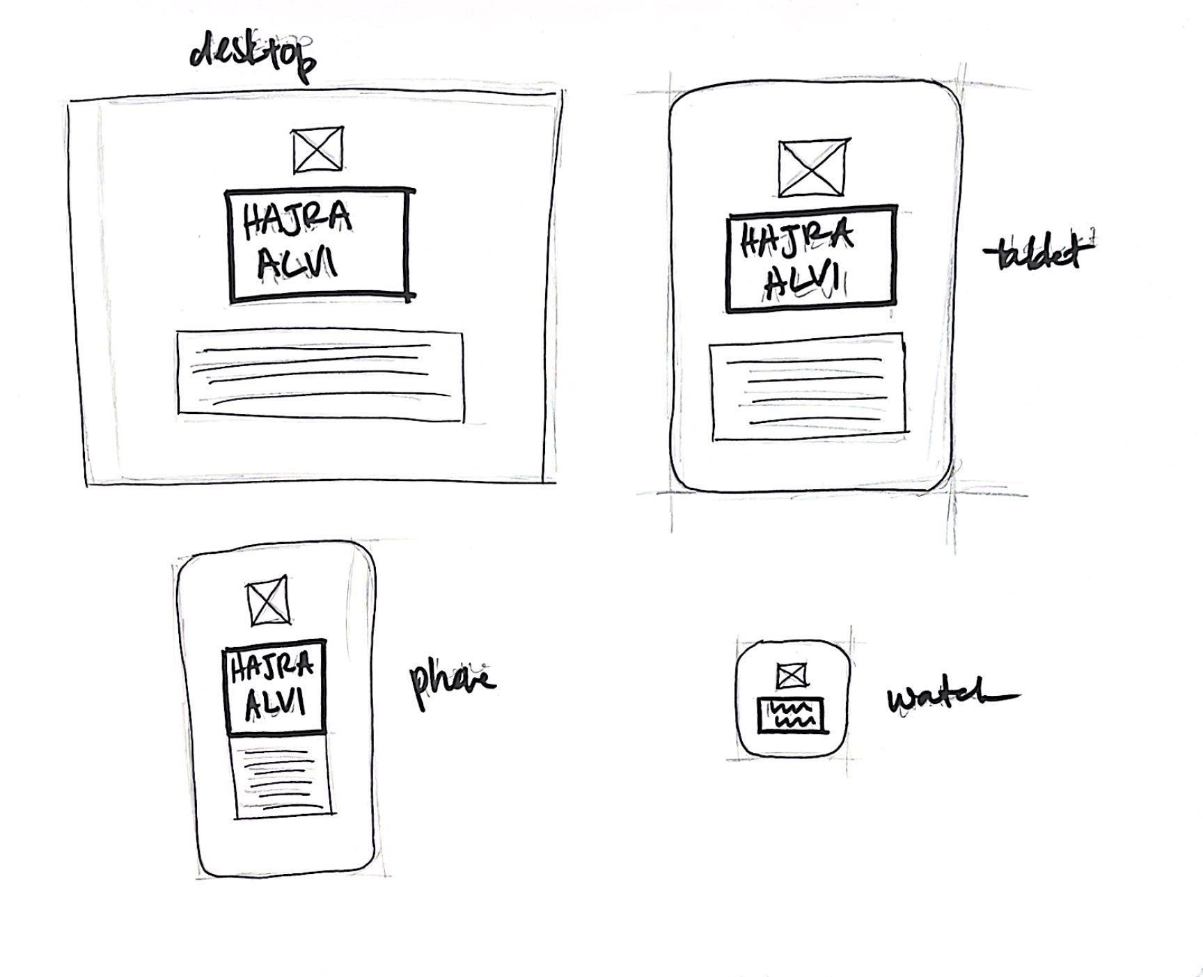
Wireframes and Prototypes
As for now, I am focusing on having a very simple website with direct and clear information. As such, my wireframes are pretty similar, with a few sizing considerations. Overall though, I am focused on a clean, straightforward approach.
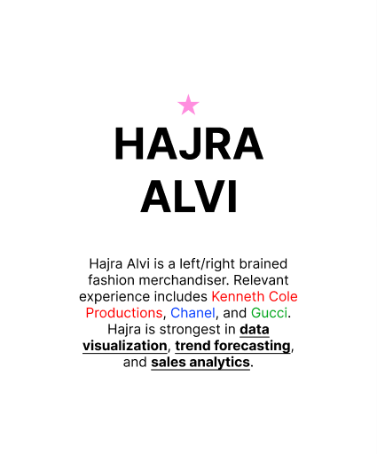
Responsive Mockup
I started out the design for my homepage’s mockup on Figma.
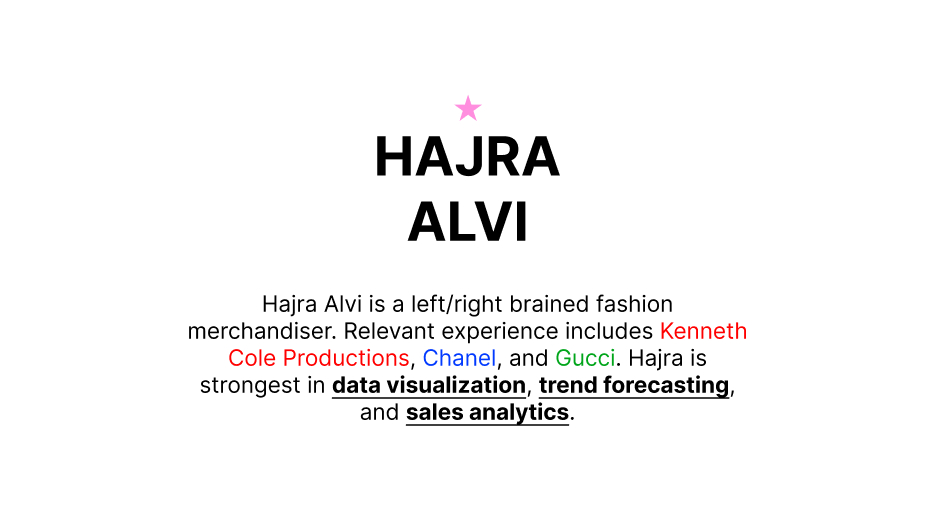
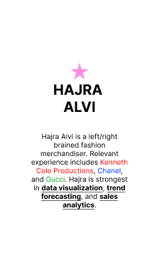
PS Comp
Then, on PhotoShop, I played out the multiple designs. Here, I was able to use color and hierarchy to indicate links and important information. I am not entirely sure how I feel about all the whitespace…on one hand, I find it annoying, but on the other, I know that this format is the most efficient for HR professionals viewing my website. At least for now, I am liking the simplicity.