Final Worksheet
01. Develop Idea
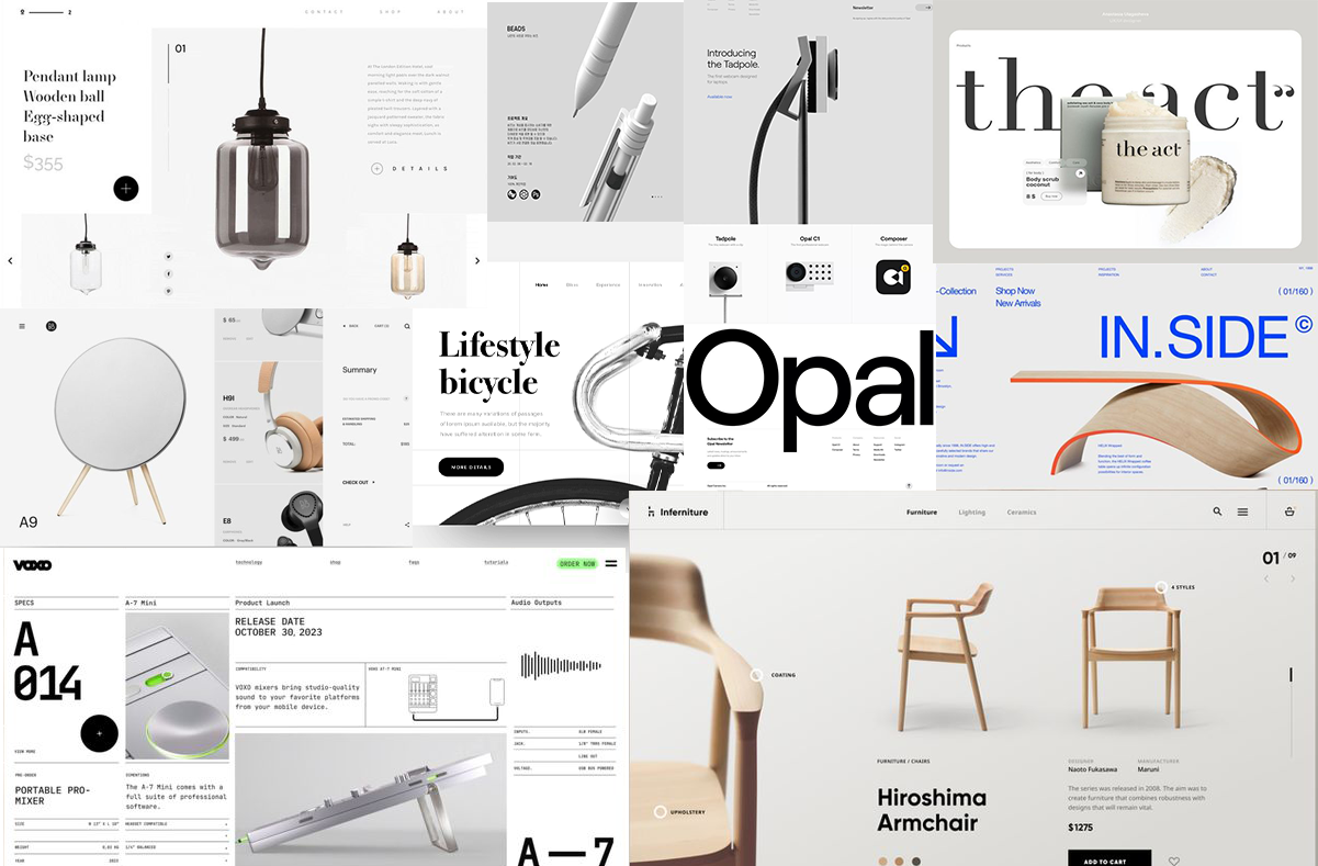
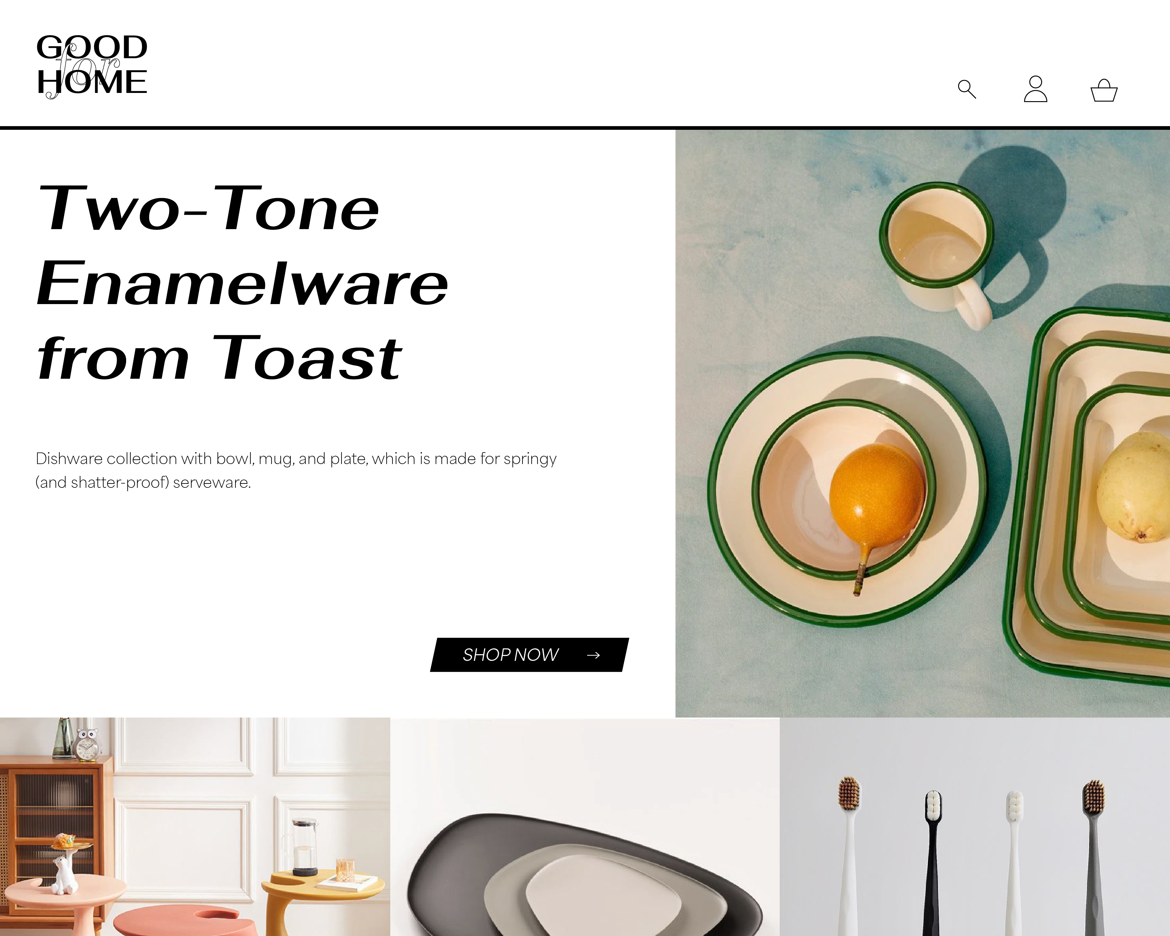
The point I would like to sell furniture and homeware through this project to create attractive webpages that show the products efficiently by emphasize each featuer of products,in a well-organized and visually fasinating manner. I prefer this selling website to serve as a professional brand website for allowing the viewers’ purchasing pursuit. My goal is to produce a website with minimalistic design, viewing clean and approachable but representing the characteristics of this website.
02. Discovery and Research
I researched a variety of other selling websites and noticed how they categorized their works in attractive visual layout and how they navigated them. Each of their websites has their own unique styles, themes, and concepts, which influenced how to represent the product that will be allure to customers and stimulate the consumer's purchasing desire.
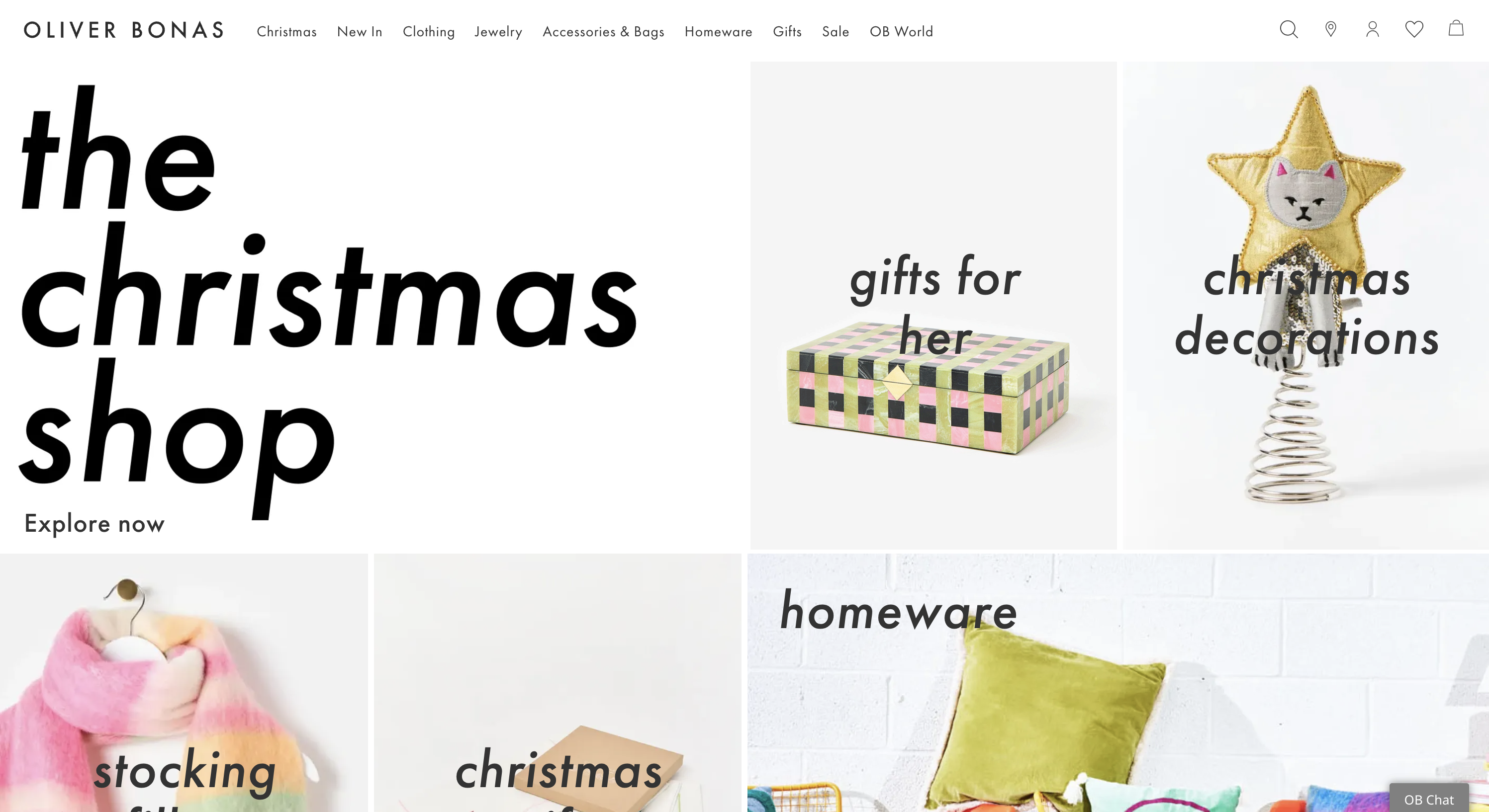
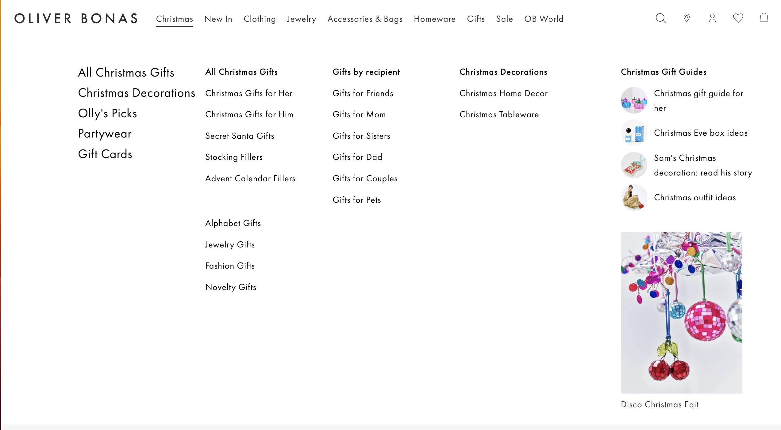
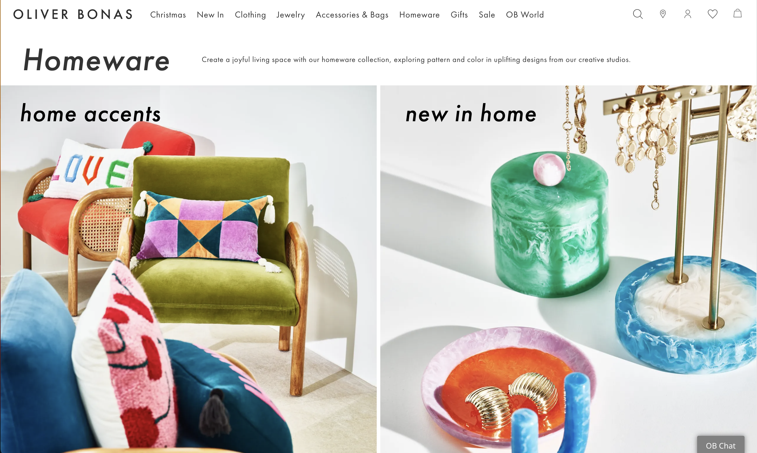
The website of a brand, OLIVER BONAS has their own unique layout. This website uses white and slight gray background to empathize the scene of the products they are selling. They use an automatic animation on the projects' images to catch the viewer's eye. Everything is quite clean but not boring. It makes people only focus on the products, is easy to navigate throughout, and simply recognize all categories at a glance.
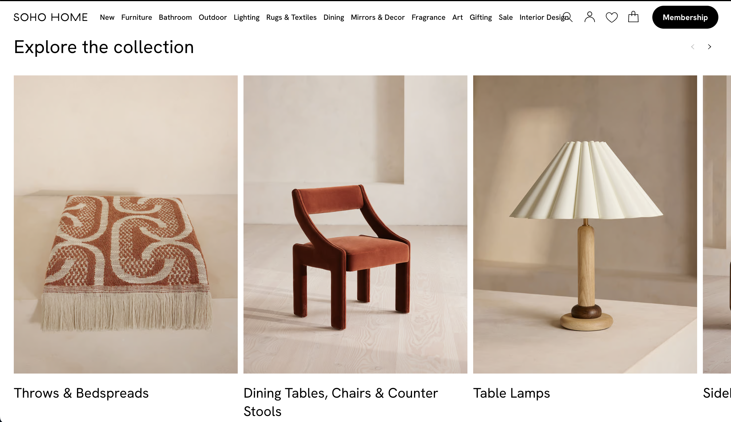
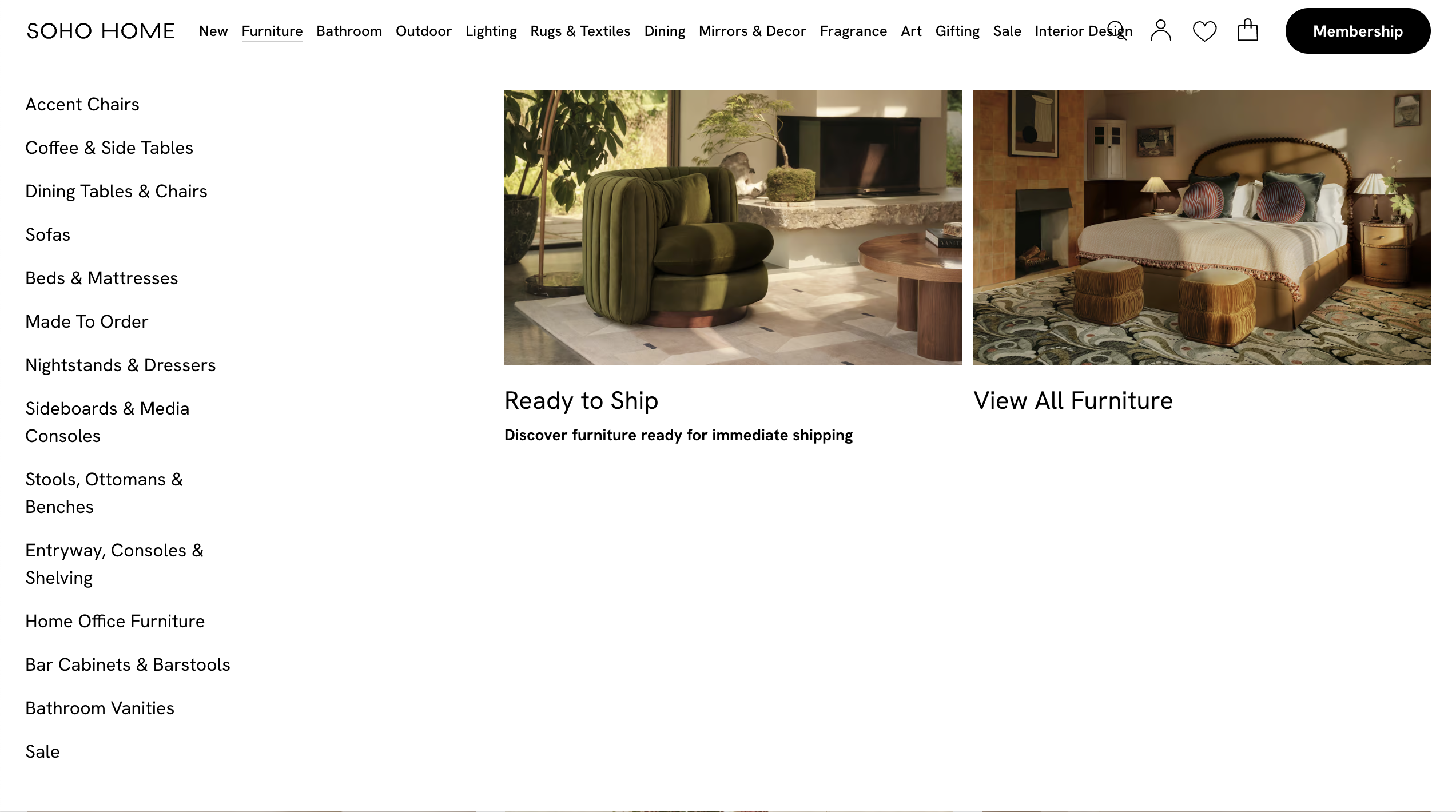
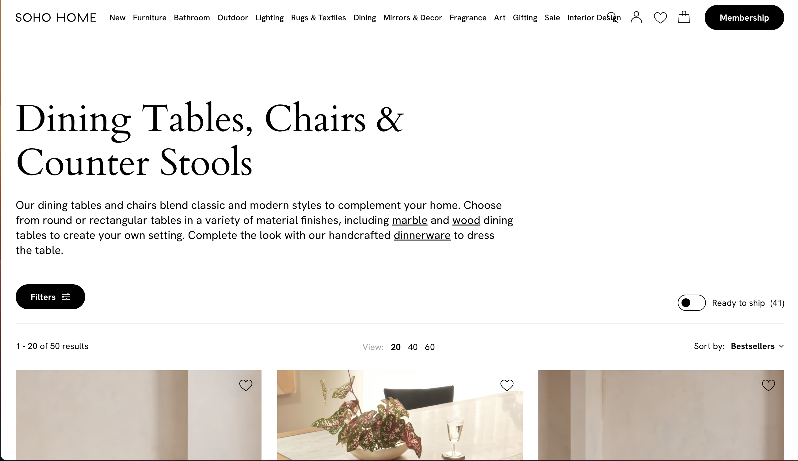
The brand "SOHO HOME" website is modern, well-organized and fasinating. This website uses warm color scheme to represent their own cozy atmostphere. It makes the products on the websites looks better and lead customers to concentrate on the selling products. It easily navigates to each product category and arouses the purchasing desire to the consumers. By using classy and modern fonts for the explanations of the information on this website and products, the website represents the unique characteristics of their furniture design.
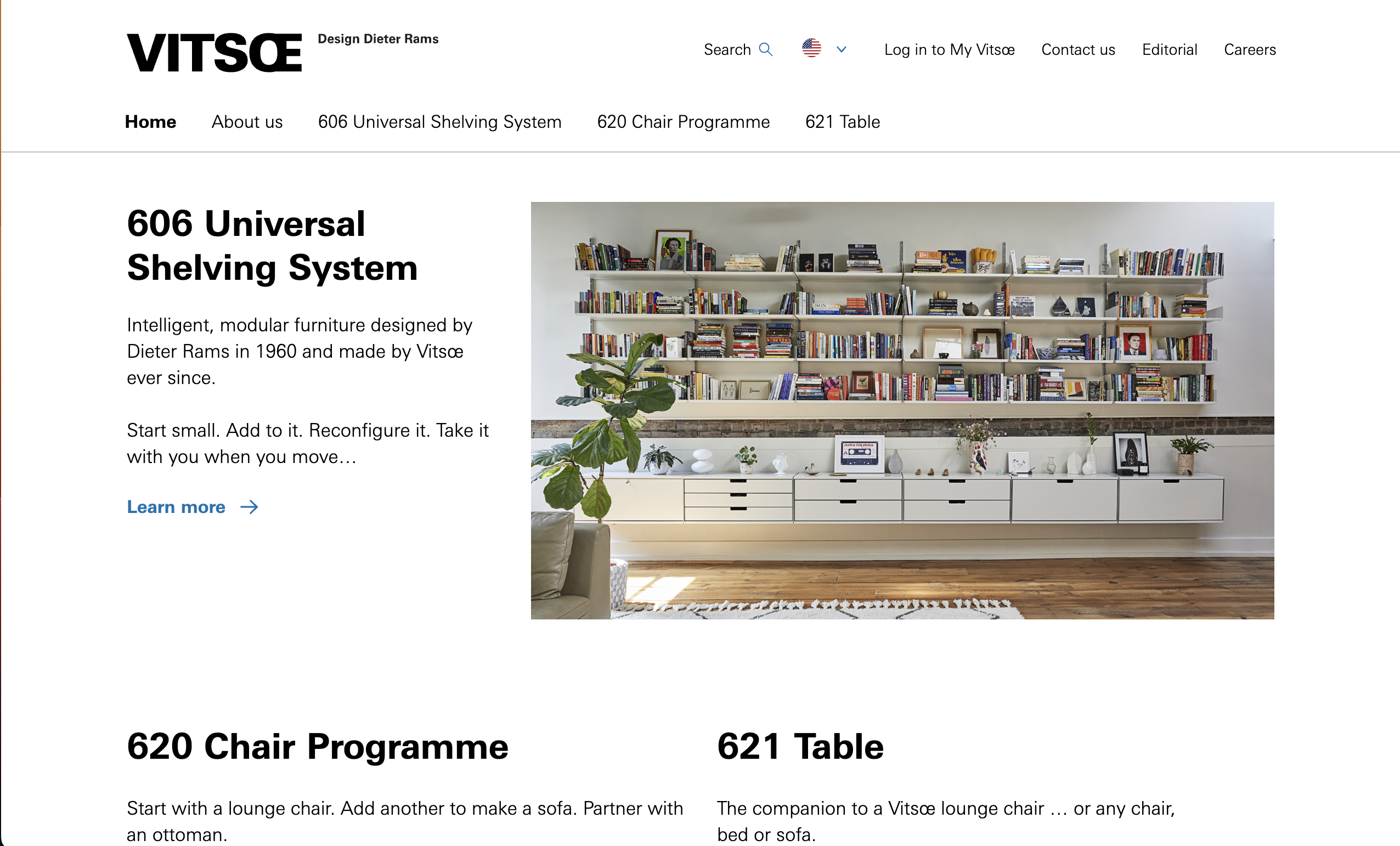
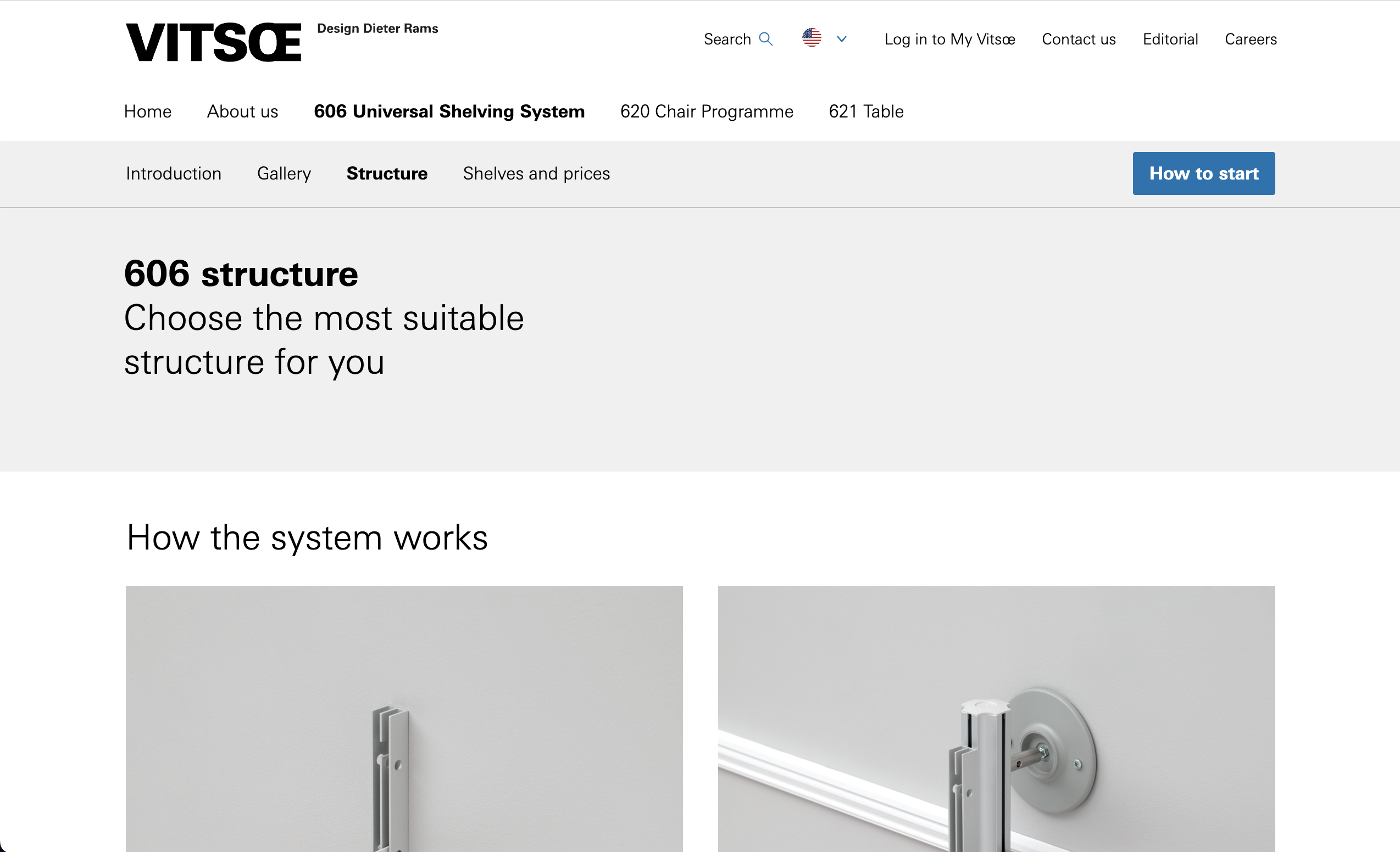
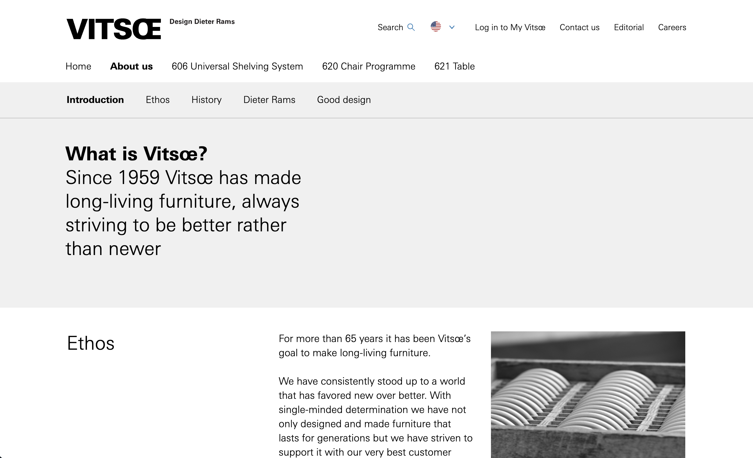
The brand "VITSOE" website is modern, well-organized and minimalistic. This website uses blackand white color to represent their product and information clearly. This white backgkround makes the products on the websites looks better and lead customers to concentrate on the selling products. It easily navigates to each product category and lead the purchasing desire to the consumers by showing how each product uses in reality. By using clean and modern fonts for the explanations of the information on this website and products, the website represents this brand's own design mood.
03. Target Audience
Target audience for this selling website is potentially the people who are looking for adorable and unique homeware and furniture in their home. It is also targeted fellow designers or people, who work in other fields and would like to put their projects on this website. I would love to create an engaging user interactive website with a clean, well-organized design, but also attractive to stimulate the customer's desire for purchasing.
04. Inspiration and Concepts
05. Thumbnails and Sketches
06. Wireframes and Prototype

07. Responsive Mockup
08. PhotoShop Comp
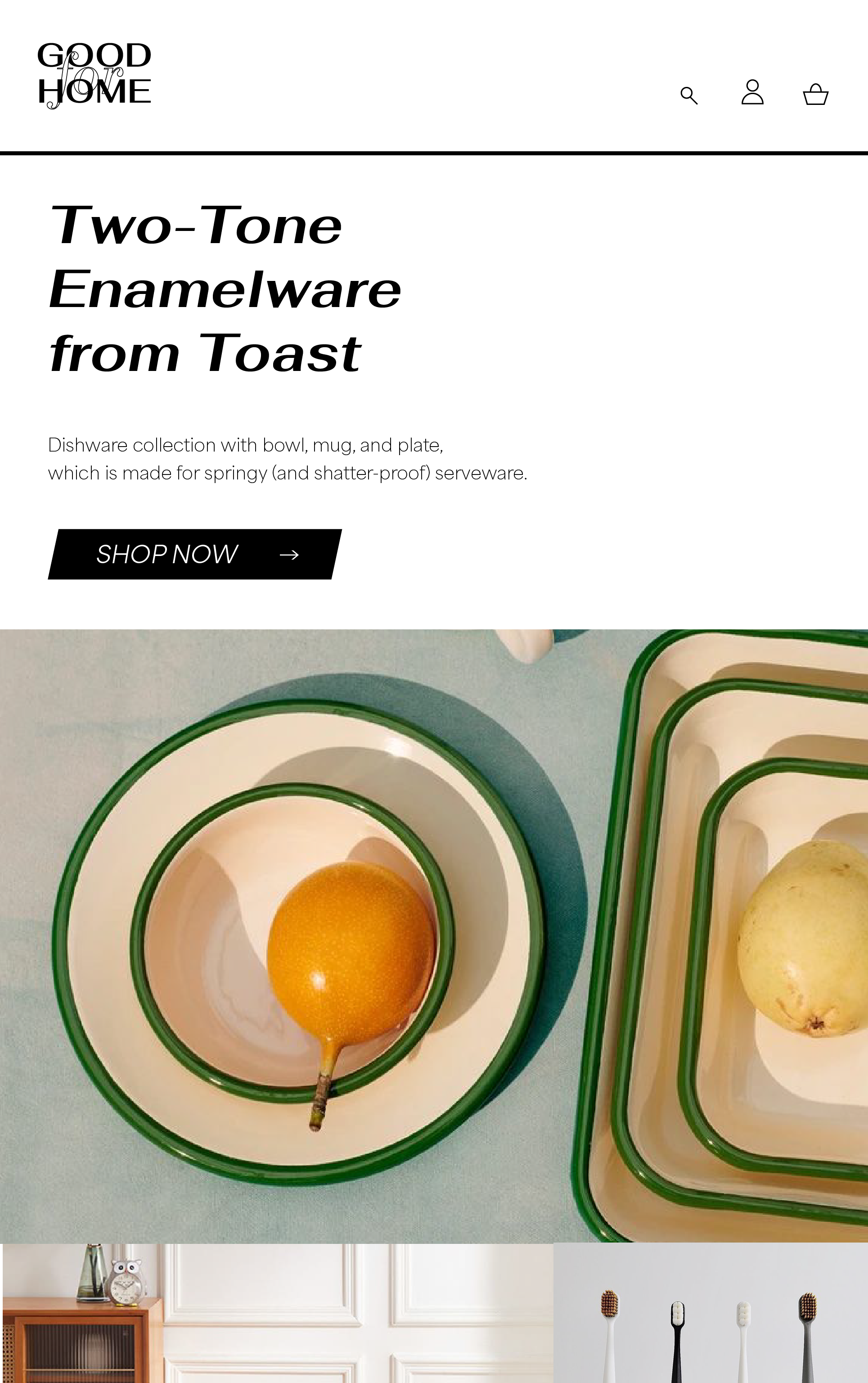
▲desktop
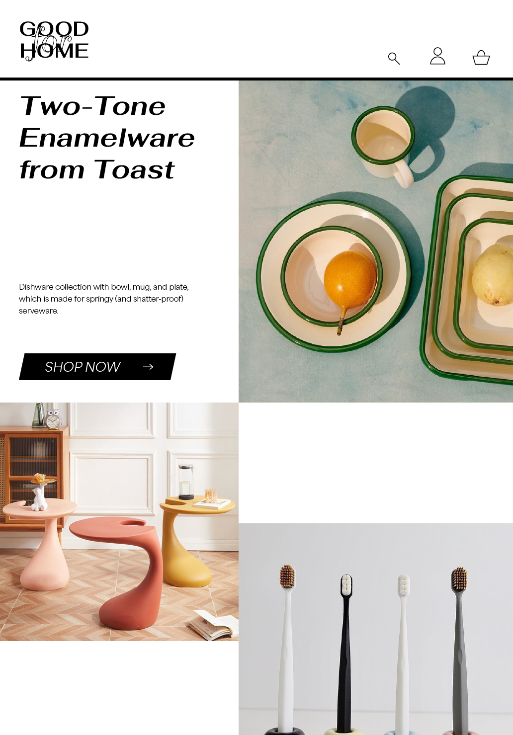
▲tablet
▲phone