Develop your Idea
The concept for this project is to create a captivating website dedicated to introducing users to the Taiwanese band, No Party for Cao Dong. The website will serve as an immersive platform, combining audio and visual elements to showcase the band's music, aesthetics, and art. The primary objective is to engage visitors in a dynamic experience that resonates with the band's unique style.
Discovery and Research
IIn the discovery phase, thorough research will be conducted to understand No Party for Cao Dong's musical journey, influences, and visual identity. This will involve studying the band's discography, reviewing interviews, and analyzing their visual artistry. Additionally, a market analysis will be undertaken to identify user preferences in the context of fan websites and music-related platforms.
Example websites I discovered:
- Taiwanese Band - Sunset Rollercoaster
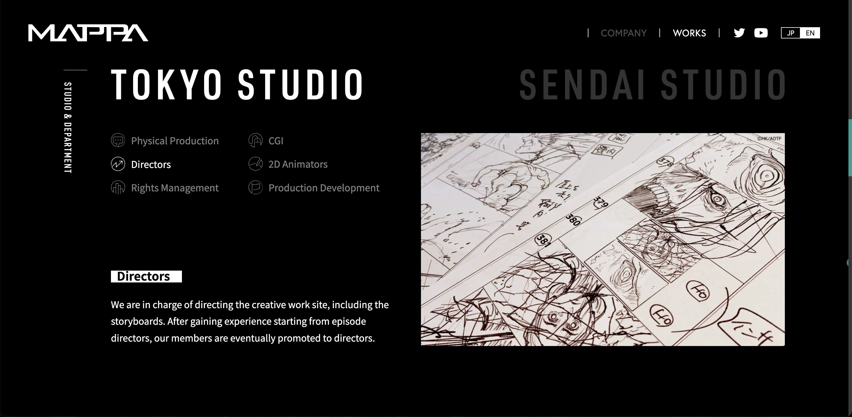
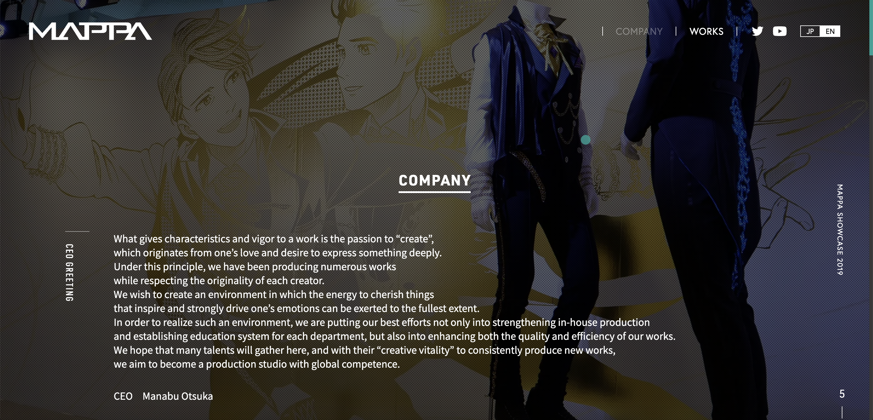
- Animation Company - MAPPA
simple with the domain color of Orange which symbolizes the "Sunset"
good balance of the image with text, also includes simple icons for navigation
In addition to my prior analysis of James Jean's website, I delved deeper into other websites that I find to be artistically designed. This expanded my scope beyond illustration artists' websites to include those created by bands or musicians. A notable observation was that many illustrators do not have their own domain; instead, they use platforms like Linktree to streamline the process of sharing links for purchasing their prints.
I draw inspiration from websites like "MAPPA" due to their design style. This choice is influenced by the fact that my illustrations often lean towards a darker and more realistic aesthetic, which is reflected in the predominant use of the color black on my landing page and other interconnected web pages. Another aspect I appreciate about this website is the visual dominance; it primarily relies on images rather than text. Furthermore, the subtle animations employed on the site catch my eye; they enhance the user experience without overwhelming the content's message to the audience.


Target your Audience
The target audience for the No Party for Cao Dong fan website includes existing fans, potential fans, and individuals interested in exploring unique music and visual aesthetics. By understanding the audience's preferences, the website will be tailored to cater to their expectations, creating a user-friendly and engaging experience.
Inspiration and Concepts
Inspiration for the website's design and content will be drawn from No Party for Cao Dong's black and white aesthetic, mirroring their music and art style. Concepts will focus on creating a visually striking platform with a seamless blend of images, interactive elements, and an ambient audio experience. The goal is to evoke the band's essence and immerse users in an environment that reflects their artistic identity.
Here are the mood boards that I have created, it includes some of the inspirations from other people's portfolio, graphic design, and landing page:
.jpg)
.jpg)
Wireframes and Prototypes
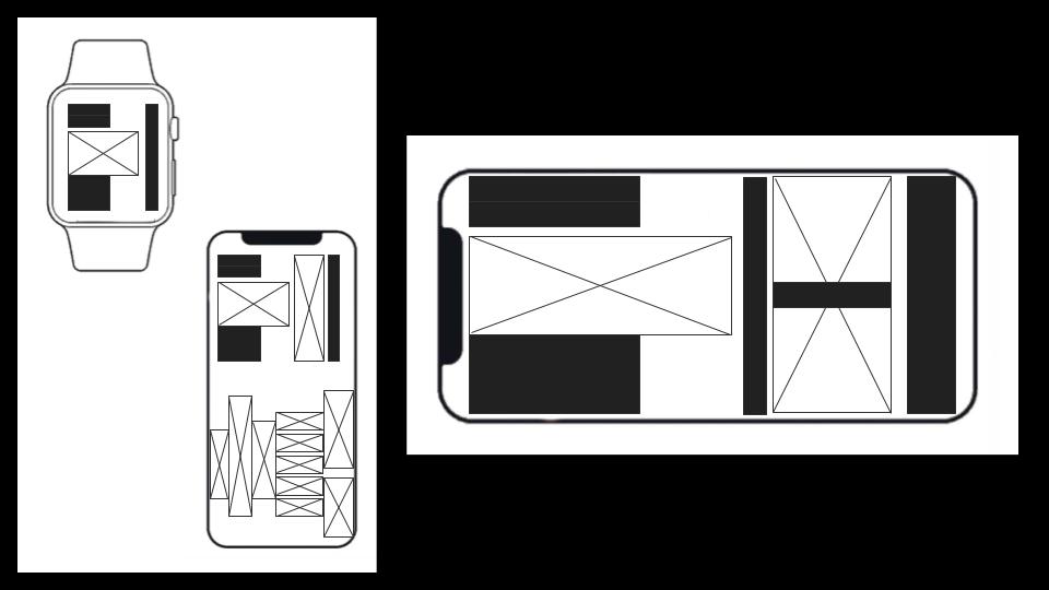
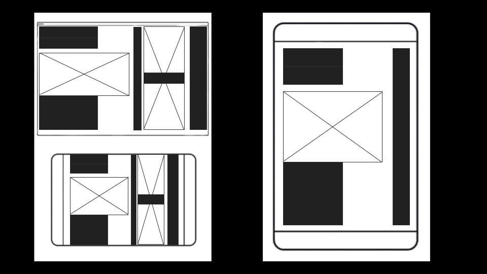
Wireframes and prototypes will be developed to visualize the website's structure and layout. This phase will outline the placement of key elements, such as the audio player, visual showcases, interactive features, and information sections. Prototypes will allow for testing and refinement, ensuring a cohesive and intuitive user journey. Feedback from this stage will guide the final design and development phases.
By following these stages, the No Party for Cao Dong fan website will evolve from a conceptual idea into a well-researched, visually compelling, and user-focused platform that effectively introduces and engages fans with the band's music and artistry.

