Develop your Idea
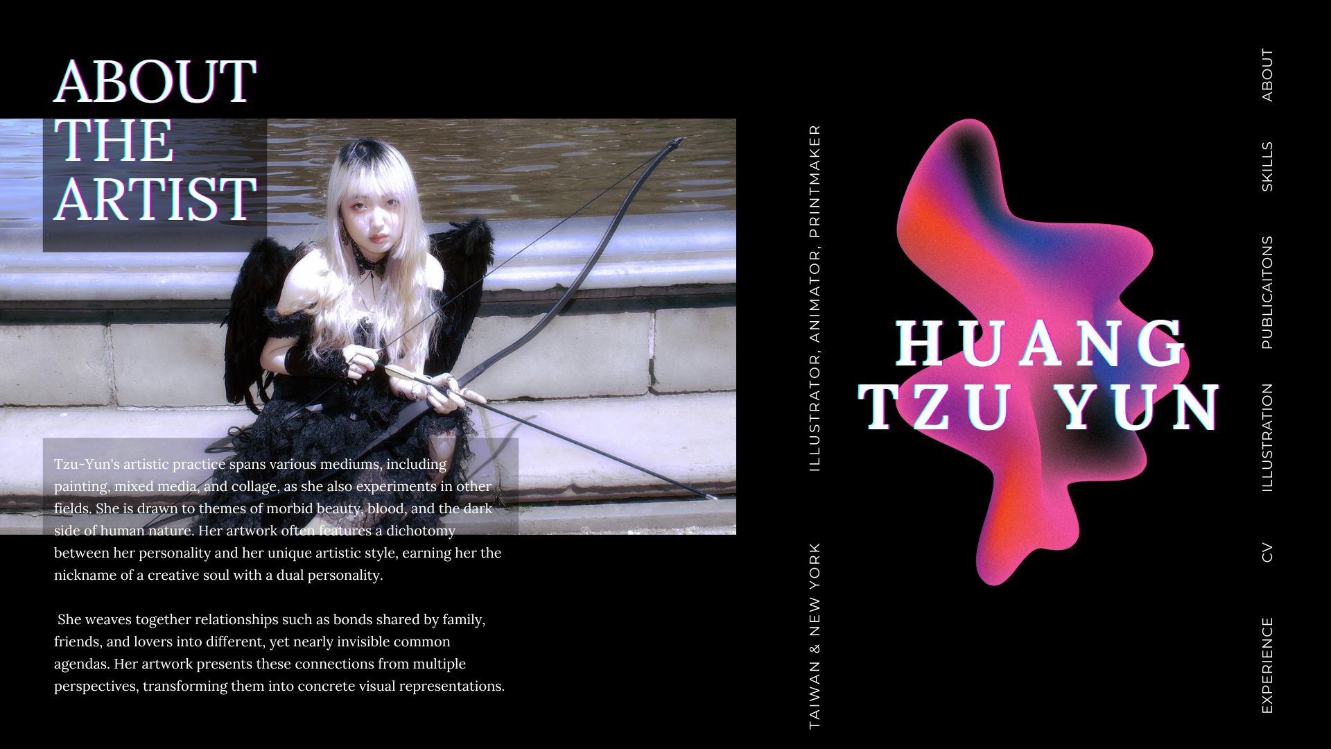
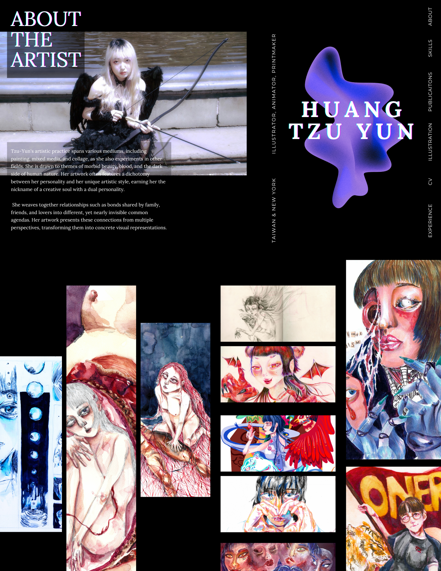
Motivated by James Jean's website, I aim to craft a portfolio that showcases my artistic concepts and creative endeavors, predominantly through visual components. Additionally, I aspire to incorporate my artist statement along with highlights of the exhibitions and illustration-related events I've participated in, offering a glimpse into my extensive experience in this domain.
Discovery and Research
In addition to my prior analysis of James Jean's website, I delved deeper into other websites that I find to be artistically designed. This expanded my scope beyond illustration artists' websites to include those created by bands or musicians. A notable observation was that many illustrators do not have their own domain; instead, they use platforms like Linktree to streamline the process of sharing links for purchasing their prints.
Example websites I discovered:
- Taiwanese Band - Sunset Rollercoaster
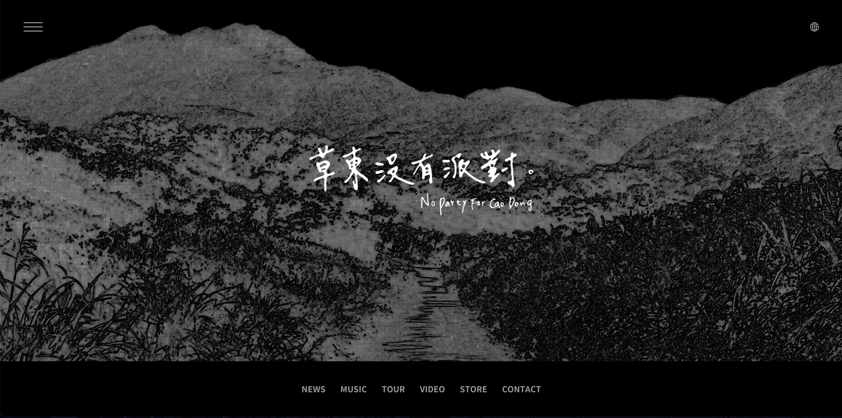
- Taiwanese Band - No Party for Cao Dong
- Riot Games - League of Legend
- Esports Team - T1
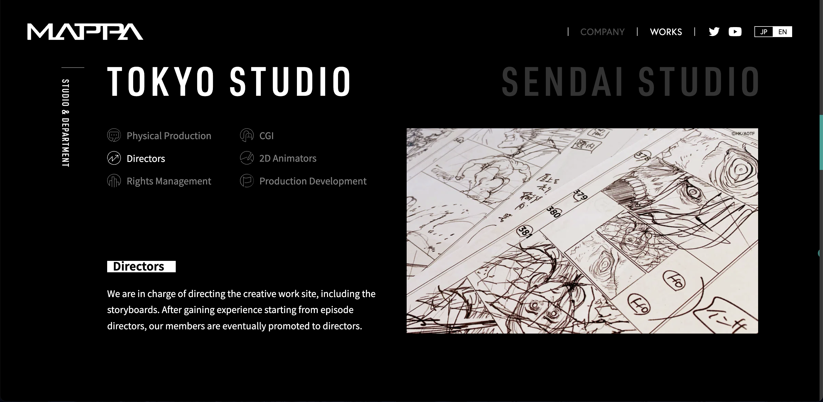
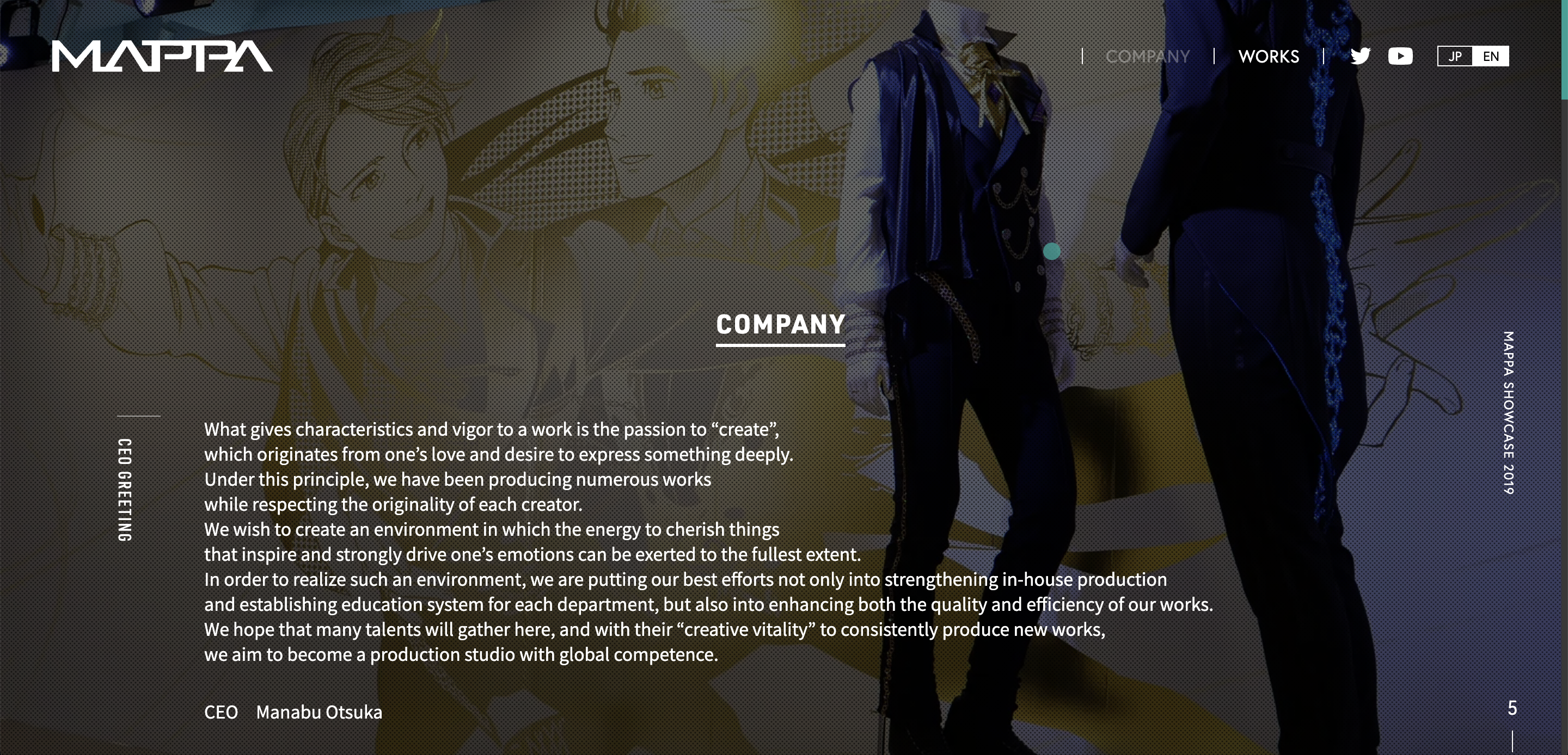
- Animation Company - MAPPA
simple with the domain color of Orange which symbolizes the "Sunset"
image and animation based with the domain color of black which fits the tone of their music
more text based, other than the color black also includes the light blue to highlight the futuristic cyber punk style of video games
mainly red (the theme color of the team and the company) other than the images of the players and games, also leaves a large space for the goods they are selling
good balance of the image with text, also includes simple icons for navigation
In addition to my prior analysis of James Jean's website, I delved deeper into other websites that I find to be artistically designed. This expanded my scope beyond illustration artists' websites to include those created by bands or musicians. A notable observation was that many illustrators do not have their own domain; instead, they use platforms like Linktree to streamline the process of sharing links for purchasing their prints.
I draw inspiration from websites like "No Party for Cao Dong" and "MAPPA" due to their design style. This choice is influenced by the fact that my illustrations often lean towards a darker and more realistic aesthetic, which is reflected in the predominant use of the color black on my landing page and other interconnected web pages. Another aspect I appreciate about this website is the visual dominance; it primarily relies on images rather than text. Furthermore, the subtle animations employed on the site catch my eye; they enhance the user experience without overwhelming the content's message to the audience.
Target your Audience
My portfolio website is designed to introduce myself to potential employers, interviewers, and fellow creative professionals who share a similar background and wish for me to provide any creative support. It goes beyond showcasing my work, which is currently limited, by telling my story. The website aims to provide easy navigation and an engaging experience for all visitors. Through this platform, I want my future employer to gain insights into my creative practices, which cannot be fully conveyed through a traditional resume that are mostly text dominated rather than images and illustrations.
Inspiration and Concepts
Here are the mood boards that I have created, it includes some of the inspirations from other people's portfolio, graphic design, and landing page:
.png)
.png)
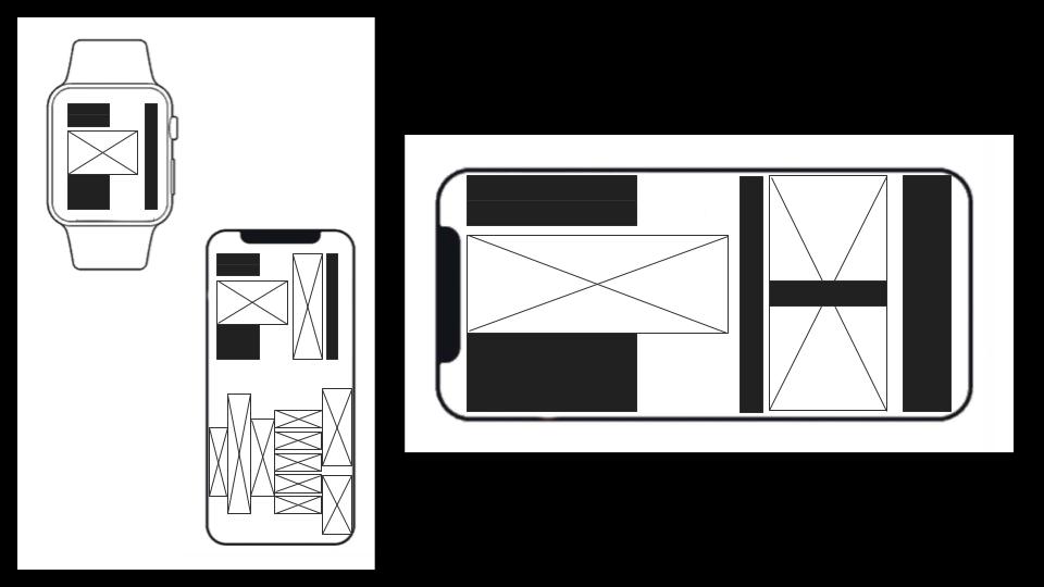
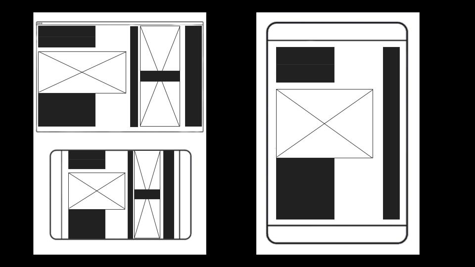
Wireframes and Prototypes
Responsive Mockup
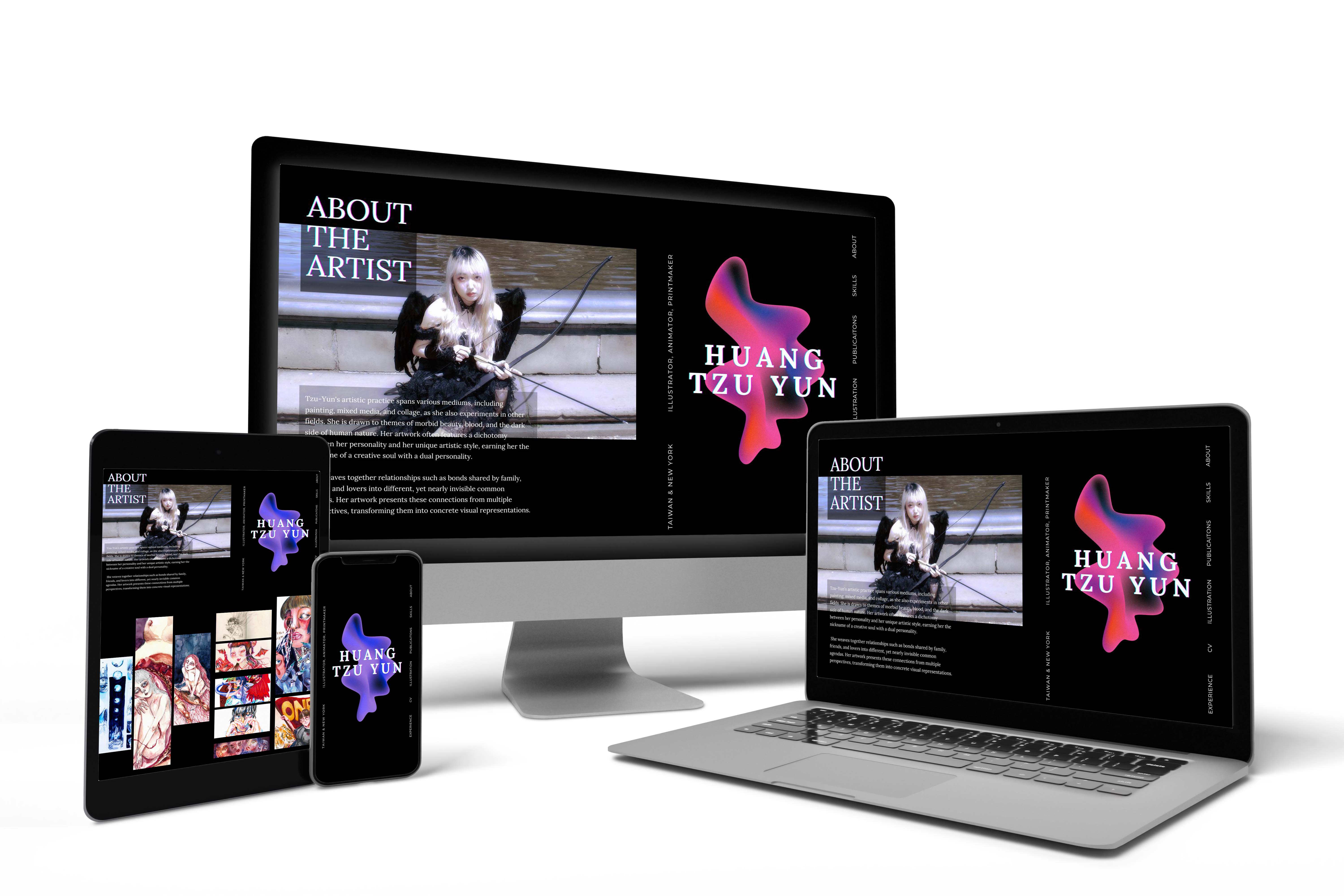
Photoshop comp
