Analysis on the website: Robert Bugel
Intent:
The main purpose of this website is a digital portfolio of a graphics office in Dusseldorf, run by Robert Burgel.
Voice:
The voice of the website is clear and precise to the point. It is organized into different sections which summarize the skills and products handled by Robert Burgel. Since the statements and descriptions written on the website are short and straightforward, they set an impassioned and professional tone.
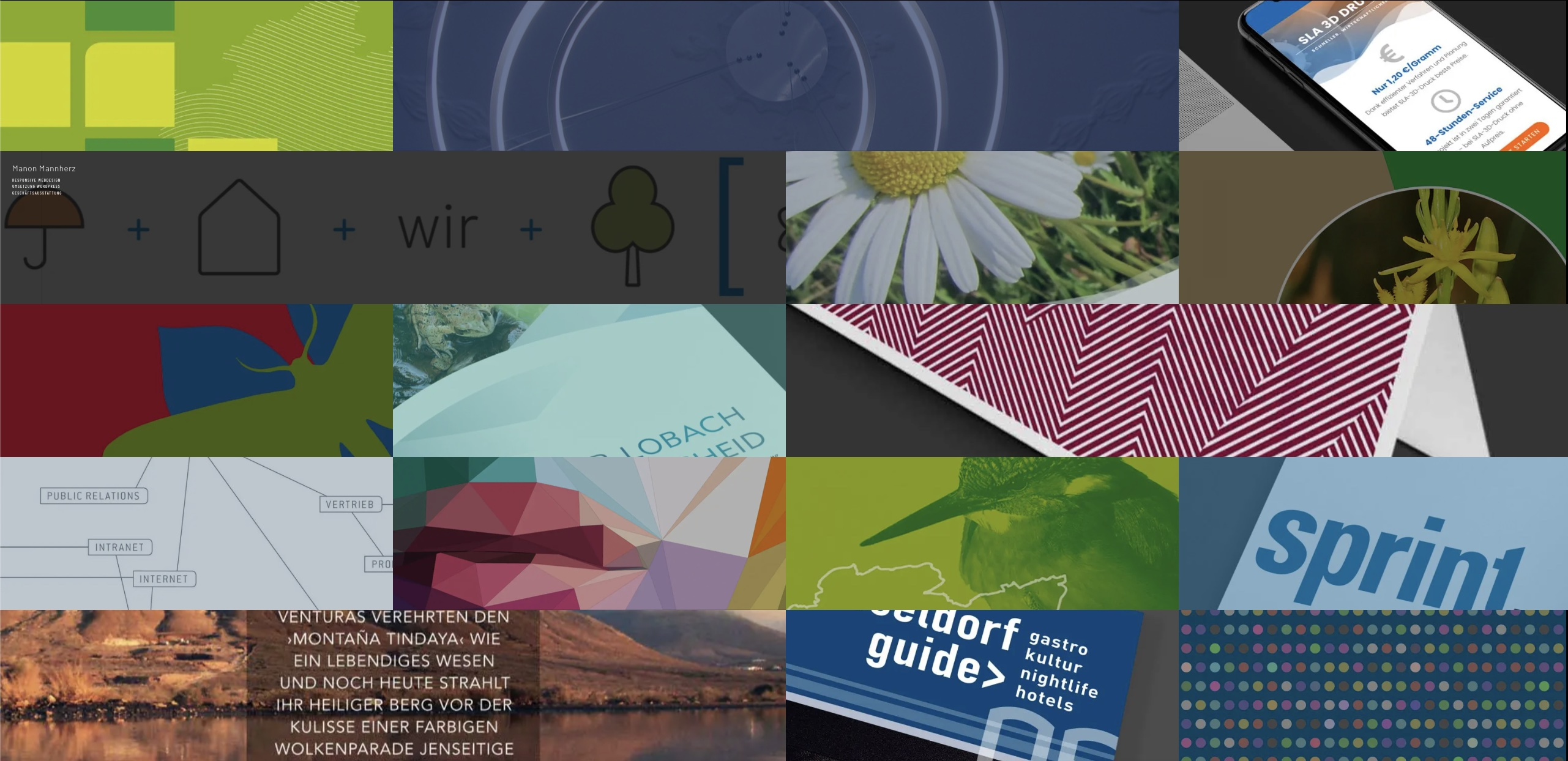
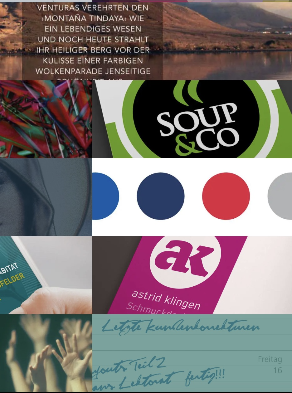
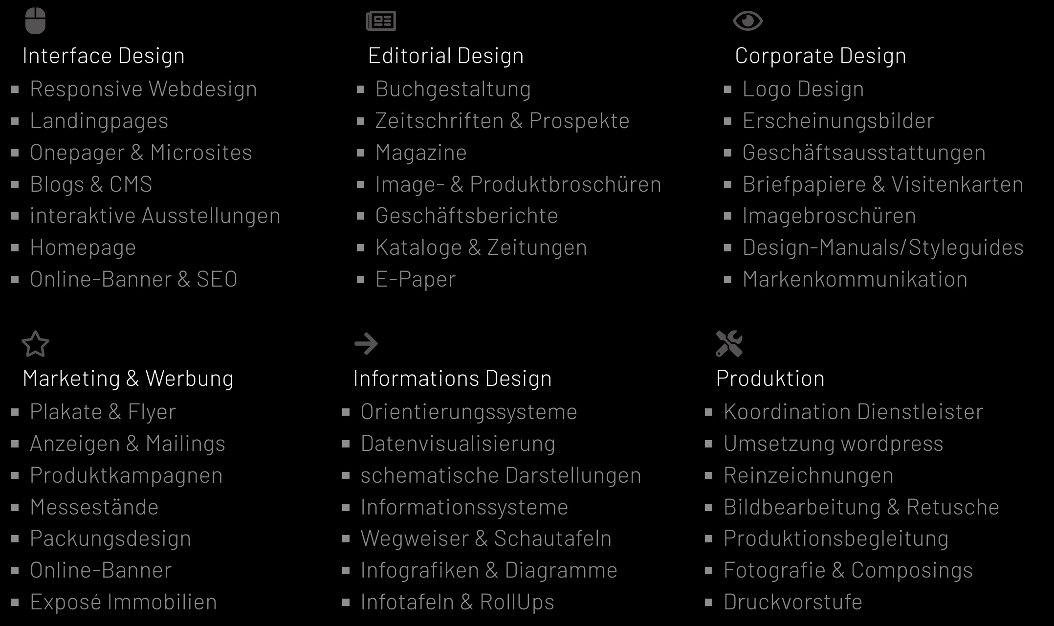
The website is divided into a single page, but there are mainly 4 sections. The first section is the main homepage which has a subtle yet classy tone. This is addressed through the combination of the color black and highly saturated video. Since the negatives of the text are overlayed with the vibrant colored video, it makes the website eye-catching. The usage of motion effect is captivating and also unique creating a subtle tone. The second and third sections have short but clear descriptions of what the office can provide. The third section has a set of example projects that are accurately divided into two columns. This precise division sets a clear tone overall.
Brand:
Since the main background color is black the website has a consistent feeling. Every column is precisely divided, therefore it is professional and clear. Such features establish the brand to be professional and accurate.
College student who is studying computer science
Companies who are looking for a graphic designer for their brand
cProfessionals who are looking for a graphic design office to create their portfolio website
Companies that are willing to create a commercial
Companies who want their brand logo/website
Magazine websites
Image display
Myself (College student doing research): When I first encountered this website, there was nothing too unique but the clear contrast of the deep black color and the vibrant display playing in the negatives of the letter. This created a striking feeling that naturally grabbed my attention to interact with the website. I wanted to scroll down to see what the website was about and moved my cursor following the impactful display playing in the background. As a student researching websites, I wanted to learn how to create such powerful visuals.
Professionals willing to make portfolios: Looking at the website, the professional-looking logo greets me at first site. I am trying to find someone skilled enough to make a great and eye-catching portfolio. This website looks great and makes me curious, which is a good thing since proves that this company can make a portfolio for me that could be appealing to my customers. Scrolling down, I see their example past works. Some of them are my style but some are not. I would love to see them in detail and how it has been used in real life but it lacks in examples. Their website ends with their contact information, maybe I should contact them and leave them an inquiry email.
I want my company’s brand logo designed. I clicked on this website and they do not have a logo. Rather they have the name of the company with a video playing as a texture. I think this is such a great idea, but as a customer willing to create a company logo, I would like to see some examples of their previous works. The examples provided look pretty professional and clearly set out to the audience which seems like it is working. I am interested in working with this designer but where is their contact information? Scrolling down I see with their contacts, there are a lot of ways to reach out to them, which seems like they are quite a professional, active, and busy team. This makes them seem more reliable and experienced!

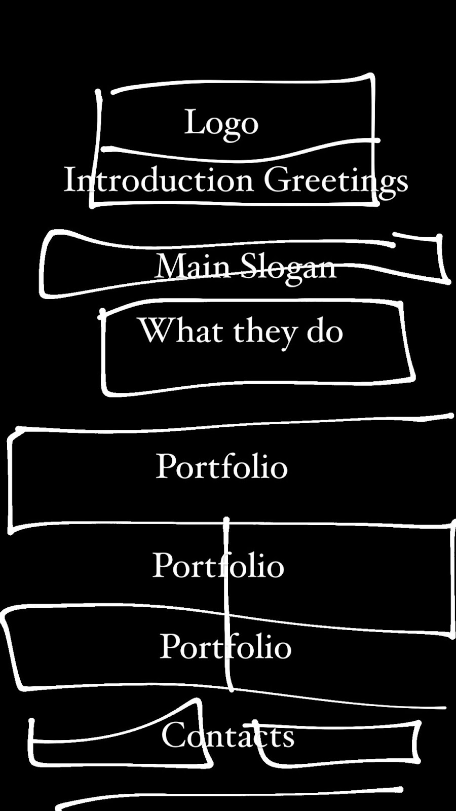
List 1: Heading : Robert Burgel
List 1: Introduction: Hallo und willkommen.
Wir sind ein Grafikbüro in Düsseldorf. Wir entwickeln grafische Konzepte, beraten, entwerfen, gestalten, realisieren, tüfteln und freuen uns schon auf das nächste Projekt.

List 3 : Portfolio Examples:

List 4: Past Experiences:
 List5 Contacts:

Competition: It has a really strong style with the use of powerful visual:
And the layout is clear and eyecatching therefore it is communicated well to the audience:
My Website Style Guide
Intent: I want to create a portfolio website that can define my art practice. I want to sell my color skills since I think I am good at playing colors.
Voice: The voice of the website should be sophisticated but eye-catching. This can be done using contrast, and vibrant color, but all in the sense that they are in moderation. Having too much of a single quality would not help me to achieve my goal.
The tone of the website should highly be based on the visuals, especially the use of colors. I want to use less type rather than more visuals.
Brand: Since the website allows me to address my biggest quality as a brand: the use of vibrant colors, if I show my unique skill of moderating the use of colors, I can address my uniqueness and creative talent as a designer.
Persona: The users of the websites are people who need a brand manager, designer, and art director for their own brands or companies. They would be looking for someone who is sophisticated and skilled in communicating with visuals.
Persona no. 1 (A Company needing a marketing manager/ designer): They are looking for someone who is really talented at picking the right visuals and colors that would be able to persuade the target audience. They would be searching for an eye-catching, and vivid image that would leave a strong impression on the customers.
Persona no. 2: ( A fashion brand recruiting a marketing manager) They would be finding a designer who can integrate the fashion brand’s voice in a simple and clear way so that it forms an image of the brand according to their intention.
Persona no 3: (The owner of an art gallery looking for someone to work for the gallery) They would want someone who can communicate effectively so that the designer can work as part of the art gallery team. The director should have the skill to understand and provide an overview of the aims of the gallery.
Copy Deck: