Designing for the Web
Develop your Idea
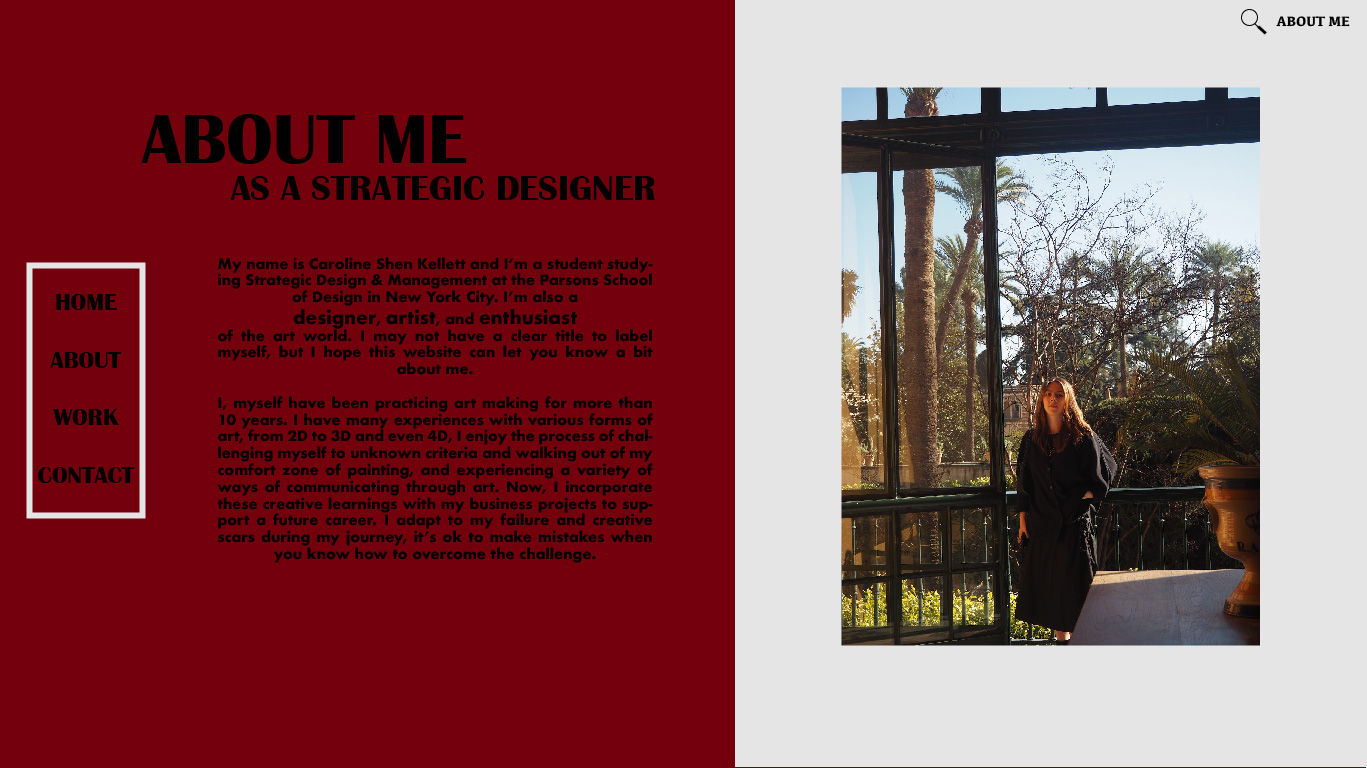
I don't know how to define myself by social titles. I know I'm student but what else? I want to create a website that reflects on my passion, interest, skills, and identity. I hope to find a suitable title for me during this discovery process. As a business major, I create a wide range of art from painting, to drawing, to wheel-throwing, to sculpting and now designing. I'm not a master in any of them but just a passionate learner. I want this website to evaluate my works and identify my style (hopefully:>).
Discovery and Research
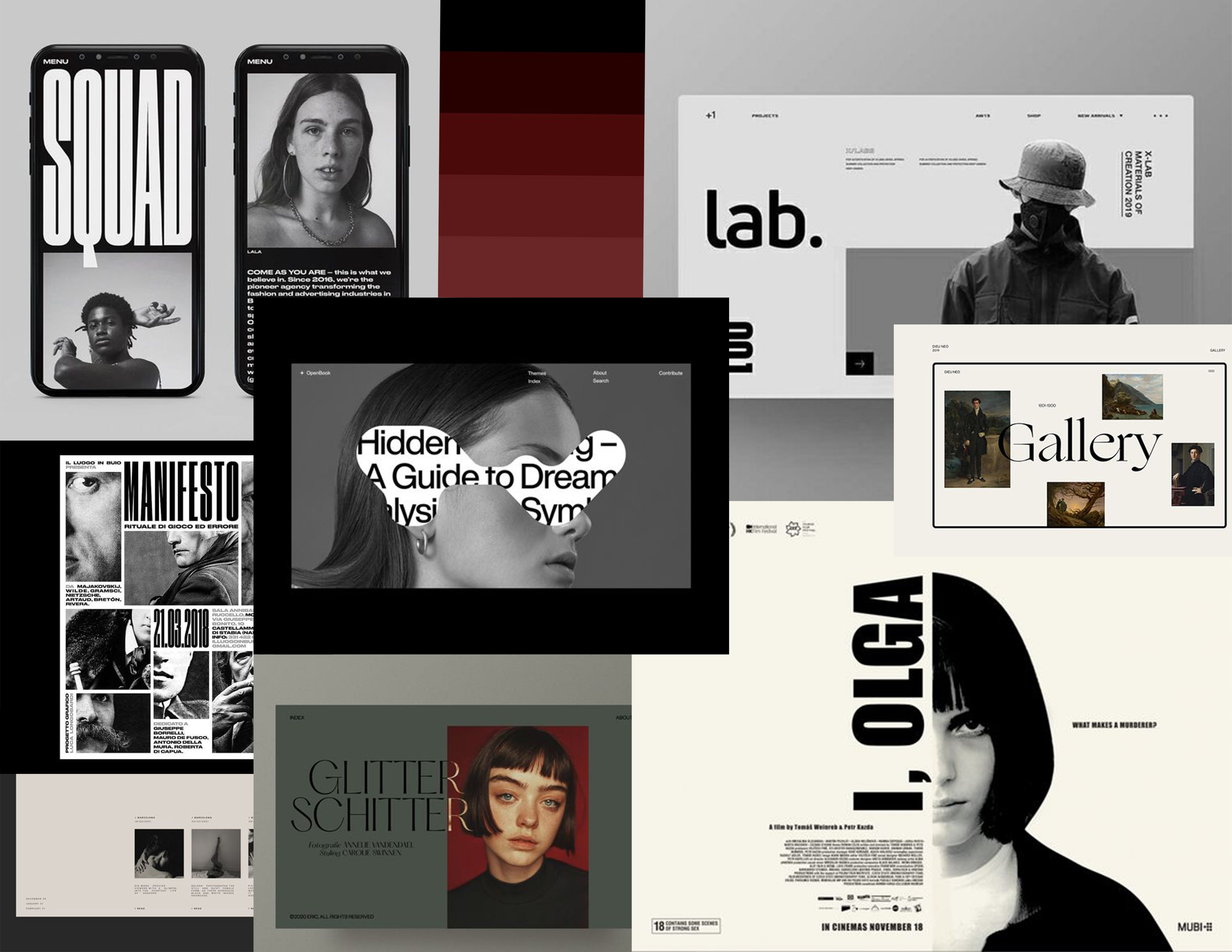
During my process of discovery and research, I was first confused what to search for where I don't have any specific artist and designer I admire that have a cool website. Many of them are artwork focus and fewer information about the person itself, which is not what I'm looking for. I like simple, clean, and easy to navigate kind of website. I resonated with the combination of black and white; it's standard but nice. Therefore I start to research into different corporations and organizations to find a diverse range of communication.
- COMME des GARÇONS
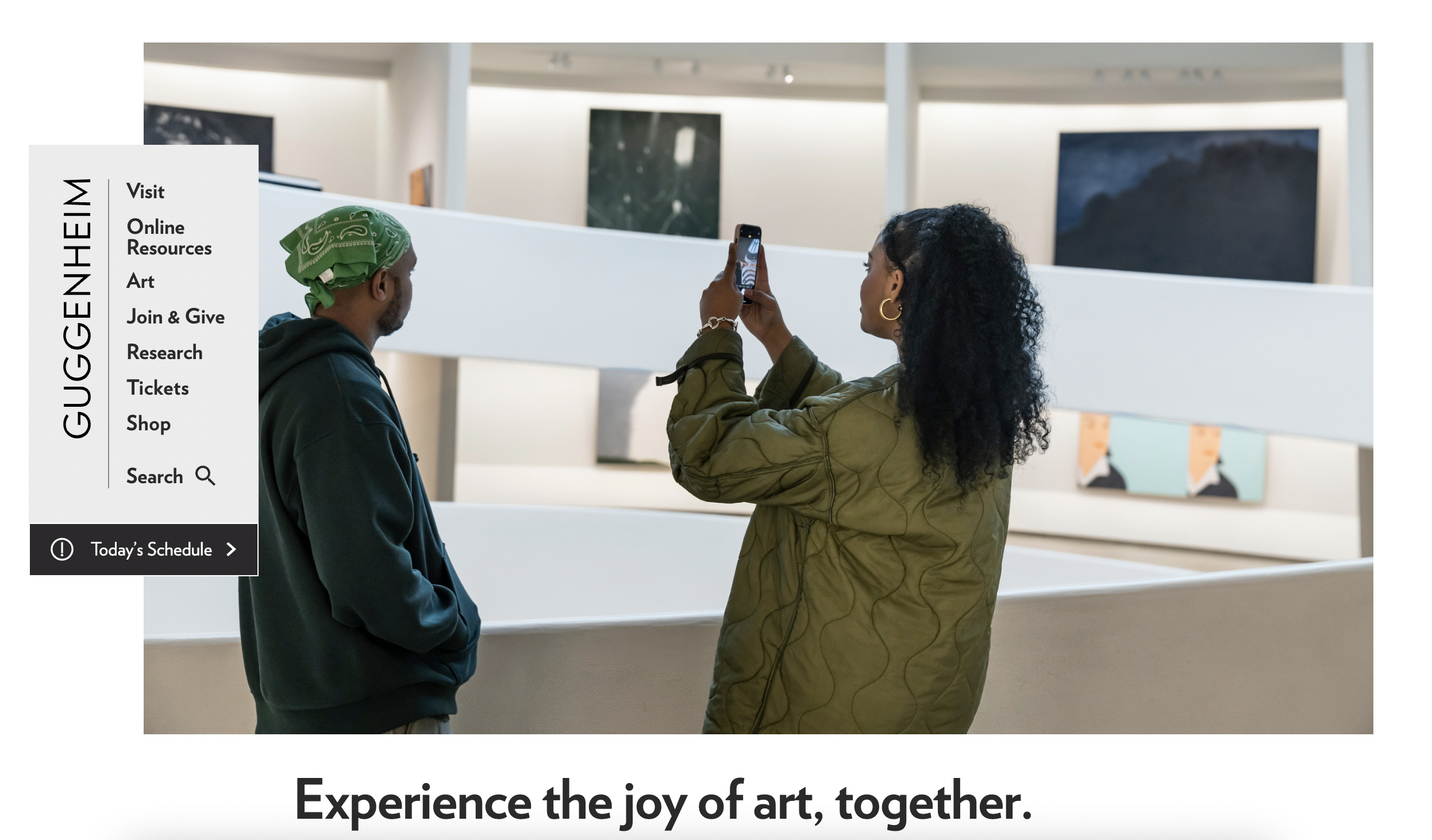
- Guggenheim
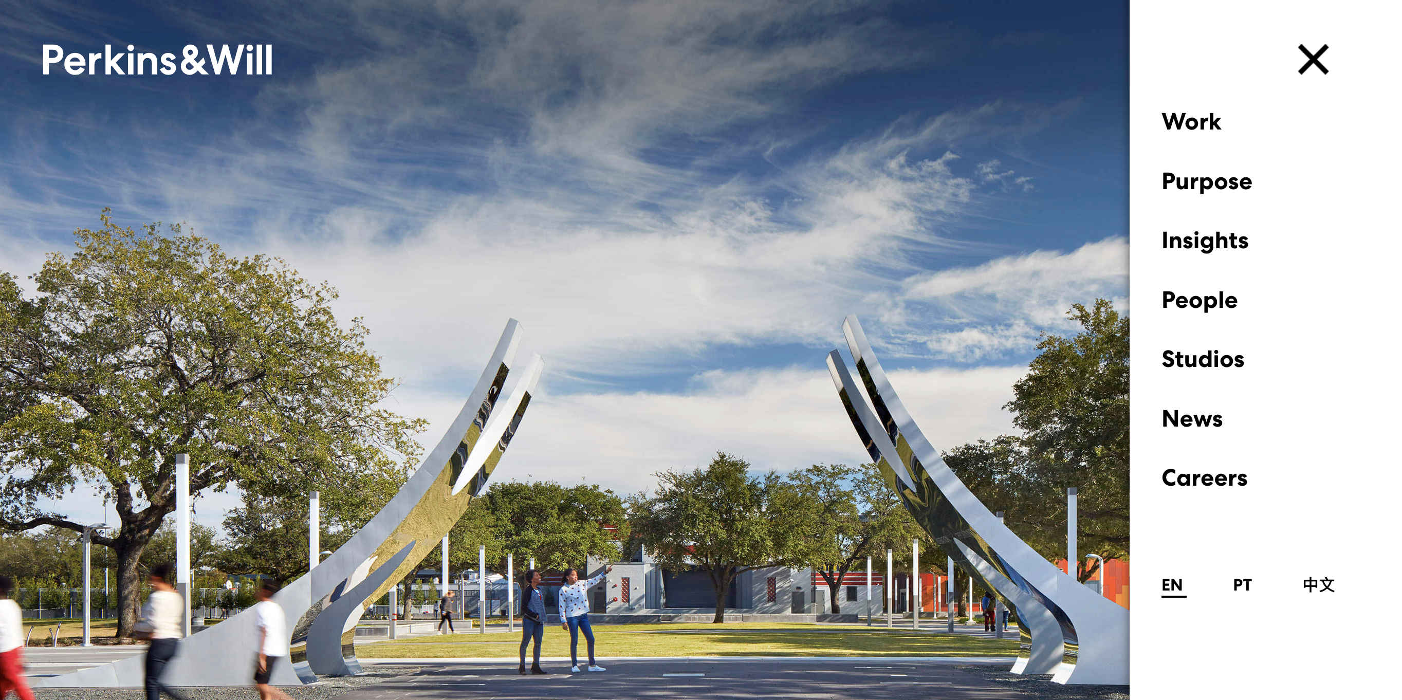
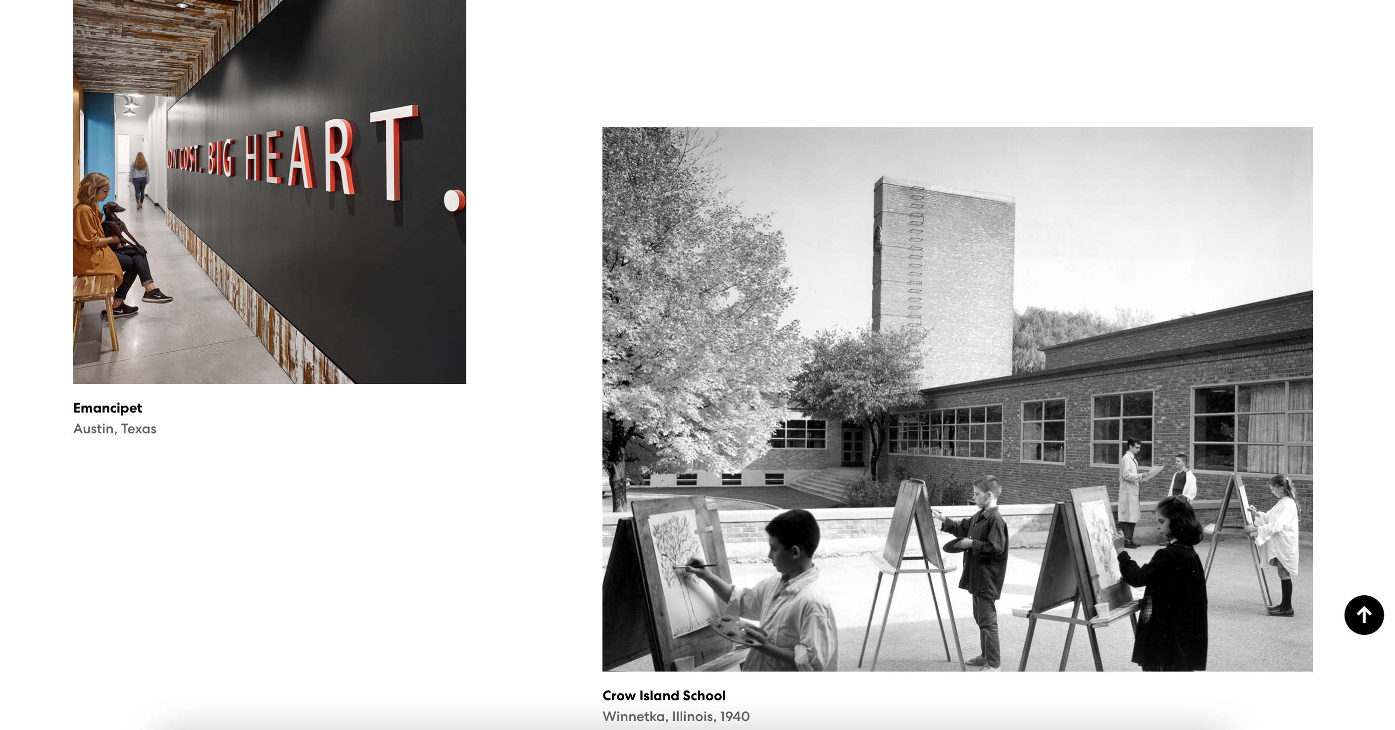
- Perkins & Will
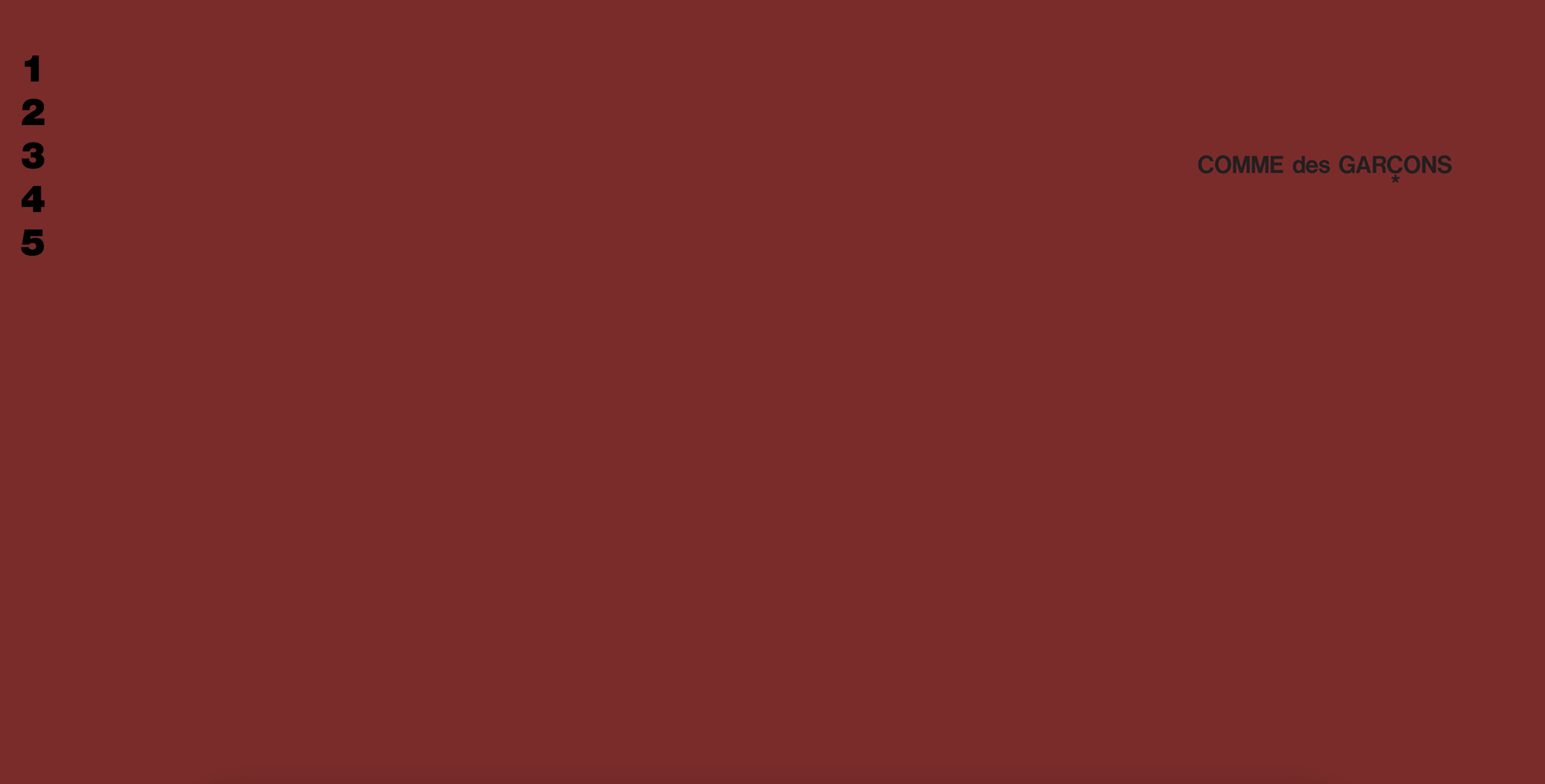
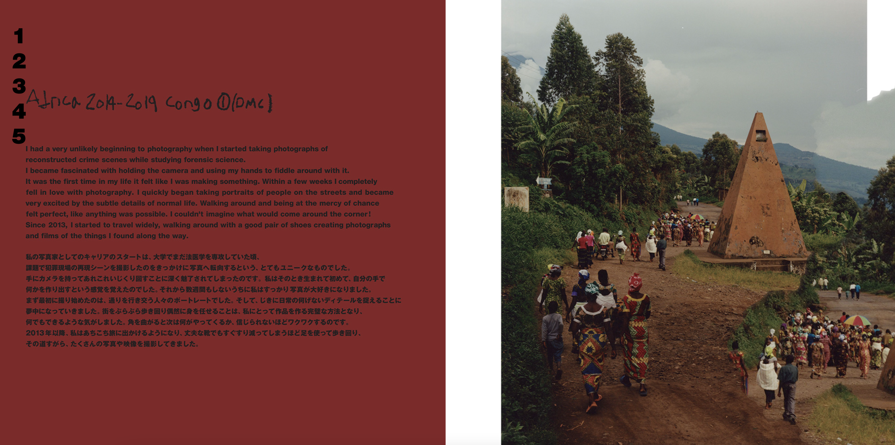
Being one of my favorite fashion brand, COMME des GARÇONS's website style is also my taste. I enjoy the simplicity and impression. The burgundy red creates a smooth contrast with the black and sets the mood. I also really like the number bar on the left, it gives a fun and modernistic feeling to it. The introduction page is a standard horizontal structure which I like how there is a equal amount of information and visual representation presented.
I always enjoy the format of museum and gallery website since they are packed with tons of information of art and artists. I would like to incorporate this balance between photos and words into my website too. It's professional, clean, direct, and welcoming at the same time. personally, I like the design of the left navigation bar, where it moves along the page as you scroll down. I think this is a great design for users when they navigate through the page and can feel free to move to the next page anytime they want. I want to incorporate design like this that are helpful for the user.
Perkins & Will website style is attracting to me. It's not as information packed in one page like Guggenheim, it distributed it's info to different pages and create a great balance and simplicity. The way the website present the images is also more dynamic but organized. I like how it use bigger headers with easy to read font at the beginning of each page so the user won't feel lost.
Target your Audience
My target audiences are my possible employer and interviewer for a job, and other creative thinkers, artists, designers who shares similar background and story. I want this portfolio website to be a introductory of myself, not only my work (since there's not much), but also my story. I want this website to be easy to navigate for all people and feel engaging. I want my future employer to have a basic sense of my creative thinking process that I can't present through only resume.
Inspiration and Concepts
Thumbnails & Sketches
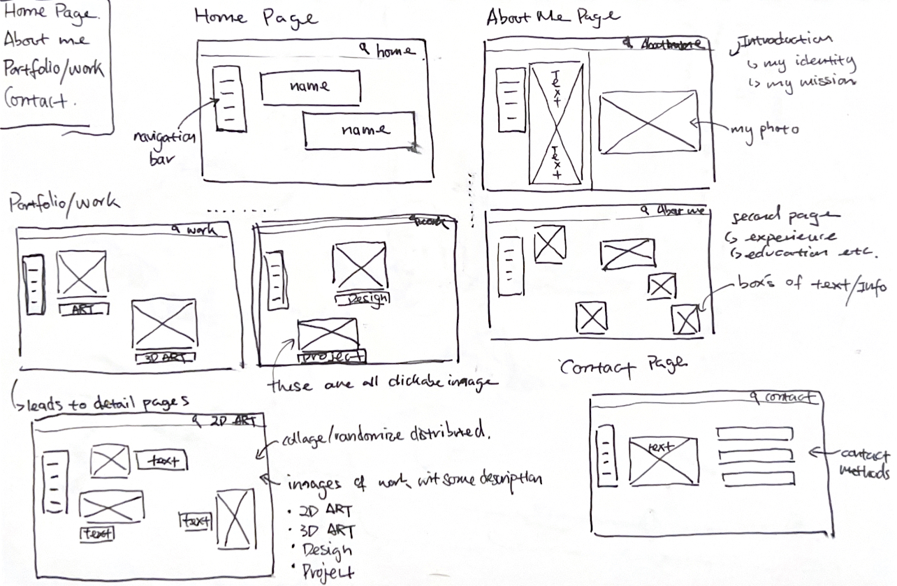
Wireframes and Prototypes

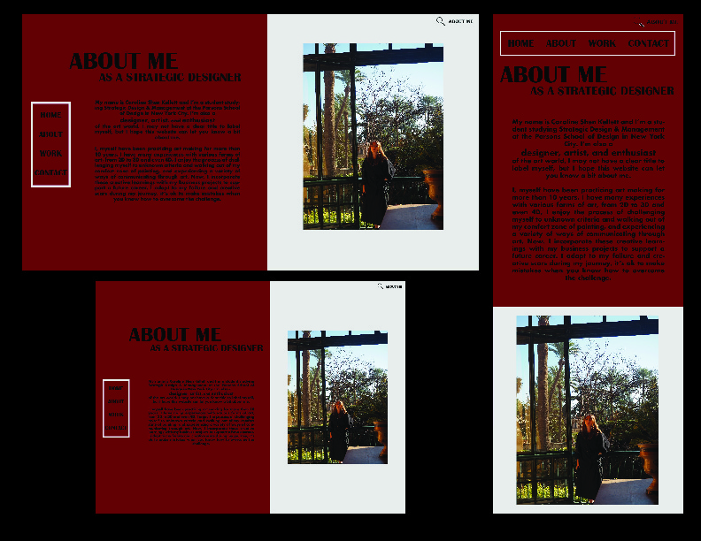
Responsive Mockup
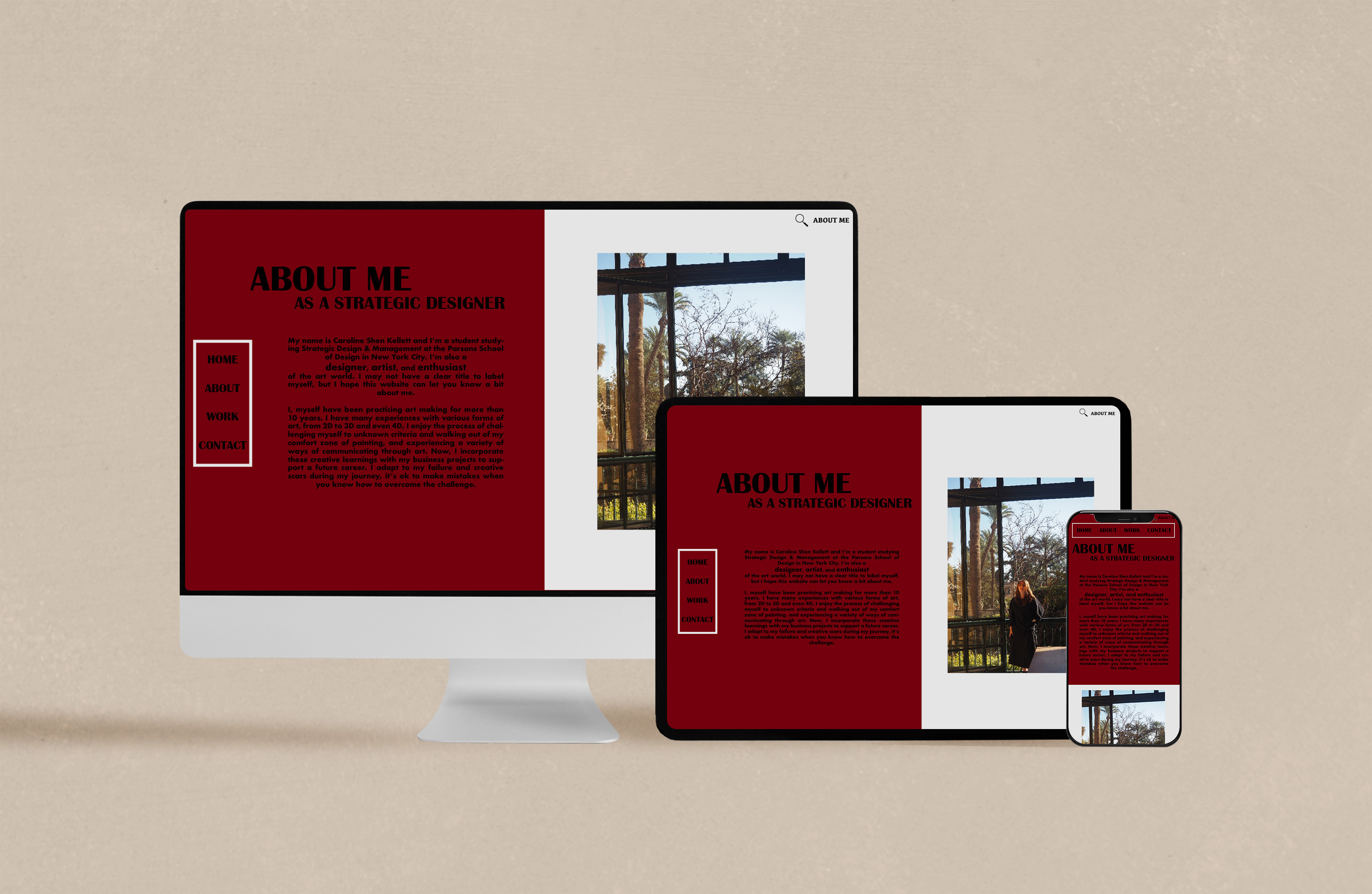
Photoshop Comp
