1. Intent
The purpose of Areaware is to create things that are out of the ordinary while giving consumers curiosity in their products. Areaware is designed to encapsulate the meaning of joy and playfulness in a world that takes itself too seriously.
2. Voice
Areaware is a company that collaborates with independent designers to bring in a more playful characteristic to design. Their philosophy is that “good design evokes good feelings and think everyday objects should be as fun as they are functional.” The whole purpose of Areaware is to weave the idea of playfulness through their designs. Their designs cover a multitude of environments from homes to offices. Each design has characteristics that encapsulates the goals of the company to create products that brighten the environment they are in.
3. Tone
As this company focuses on producing home decor products the overall website is simple. The website does not fill the screen with text but lays out images of the products themselves. From the in depth screen of the product to the about page it has a cohesive theme throughout. The lighter and pastel tones of color creates a sense of lightheartedness and a vibrant experience.
4. Brand
The websites brand is dedicates itself to creating products through independent designers and artists. These products are representative of the artists themselves and stick with the theme of playfulness. The websites aesthetic is rather simple and while still keeping it proffessional. Each section of the website uses bright colors that creates a welcoming experience.
6. Personas
1. Home Owner
Although your average homeowner might not buy from Areaware, James Einheart is not your typical consumer.
James works in social media. The products in Areaware are just the type of eyecatching items he needs for
a media post about his house. James is intrigued by the different atmosphere that Areaware brings to the table.
As soon as he opens the home page he is greeted with the different products that Areaware has to offer.
From the stackable tables to the oddly shaped cups it. The overall layout is simple and easy to understand.
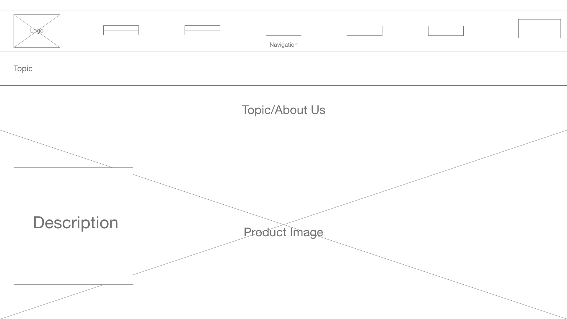
The content pages were also simple but James found that it is a bit bare in terms of web design and does not
attract the eye as much. In conclusion James found that the website was intuitive and the products speak for
themselves.
2. Parents of Children
Samantha Roberts is the mother of one children. She is 30 years old. Roberts heard about Areaware through her
friends. They all live in an upper middle class urban environment. Roberts was intrigued by the simple but playful
concept in the design. When she visits the website she immidietly notices the vibrancy of the website. What interested
her specifically was the variety of colors in the toy section of the website. The toys themselves did not look like
regular childrens toys but had a more modern design to them. Roberts thought that these toys would not only be good
for the children but also look good in whatever room they are in. With the toys more subtle approach to design they
blend in nicely with a more modern looking home compared to the tacky looking toys seen on store shelves.
Navigating through the website was simple. Roberts really related to the "about" section of website and Areawares
philosophy. She did have slight qualms about some of the shape of the products but also knew that it is meant to be fun
to look at.
3. Product Designer
There are many universities offering product design as a major. Jerry Lin is a student currently in the product
design major at Parsons. Although he is only in his sophmore year, he is looking for furniture and home decor for the
apartment he is moving into in the summer. Jerry was looking through the internet for different home decor websites and
found Areaware. Immidietly the website stood out for the difference in products compared to other home decor goods.
Initially the form and color attracted Jerry's eyes but the functionality immedietly came after. Although the functionality
of the products were put into question after more research Jerry discovered that the functionality of the product is changed to
create a more playful interaction.
7. Wireframe


8. Copy Deck
Title: Areaware
Navigation bar: New, Home, Play, Work, Sale
Main Body:
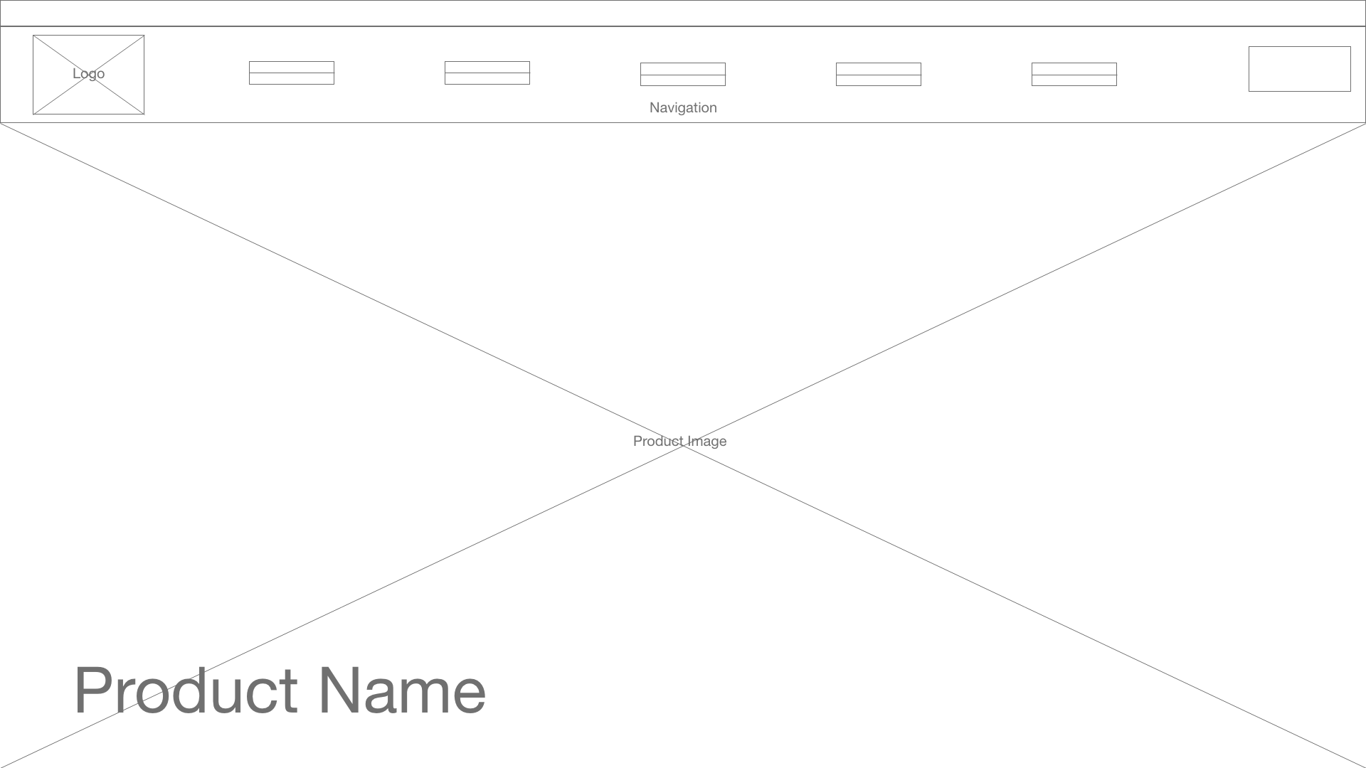
Picture of product and product name on the bottom right of the screen
Sub header: New arrivals
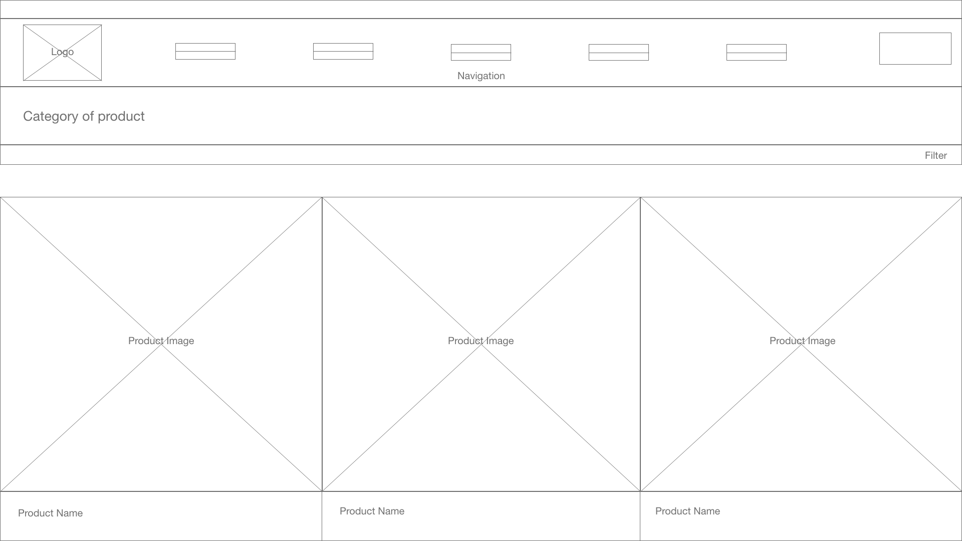
Product picures with name and price at the captioning the picture
Sub Body:
Categories of products with images of them behind.
Sub header 2:
Vogue, The Strategist, domino, Dwell, Sight Unseen
Sub header 3: Socials
Subcopy
Policies and other contacts
- Areaware
- Contact
- hello@areaware.com
- 1-800-783-5683
- About Us
- Our Designers
- Press
- Blog
- Careers
- Areaware Studio
- Affiliate Program
- Wholesale
- International Distributors
- Donation Request
- Submissions
- Terms of Service
- Shipping Policy
- Return Policy
- Privacy Policy
- Instagram TikTok
9. Competition
Competitors of Areaware also have simple websites. The differentiation begins with the theme of their products. Areaware does not focus on taking itself too seriously. The brand is all about having fun. The competitors have a very adult and modern tone to their websites and products. Areawares values are different than most home decor product companies.The website layout itself is very similar to other competitors in terms of the simplicity and the layout. Areawares website is more bright and have warmer colors in the products themselves and so that brightens up the website. The more modern home decor websites are paved with white and pastel colors and so the websites usually have a minimalist and bland tone to them. These websites feel commercial and mainstream. I do think that there are websites that feel more personilized and if Areaware could further introduce that feeling into their website. It could further increase the feeling the website gives upon seeing it.