Website Comparison
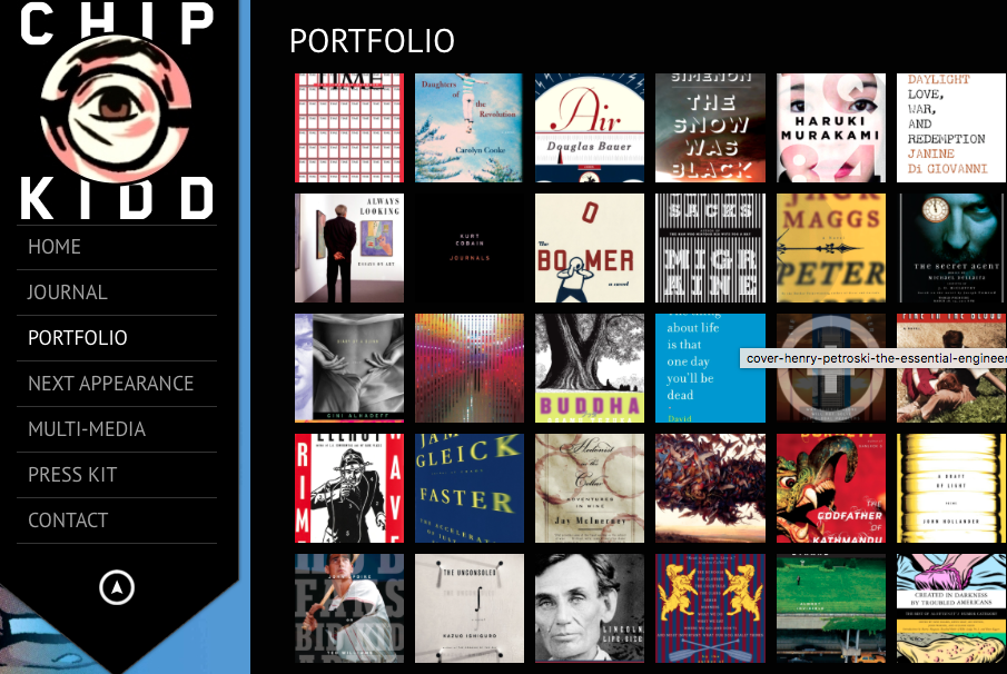
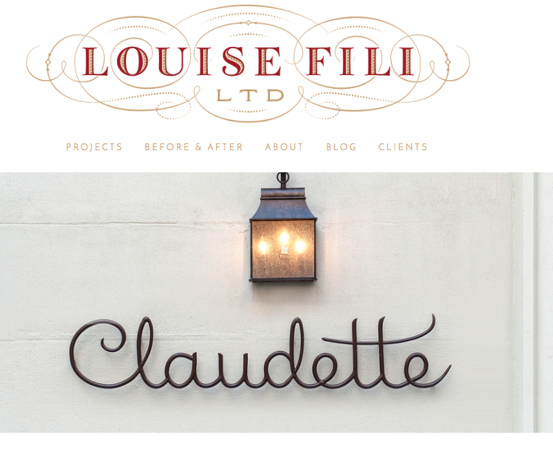
My major Is graphic design. In this compare and contrast analysis, I will examine two very popular and established graphic designers. Louise Fili and Chip Kidd. From the opening pages Louise Fili and Chip Kidd's graphic design website portfolios have a different feel and intent but send a clear message towards two different audiences. Fili's site is clearly more conservative and appears to target a much older audience. Her designs are very sleek, conservative, and elegant. Her work focuses on restaurants, design companies and books. While Chip Kidd’s site is more animated and has a more diverse feel to its demographic. From looking at Kidd's site it seems as though his age range is wider then that of Fili. Comics, books, movies, and animations are the focal point of Kidds work. Both sites are well created and send the needed message to the audience. In my work I would like to incorporate a bit of both elements from these site.

