Intent
The primary intent of this website is to showcase Guillaume Colombel's design work, skills, and professional background to attract potential clients or employers. The site uses avant-garde and visually appealing design with high-quality project displays to highlight his capabilities in the creative and technical fields.
Voice
The voice of the website is confident, tech-savvy, and concise. Through minimal text and a visually driven layout, the site communicates his professionalism and creativity as a digital media interactive designer. The overall user experience is smooth and simple, yet it still feels innovative and tech-focused. The 3D interactive visuals are eye-catching, and the lack of excessive text makes the content more readable.
Tone
The tone is direct, refined, and visually oriented. The homepage and project display pages are very concise, focusing on conveying information through images and videos rather than extensive text descriptions. The tone on the About page is slightly more personal, allowing visitors to better understand the designer’s background and personality.
Brand
The website establishes Guillaume’s brand through a minimalistic and modern design style, portraying him as a concise, tech-driven, and highly professional digital media interactive designer. It also reflects his personal aesthetic in art and web design. The use of black and white tones and a clean layout gives a professional yet distinctive impression. Brand consistency is strong, with a unified visual style and design language from the homepage to the project displays.
Personas
Persona 1: Sophie - Creative Director
Background: 38 years old, female, Creative Director at an advertising agency. She frequently seeks unique design partners.
Attraction: Sophie is drawn to the visual appeal of the website and impressed by the creativity and professionalism showcased in the portfolio. She might contact Guillaume to discuss potential collaboration.
Behavior: She regularly browses designers' portfolios, looking for creative talent that fits her company's needs, and would likely revisit the site multiple times.
Persona 2: Mark - Startup CEO
Background: 32 years old, male, CEO of a startup, currently looking for website and brand design for his new product.
Attraction: Mark is attracted by the site’s simplicity and modern style, which aligns with his product’s image. He seeks a professional who can deliver high-quality design.
Behavior: He would explore the designer’s project experience in detail and might contact Guillaume to discuss how this style could be applied to his product.
Persona 3: Laura - Design Student
Background: 22 years old, female, design student feeling uncertain about her future career and hoping to learn from industry professionals.
Attraction: Laura is captivated by the projects and design processes showcased on the site, eager to learn more about design thinking and project implementation.
Behavior: She would frequently browse the site, particularly the case studies, to learn how to present her own work and project processes.
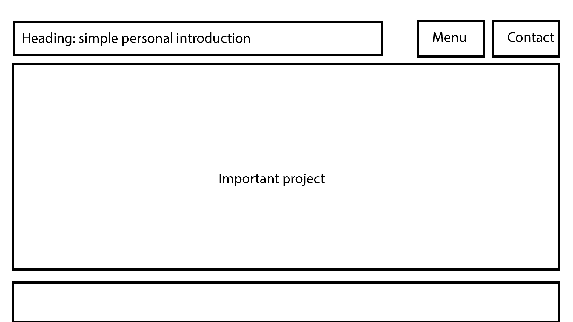
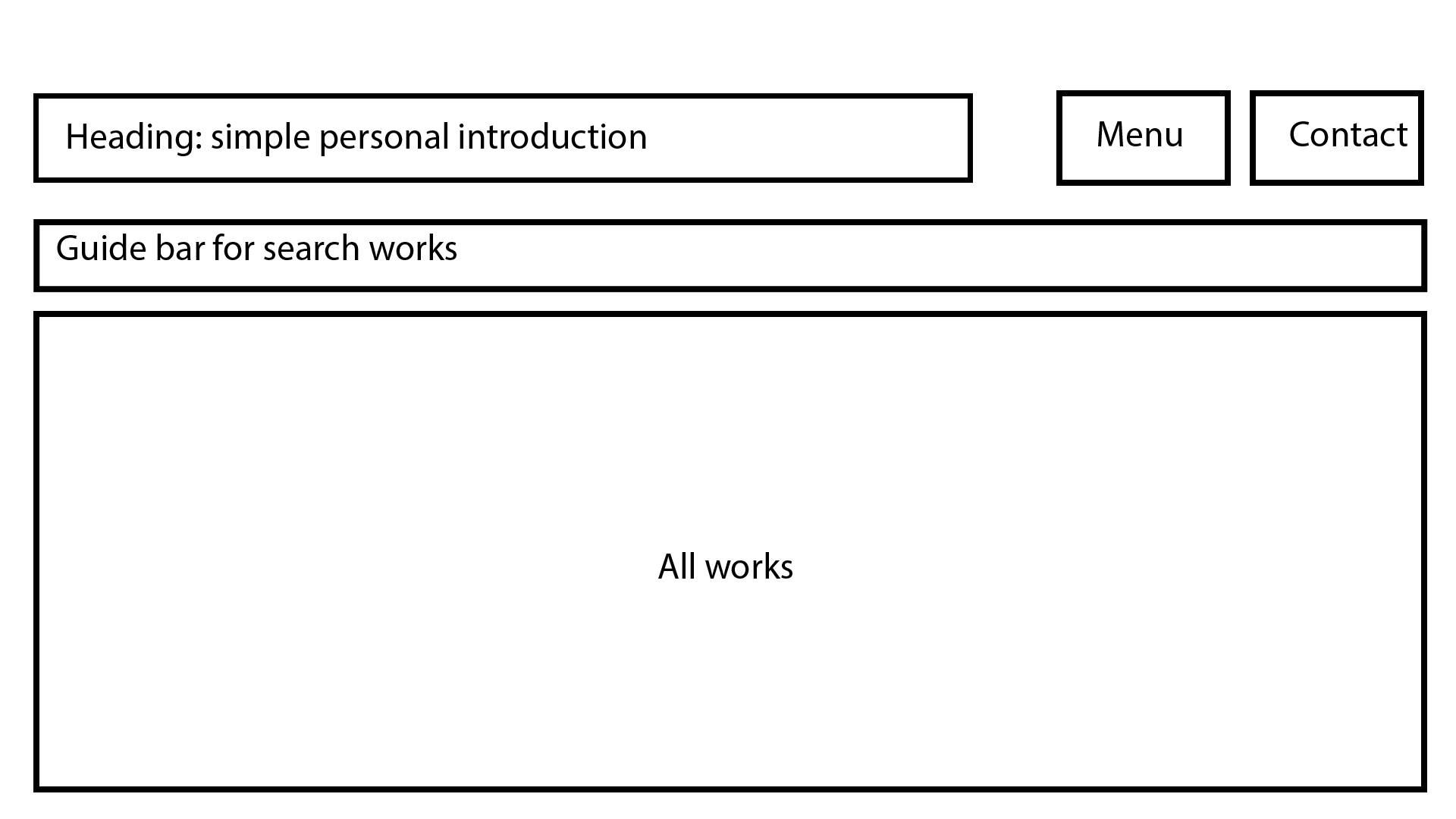
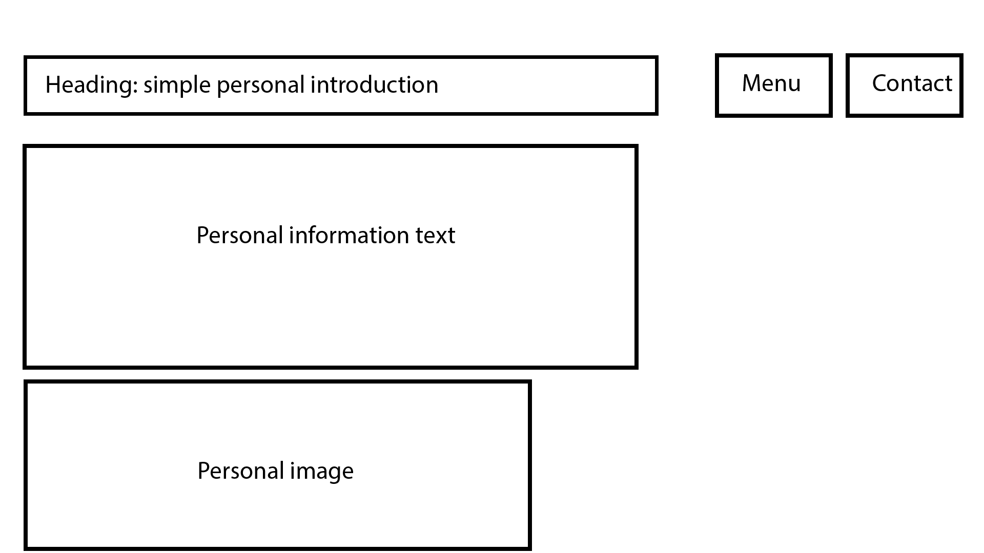
Wireframe


Copy Deck
The main copy elements include:
Heading: Brief personal introduction and site menu.
Homepage: Key project introductions, with nearly full-screen dynamic visuals to capture attention and concise project descriptions.
Project Pages: Names of past projects, brief descriptions, and project links.
About Page: Detailed personal bio, educational background, professional experience, and design philosophy.
Contact Page: Simple welcome message (e.g., “Let’s work together!”) and contact information.
Competition
Compared to other designer portfolio websites, Guillaume Colombel's site excels in visual simplicity and user experience. It emphasizes a visually driven communication style, reducing textual clutter and allowing users to quickly focus on the work itself. Competitor sites may feature more complex navigation or extensive text descriptions, but Guillaume’s site stands out for its straightforward and direct approach. This style particularly appeals to those who appreciate minimalist design and wish to quickly assess a designer’s capabilities.