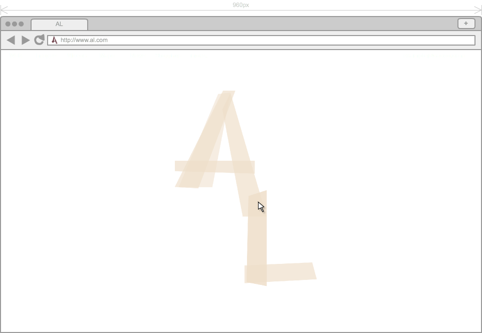
What's the Problem?
I want to create a website that is easy to understand, makes a statement and showcases the direction I move in as an artist. The problem is that although I'm studying fashion design, I've come to explore so much more than just clothing and understand it as an exploration of product design, thus I want my portfolio site to apply to all mediums I explore. Through the use of color palette, texture, typography and layout, I want to keep all content strategically cohesive and keep the user involved. My goal is to make a memorable and clean platform for my content and keep the viewers interacting, responding.
(II) Discovery & Research
I've noticed through the countless amount of fashion design portfolio websites I browsed through as research, they tended to simplify the template design and keep the focus clear on the content. Maybe because they are all focused on the works themselves, two websites I stumbled across had the same layout, regardless of content.
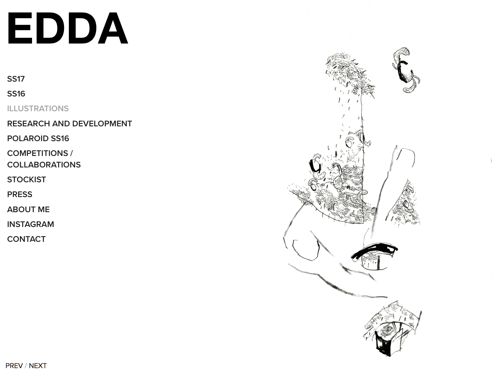
Edda.com
Edda.com features an artist, Edda Gimes, who... "aims to combine art and fashion in a new and unexpected way, and its important to her that you should have fun with the clothes and feel like wearing her collection is like dressing up for different characters..." She wants to help start conversation about what fashion is and what it could be, pushing people to interact with art as a personal experience. Her website consists of a simple front photograph from her newest, most updated project- a collection.
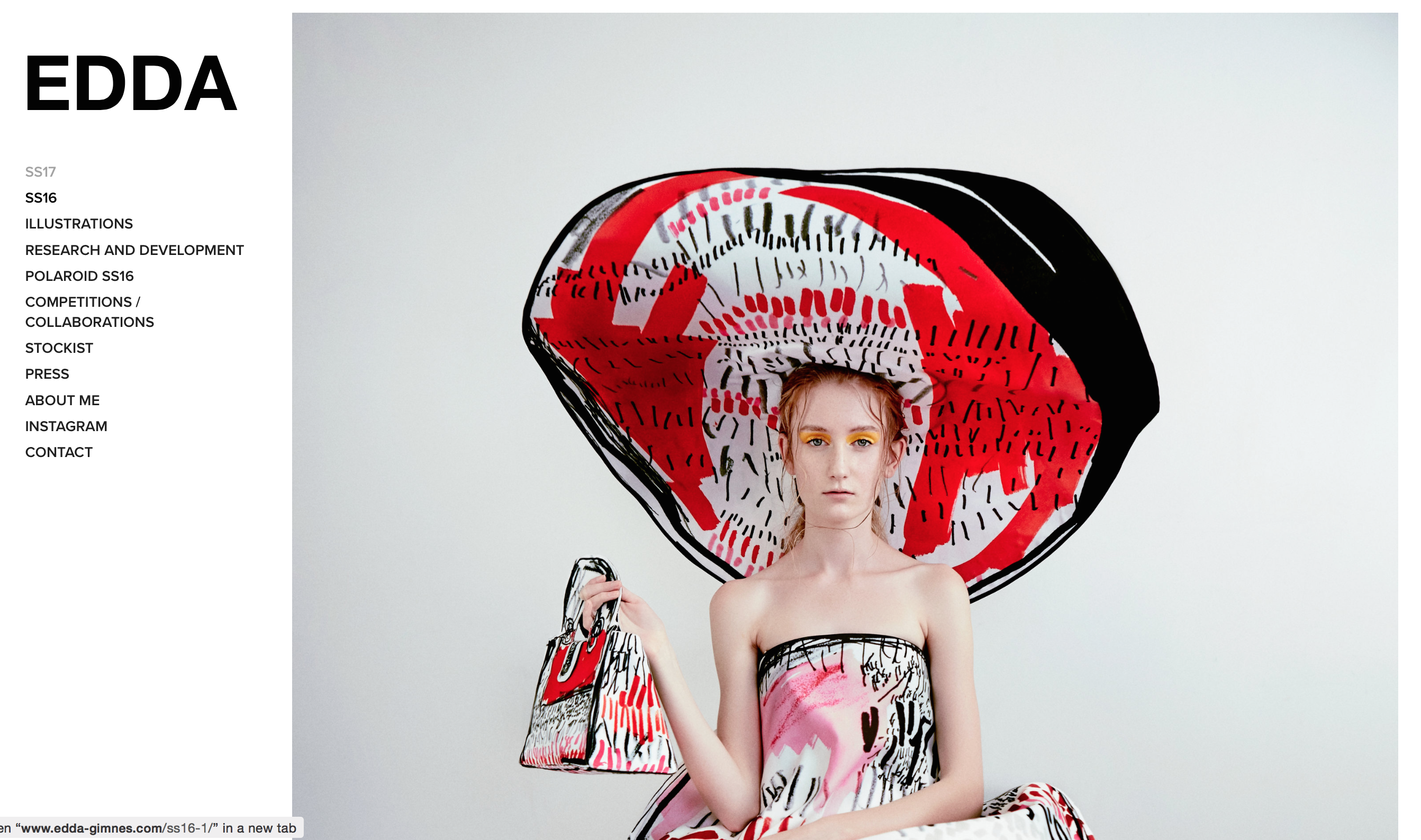
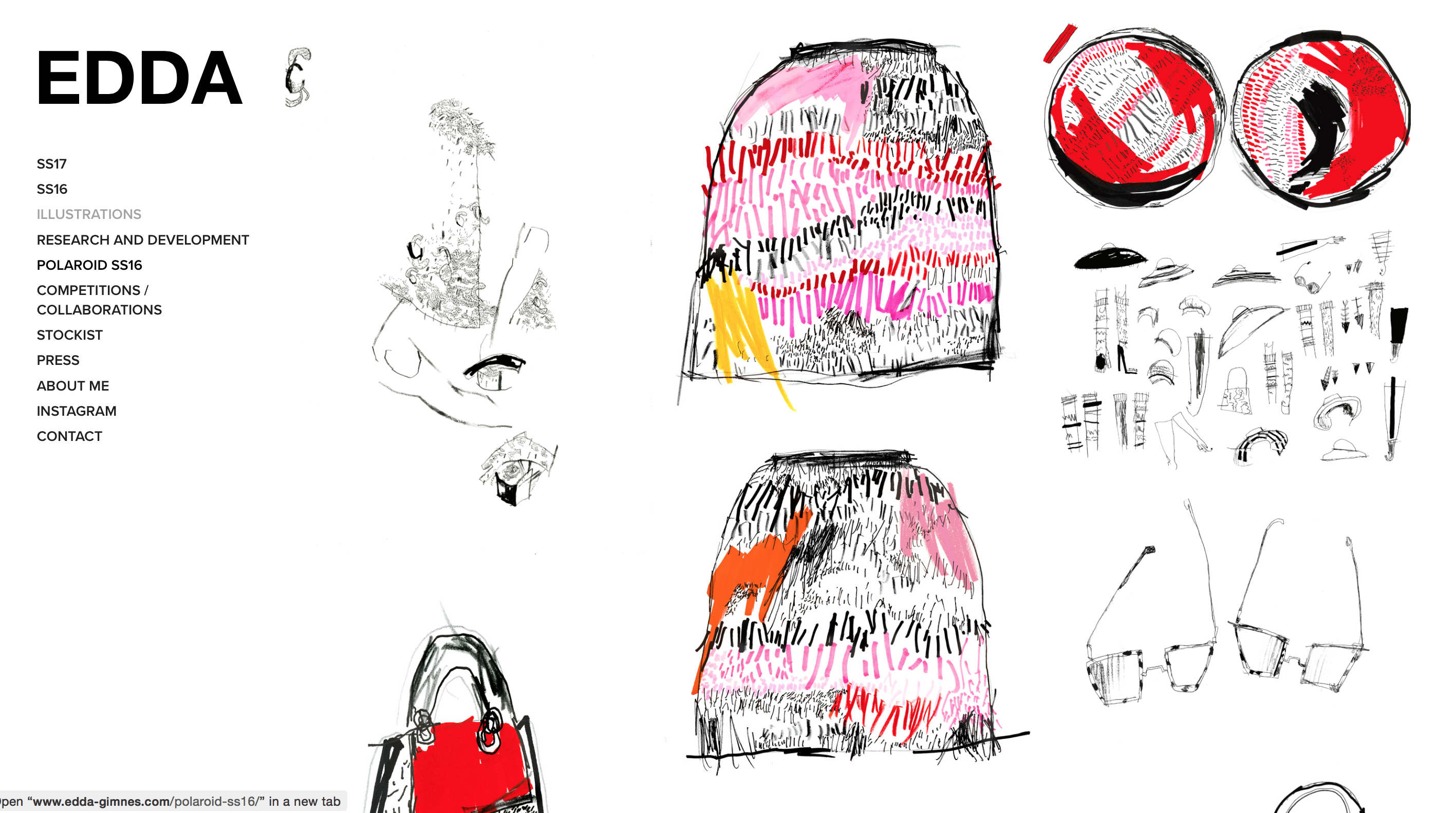
Although the website begins very simple, with her name in bolded, black letters and a starking photograph with wide, white borders, once you start interacting with the sublinks, a page such as, "Illustrations," becomes intriguing in the simplest way. She adds character connecting the function + layout and content to play off of each other. As soon as the first gif plays of an example illustration cover piece, once you click anywhere on the subject (because you realize you have nowwhere else to turn), you are directed to a page with many variations of this style of work, all playing in gifs (if applicable). It's brilliant and simple.
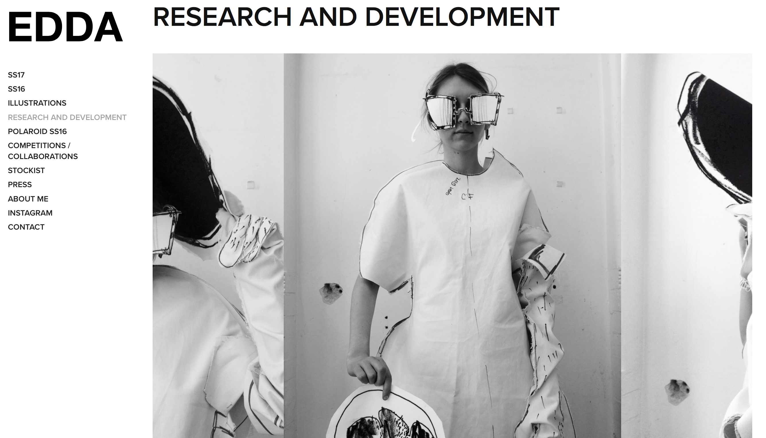
Another interesting function in this website is the different ways to interact with the pages. For example, in the 'Research and Development' page, one and a half photos show hinting that it is a slideshow of photographs/content. But, the challenge comes in how to view the photos because you realize they don't automatically slide for you. Then you start to click around and as soon as you click anywhere on the photograph, it starts moving the next photo in the center and this lets the viewers get a good look at each photo instead of scrolling through a handful and inevitably diluting the beauty of the each photogrpah.
The biggest downfall about having such a simplistic website like this is that the content is really the only focus. The layout is quite generic, although the content is so beautiful and striking. The downbar has minimal but fitting interaction that lets the user know that they have pressed on a working link because it highlights the word or brings down sublinks.
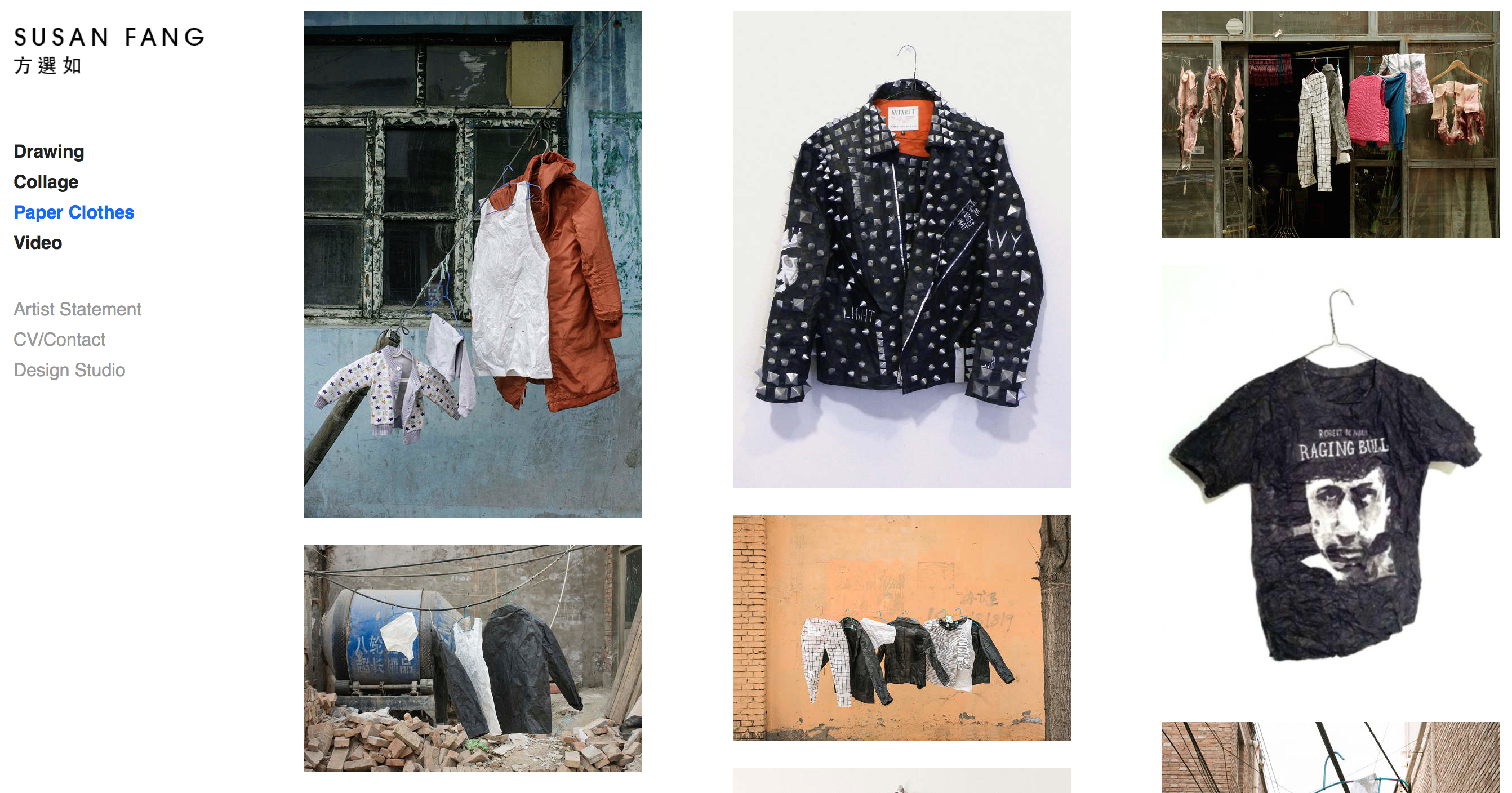
SusanFang.com
It's funny because I stumbled across these two websites in different places and both have the same layout. However, Susan Fang does a variety of work so she separated her Fine Arts portfolio from her Design Studio portfolio. What's most interesting is both 'types' of portfolios carry very different layouts/aesthetic. Her Fine Arts Portfolio is very similar to that of Edda's, in fact I think most of it shares almost identical features. Both don't have captions, but you can click on each photograph to enlarge.
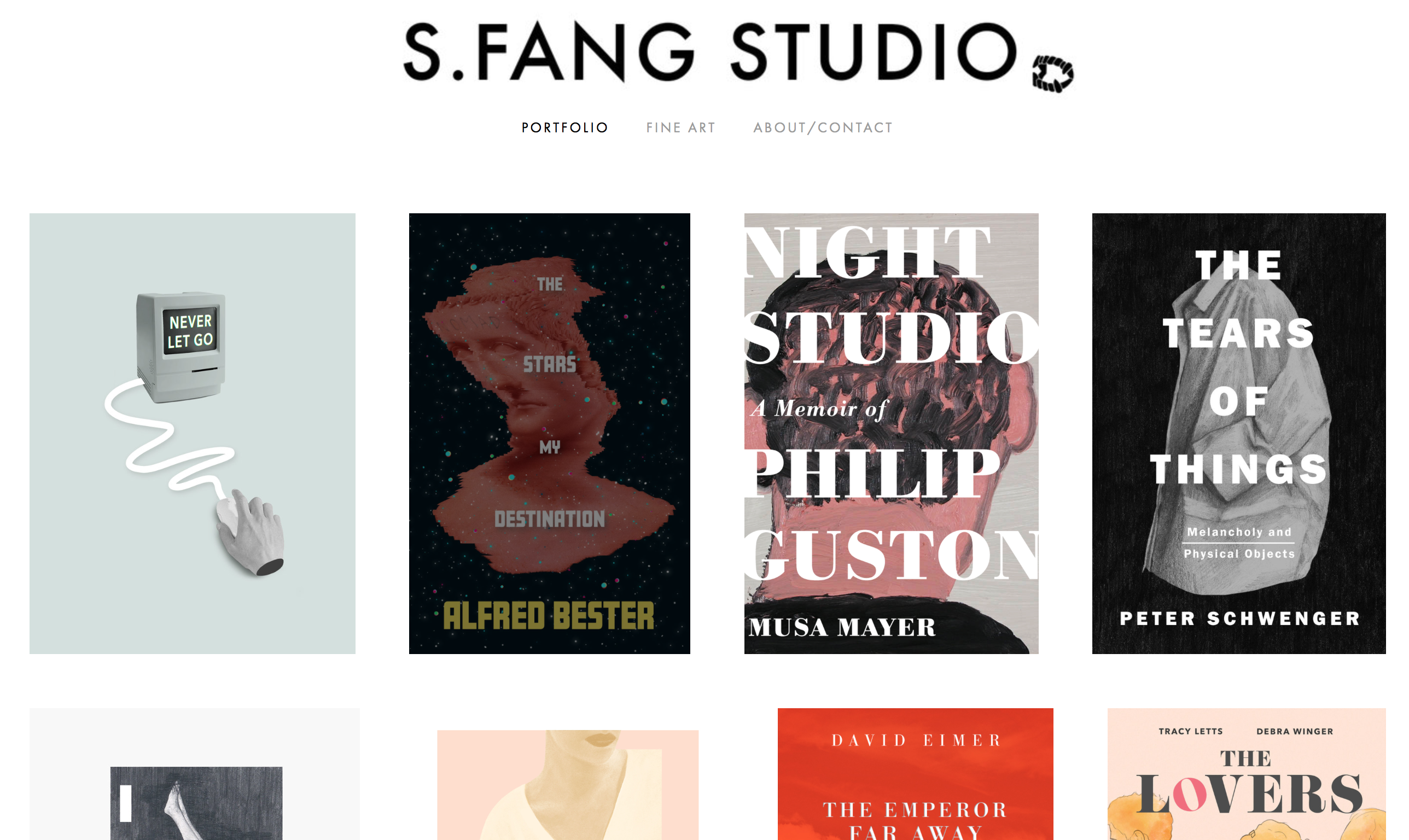
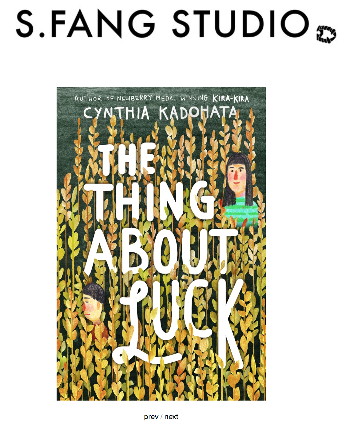
On the other hand, her Design Portfolio (sfangstudio.com)shows a completely different side of her in which she strategically uses her font differently, in a different place, to make it match the aesthetic of her digital work. But, staying true the extremely clean and minimalistic layout, each photograph can be enlarged but to go next, you simply press the universal and abbreviated four letters 'prev/next' to direct yourself.
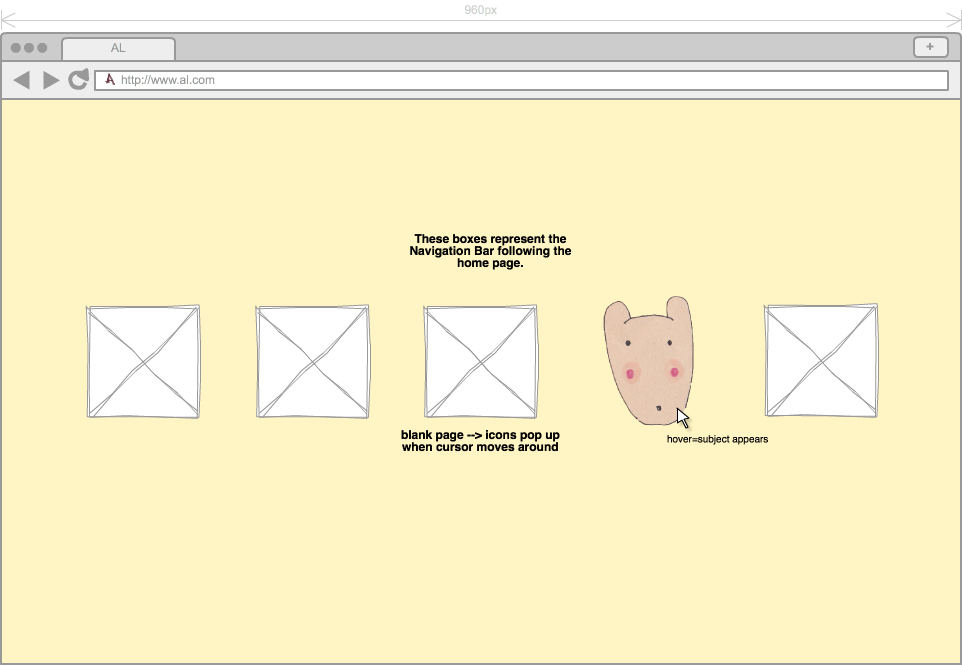
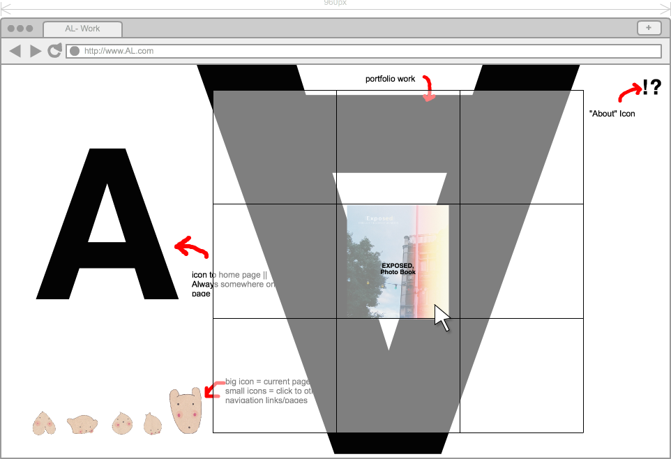
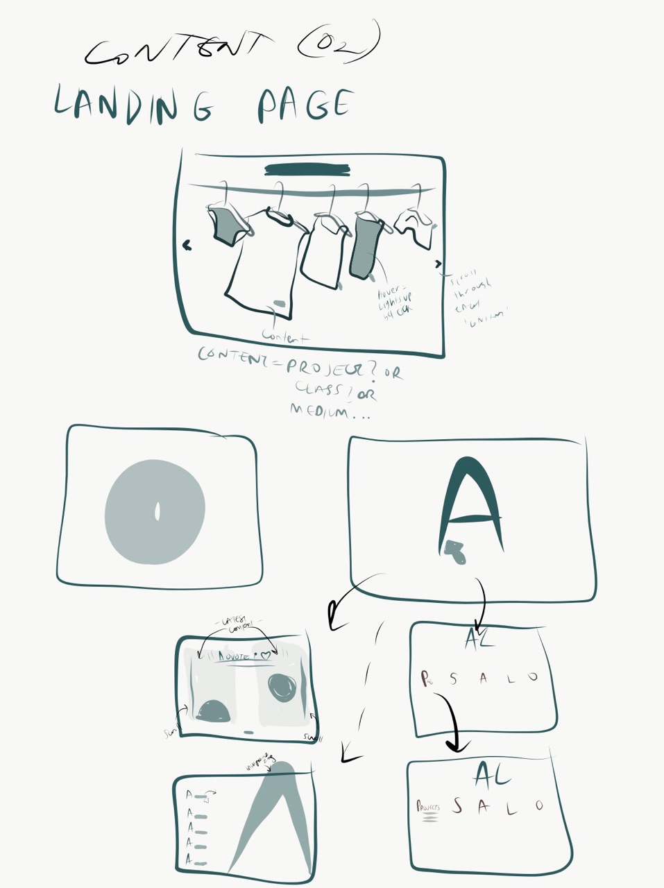
(III) My Audience
I want this website to be a platform for viewers that share same interests or find me publicly and are able to understand and get a feel of what kind of artist I am and what this portfolio website is an introduction for. Interaction is imperative for me and I want to avoid simply putting content in a beautiful way and letting the user feel like that's the end of the experience. I want the final products of my work to link to the research, process, or maybe a caption adding to the conversation. I want the viewers to leave remembering an 'Alice Moon' mood and imagery.
(IV)Inspiration

(V) Thumbnails
(VI) Wireframe