Develop your Idea
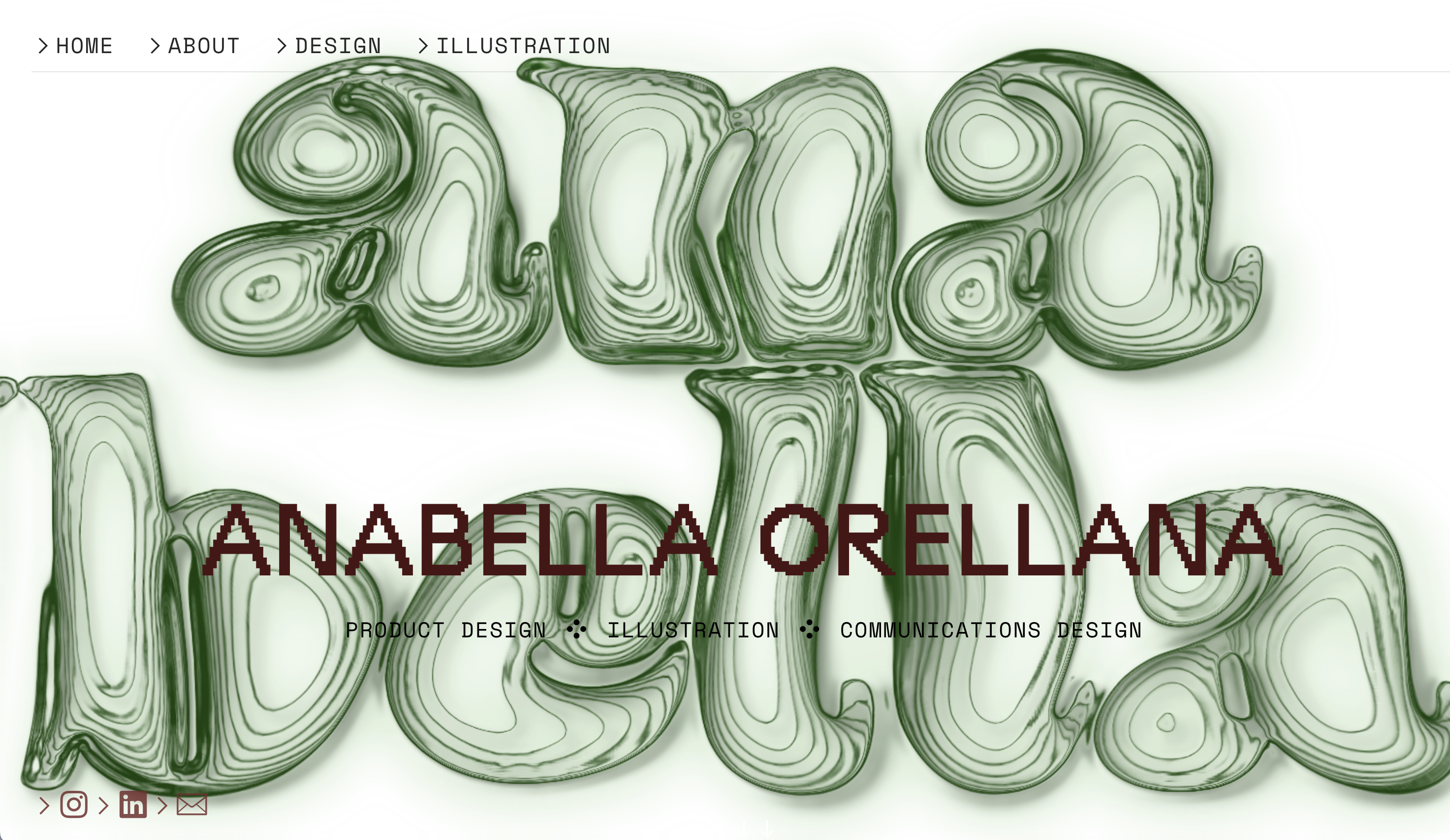
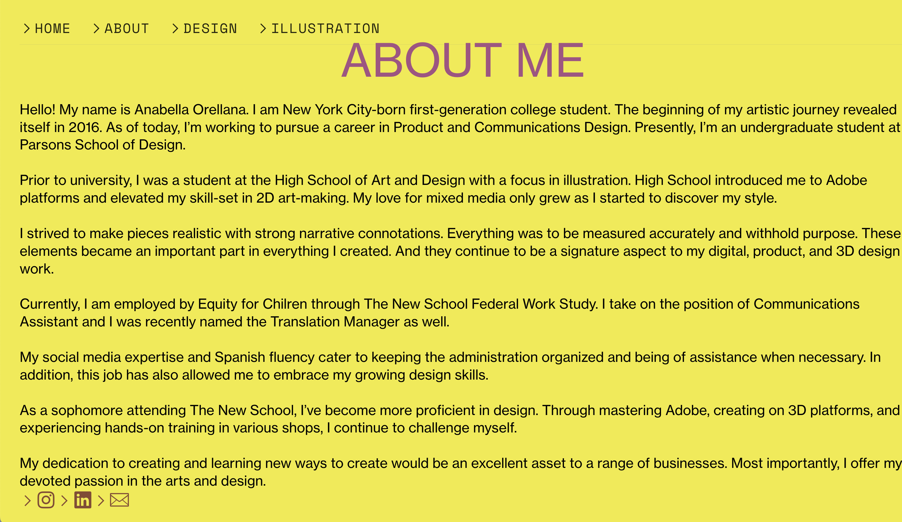
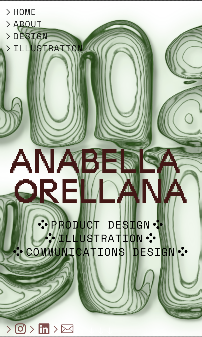
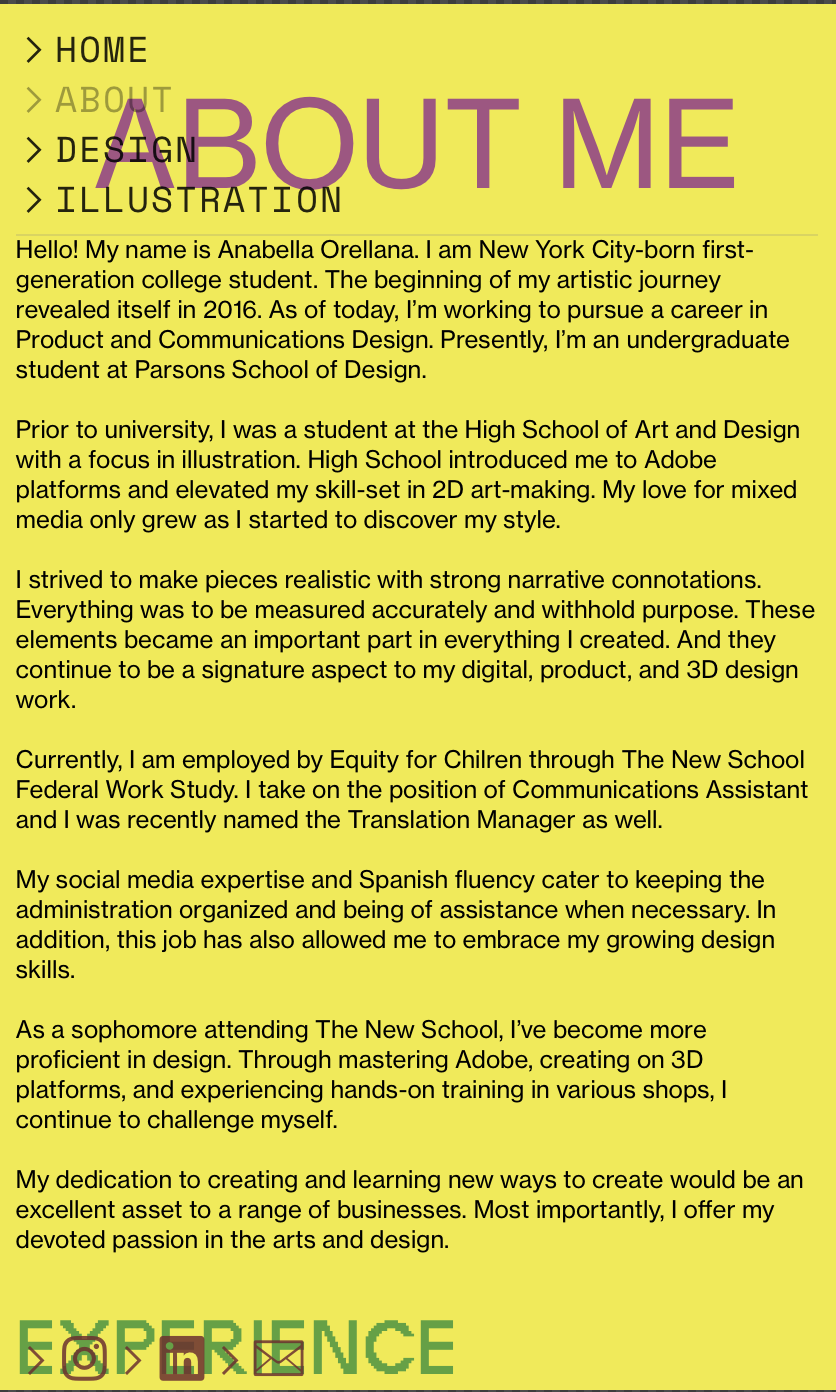
My website will consist of elements inspired by my interests and aesthetics. I don't want to simply make this a platform where I can lay out my artwork and design. My goal is to make it personable; I want to emulate my energy to the viewer of my portfolio and hope that they can get an understanding of my identity. It'll be a challenge to make this static website scream my personality. But I think it's most important to me that a company that truly sees me as a potential candidate can already get an understanding of who I am. If they simply like the work I put out but don't see me as a person, there's a chance that me and said job won't be a match; I'll feel stuck in a job I don't feel super comfortable in. If a job sees what I radiate as a person, in addition to the work I present, then there's opportunity for my dream job and I to finally align.
Discovery and Research
I was having trouble with the layout for my website, so I looked at existing formats on wix and canva. I got really inspired by the appearance of a few student portfolios, especially from their ABOUT section. I also want the color scheme to be really specific as a way to showcase myself and attract a company that's built on fun design.
Target your Audience
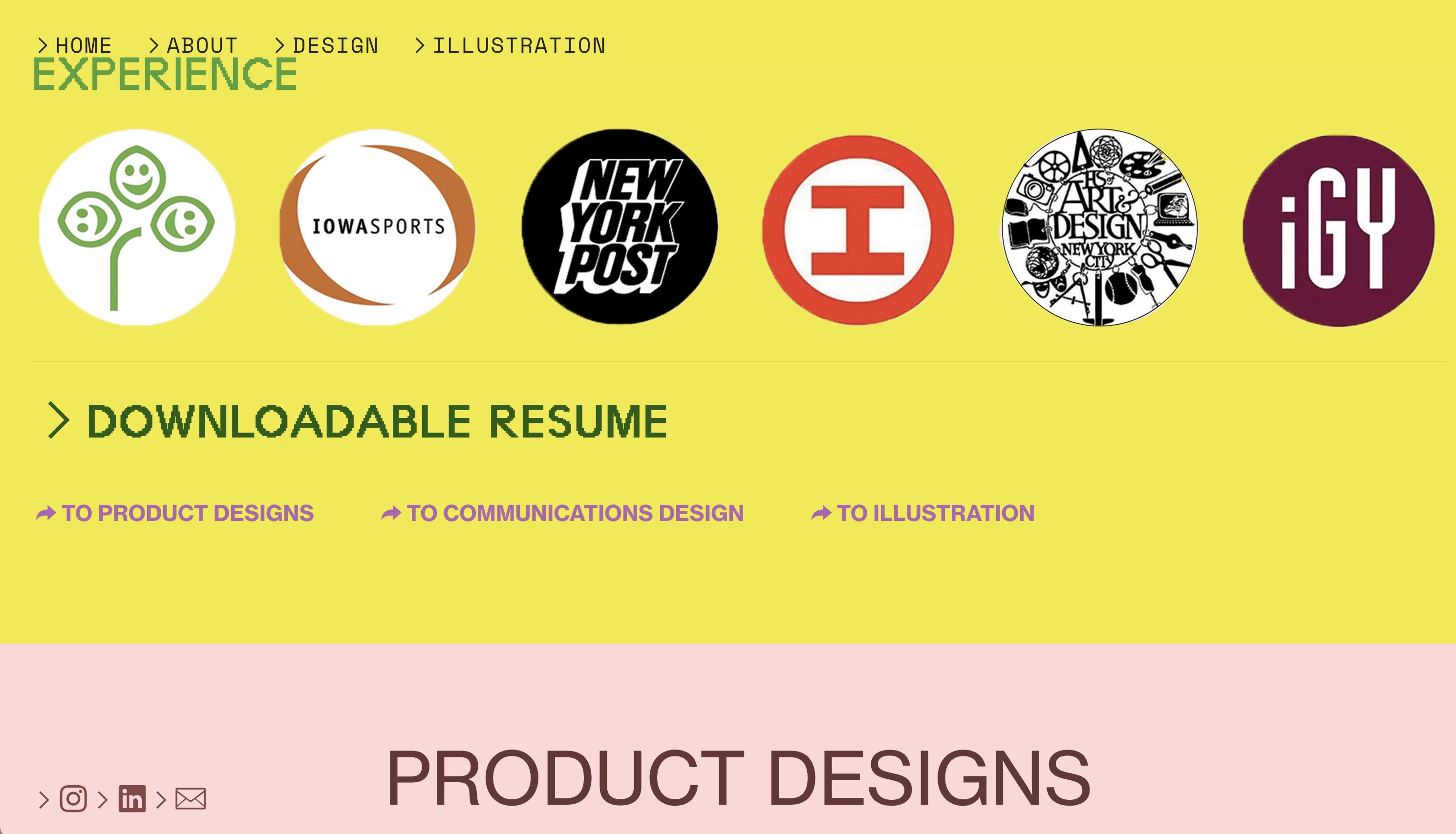
I gravitated towards people who had an image of themselves stylized, followed by their artwork presented right on the home page. I think it's a nice way to talk about identity in both a written and visual way. It'll be hard to make this possible without it being too overwhelming; a few sites I liked did have too much in one spot. I assume that my audience will be most interested in the visual aspect, as I am targeting artists and designers. I'll have to limit the word count but say just enough to summarize every piece.
Inspiration and Concepts
I aimed for illustrator websites because, in my opinion, they tend to showcase their vibrant personalities more freely while a designer's portfolio is usually more serious. Ollie Silvester, commercial illustrator and animation director, embraces his artistic skills and integrates it in a way that's personable. This makes an effective website in my opinion. There's something static about most of the product and communications design portfolio sites I've looked at. This artist manages to make the appearance of his site vibrant and fantastical by simply using one bright color. It allows the work to be highlighted so effortlessly and doesn't overwhelm. The gifs and graphics he created himself already introduce a skill that makes him an effective designer to work with. My goal is to stand out just as successfully and effortlessly as Silvester has.
https://olliesilvester.co.uk/Thumbnails and Sketches
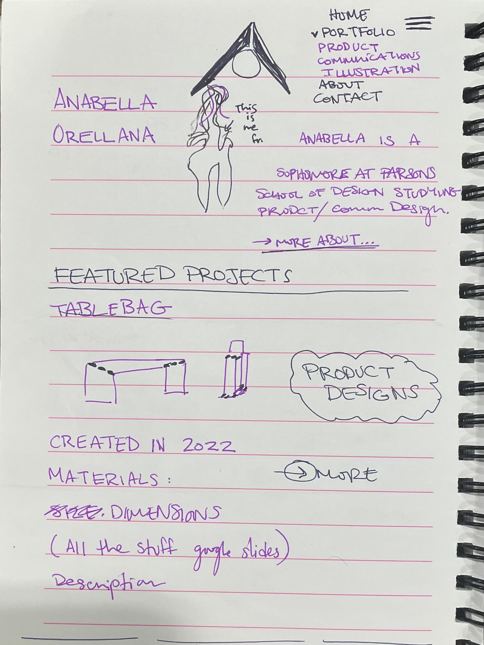
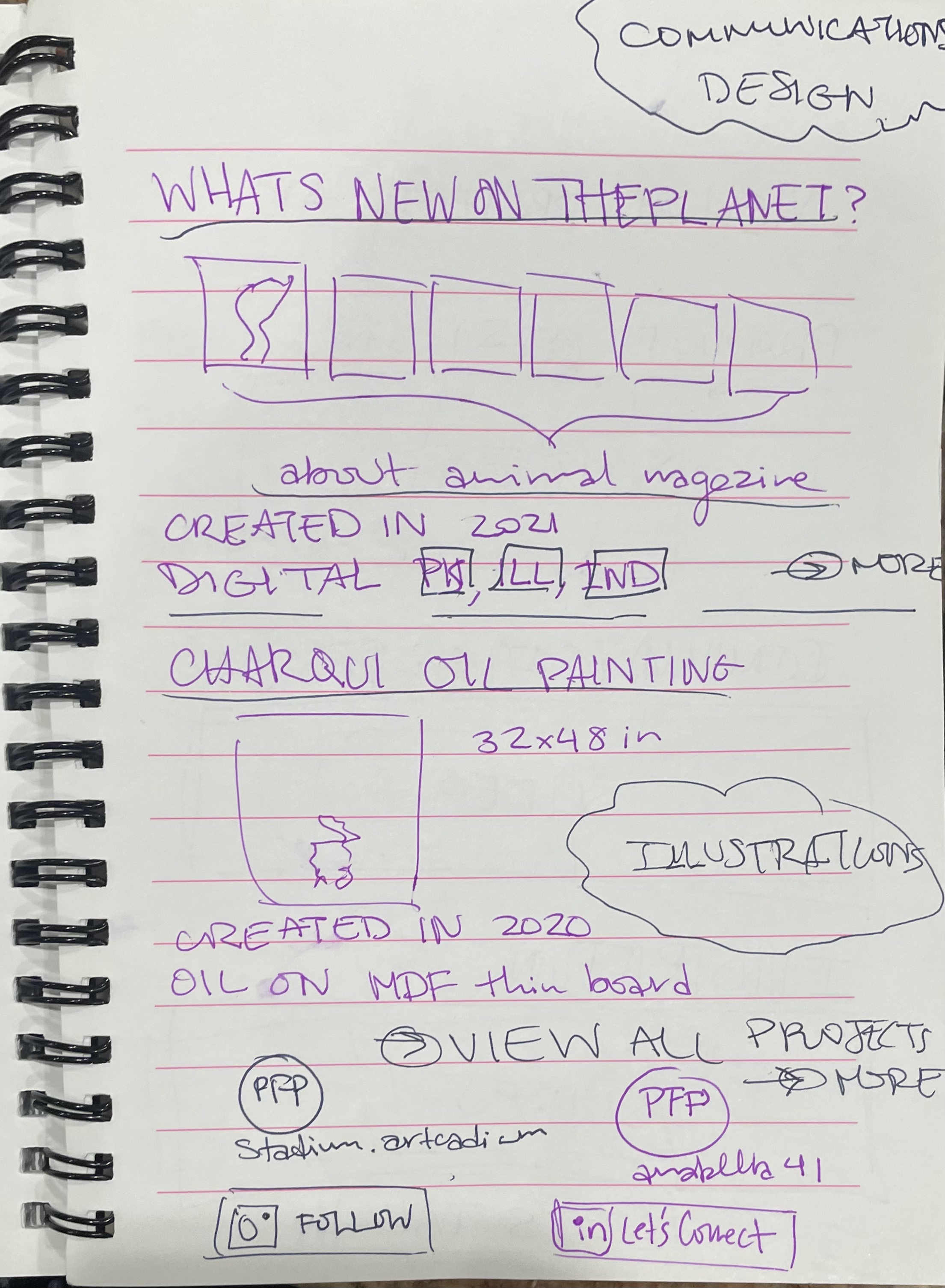
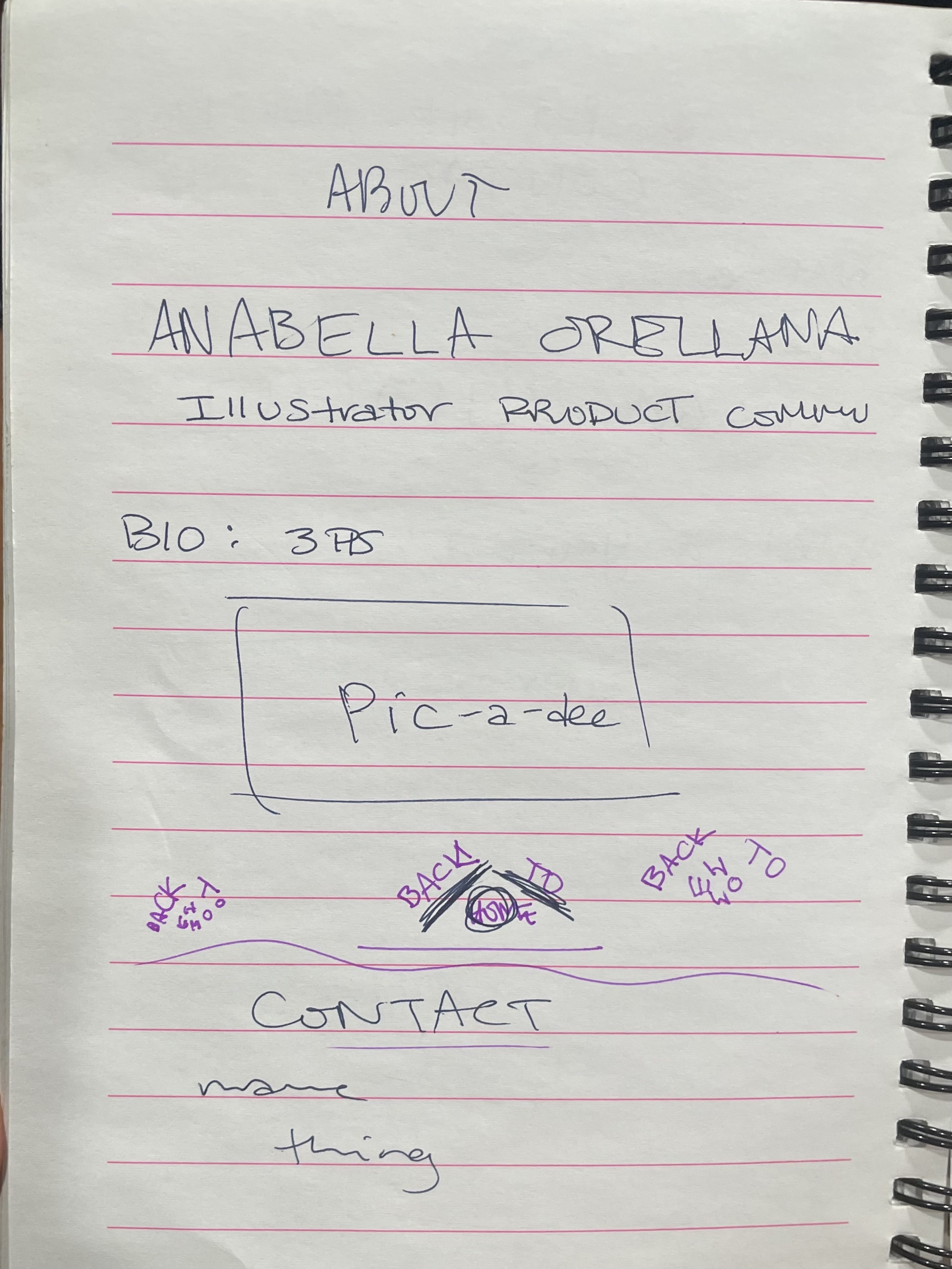
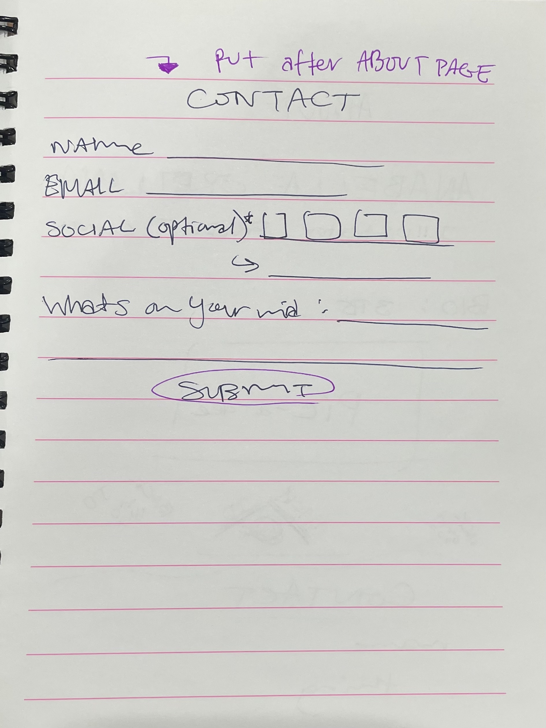
I wanted this website to say I'm confident in myself as an artist and designer, which is something I struggle to say in reality. The format has a lot of animated and decorative elements while still being sectioned into specific parts. I wanted it to be neat but not conservative. This isn't the set appearance of the website yet, but I like how I played with a lot of fun elements so far.
Wireframes and Prototypes
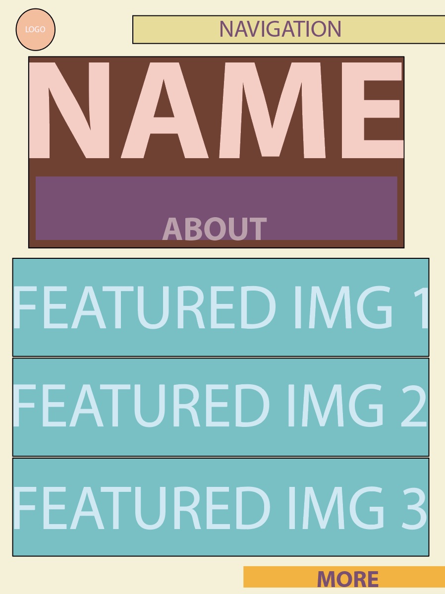
Responsive Mockup
Photoshop Comp
Resources
- HTML inline and block elements.
- Writing CSS, examples, layout and styling the navigation
- Validate your page
- Page quality audit