Develop Your Idea
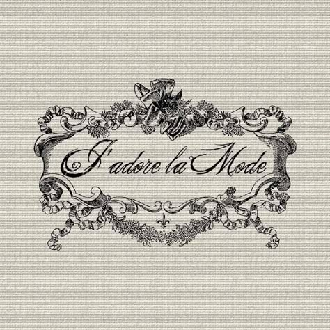
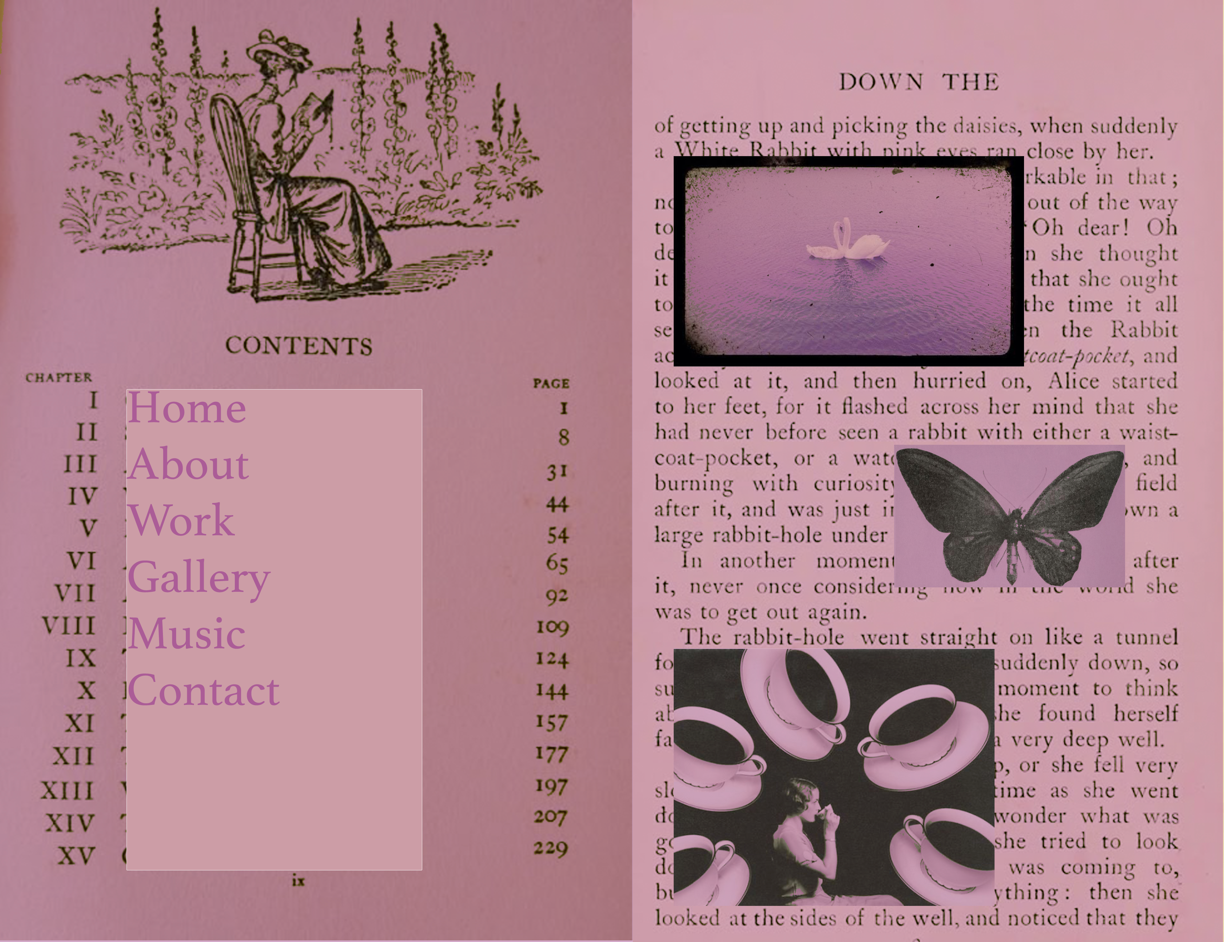
I would like my website to showcase my personal style. I want it to be unique and visually interesting. I'd like the home page to be an open storybook, with links throughout the book to the different pages. I like a particularly girly, french aesthetic.
Discovery and Research
I'd like my website to be simple and clear. I'd like the user to have a very streamlined and clear path to view my work. From other portfolio sites I looked through, I noticed that those with a creative landing page caught my attention the most. I was often struck by how unique each website was.
Target Your Audience
My target audience are other creative professionals, likely in NYC and likely range 25-45 years old.
Inspiration and Concepts


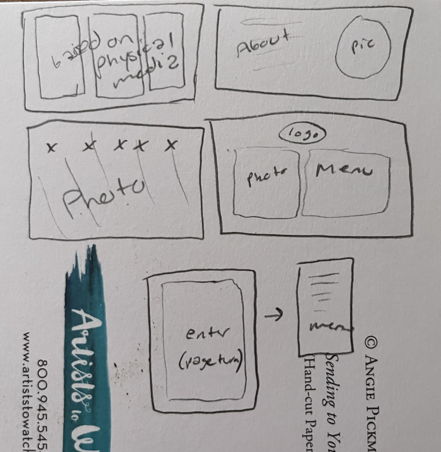
Thumbnails and Sketches
Layout ideas from AI:
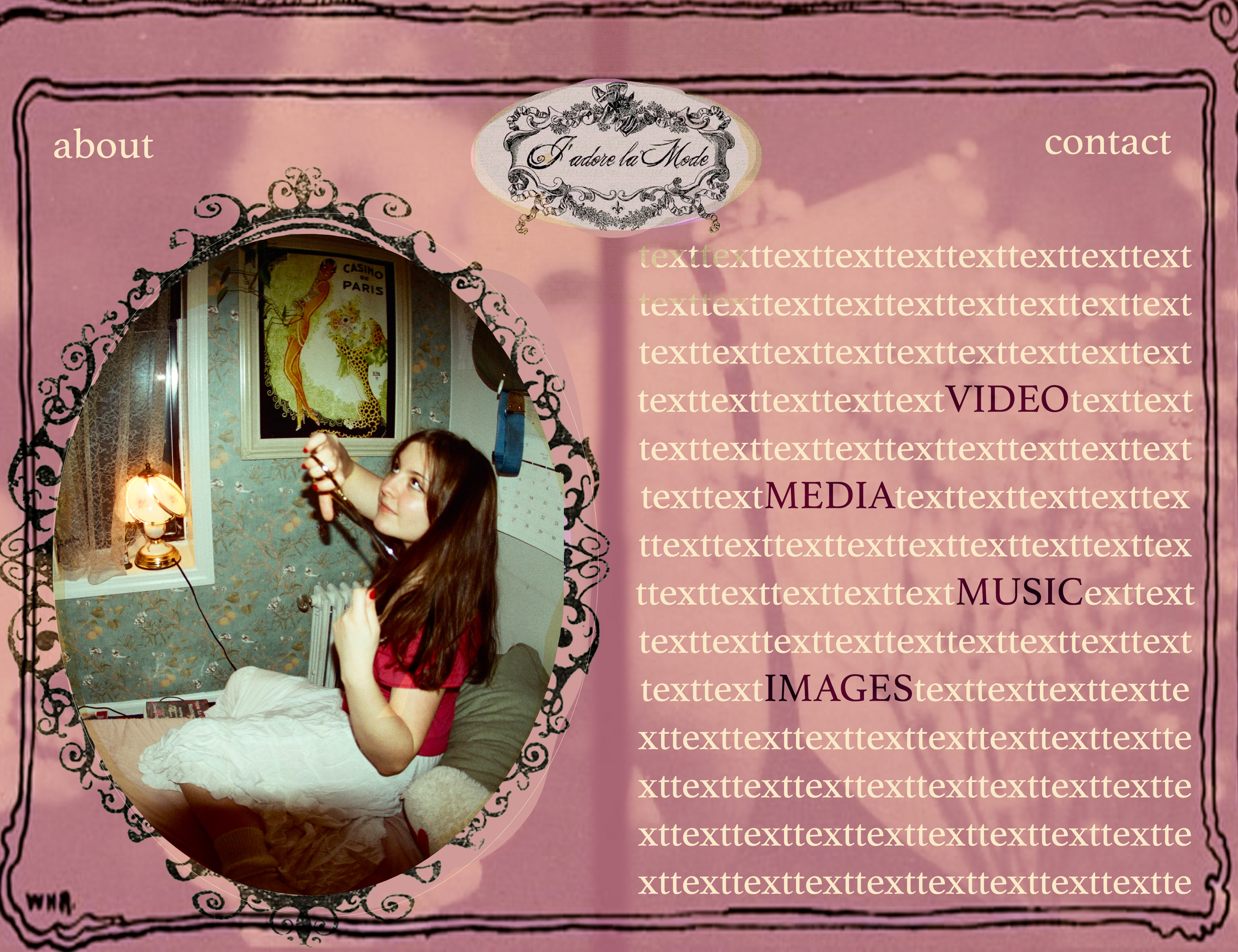
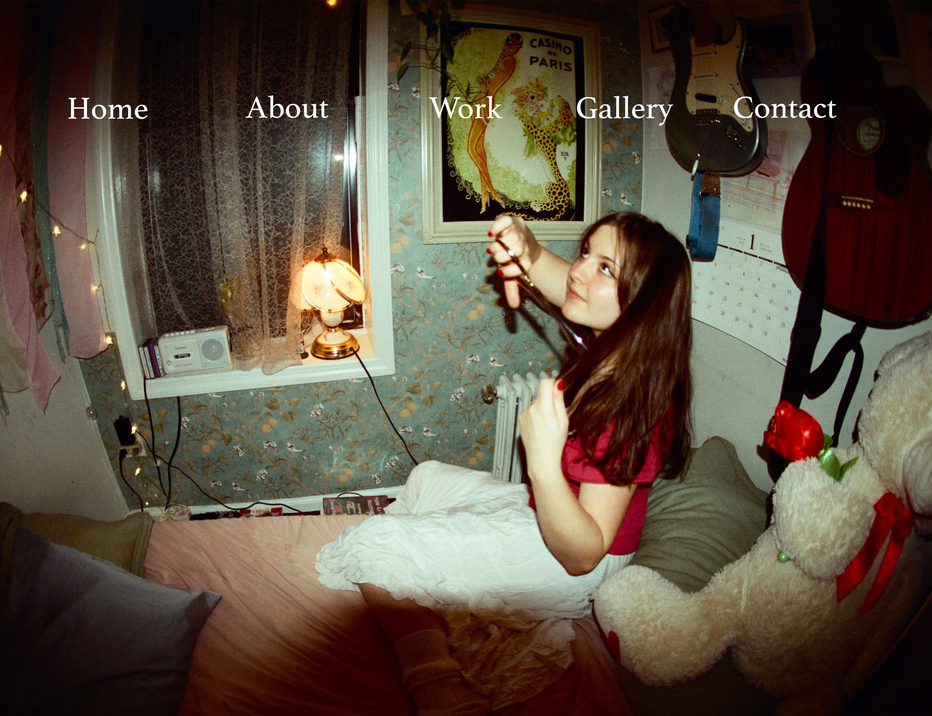
Left Side:
An old-fashioned, vintage portrait-style photo of you, perhaps with a slightly faded effect or in sepia tones to maintain the "storybook" vibe. The image could be framed by a decorative border, like a lace or floral design to enhance the storybook feel.
Right Side:
Text styled in a whimsical, elegant font that fits the French storybook theme. The text could include your name and an introduction to your portfolio. Below the intro, you can have links to each section of your portfolio (e.g., "Illustrations", "Photography", "About Me", "Contact"). These links could look like they are written in a handwritten script or delicate calligraphy to match the vintage theme.
Background:
A parchment or aged paper texture for the background to give that "storybook" feel. Soft pastel colors, like muted pinks, blues, or greens, could complement the overall look while not overwhelming the content.
Fonts:
For the headings or titles, something like a French-inspired serif font, or even something resembling hand lettering, would be a perfect match. For the body text, you can use a clean serif or handwritten font that is easy to read but still elegant.
Responsive Design:
Mobile View: The text and image should adjust so that the content remains readable and visually appealing. The left image could be placed on top, with the text stacking below it. For mobile, ensure the text and links are large enough to be clicked or tapped easily.
Tablet/Small Screen: A layout that combines both elements side by side while ensuring the text and image are scaled appropriately.
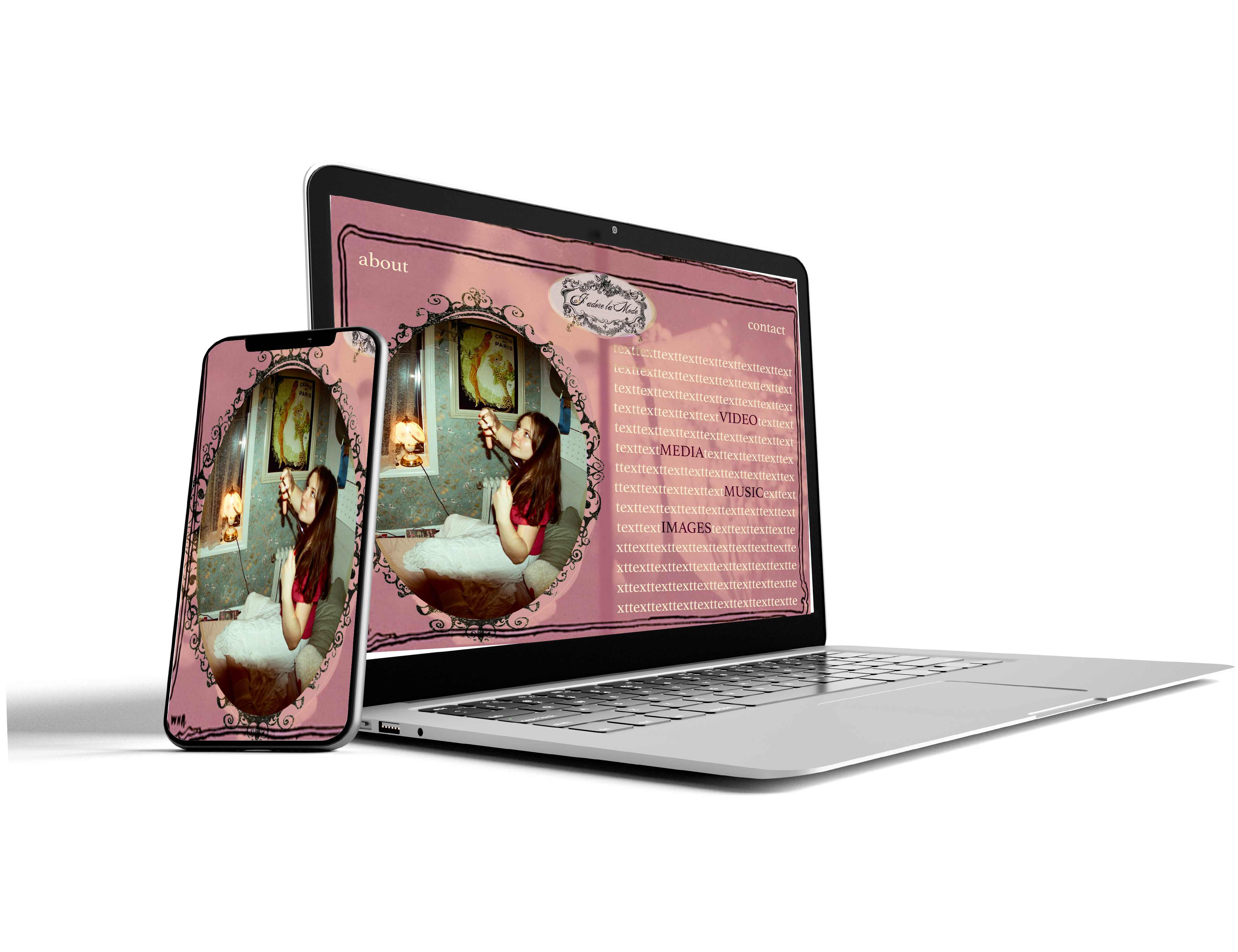
Wireframes and Prototypes
Here are some mock-ups I made:
Responsive Mockup
Attempting Figma...
PhotoShop Comp