Idea Development
I want to create a portfolio website. My intent is to sell my creativity and skills to potential employers while still being an interesting stand alone piece of work outside of commercial purposes.
Discovery and Research
Looking around at websites to aspire towards, I found three websites which stood out to me.
Tore Bentsen’s website is stylish and reactive to the user’s scrolling, it feels very satisfying on mobile, though the photos going behind his work’s titles do make it hard to read occasionally. It’s a good showcase of his skills as a web designer and an example of how he creates a fun experience by scrolling down a webpage. His portfolio also provides easy access to see his previous work if you were to hire this man.
FPP has a fun website with an introductory sequence which turns their first webpage into sort of an interactive game though it’s a bit long and time consuming, but there’s also the option to skip past this through clicking through the menu instead to reach the real home page as well as the other pages on this website. The aesthetic of this website reminds me of early low poly 3d games. It’s also very reactive to the user’s scrolling.
Moooi mostly stood out to me for its menu because I already had the thought that a moveable floating icon menu could be a fun feature to play with. There’s also other features in the website which stood out to me, such as the changeable grid size of the products page, as well as the moving doors in the gift page. This website does a great job at being an online store.
I’d like my website to ideally be expressive and fun to navigate, though given that I’m starting from scratch without much prior experience/knowledge in web designing this could be a tough goal to achieve. But regardless I feel like my website should reflect myself in such a way that if I were to meet someone in person who only knew me through seeing my portfolio, that they would have a grasp on who I am as a person. I like the feeling of having a draggable menu like the Moooi website, especially if it’s not entirely noticeable so it’s like an easter egg to discover and interact with. I think if I had all the time in the world to try and make some sort of storyline and immersive experience like the start of FPP it’d be a fun thing to try out, but not necessarily necessary. I do enjoy all the movements that Tore Bentsen has on his website, so I want to try and learn how to do that for myself.
Target Audience
I know that my target audience would be employers, but I’d also just like to target myself in my website design and just make a really fun and cool website which might be a bit of a childish and idealized take on creating a portfolio website in the first place. This means that a certain level of professionalism is expected, but I’d interpret this more so as having to be deliberate and professional in the website’s creation. If that makes sense? I just don’t want to equate plain minimalism to professionalism because it feels boring and comfortable, which isn’t a bad thing in itself. I just don’t want to be unapproachable and therefore unappealing.
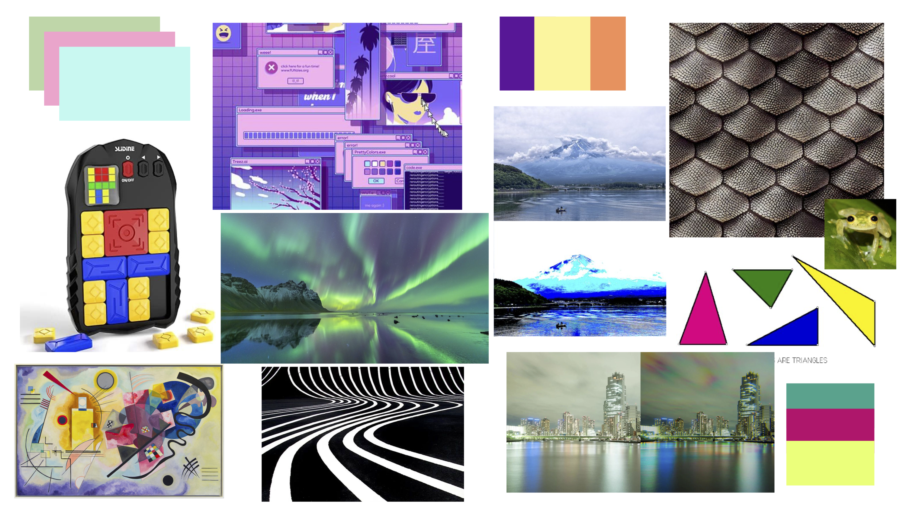
Inspiration/Moodboard
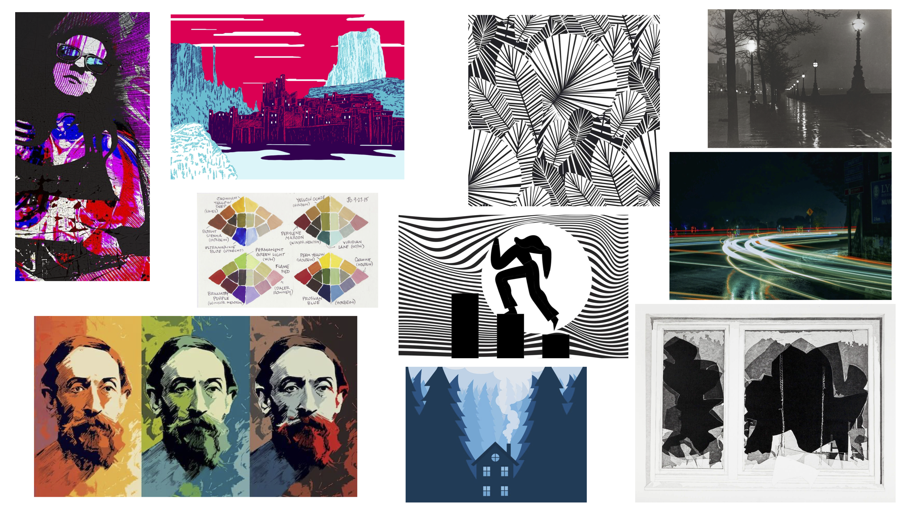
I’m not really a big moodboard sort of person. I never really fell into using pinterest to collect pretty or cool images in a neat organized sort of way. I think my brain works in chaos where I’ll go from mental brainstorming to doodling around ideas and when I need references for things I’m thinking about is when I go out to look for helpful images. I guess I just kinda threw things down on this as it came to me? Mostly while thinking about what kind of things appeal to me or that I want to move towards in my artistic practice. Currently, I feel like I’m drifting between taking a maximalist approach in art and a minimalist approach.
Thumbnails
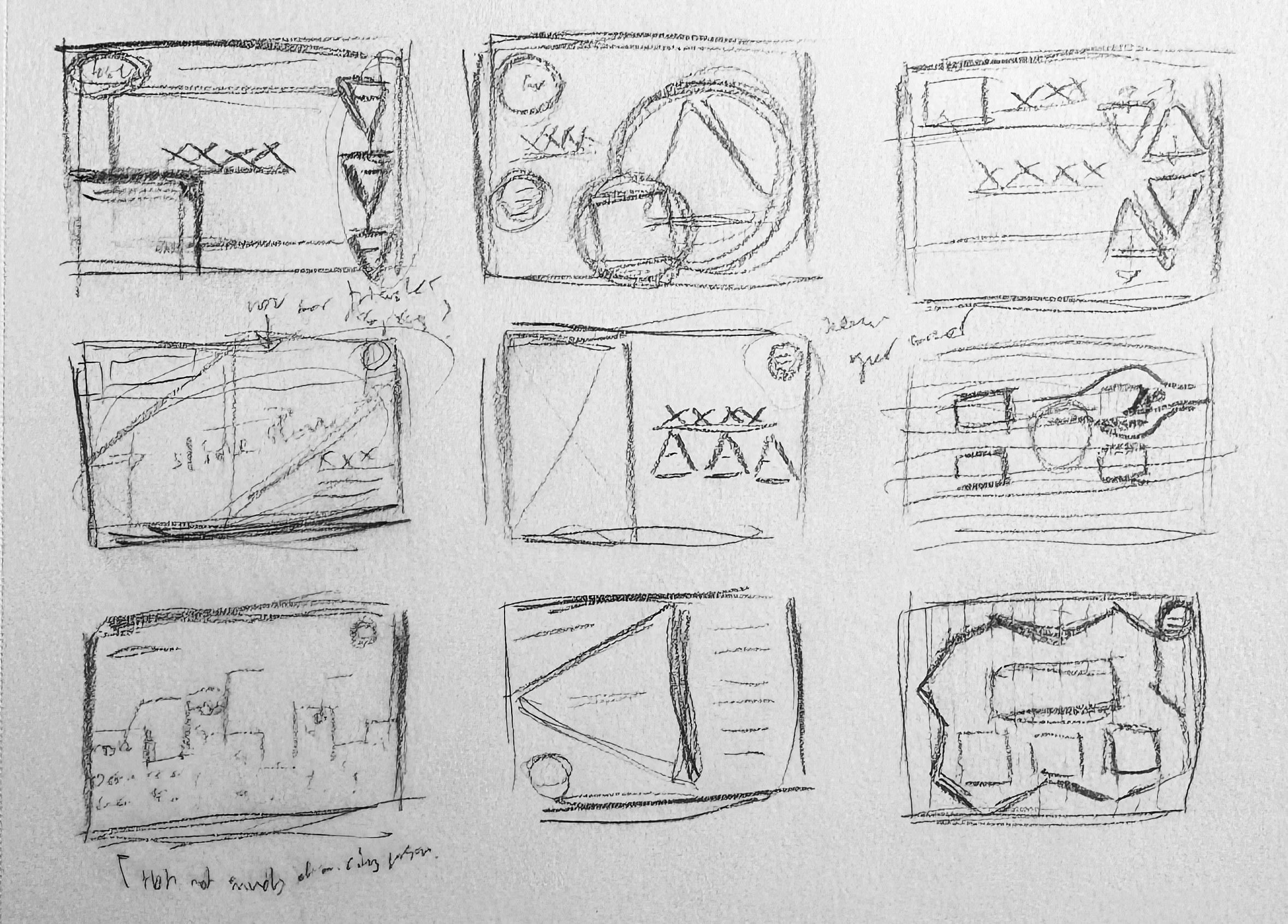
I started with trying to arrange simple shapes in interesting formats, and then took it by ear from there. I think I want to use triangles, despite the fact I think that they’re not the easiest shapes to work with from previous coding experience in python.
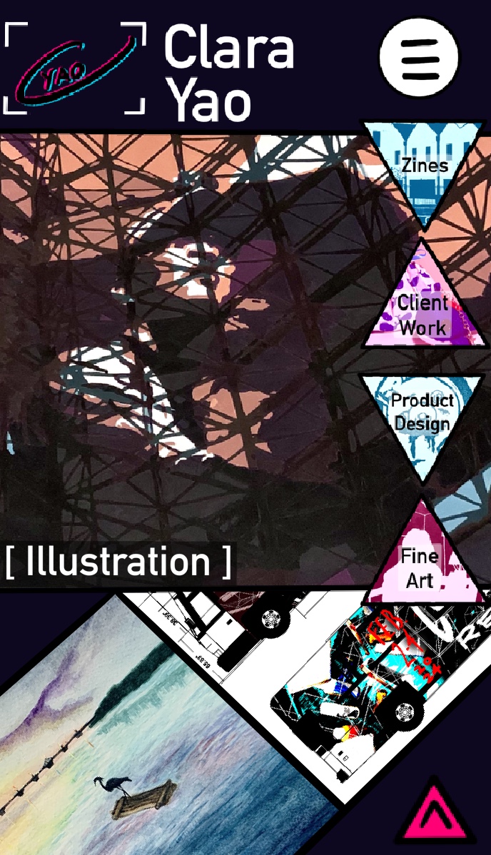
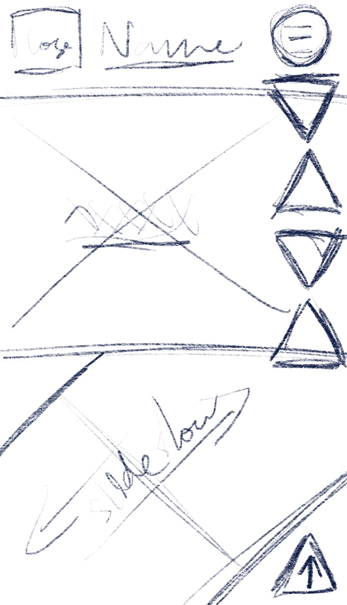
Wireframes
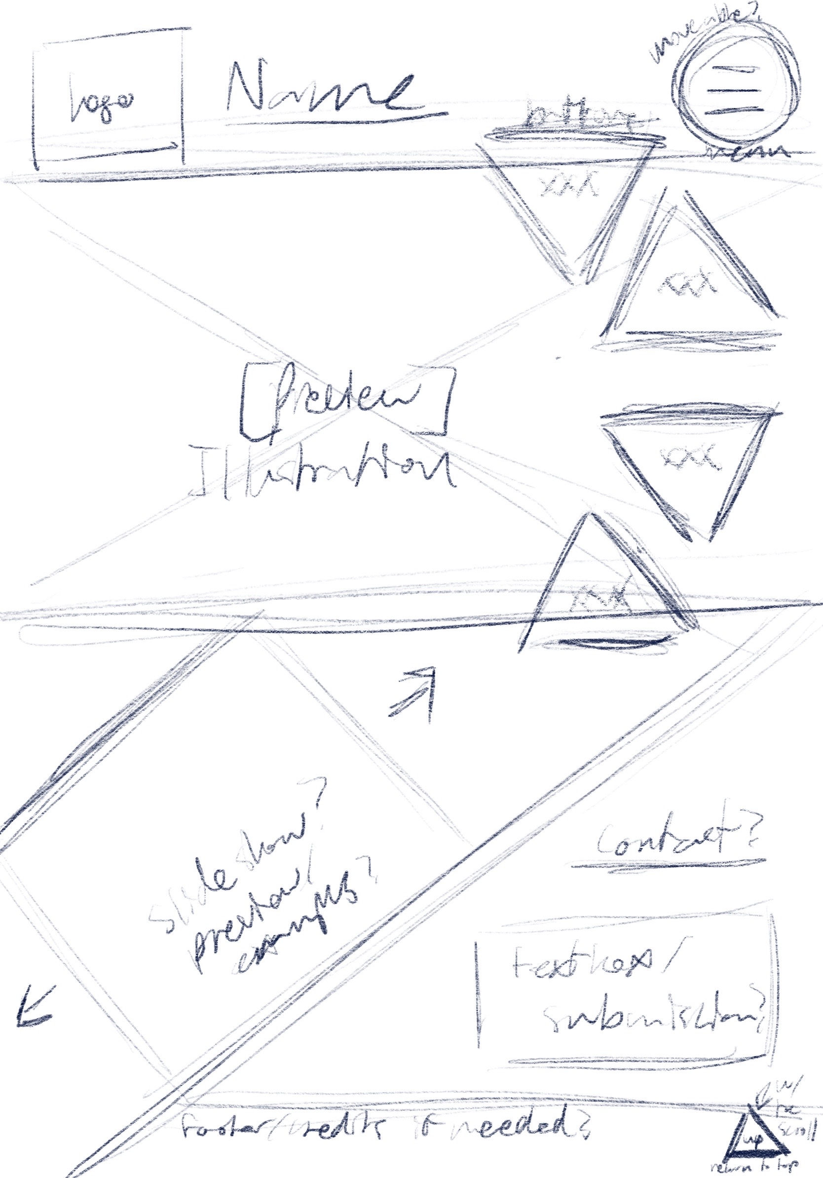
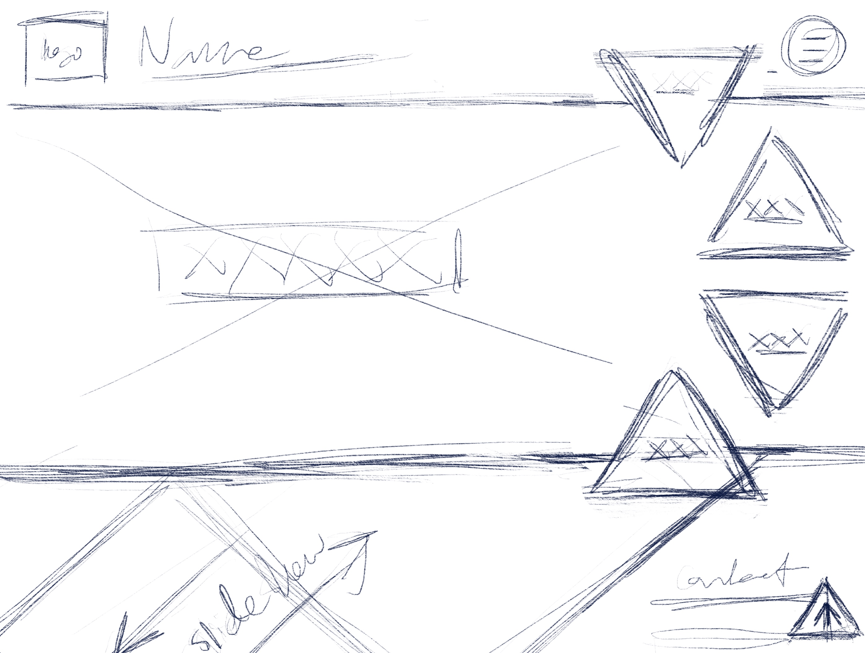
I decided to sketch out wireframes for a laptop screen, ipad, and iphone because these are the 3 devices I use the most and therefore am most familiar with. I stuck with the home screen for this as it's the first impression for the website, and once the home page is laid out, the rest of the website's appearance can follow suit.
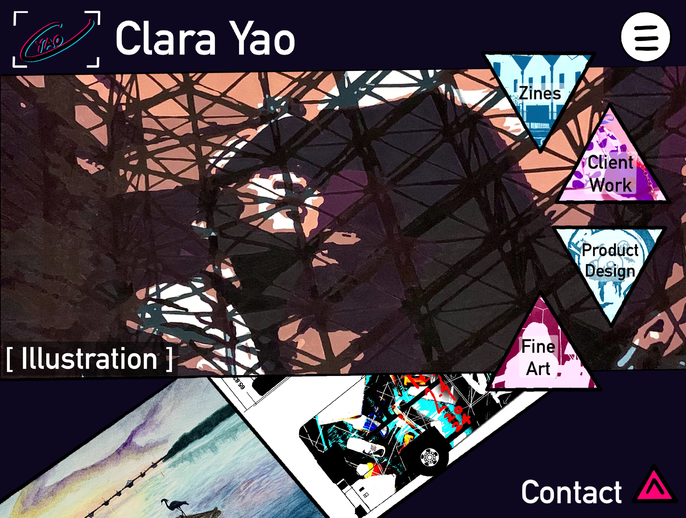
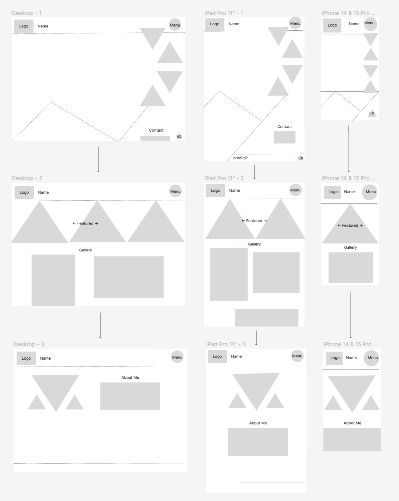
Responsive Mockup
I tried out using figma to visualize what different pages of my website would look like as well as on different devices.
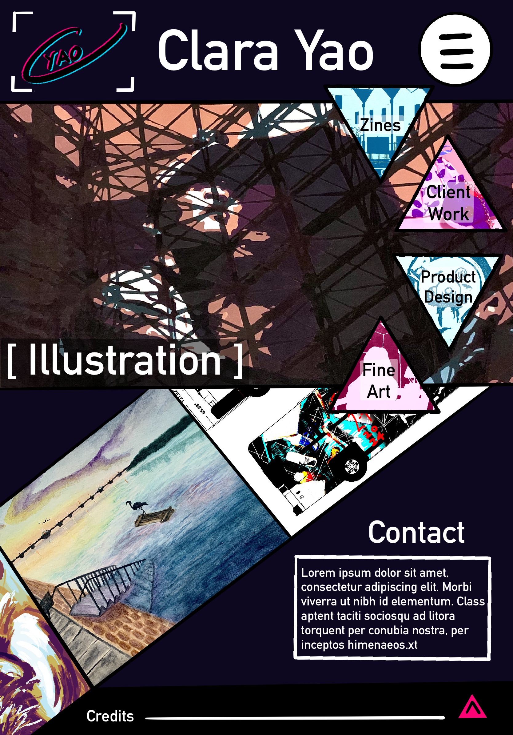
Photoshop Comp
I technically used procreate for this instead to roughly figure out what my wireframes would look like actualized into a website. I reused the logo I created for my current portfolio website with an added frame because it felt too empty by itself. They feel a bit childish in my opinion, I wonder if it's because of the font I used for text or if there's something else that's making me feel like this.