Questions, Comments & Observations
- How much friction is too much? Where's the line between "memorable" and "just annoying to use"?
- Can I keep the site scannable for someone skimming quickly, while still rewarding someone who spends real time on it?
- Which of my three concepts can I actually build with HTML/CSS in the time I have, versus which one needs JS I don't know yet?
- How can I tell a story? Theres so much competition out there how do I compete?
1) Develop Your Idea
The problem I'm solving: most portfolio sites optimize for frictionless scanning, which makes them fast to browse but easy to forget. I want to design deliberate, rewarding friction into my portfolio. so that the act of interacting with the site becomes evidence of my design thinking, not just a delivery mechanism for images of my work.
I'm my own client here, which is the hard version of this problem: there's no brief to push back against, so the risk is building something that feels cool to me but doesn't actually communicate anything to the person looking at it. The idea only counts if it still works for a stranger evaluating my work, not just for me.
2) Discovery and Research
Reference Sites
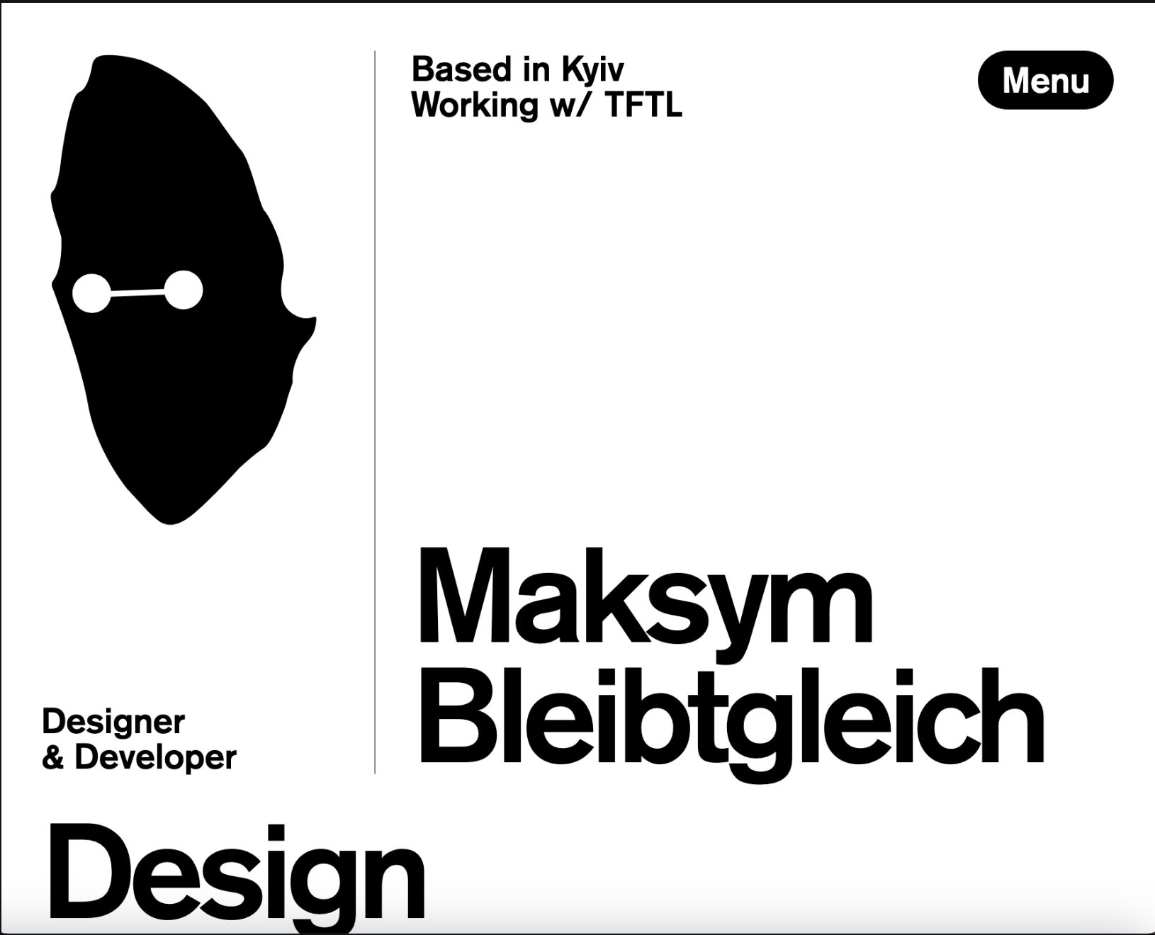
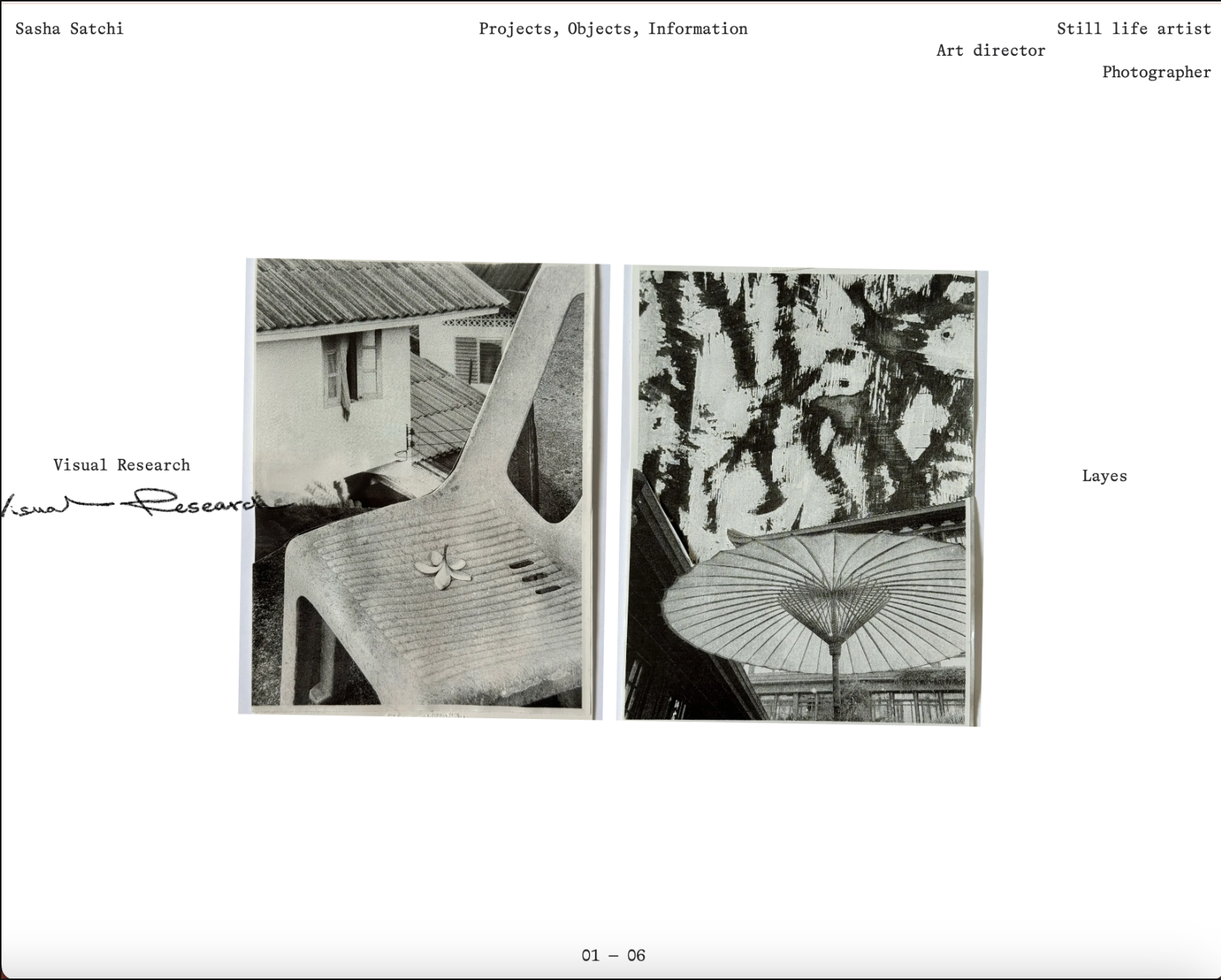
I looked at sites that treat interaction as a design decision rather than decoration — specifically ones that use some form of "friction" (delay, discovery, resistance, a small puzzle) as part of how they communicate craft.
What I've concluded
Across these references, the sites use the viewers curiousity as a vessel to explore their work. By applying intresting unique ways of navigating each portfolio, as simple as beautiful image hovers and as complex as animation graphics. Entry points (homepages, project thumbnails) tend to stay true to the designer and immediatly showcase their skills and focus, also maintaing fast and legible ux. The only friction that shows up is once you're already committed to going deeper into a project. That's the pattern I want to borrow: friction as way of exploring and making my portfolio memorable.
3) Target Your Audience
People who want to pay me?
My target audience would be employers like art directors, buisnesses and recruiters. Or just any other creative indivduals who are curious about my work (want to collaborate?) My real design problem is that "friction" cuts two ways depending on who's looking: a fellow designer or an art director will likely read intentional friction as craft and stay longer because of it. A recruiter skimming dozens of portfolios in an hour needs a fast, legible exit if my site doesn't match what they're looking for. Friction there just reads as a bad, slow website.
Resolving that tension is my actual audience strategy: keep the entry layer (homepage, project index) fast and scannable, and let the friction live deeper in, inside individual project pages, where someone has already chosen to invest time. I'm designing for two audiences moving at two different speeds through the same site, not one generic visitor.
4) Introductory Framing and Concluding Call to Action
If friction is the whole thesis, the homepage needs to teach that in the first few seconds — a cursor behavior, a hover state, something small that signals "this site rewards attention" before any text explains it. I don't want a plain hero and nav that could belong to any portfolio; the first interaction should already feel like mine.
The closing call to action shouldn't just be a static "contact me" link — it should mirror the opening interaction in some way, so the site feels like it has a shape (a beginning and an end) rather than just stopping. Still deciding exactly what that looks like — likely tied to whichever concept I pick in Step 5.
5) Inspiration and Concepts
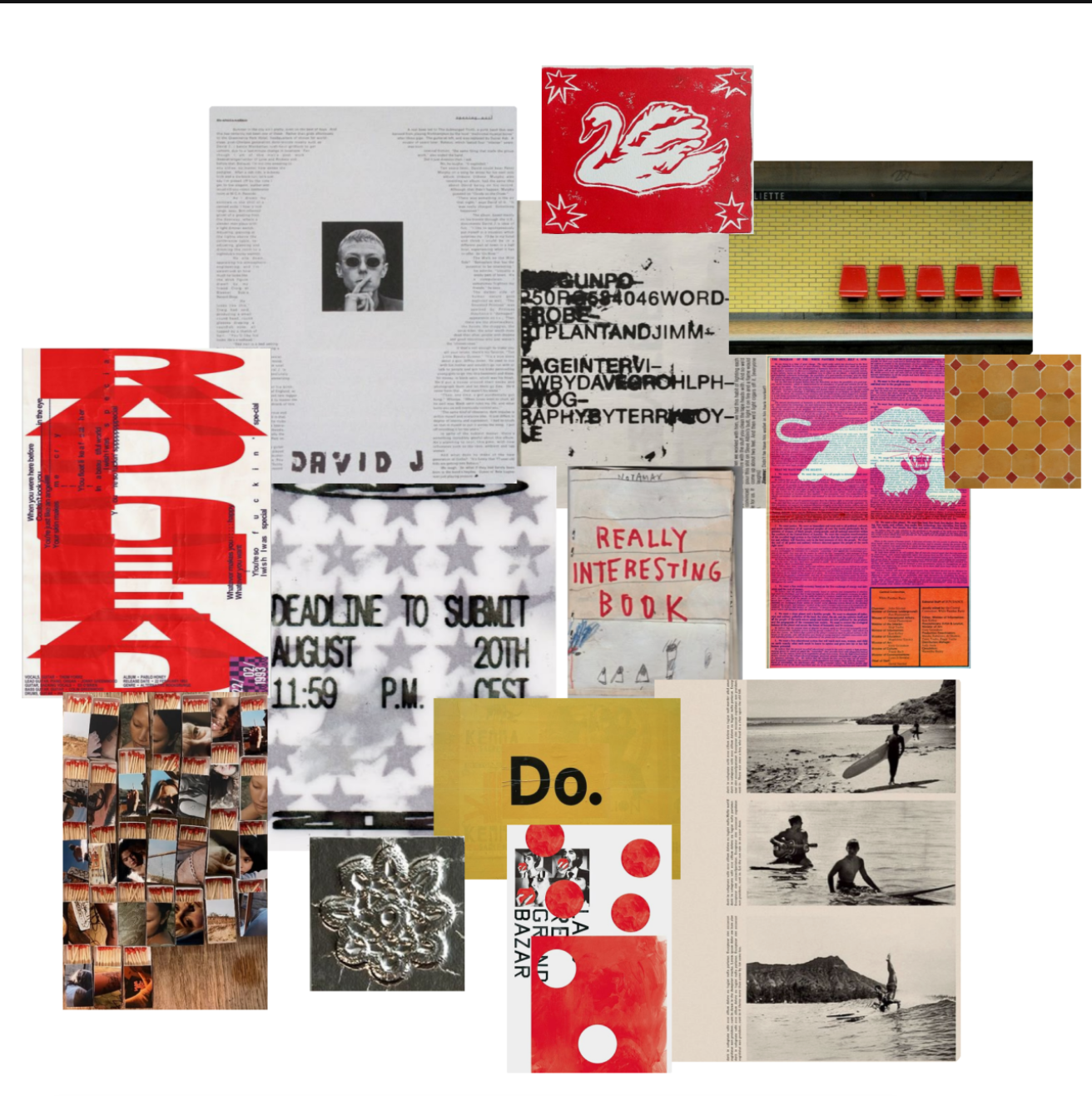
Mood Board
Concepts
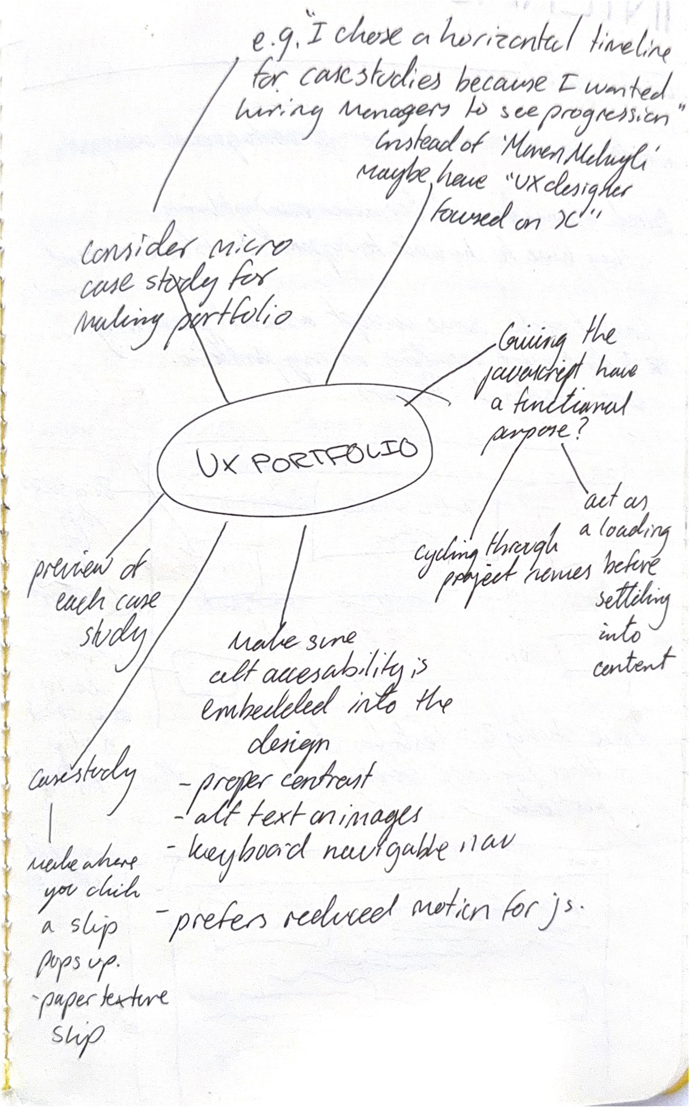
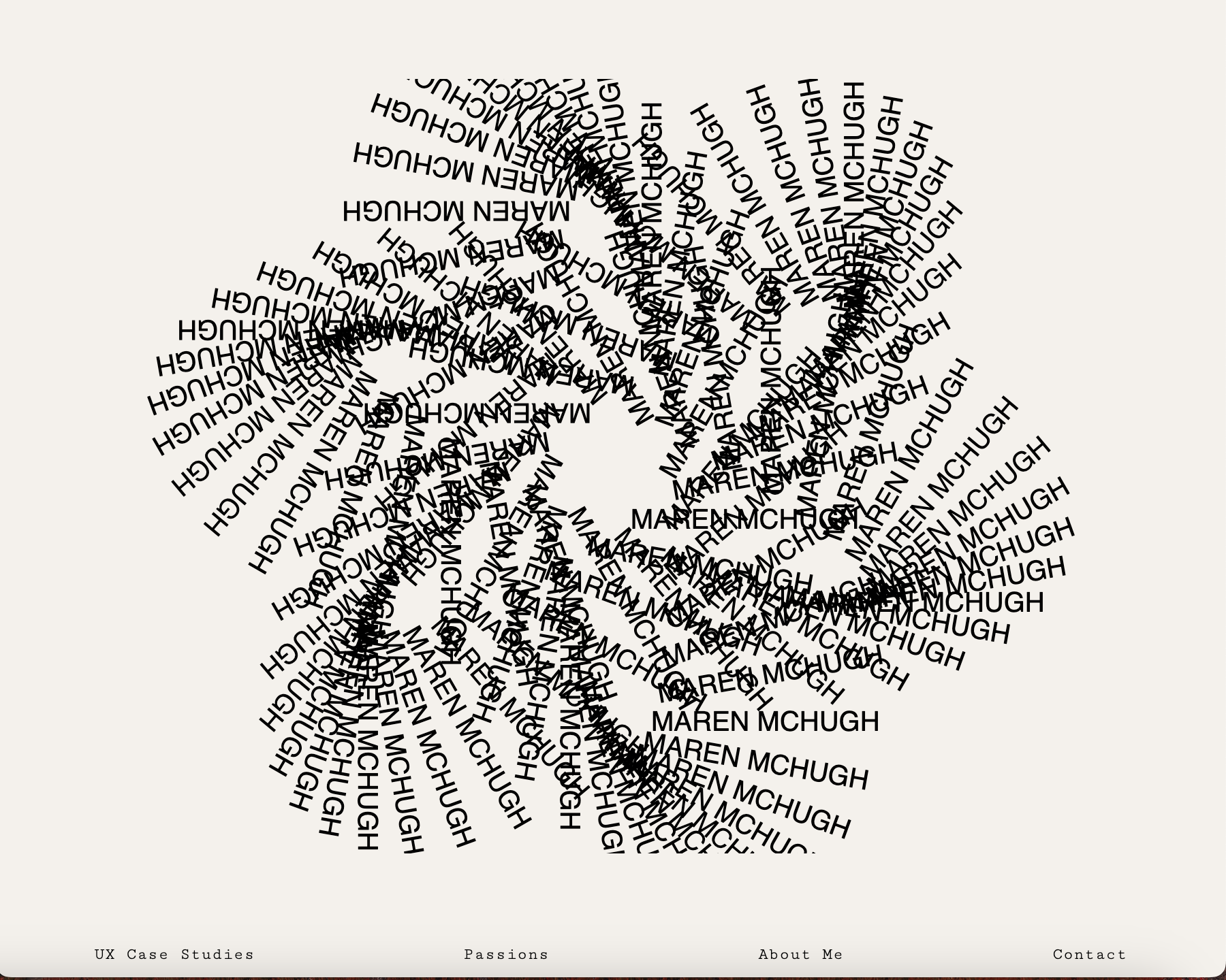
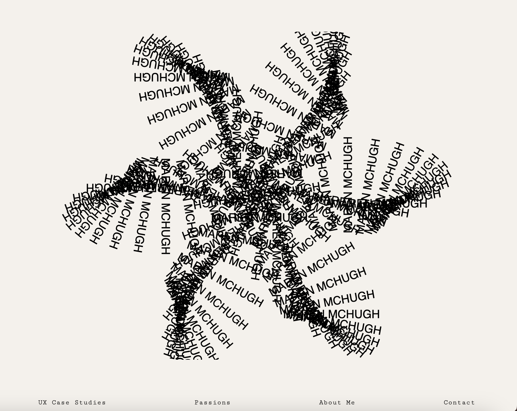
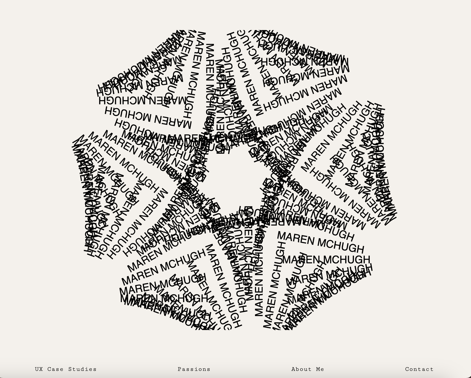
- Javascript interactive animation Last year I coded a javascript interactive art work that I feel like could be a powerful interactive element to my website. I've changed the text to have my name but I need to figure out how it could become more than just decoration. May change the words so it says something about my UX not just my name.
- Weighted Interactions — elements physically resist the cursor: drag, spring-back, magnetism. The friction is tactile — you feel the interface push back.
- Maze Navigation — a nonlinear structure where finding a given project is itself part of the experience, rather than a straight list. The friction is spatial — you have to explore, not just scroll.
Leaning toward Weighted Interactions right now — it's the most buildable with CSS/JS I'll actually learn this semester, and it lets me keep the entry layer (Step 3's fast audience) mostly untouched while concentrating the friction inside project pages, which lines up with the audience strategy above.
6) Thumbnails and Sketches
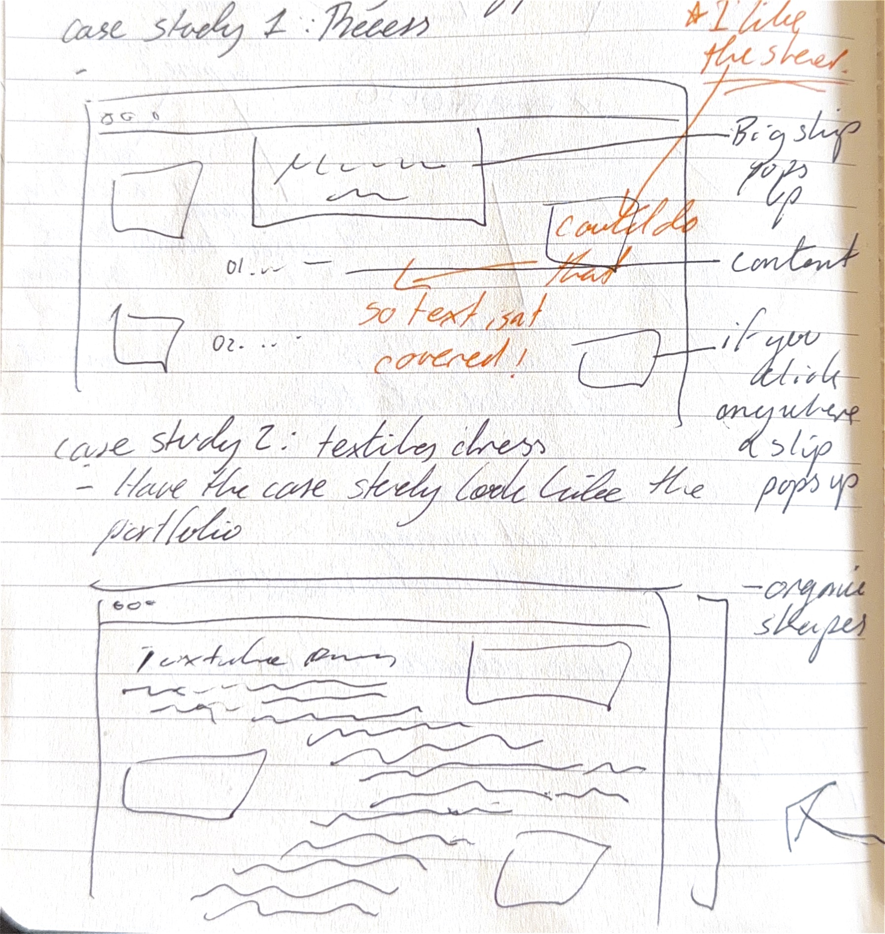
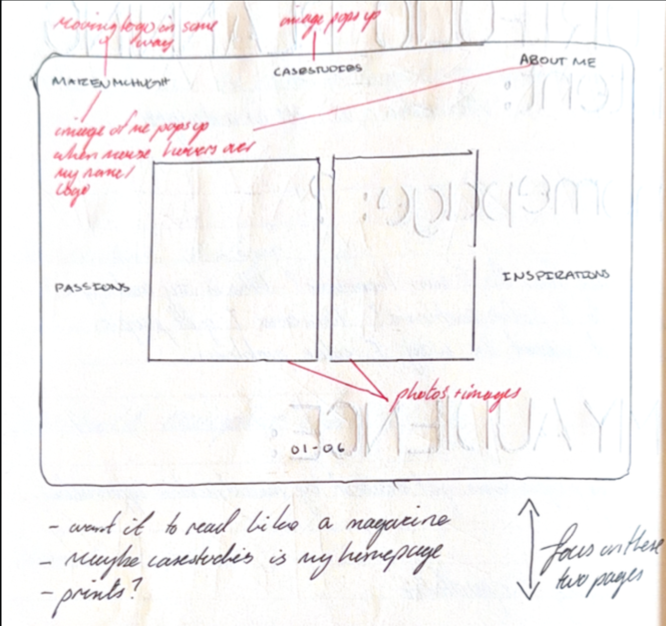
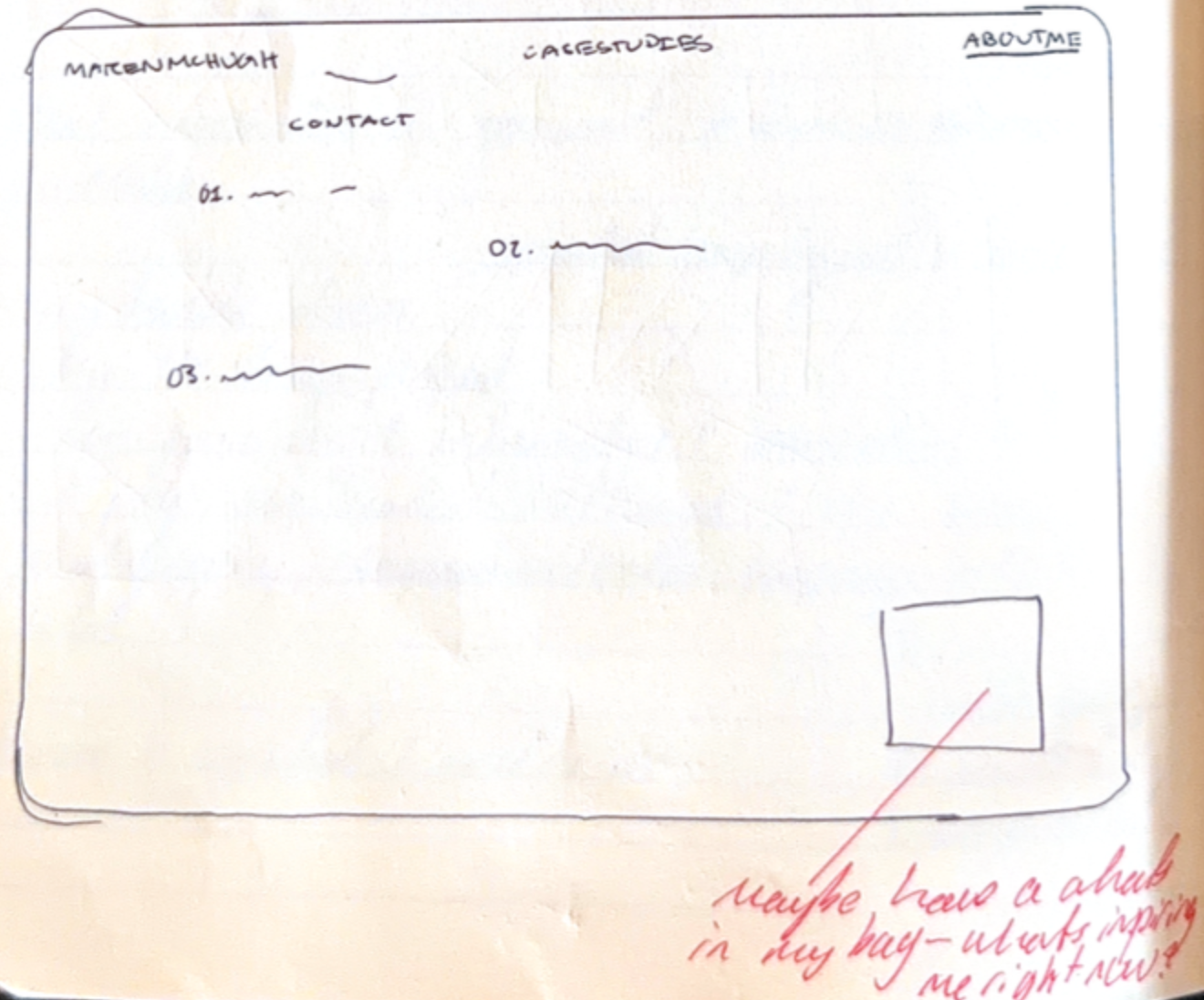
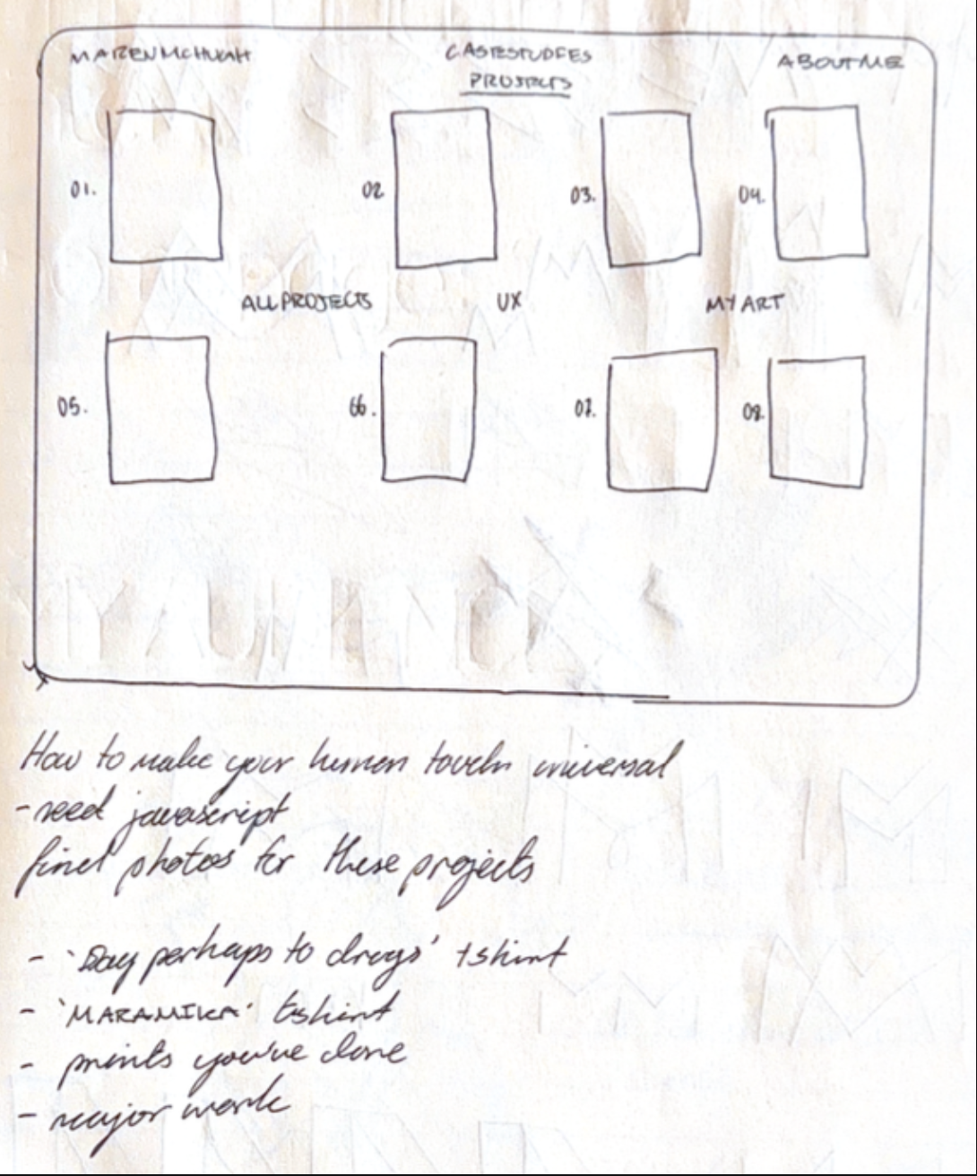
7 Wireframes and Prototypes
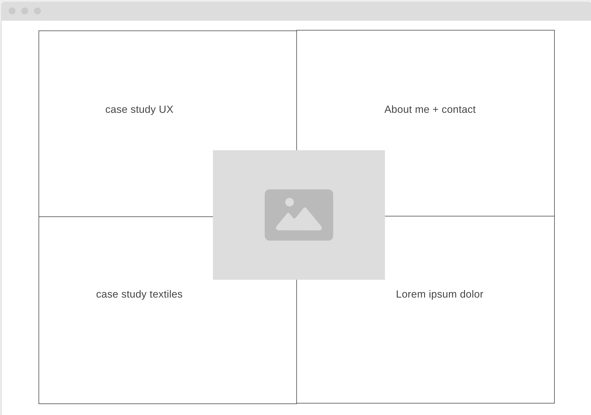
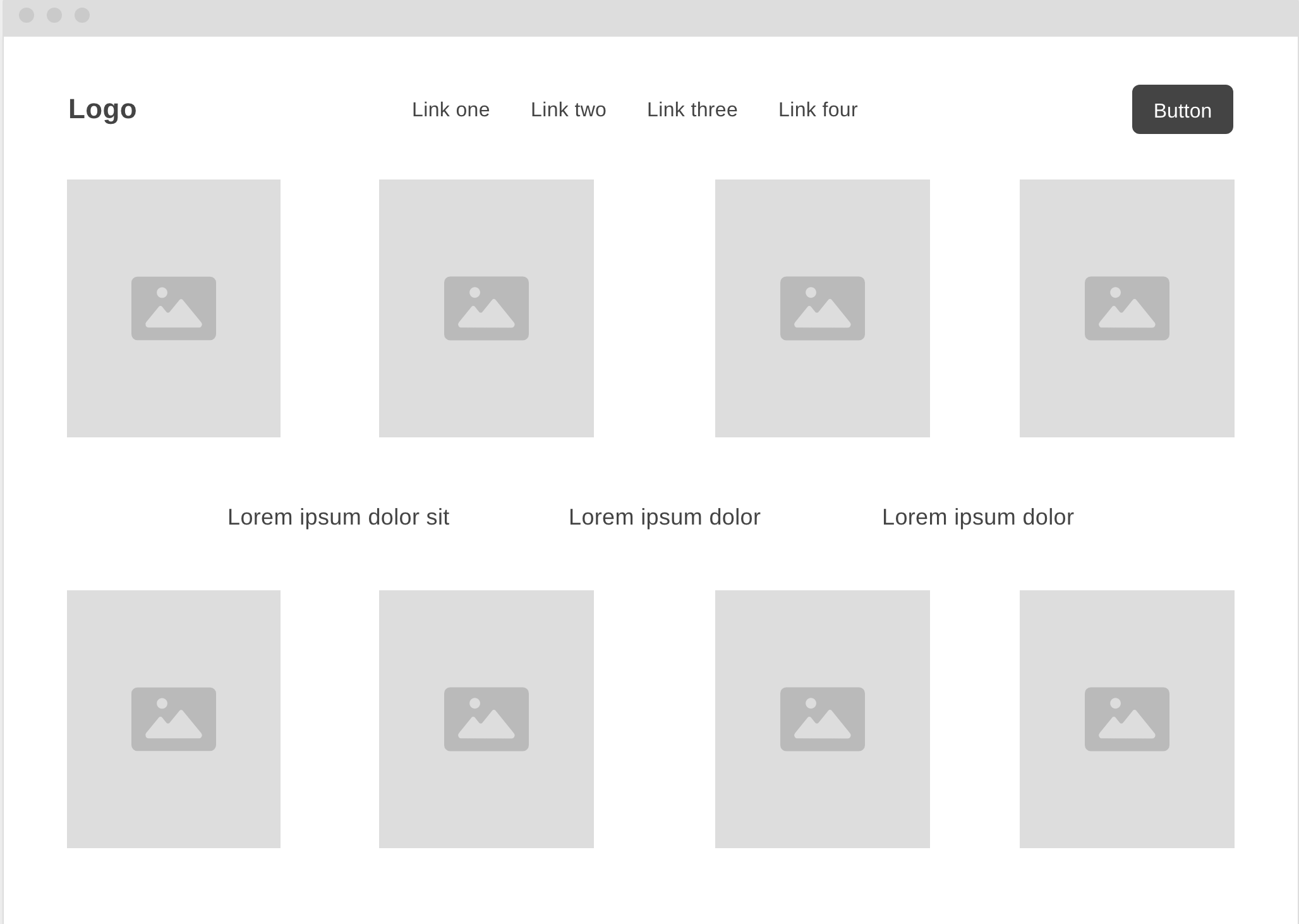
Homepage

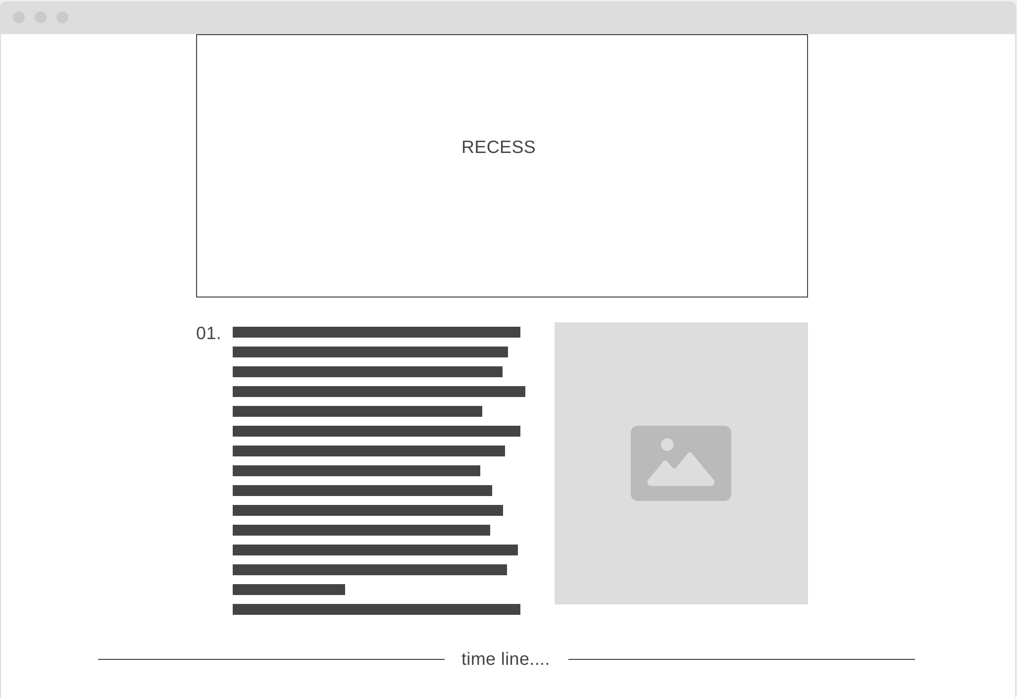
Recess:UX case study
Its meant to be a ceremonial object for adults to connect with their inner child. Its supposed to lead with curiousity, the size and colour (red) of the sculpture would make passerbyers curious to investigate. Idealy it would be set in densly populated ares like at a university campus where young adults are busy doing their studies and may need a much needed reminder to play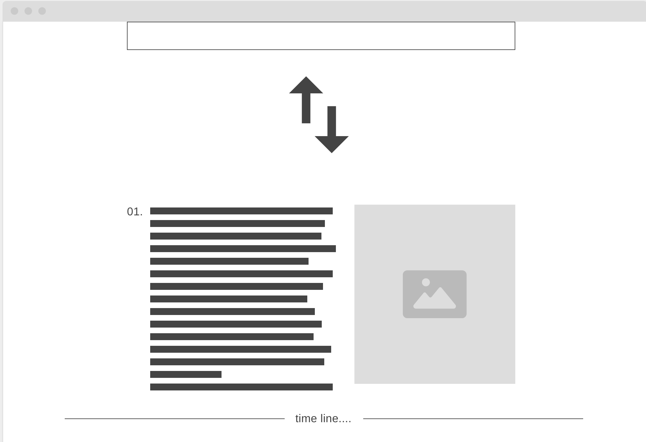
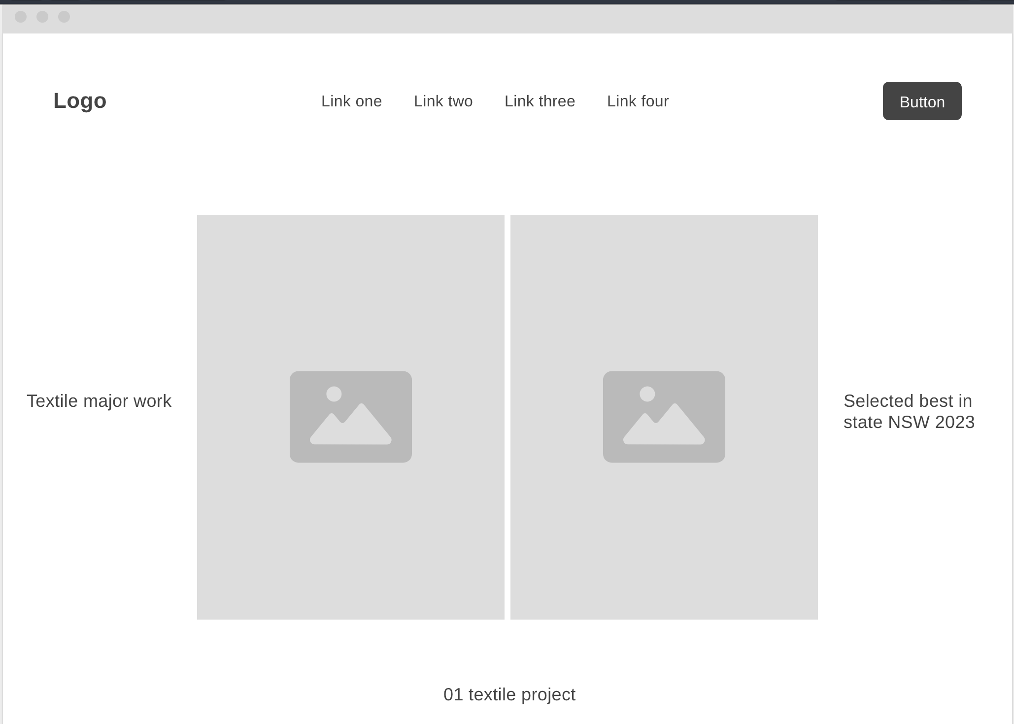
Textiles major work
Passion Projects
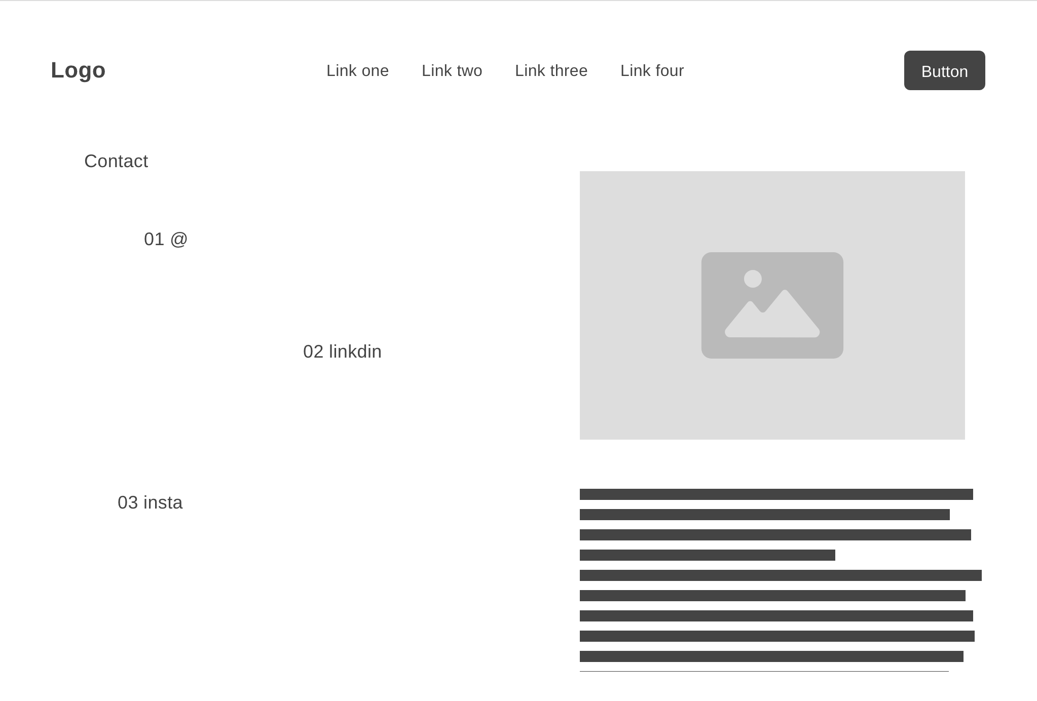
About me + contact page