Prun
Professor Alexa Nosal
Designing Symbols
Spring 2015
The goal for this project was to create a logo for a high-end boutique shop that uses prunes and both baked goods and natural skincare products. The challenge for this project was attempting to make prunes look both high-end and desirable, as they tend to have a negative connotation.
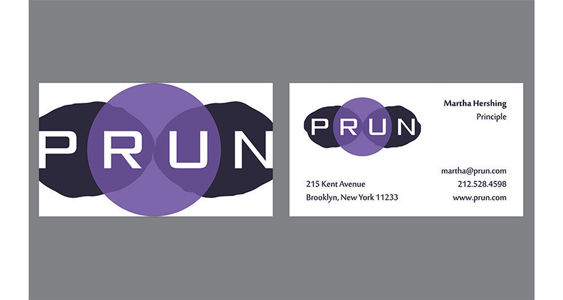
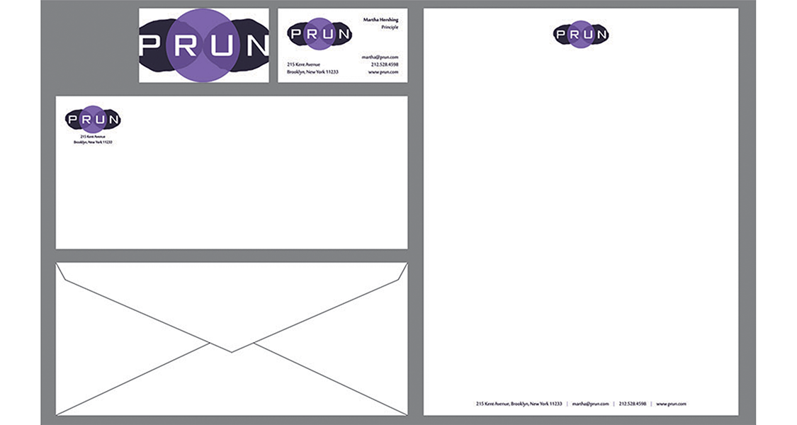
The logo itself is made up of two prune shapes with one circle on top of them. I used transparencies to overlay the shapes to create depth. The colors used symbolize the plump, lively color of the plum, while the darker color resembles that of a prune.
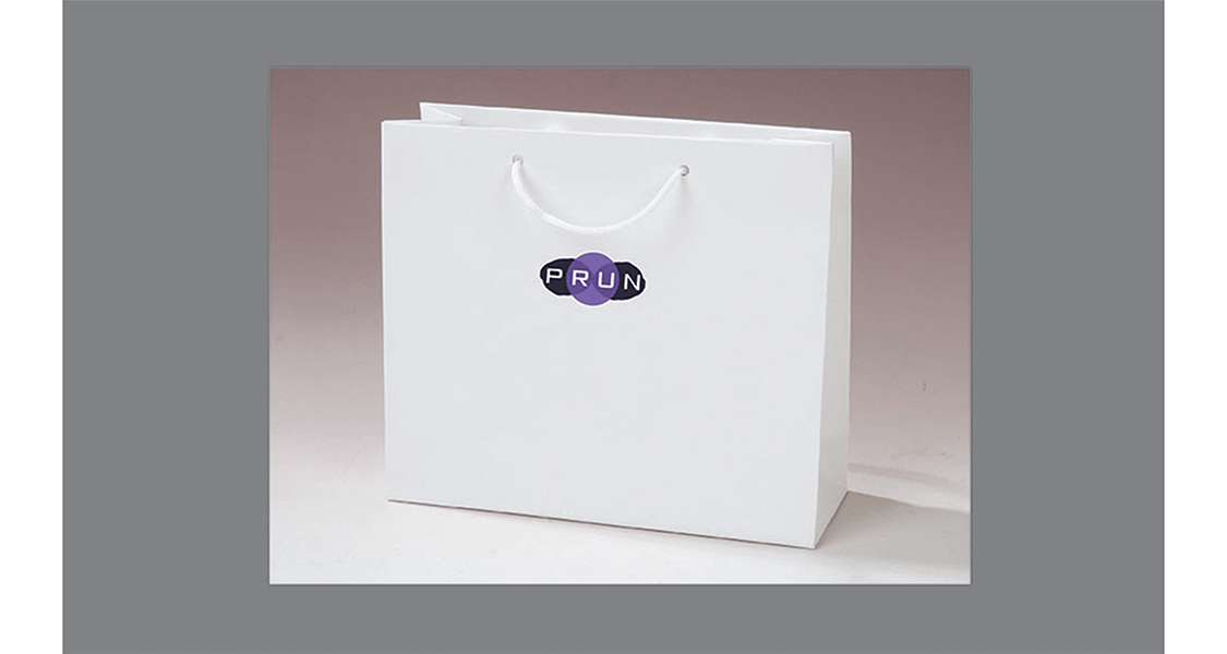
The illutration of this logo used on a clean, white bag also maximizes the high-end feel that I wanted to accomplish. The strong typeface also contributes to that, creating a trendy, desirable boutique brand.
