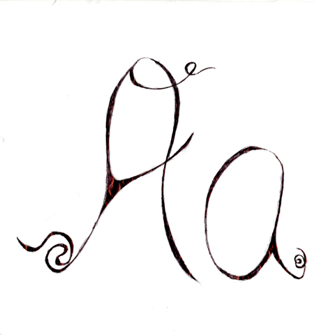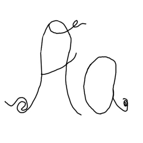
Okay so this is what I have come up with for my font creations. I have tried to morph my “A” into a slick piece of Post Modern, abstract sculpture. What I really like is that this font I created is similar to my drawing/inking style when I illustrate something. If I had to do it again to improve it, I would do more research on similar fonts to see what made them successful in their creation & I would try to pick some elements from it that I liked. For Example Edwinscript is one of my favorite fonts to use, but due to time constraints I wasn’t able to do in depth analysis before I started. this
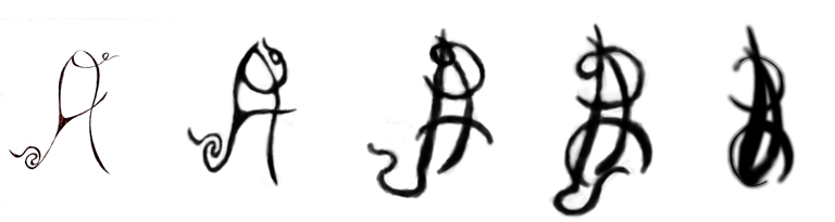
Here is the sculpture below